Here at Proto.io, we’re excited to see what fresh and innovative design ideas come out this year. As 2018 gets off a great start, it’s important that we look back at the mobile interaction designs that “wowed” the industry. Last year we went over the top five mobile interaction designs all the way from January through December and we want to recap those collections.
Without further ado, let’s get right into the mobile interaction designs that made us look twice (or more!) in 2017.
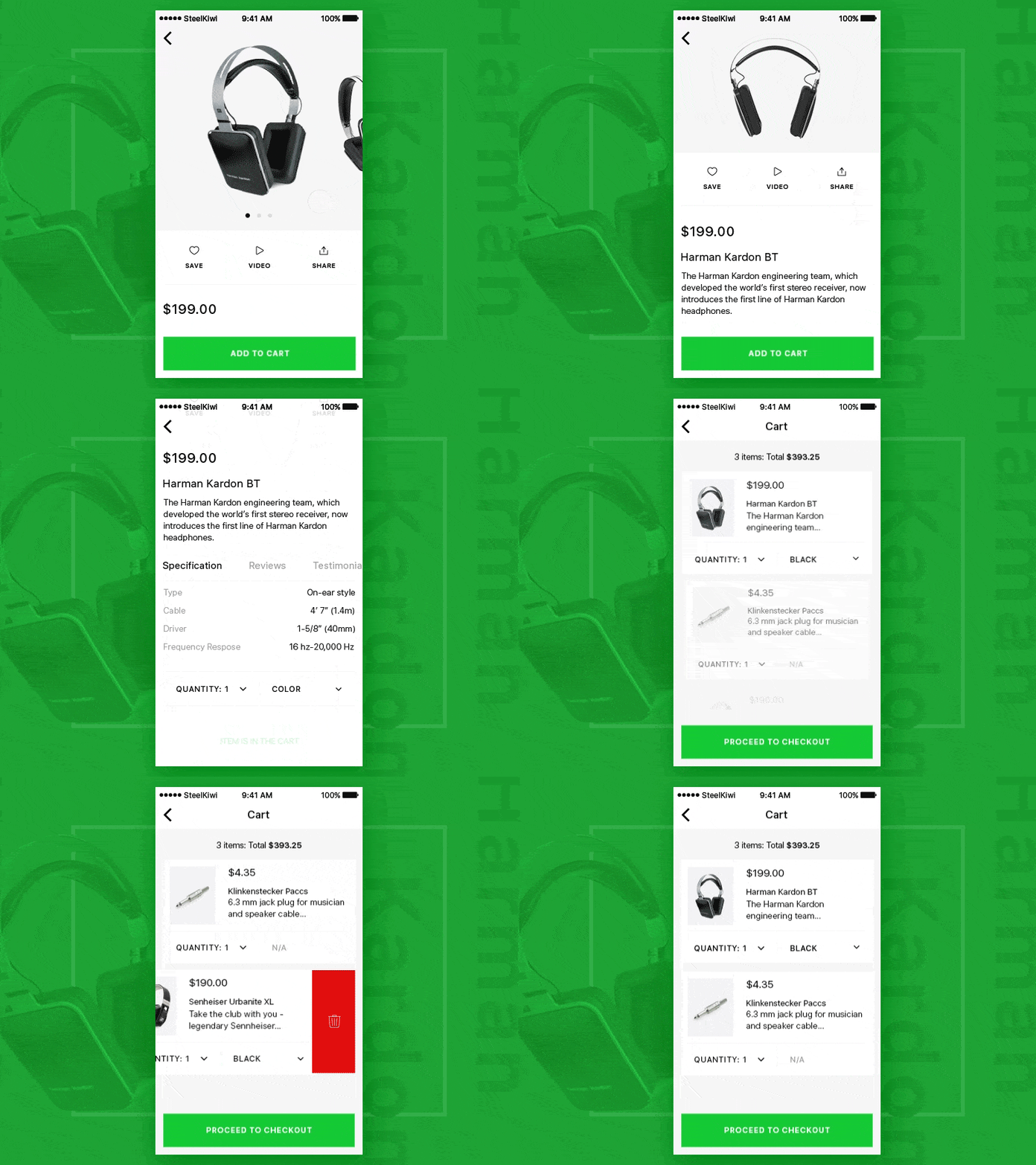
1. Product and Cart by Skiti for Steelkiwi Inc.
This app concept impresses me with the smooth transition when you add an item to your cart. The designer added an interesting syncopated rhythm when you swipe through through the product options.
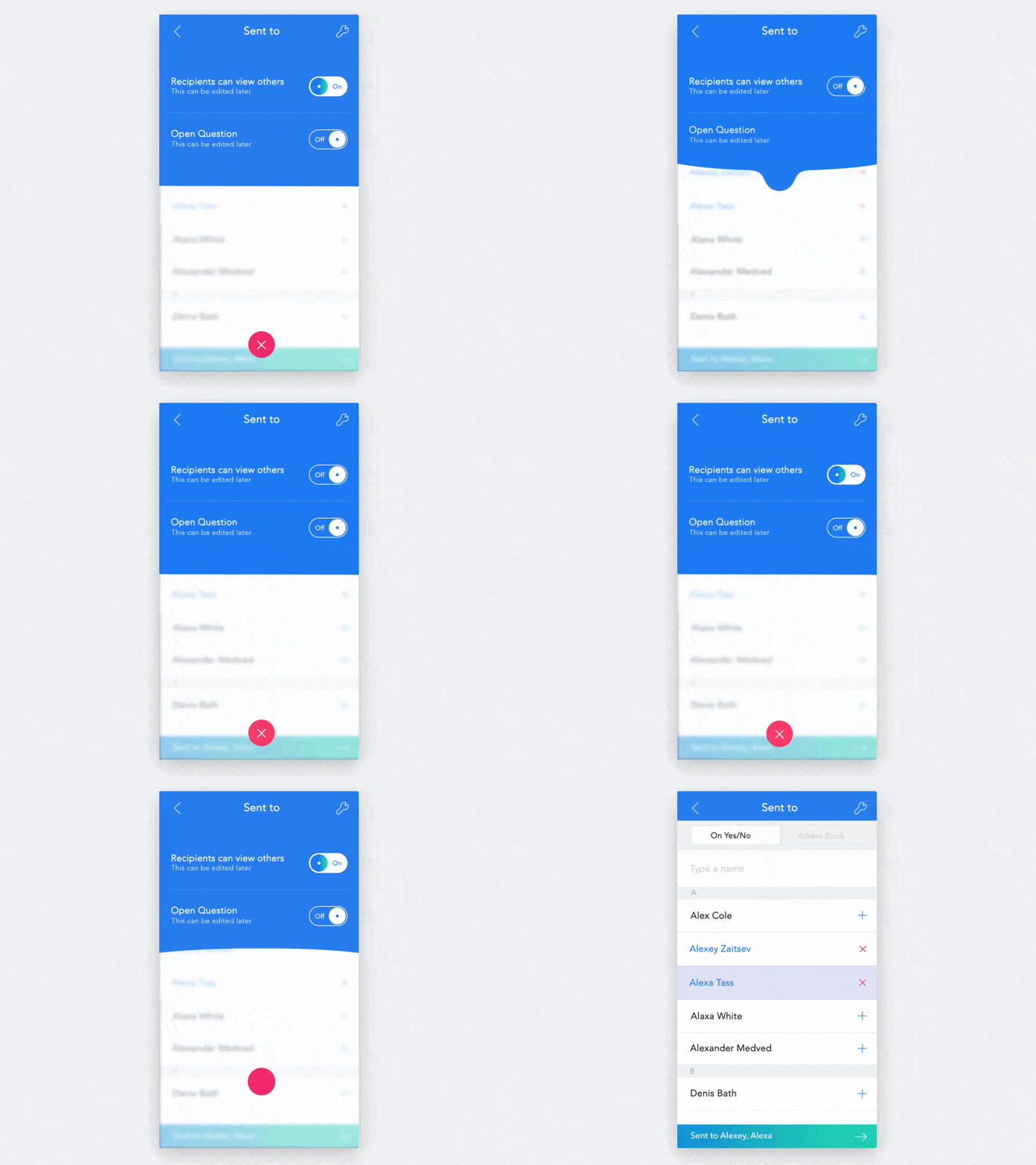
2. Conversation Settings Animation by Luboš Volkov
This app concept caught my attention because the design is literally fluid. Changing the settings of an app is never a very exciting part of using it, but when one section flows so smoothly into the other, it’s hard not to enjoy the microinteraction.
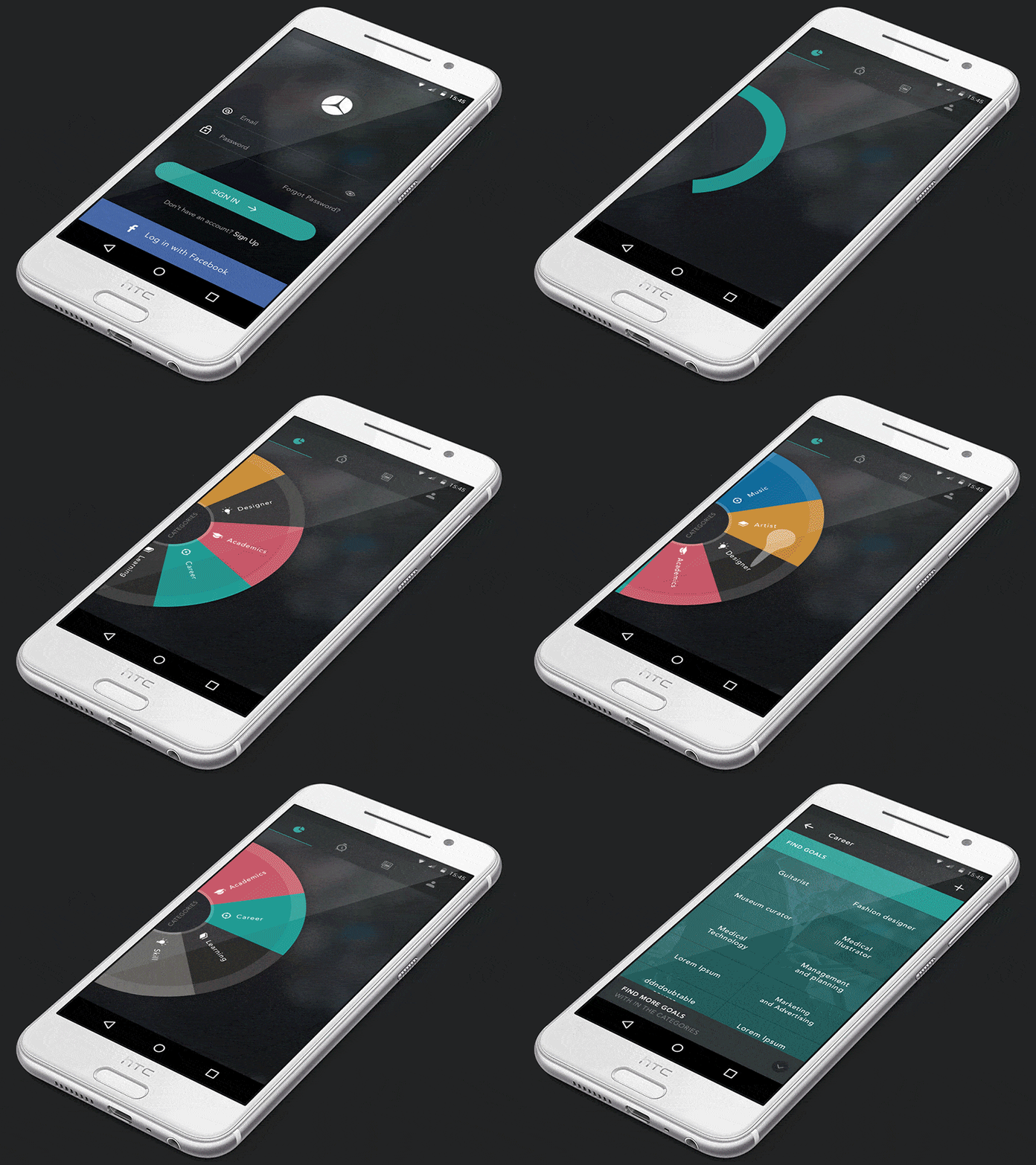
3. Interaction Design by Dhipu Mathew
We’re used to scrolling down or swiping to the side to go through options, but Mathew puts a delightful spin (pun intended) on that. Overall, it is a very cohesive concept that drives home the spinning feel.
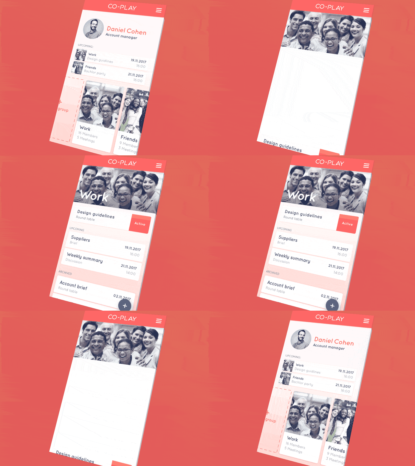
4. Co-Play Interaction 1 by studio&more
Co-Play has a fun way of pulling up information and minimizing it. The rising and falling motions of the Co-Play app make it a soothing option to make group work easier.
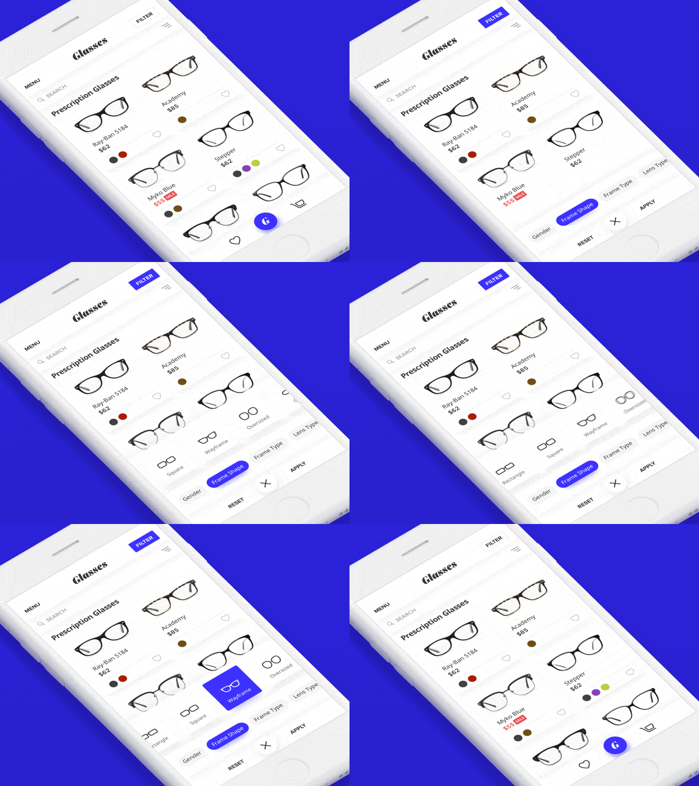
5. Filter by Vladimir Gruev for Heartbeat.UA
This app concept makes the glasses buying process better by simplifying the filtering function. They also added lots of bounce effects to improve the user experience.
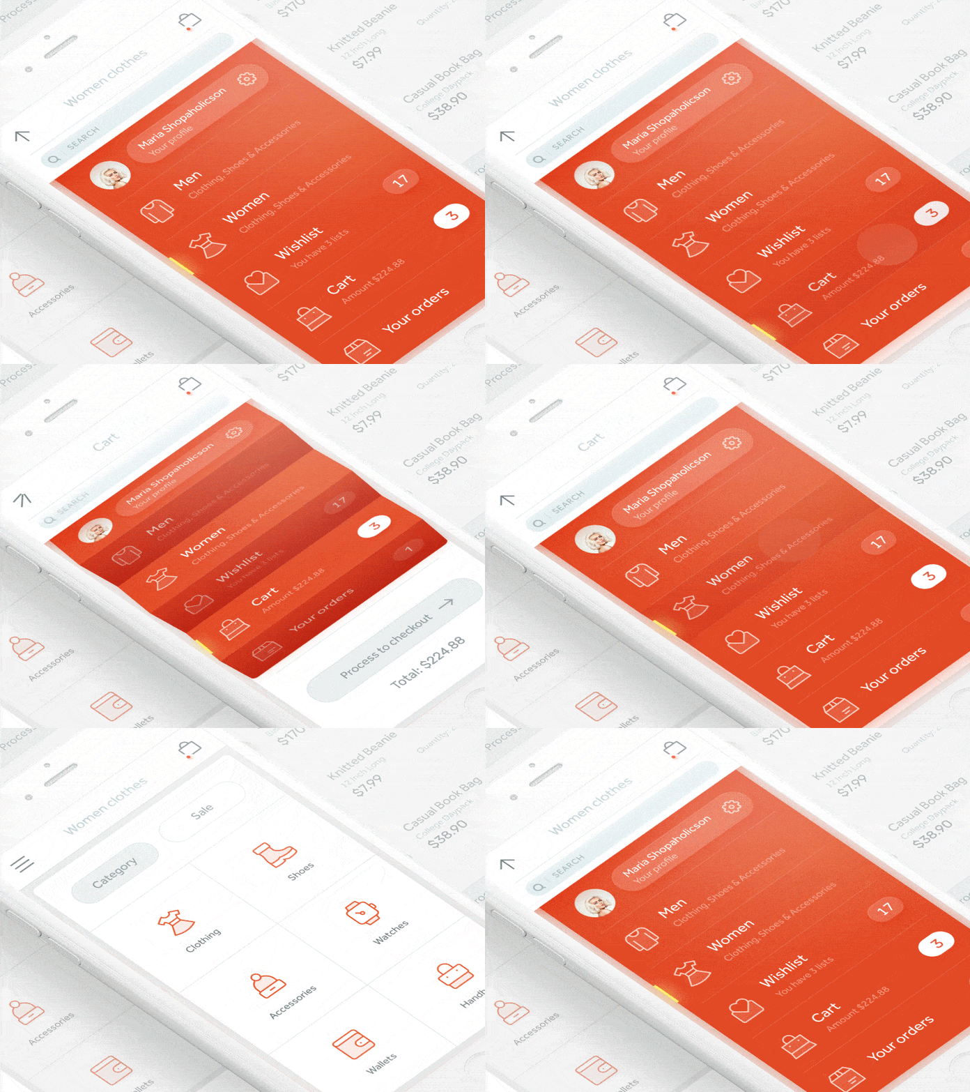
6. Accordion Fold Menu by Alex Khoroshok
This mobile interaction design is part of a shopping app concept and it’s pretty much perfect in my eyes because it does exactly what you need it to do (switching categories or tapping into your cart), but it also has a bit of bounce and flair to it. I think this is a great take on the average hamburger menu drop down that makes finding information in an app much more enjoyable.
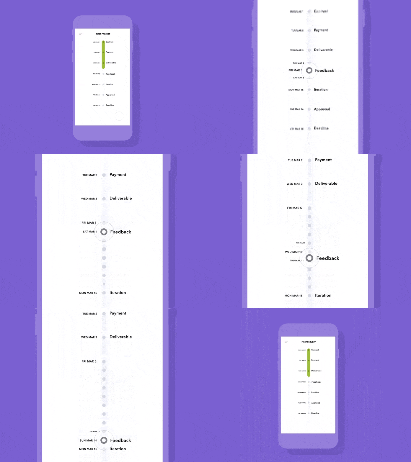
7. Omelo by Caleb Barclay
I appreciate the movement in the Omelo app because it introduces a rhythm into the process of completing a project. Omelo has a high level view, giving the big deadlines, but also gives you insight into the small parts of a project that keep the entire team focused day by day.
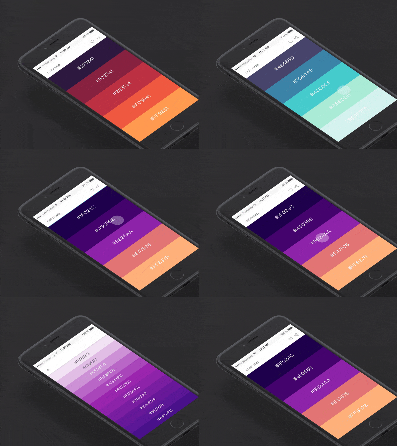
8. Colorsup by Vijay Verma
This app concept allows you to swipe through numerous colors and when you find one you like, you tap it to find a full palette with multiple shades of that original color. My favorite part of this mobile interaction design is the way the shades trickle down the screen when you select a color.
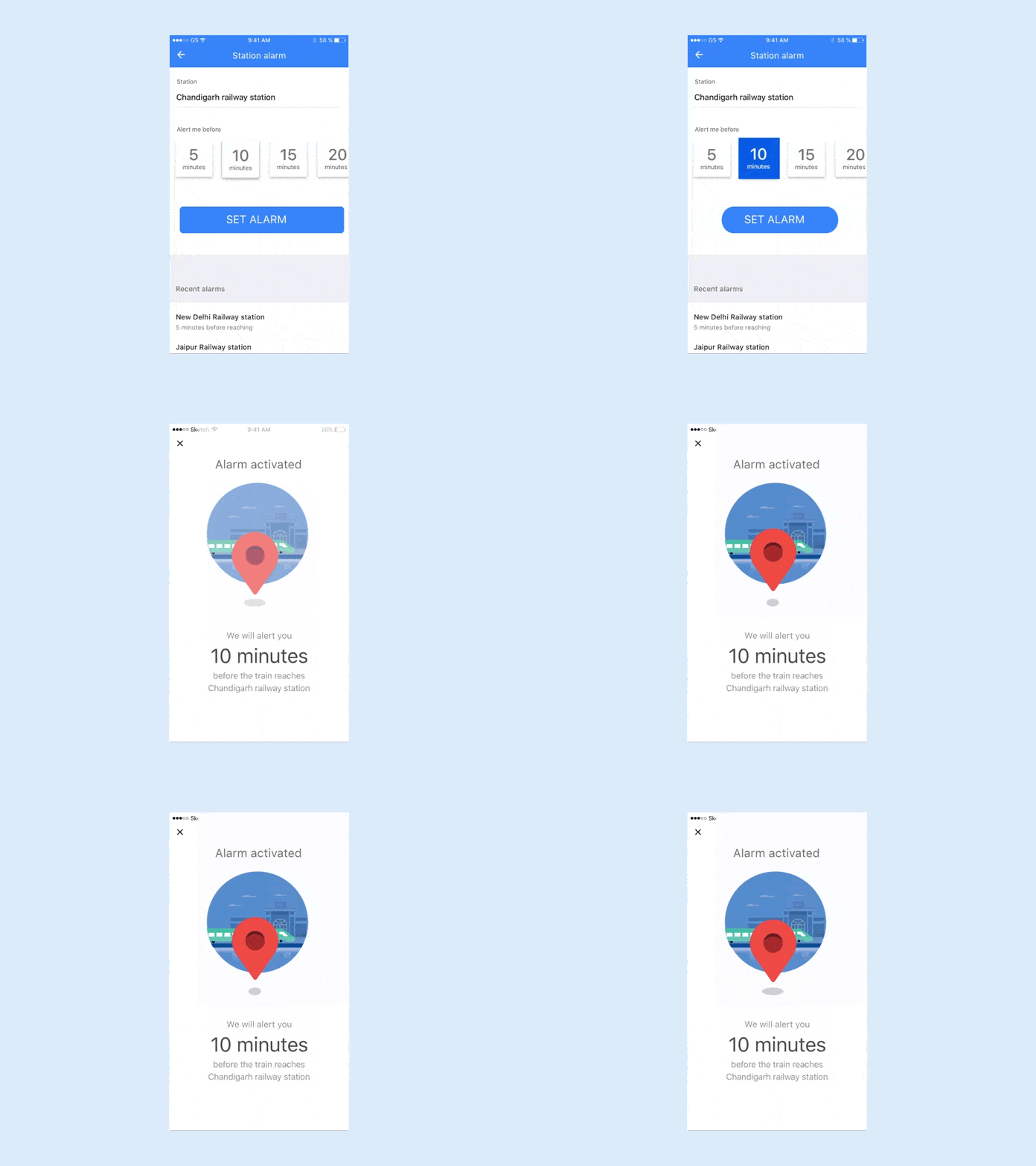
9. Location Alarm by David Lau
This app concept alerts you a certain number of minutes before you reach your destination. There are many notable mobile interactions going on here, such as when you select the number of minutes before you reach your destination, the blue fills the square, showing your selection.
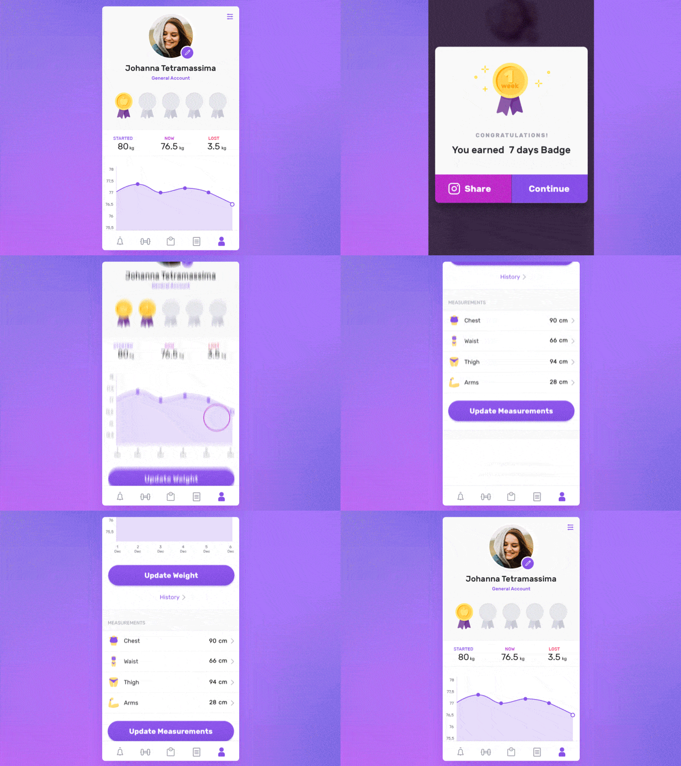
10. Fitness Profile Achievement by SELECTO
This app concept from SELECTO is for users to track their weight and measurements over time. The badges are my favorite part of this concept, as they add in a little moment of delight and celebrate meeting a goal.
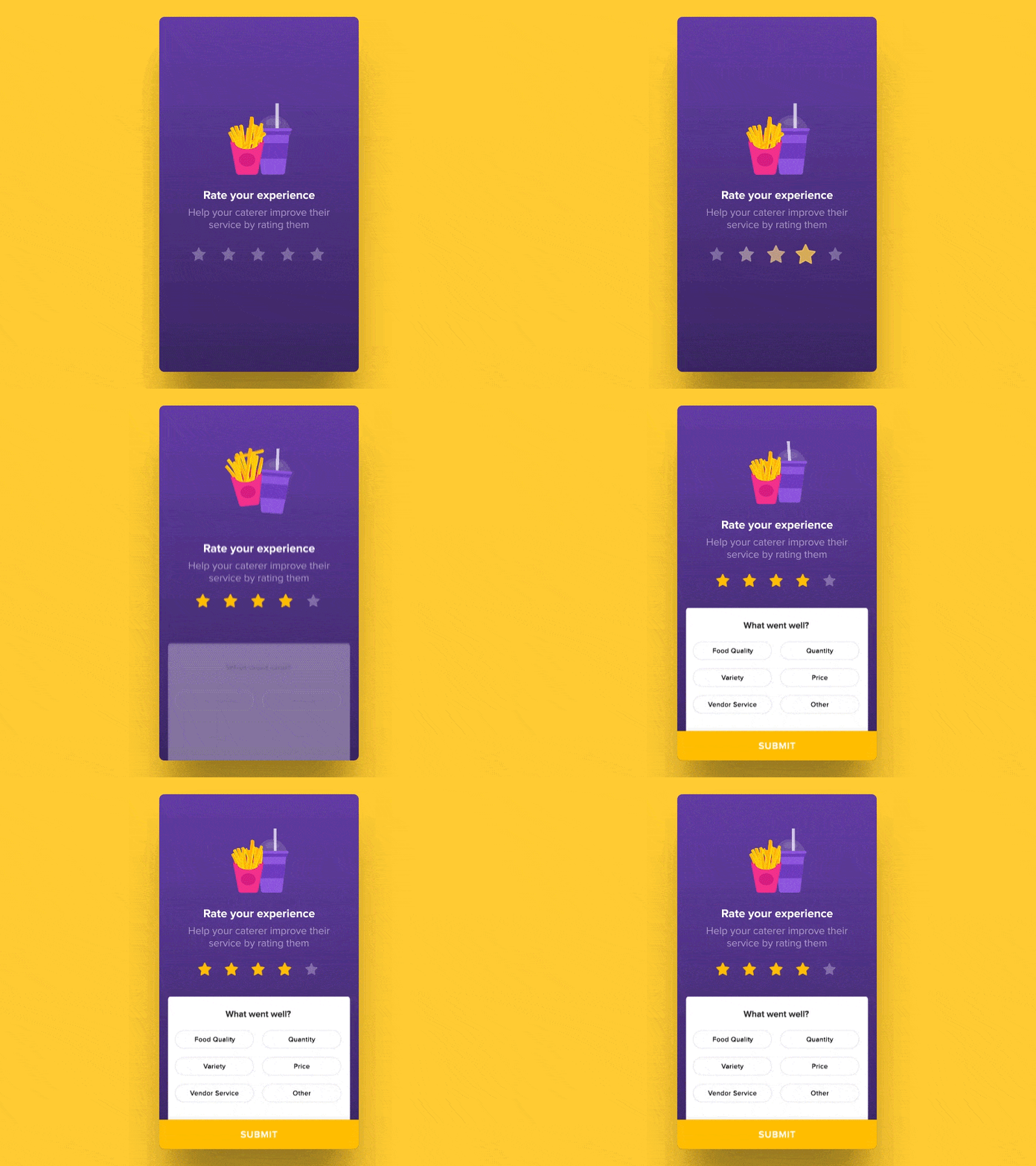
11. Rate Your Experience by Saptarshi Prakash for Zeta
This mobile interaction design is so simple and it makes the rating experience more enjoyable. The fries and drink jump up on the screen and they have lifelike motions, with all the fries jumping up in the container and one on the top flying higher than the others, then settling back in.
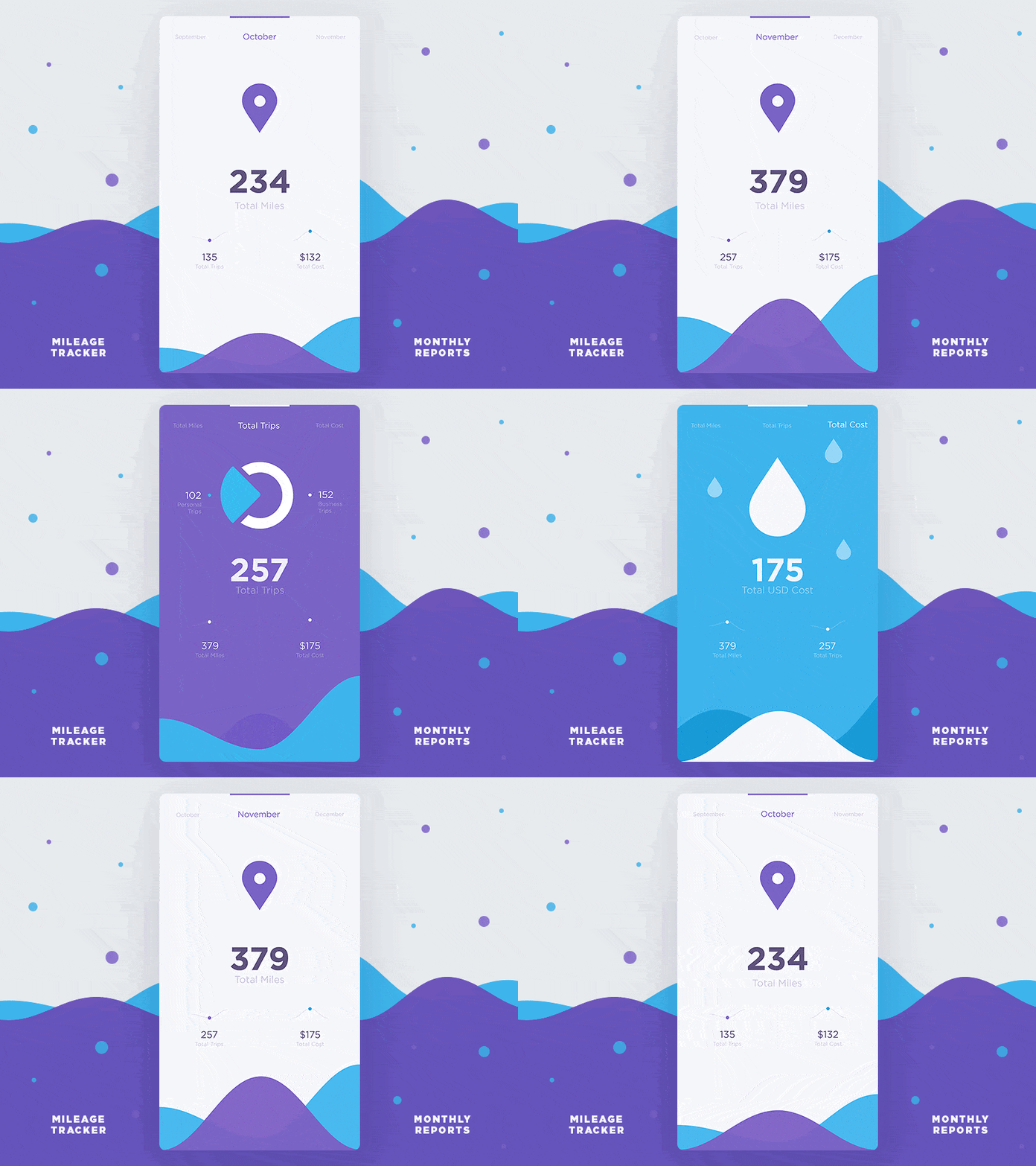
12. Monthly Data Reports by Stanislav Hristov for DtailStudio
The shaky movements present throughout the screen transitions adds a bit of personality to the app. This mobile interaction design is one of the best I’ve seen recently because not only does it have delightful transitions between screens, it also shows how much thought the designers put into the family of shapes they use to convey information and kept it all consistent in a beautiful way.
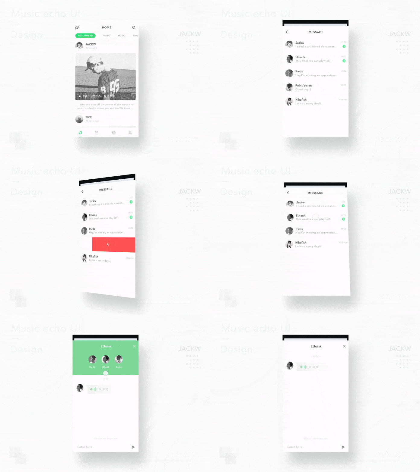
13. Music Echo UI by JACKW for Wizard Alliance
My favorite parts of this mobile interaction design are the screen transitions. When you tap the messages button, the message section pops up to take over the majority of the screen.
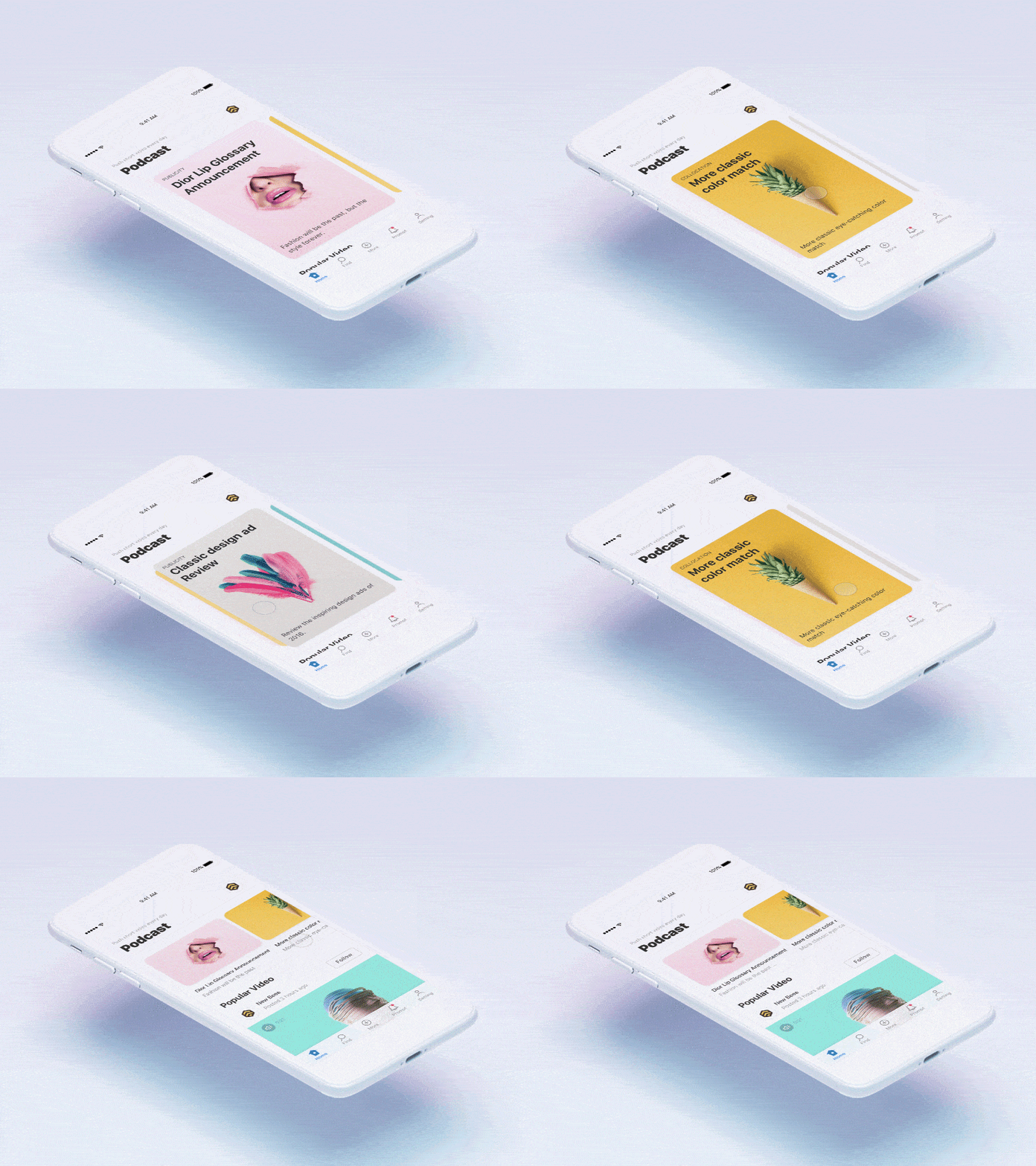
14. Card Interactive Demo by Chris Yang for New Beee
This podcast app concept has a mobile interaction design rooted in cards. I especially like the way the cards change from portrait mode to landscape, when switching from tapping on them to what seems to be the main menu.
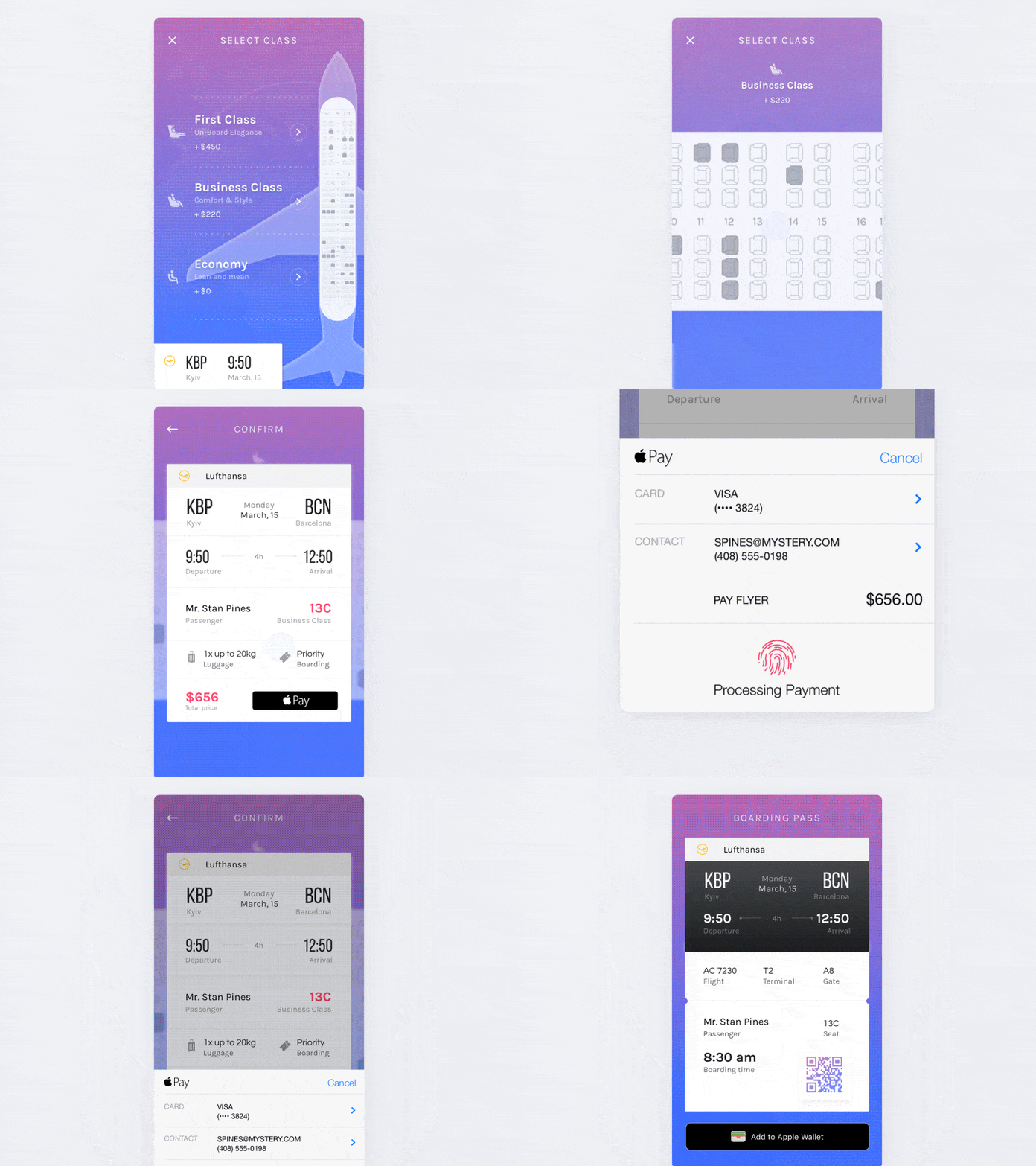
15. Select Seats & Payment Flow by Vitaly Rubtsov
This app concept revisits the flight booking process and makes it design friendly. It is intuitive and the detail involved is nothing short of remarkable. This concept takes us through the process of picking which type of seat you’d like to purchase, then the background image of the plane takes over the screen and rotates to take you straight to the seat selection process.
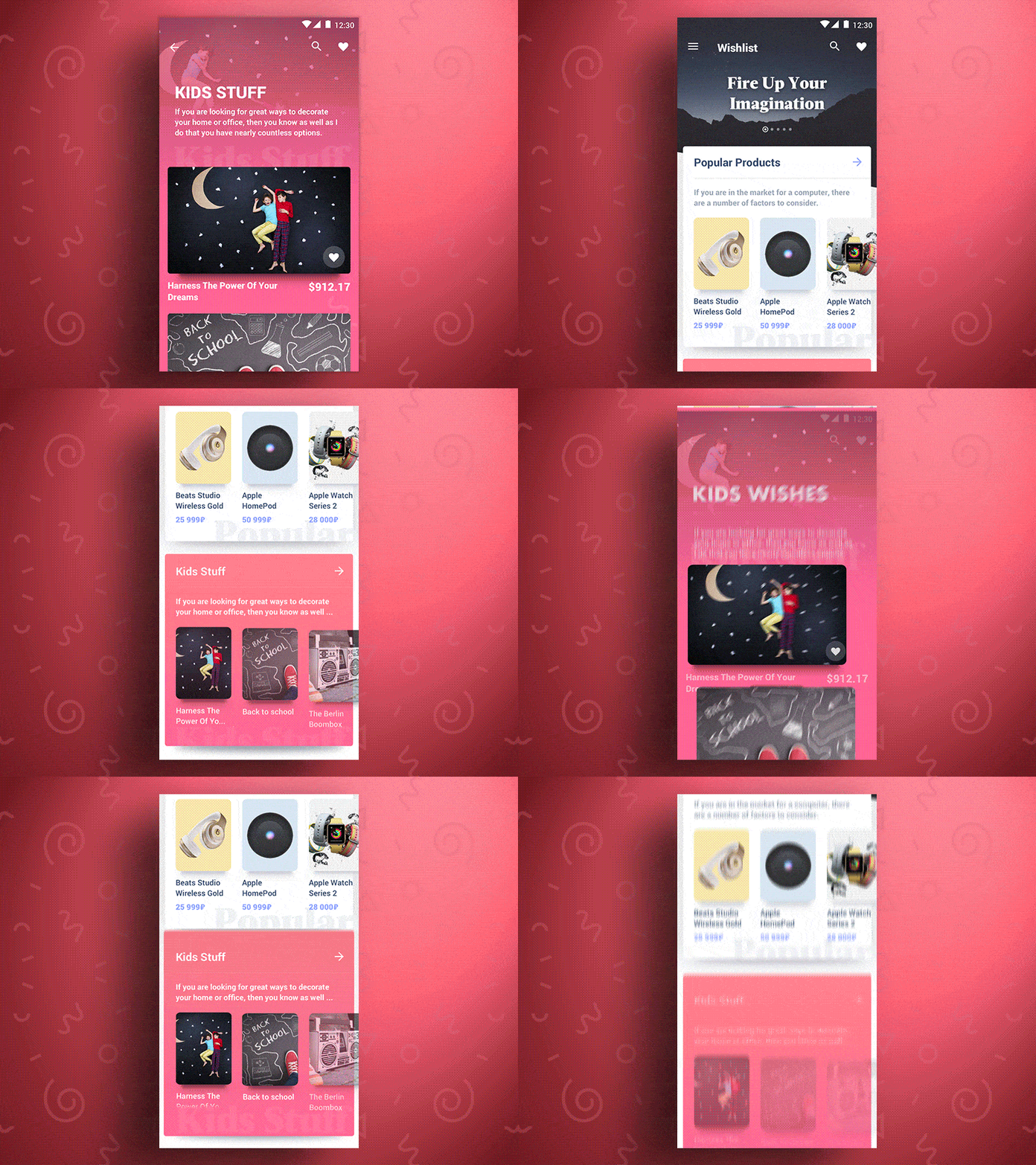
16. Marketplace Animation by Alex Bender
This marketplace app concept is a ton of fun, mainly due to the fluttering movements as you move between categories and expand to view specific categories. When you get to the main wishlist, there is a nice upward bouncing motion to settle the header and first category into place.
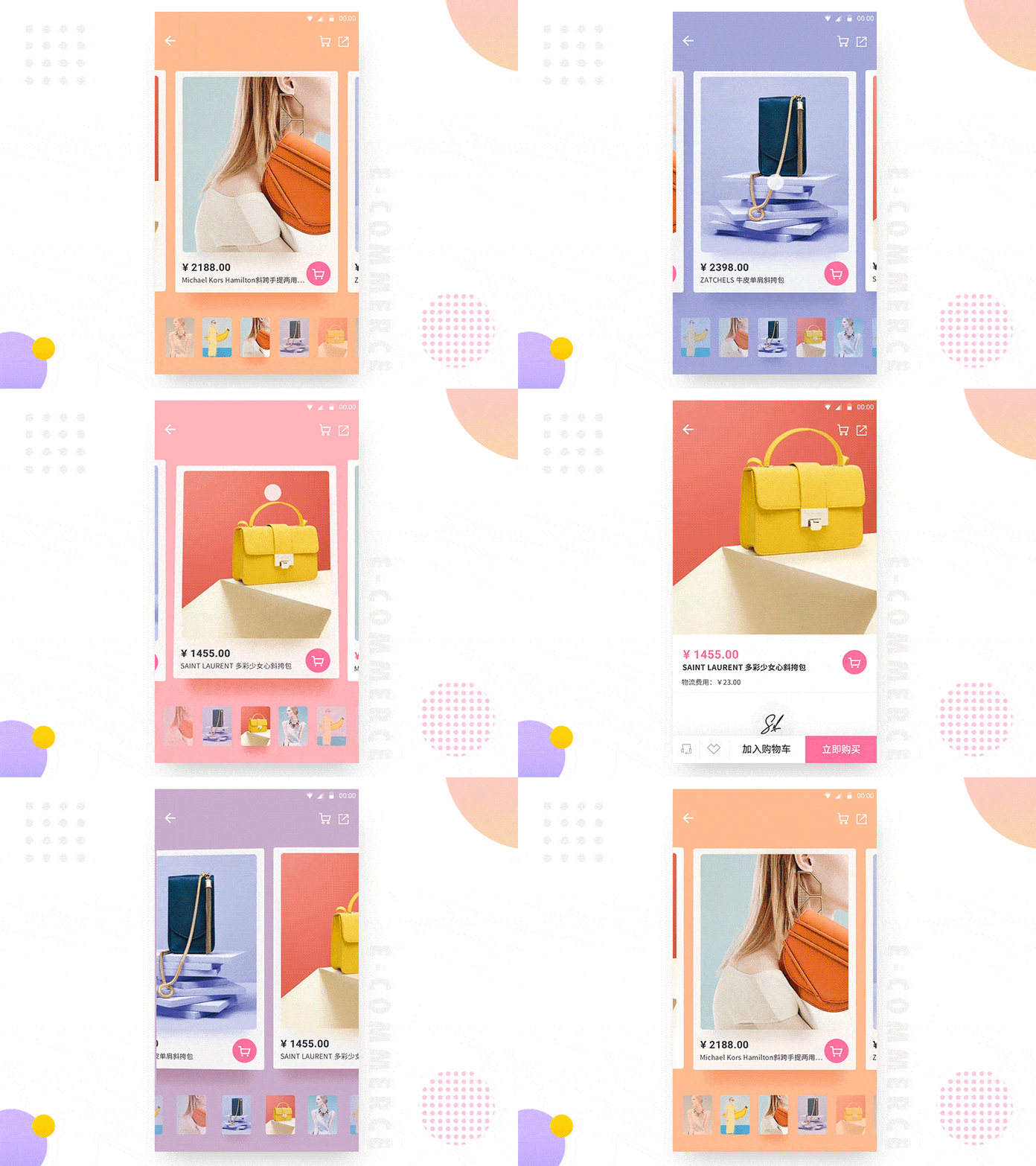
17. E-Commerce App-Event Cards Interaction by LINA_ for UIGREATY
This app concept tries and succeeds at making the online shopping experience a little more life-like. As you swipe left and right through products, it allows you to move around the product image and get a unique view of it. This motion almost feels like you’re touching the purse.
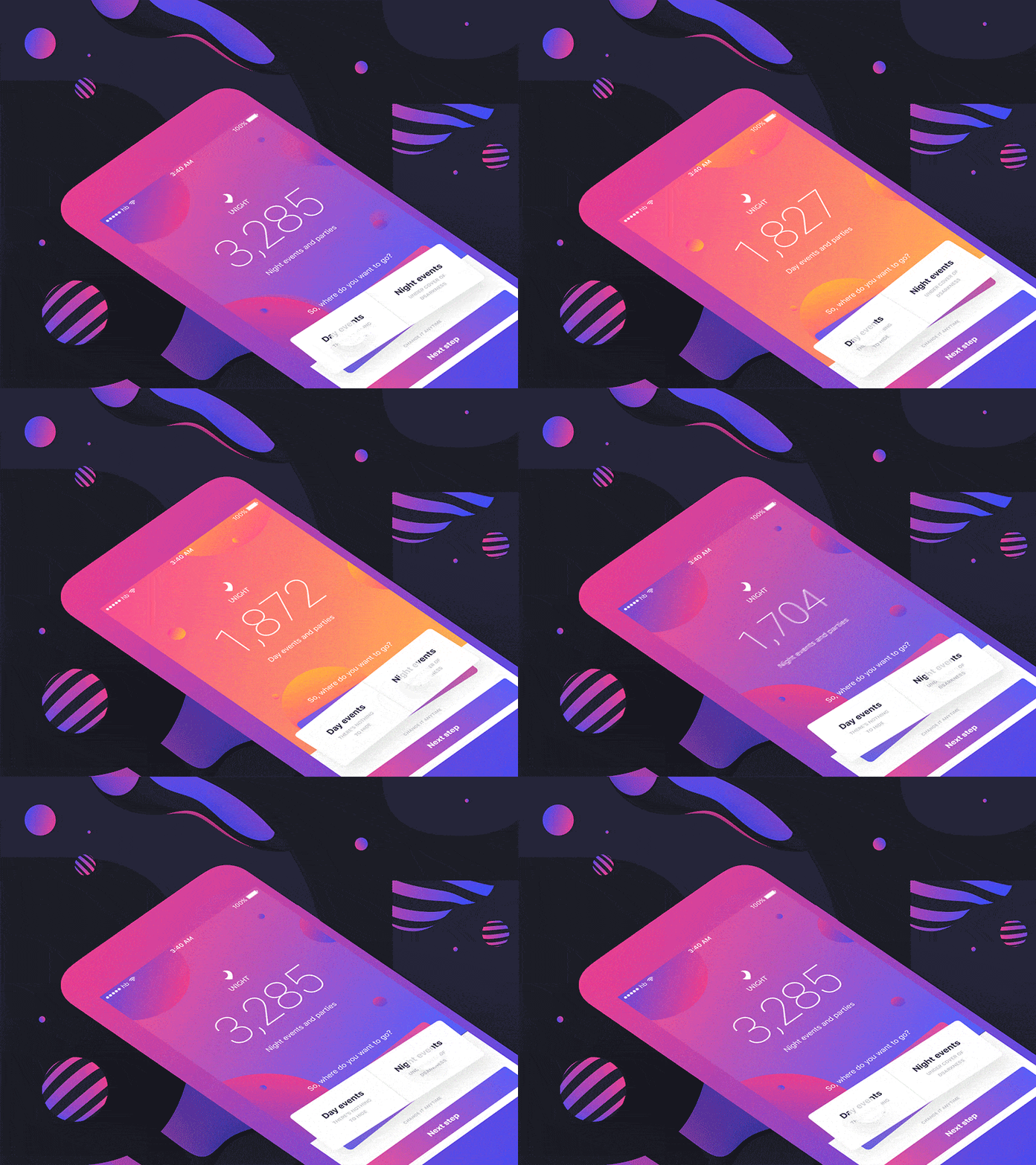
18. Unight — discover the night by Stan Yakusevich 💥 for Heartbeat Agency
The goal of this app seems to be getting its users out and about to have more fun. It has a great seesaw motion that shakes into place when you toggle between day and night events. As you do that, the color scheme changes to deep purple for evening events and bright peach for daytime events.
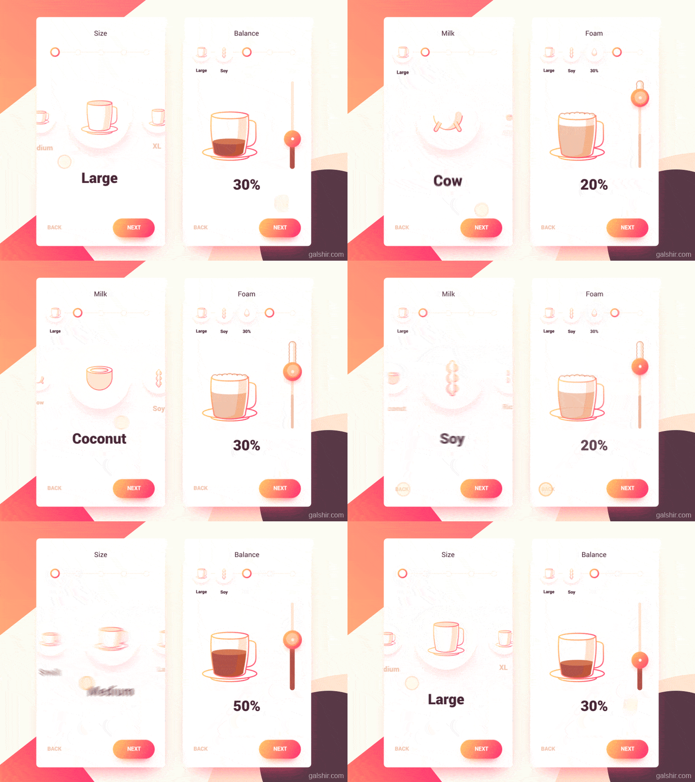
19. Coffee Maker Interface by Gal Shir
This is a fun app concept for customizing a coffee drink. Deciding on a size and tapping “next” sends the selection up to the top left corner in a bouncing motion, completing the first step of making a drink. As that happens, the first option for milk bounces to the center of the screen in a complementary motion.
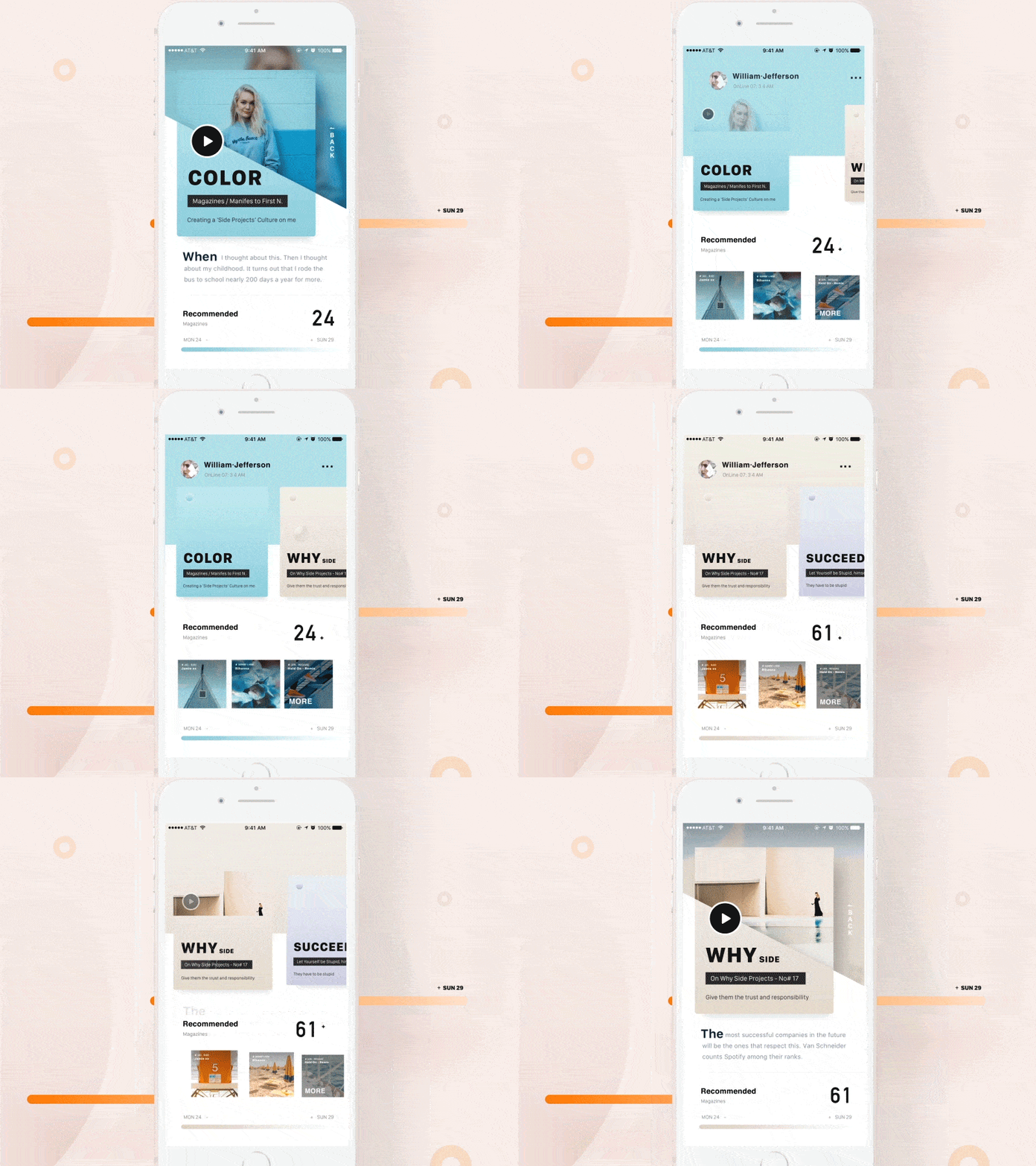
20. Two Invitations by Leo Leung
When you tap into one of the top cards of this mobile interaction design, the line that had divided colors below the header moves in a seesaw motion, slanting down. Another motion that is very pleasing is the “back” button that falls down in a cascade from the top of the screen, next to the expanded card.
21. Drop a Piñata by ⋈ Brandon Termini ⋈ for Handsome
This app concept allows you to share your location by dropping a pin…piñata that is! Once you tap into the piñatas, your specific piñata drops at your location and moves slightly as if it’s hanging from a tree and full of candy.

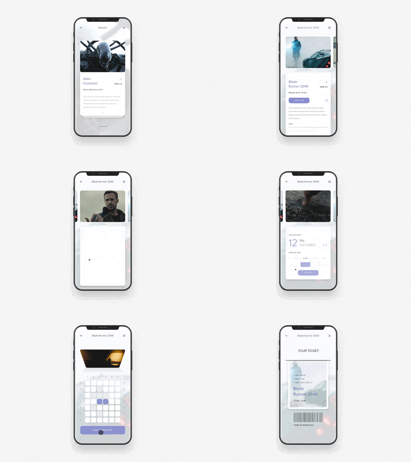
22. Cinema App Concept by Anton Skvortsov for Norde
This app concept has an expandable card layout that allows you to swipe through the movies that are out and swipe down to get more information on the movie you selected. After you decide on when to see the movie, a delightful theater (although much smaller than most I’m used to) pops up so that you can choose the exact seats in which you’d like to sit.
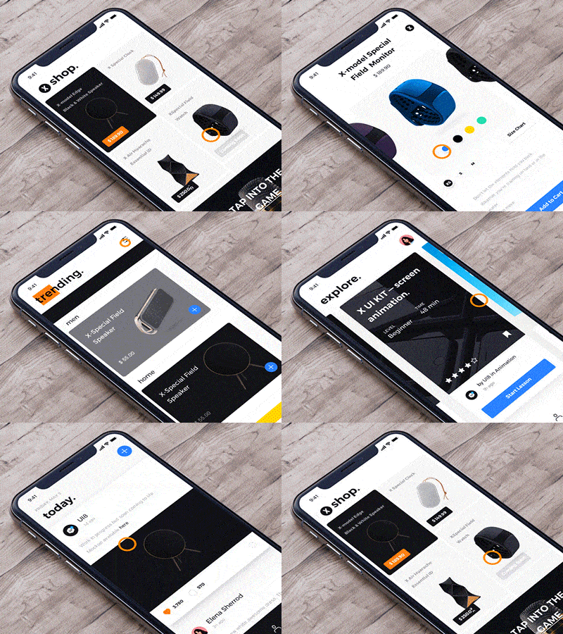
23. X Browse interaction by UI8
This app concept has eCommerce capabilities, with trending products users can swipe through to find something new. The browsing interaction has many surprising transitions and elements that move incredibly fluidly.
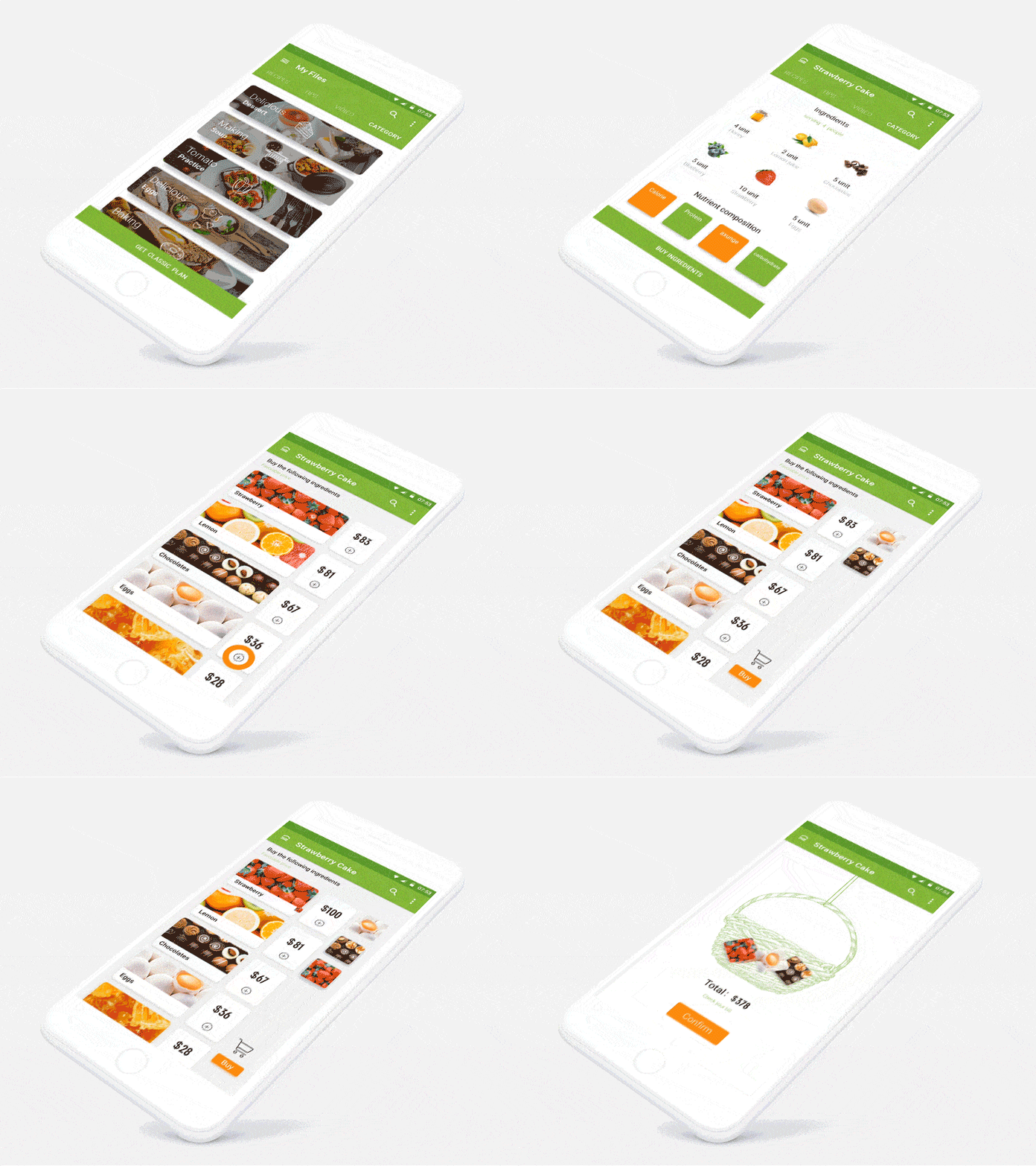
24. Green Food Interface by H-stepbackward for UIGREAT
This app concept serves as a recipe for a gourmet cake and helps users buy the ingredients. I like that the individual ingredients jump out and get situated in that column as you tap them.
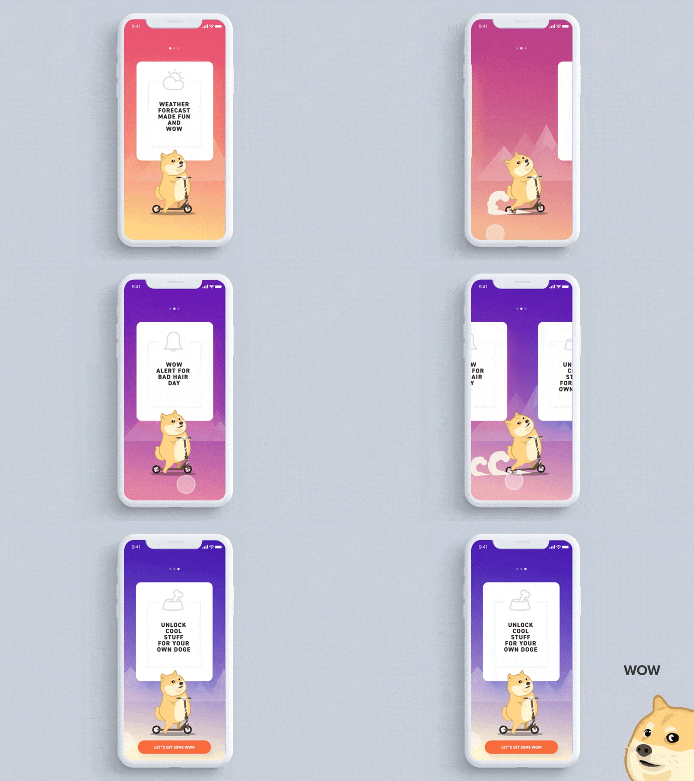
25. Doge Weather App by Minh Pham
Minh Pham has made our list of the top mobile interaction designs more than once. The motions in this concept are so delightful, as Doge appears to be scooting rapidly to get to the next card when you swipe to the left.
26. Watering Tracker App by tubik
This app concept lets you know which plants need to be watered and when with custom alerts. When you complete a watering, you tap the water icon, and it moves down the screen and transforms into a check mark. This mobile interaction design does a great job of helping visualize a household chore with appealing imagery.
Source: Dribbble
That wraps up the top mobile interaction designs for 2017. Did we miss any of your favorites? Be sure to leave a comment with apps we should include in our next round-up.
Feeling inspired? Sign up for free with Proto.io and prototype your own interaction design in minutes.
Proto.io lets anyone build mobile app prototypes that feel real. No coding or design skills required. Bring your ideas to life quickly! Sign up for a free 15-day trial of Proto.io today and get started on your next mobile app design.


