User experience design is a complex and eclectic field. It stresses functionality and usability as much as visual design and draws insights from psychology, cognitive science, marketing research, and other related fields.
To coordinate all these different aspects into a coherent experience, UX design methods must focus on the design process to research and support user needs as much as the abstract design principles that theoretically promote usability. Here’s what we learned from talking to three experienced UX design professionals.
Get to Know Your Users: The Usability People
When you know your users, you can create an experience that’s tailored directly to their needs. Yet in many app design projects, the user remains an abstract concept until late in the project. Sure, sometimes you’ll release a product that aligns with their needs — but only because of luck. With a solid grasp of UX design principles — and good intuition — you can give users what they want.
However, there are a lot of UI design mistakes that can cause even experienced designers to ruin apps. Your buttons might look slick and tidy to your team, but they’ll end up being too small for users to tap accurately on-the-go. Those push notifications you think are providing users with valuable, up-to-date information might actually be giving them reasons to uninstall your app. The earlier you connect with your users and the bigger the role they play in your design decisions, the more likely you are to avoid UX design pitfalls.
According to Bennett Lauber, Chief Experience Officer for The Usability People, LLC, “an understanding of the User-centered Design paradigm is essential for a successful project.” For their company, which provides UX consultation and usability testing to a wide range of clients, the user is at the center of everything they do:
“The most important thing for UX designers to know is their users. What are THEIR needs, goals, experiences, etc. What words do THEY use to describe their tasks. Then, once you have an understanding of the tasks and workflow that they are likely to use, then you can begin to design a system that matches their mental model and task workflow system. This will make the system much easier to learn and use, because they will be able to assimilate their existing understanding of the tasks into the system you are designing. Not going through this process forces them to accommodate your workflow, nomenclature, etc. into their tasks — this exactly how to create a steep learning curve for your system.”
Modelling Your Users
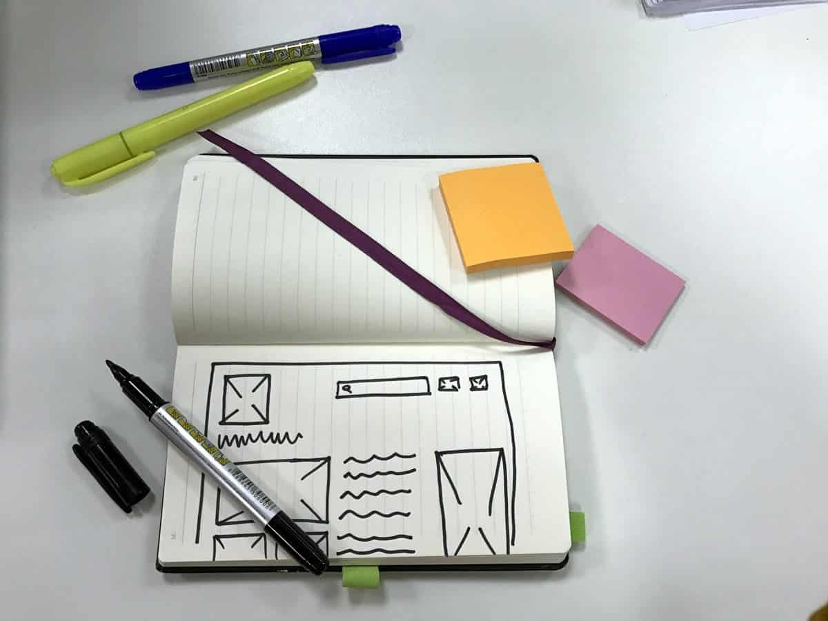
Before you can get user input or involve users in any way, you need to understand exactly who your users are. That’s what user personas are for. A user persona is a fictional portrait of your targeted user — almost like a character sketch in fiction. There are a lot of different ways of creating personas, from filling out dozens of rigorous categories, to simply brainstorming everything you know about your users, and then organizing all of that information into a coherent story.

There are also different paradigms like User Journeys (which The Usability People use), which organize the information differently, but serve the same basic purpose as personas: getting to know the user and how your product fits their needs. Whatever method you use, here are a few types of information you should try to include:
- Basic demographic information: How old is your user? What’s their gender? Their income? Their education level? Are they married, single, or partnered? Are they urban, suburban, or rural?
- User psychology: Think about your user’s personality and psychological motivations, particularly as they relate to UX design principles. Do you have a conservative user who values understated design?
A neophile who loves unconventional interfaces? Does your user value a lot of external feedback, and social interaction, or are they driven by more intrinsic motivations?
Do they like the power of a feature-rich app, or the simplicity and elegance of a more minimalistic product? - Technological profile: What’s your user’s relationship to technology in general, and your market specifically? Are they early or late adopters? Do they have a strong preference for iOS over Android or vice versa? Phone over tablet? Or are they spread pretty evenly across platforms and form factors?
Most importantly, what product preferences does your hypothetical user have in your niche? Don’t just look at who is leading the industry — get as granular as possible.
For example, successful apps for Gen Z often feature in-app messaging, a greater preference for visual communication over large blocks of text, and other conventions that don’t necessarily appeal to older users. If you just look at the raw number of downloads in your sector, you may miss distinct generational preferences, and build a middle of the road product that doesn’t really appeal to any demographic.
Testing Your User Design Principles With Card Sorting
Having your idealized user in mind can help get everyone on the same page, direct further research, and ensure you’re honing in on the right segment. However, it’s important to test your beliefs about what your users want frequently, to ensure your UI is staying on target.

One simple but useful UX design method used to test your intuitions is card sorting. In card sorting, you write all the pieces of information your app organizes on notecards or Post-It notes. For example, if you’re building an ecommerce site, you would write down different types of products on the cards.
Then, you have users sort those cards into categories that make sense to them. There are two ways to do this: open and closed card sorting. Open card sorting is the more flexible approach, and gives the user more control. In an open card sort, the users are free to create and name their own categories. Closed card sorting, in contrast, has users organize data within an existing structure. You create the categories and see where users fit the objects.
Open sorting is a good way to get into your users’ headspace, particularly in the early stages of a project. It can help you identify the organizational structures that will be most intuitive to your users and come up with solutions you might not normally think of. Closed sorting is more useful when you have edge cases or added features and want to test your own intuition about where your users would expect that data to fit.
For example, let’s say you’re building an app for a home improvement store, and two of your categories are “Roofing” and “Winter maintenance.” Your client sells roof rakes, which are used to brush snow off the roof.
The product doesn’t fit neatly in the “Roofing” category; technically it’s a winter maintenance tool, not a roof repair or maintenance tool. On the other hand, clients might expect to find it in the “Roofing” section, since it’s used to take care of the roof specifically. Closed sorting could help you figure out where most of your users expect to find roof rakes, so that you can better serve their needs.
Choosing Color for Accessibility: Data Viz Today
Designers are more interested in accessibility than ever before. With 57 million Americans currently living with disabilities — not to mention growing public awareness of the obstacles they face — making your app accessible isn’t just the right thing to do, it’s also the smart thing to do.
However, accessibility has not yet become the rule among app developers. Accessibility guidelines are just suggestions at the moment — they’re not legally mandated or required by platforms. Additionally, small app developers often lack expertise in accessibility, which can make creating a truly accessible app a daunting task. Unfortunately, it will probably be a while until the industry as a whole adopts the full range of best practices.
Even if you aren’t an expert in this area, simple changes can significantly improve disability support, if you understand how UX design principles affect accessibility. As Allison Torban, Data Analyst, Visualization Designer, and host of the weekly podcast Data Viz Today points out, UX designers can accommodate many underserved users by simply choosing their color palette “with accessibility in mind.”
“As a data visualization designer, color is extremely important because it’s essential for a reader to be able to tell the difference between each line or point. But UX Designers often don’t carve out enough time to make sure a color palette is both inspired and accessible. Your design needs to present the same way to everyone. This is my two-step process for choosing a color palette that is inspired and accessible:
1. Take a few colors from your client’s brand kit and put them into Google Arts & Culture to find a piece of work that embodies the emotion that you want to invoke.
2. Take that color palette and put it into the tool Viz Palette to check compatibility for color blindness and minimize color conflicts (e.g. two colors that are too close to tell apart as text or lines).”
We think this is a great strategy for a few reasons. First of all, color blindness is a very common disability, which affects around 4.5% of the population. That means with a simple color test, you can make your app accessible to 315 million people worldwide who might not otherwise be able to use it.
Secondly, it gets designers thinking about accessibility and appeal as part of the same integral process. Google Arts & Culture has a fantastic database of art, which can inspire designers to see new possibilities in their color palette and spur creativity.
Finally, minimizing color conflicts creates better, more usable design for everyone, not just the colorblind or visually impaired.
Maintaining a Student Mentality: Sweetbridge
As the VP of UX for Product Marketing at Sweetbridge, Dylan Figlo understands the importance of centering the user in UX design principles. Sweetbridge is dedicated to “making financing accessible, secure and transparent for all,” so translating a complex service into a simple, intuitive user experience is a key part of what makes Sweetbridge valuable. Although Figlo’s insights into UX design methods draw on experience at ecommerce companies, they apply equally well to web and app designers.
“The two most important things that influence my team’s design process is, firstly, to understand that you’re never an expert in this field. The second is that you need to understand the technology that’s being used to bring your designs to fruition.
Building experiences for truly customer-centric companies like Bonobos and Tuft & Needle, I learned pretty quickly that a good UX designer knows they’re not an expert. Shedding the weight of ‘having to have all the answers’ is freeing and critical to the design process. At the end of the day, your user is the expert on the experiences you’re building. It’s for them, they feel the pains, they can help you build it,” says Figlo.
“Your job as a designer is to build clean, consistent designs that achieve not only the goals of your business, but also the goals of the user. To achieve this, I try to restrict every screen view to a single call to action. From your understanding of your business requirements and the users, you should pick the single most important action. You then build your experience around promoting the educated use of that action.
For some pages that may be “Add to Cart”, others may be “Submit Email.” Gathering data / feedback from the users will let you know how good of a job you’re doing at achieving your goal. Using a Net Promoter Score system like Delighted or an A/B testing system like Optimizely, is an easy way to collect data, whether it’s for a business or your own personal website.”
Figlo also stresses the need to understand the technology you’re using, and having “empathy for the teams building what you’ve made.” Learning the basics of the programming languages they use “helps build rapport and enhances your understanding of what features may be difficult to implement.”
“Over time, you’ll notice when you’re over-designing a given feature that’s going to be unnecessarily difficult to build. Not only will this help the velocity of development of UX features, but it will help build a better culture between the two critical halves of building and experience.”
Finally, Figlo emphasizes the importance of keeping what he calls your student mentality:
“Your users will be constantly teaching you and surprising you with their insights on what works and what doesn’t. As new technologies emerge, you’ll be able to create better and better experiences. The learning never stops when you’re a UX designer.”
Proto.io lets anyone build mobile app prototypes that feel real. No coding or design skills required. Bring your ideas to life quickly! Sign up for a free 15-day trial of Proto.io today and get started on your next mobile app design.
Know a great UX design method we left out? Let us know by tweeting us @Protoio!