As the flowers bloom and we settle into nice weather for once, designers worldwide haven’t missed a beat. This month we round up some mobile app designs that caught our attention due to their soothing color palettes, cheerful animations, and futuristic AR-enabled features. Let’s get right into why we love these mobile app designs and what designers can learn from them.
1. Deserve Mobile by Deserve Inc.
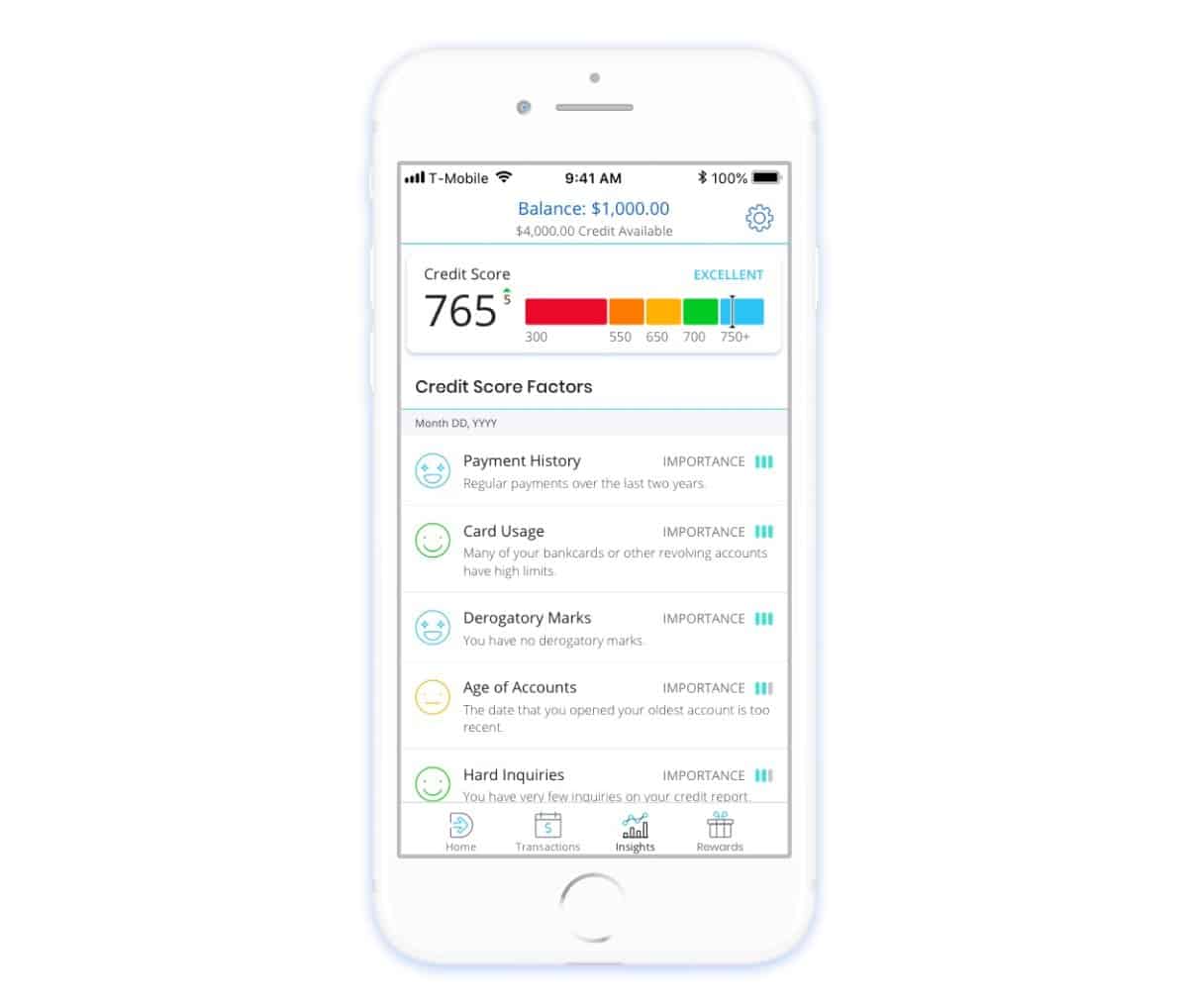
Having good credit is key to getting a small business loan, a car, and a home. But not all have equal access to credit products. That’s where Deserve steps in to determine creditworthiness using a process that is more inclusive. The app itself is a sleek white and turquoise layout, as we’ve grown used to with financial products — this color scheme conveys trustworthiness. The mobile app design makes it easy to understand key information, such as how much of your credit limit is left, when a payment is due, and more. In addition, the app helps users keep up with their credit scores and easily toggle on and off features, such as switching off the ability to use their card in the event that they lose it. In all, Deserve helps users grab the reins of their finances, with their well designed app at the center of the financial experience.
2. Posemoji by Viro Media
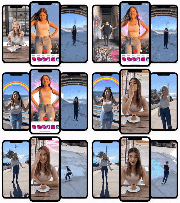
Posemoji is an AR/VR effects app that brings videos to life. This mobile app uses body tracking filters and AI to transform the world around you. There are currently 100 different filters. The app itself has very minimal buttons to make it easy to swipe through the available filters and quickly pick one. Since the effects are so complex, you might think that the mobile app UI might get a bit cluttered. But Posemoji is quite the opposite; it keeps all options and buttons down at the bottom of the screen to help users focus on implementing their filters and effects to their videos seamlessly.
Source: Posemoji
3. Dote by Dote Inc.
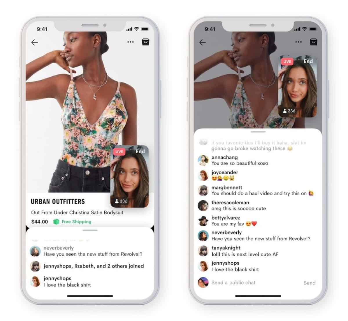
Shopping is an inherently social activity, but when you aren’t able to get together with friends for a shopping trip, there’s Dote. Dote has a video feature called Shopping Party that allows users to see a video feed of the influencer or friend and a live feed of what they’re shopping for on the Dote website or a number of other sites. At the same time it incorporates live chat—effectively creating organic conversations between users. When it comes to the mobile app design, the screen is broken into three parts so that users can see what influencers are scrolling through, while seeing their reactions and comments from fellow viewers. A quick swipe up on the comment section expands it to take up more of the screen and allow the user to type out a comment. All of these features come together in a crisp white background to be sure the shopping conversation is the center of attention.
4. Jumbo by 2121 Atelier, Inc
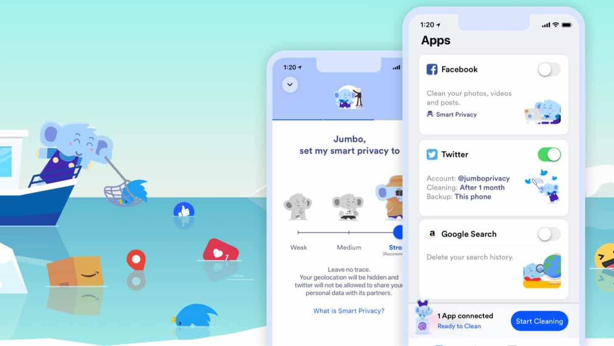
Jumbo is an app for the privacy concerned social media users out there. It helps increase Facebook security, deletes old tweets, and more across a number of social media sites. The mobile app interface uses cute elephant animations to visualize the action the user is taking; such as toggling a button to the right to clear your Google search. Icons in a similar style are used along the bottom of the screen to provide a crystal clear menu of actions users might want to take. Beyond the appealing icon style, the mobile app design also offers clean, rounded buttons that complement the blue accented app (again, invoking an air of trust and security).
5. Humm.ly by Humm.ly
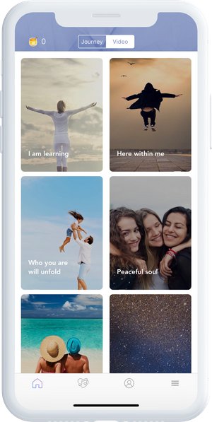
Anyone who has specific songs or musicians that got them through a tough time can attest to the therapeutic qualities of music. Humm.ly is an app created and curated by music producers and therapists to help users navigate physical and emotional pain alike with incredibly specific playlists. It can even help professionals boost their creativity or improve focus at work. It’s basically a mindfulness app that is rooted in music. When it comes to the mobile app design, the background is a soothing lilac color, with sections of cards to swipe through to pick the perfect music mix for what you’re going through. Tapping into a specific mix brings up a relaxing image with minimal options on the screen to allow for total immersion in the music.
That wraps up the apps for April, but if you’d like to explore some of our other favorite mobile app designs, check out our March installment.
Feeling inspired? Sign up for free with Proto.io and prototype your own app in minutes.
If you enjoyed this curated list of great mobile app designs, share it with your social network! Do you have a suggestion for the next edition of our Top 5 Mobile App Designs series? Reach out to us via Twitter @Protoio or on Facebook.
