Spring is finally here! At Proto.io we’re excited to show you the latest and greatest mobile app designs that we’ve dug up during a winter that seemed never-ending. In this month’s roundup, we have glorious gradients, colorful call to actions, and interfaces that are sonically optimized for the blind. We know you will enjoy these apps, hopefully as much as we do. Without wasting any more time, let’s get right to these great app designs.
1. Stash by Stash
Investing is a must if you want your money to grow over time, but many new investors don’t know where to start. That’s where Stash comes in, combining a bank account, investment education, and micro-investing platform all into one. The mobile app design is about as sleek as it gets, with its regal purple base. The interface is decidedly minimal, with gradients and simple icons to give it a little flair here and there. In all, this app does a great job of distilling complex investing concepts and options into bite-sized pieces of content that fit in perfectly on a smartphone screen.
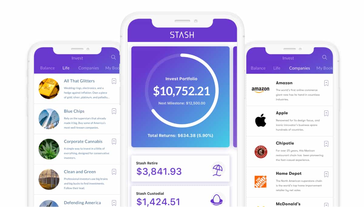 Source: Stash
2. Seeing AI by Microsoft Corporation
We live in a very visual world, and Microsoft has recently released an app to help blind folks better understand images using AI. Using the Seeing AI app, the user can point their camera at something and hear the scene in front of them narrated. This can mean hearing words on a label, getting a detailed sentence on what is happening in front of them, or even guessing the emotions of faces in close proximity. (All we can think of is: The future is here!) As you can imagine, this app is much more about function than form. With that said, it harnesses all of its power from the objects in front of the camera. It does have minimal buttons along the bottom of the screen to give users the option to save the photo, share it, or get more information. While this might seem like an out of the box choice for a top mobile app design roundup, we thought that the whole point of this app is to leave conventional app design behind to help the blind and low vision community better understand the world around them.
3. Hours Time Tracking by Hours, LLC
For any freelancers out there, you know firsthand how much of a pain tracking your hours is. This aptly named mobile app helps freelancers keep track of how much time they’re spending on each project. Hours lets users quickly set timers and track hours with a quick tap on the app interface across consumer devices (hello, Apple Watch!). The mobile app design makes it easy to visualize projects for users and those on their teams. With color-coded tiles, users can quickly understand where their time went and then dig into the full reporting to gain more information. Over all, this app design blends a simple and straightforward form with an especially useful function.
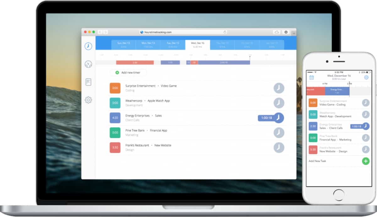 Source: Tick Spot
4. Simple Habit by Simple Habit
An app that has generated quite a bit of buzz goes by the name of Simple Habit. It piggybacks off of the current wellness craze with meditations and anxiety tips from experts. This app was named the Standout Well-Being App by Google just last year for having “responsible design,” among other features. The mobile app design offers a dark and muted color palette to avoid any color clashing that might interfere with the serenity the app aims to deliver. But still, the company uses pops of color for call to action buttons and to highlight important metrics about the user’s meditation practice.
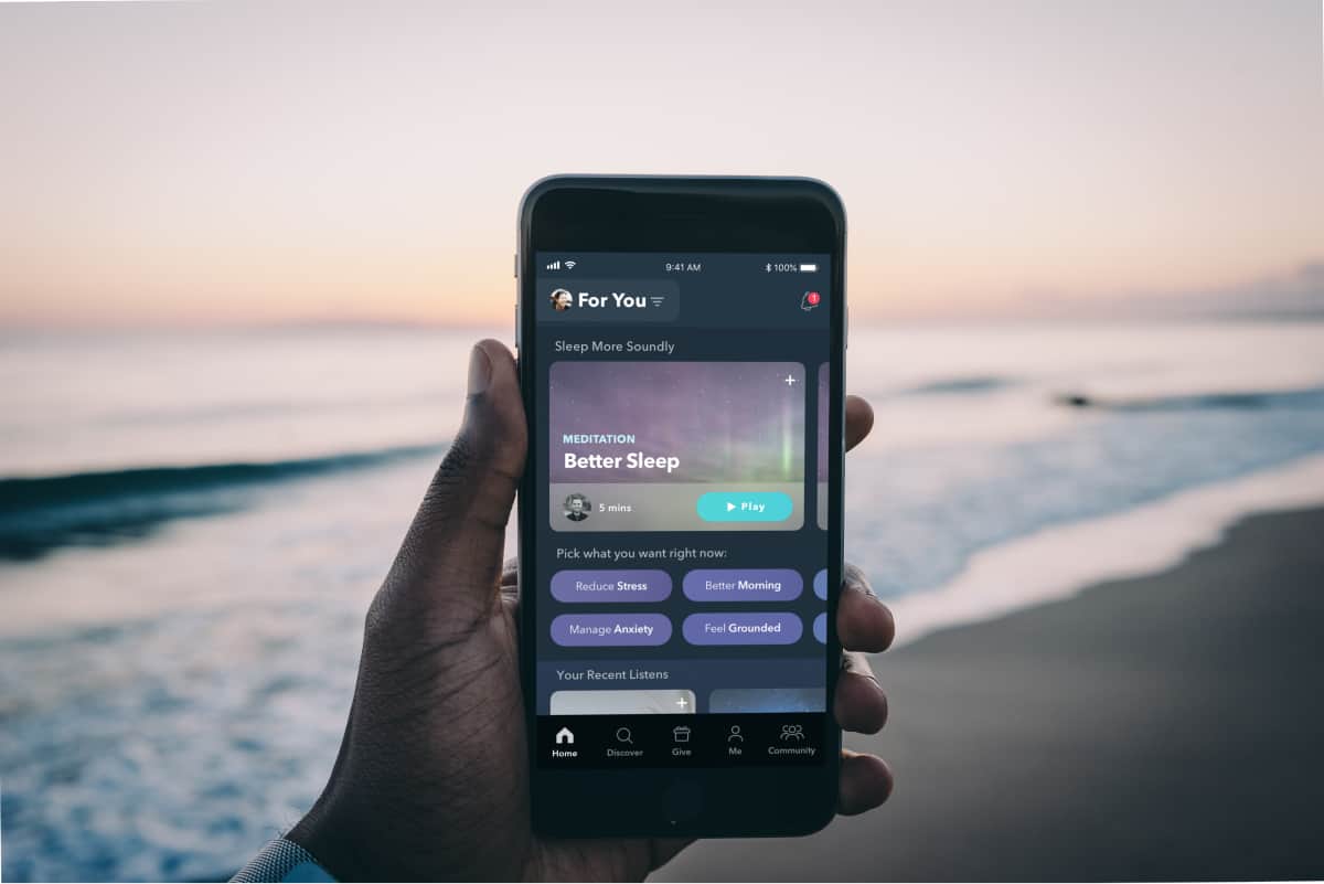 Source: Simple Habit
5. Mighty – Self Defense Fitness by release2 GmbH
Staying safe is a major priority for all, but taking a self-defense class might not be so practical. The Mighty app offers an opportunity to both learn self-defense and even get a workout in to keep up with your weight loss goals. The mobile app design is full of capital letters to emphasize specific text in its simple black and white design. Then tapping into specific content switches the app over to a black background with colorful buttons to encourage users to engage with the videos. This app does a great job of calling attention to essential features with rounded buttons with color schemes that transition from left to right.
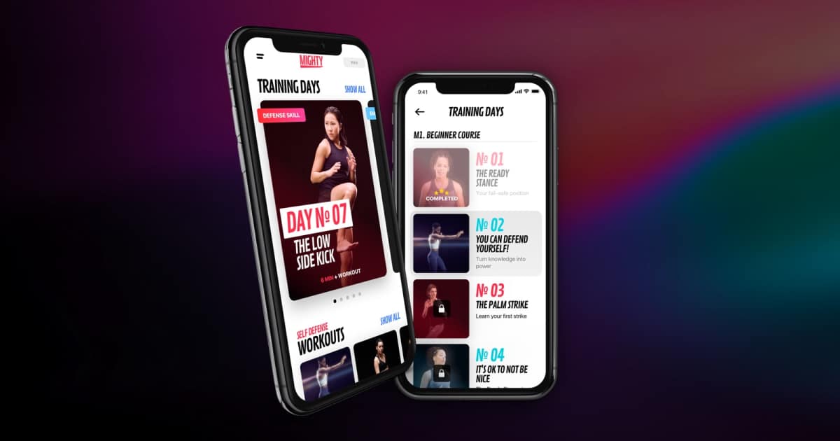 Source: Mighty Self Defense
That wraps up the apps for March, but if you’d like to explore some of our other favorite mobile app designs, check out our February installment.
Feeling inspired? Sign up for free with Proto.io and prototype your own app in minutes.
If you enjoyed this curated list of great mobile app designs, share it with your social network! Do you have a suggestion for the next edition of our Top 5 Mobile App Designs series? Reach out to us via Twitter @Protoio or on Facebook.


