Animation has the power to make apps feel alive. It can turn drawings into objects, and screens into miniature worlds for users to explore.
But for new mobile app designers without a background in animation, it can be overwhelming. Where do you start? Should you even use animation in your app? Is it really necessary?
As intimidating as it can be, including animations can give your app a visual edge. Here’s how to effectively do so.

Treat Animation as a Core Design Element
Many mobile app designers treat animation like seasoning. It’s something they sprinkle on at the end to give the app a little extra flavor.
That’s good in some ways. You don’t want to lean too hard on UI animation. An app with mediocre animation but great design, layout, and user flow could still be a successful app. On the other hand, if the app is poorly designed, fancy animations won’t save it.
The problem is, the animation isn’t just a spice, it’s an essential design element that can dramatically affect user experience. Animation provides cues that keep the user-oriented, tie the app together, and make transitions feel natural and intuitive. It’s what makes buttons feel “real” — not to mention that animations are often key to letting users know where they are in a particular app.
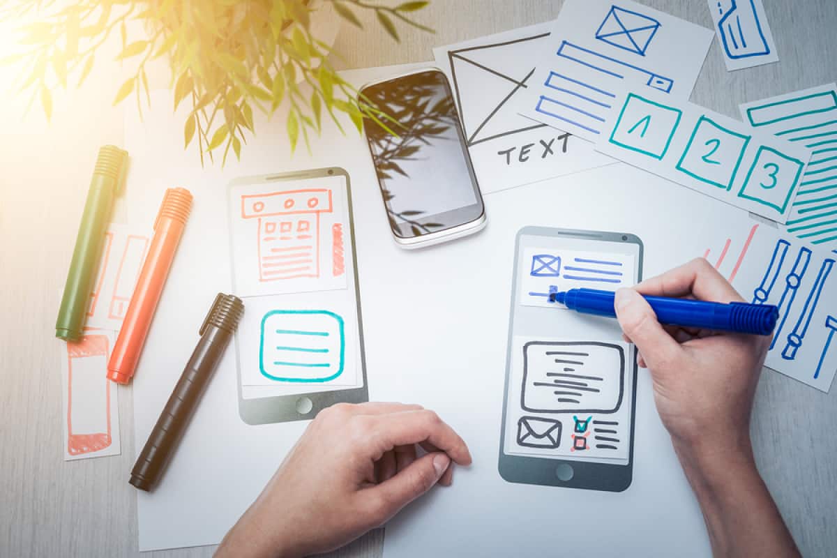
The first step to using animation successfully is to start seeing it as a design element, rather than a gimmick. It should be something you start planning early on in the process when you’re brainstorming and sketching out user flow. It should be a feature you experiment with and refine as you go on, just like you would with any other element.
Once you incorporate animation design into your process, it can serve as an invaluable check to confirm or refute your decisions. As you move from rough sketches to realistic prototypes, you won’t have to guess if a particular screen or icon successfully grabs your attention (or repels it). Instead, you’ll see it right in front of you, which will allow you to conceptualize how it will help (or hurt) users making their way through your app.
Check out Proto.io Spaces for some great examples of how mobile app designers like Barbara Fontenelle are using prototyping to build compelling UX.
Understand the Types of Mobile App UI Animation
Animation design plays several different roles in mobile app UI. Here’s how to design effectively for each of them.
Feedback Animation
When you tap a button to add an item to your cart, it doesn’t just silently add the item — it gives you a clear signal that something has occurred, such as by changing color or shape, or by moving. This shows users that their desired action worked, and helps them interact with the UI as if it were a real physical object.

Feedback animation can be extremely simple. For example, in media apps, when you press the play button, the icon just changes from a triangle to parallel lines, often with very little transition. This lets you know that the media is now playing and that you can press the same button again to pause it. Users already know how play and pause buttons work, so it takes very little visual information to clue them in.
However, in mobile app animation design, feedback animation often needs to go further to create a compelling connection with the user. The goal is to create a satisfying sense of physics, that’s consistent across the app. If one button is “squishy,” your other buttons should probably be, too (although there are exceptions). If one page has objects that light up when selected (while the page dims), other pages should behave in the same manner.
Scrolling and Transitions
Transitions hold the UI together. When a user swipes to access another set of features or drags an article to keep reading, the new information doesn’t just pop up, it slides into place. This gives the users a lot of important queues. It tells them that the app is a landscape whose boundaries extend beyond the current screen, and lets them form a mental map of where elements are located and how they’re connected.
It can also give them clues about how the app is organized. If tapping on a rectangle with curved edges expands it into a full screen, and that full screen has other rectangles with curved edges, the user will understand that the app has multiple nested layers. It doesn’t matter if they’ve never used the app before, or don’t even know what it does — they can make inferences about the way elements are nested from the design and transitions.
Good transitions should be geared towards your users’ personalities and your app’s use case. Bouncy, rounded text boxes might be a great look for a messaging app geared towards young users, but not appropriate for an app built for middle-aged accountants. They also need to align with the overall feel of your design. If everything is built around straight lines and geometric patterns, your app will probably look great with crisp, linear transitions.
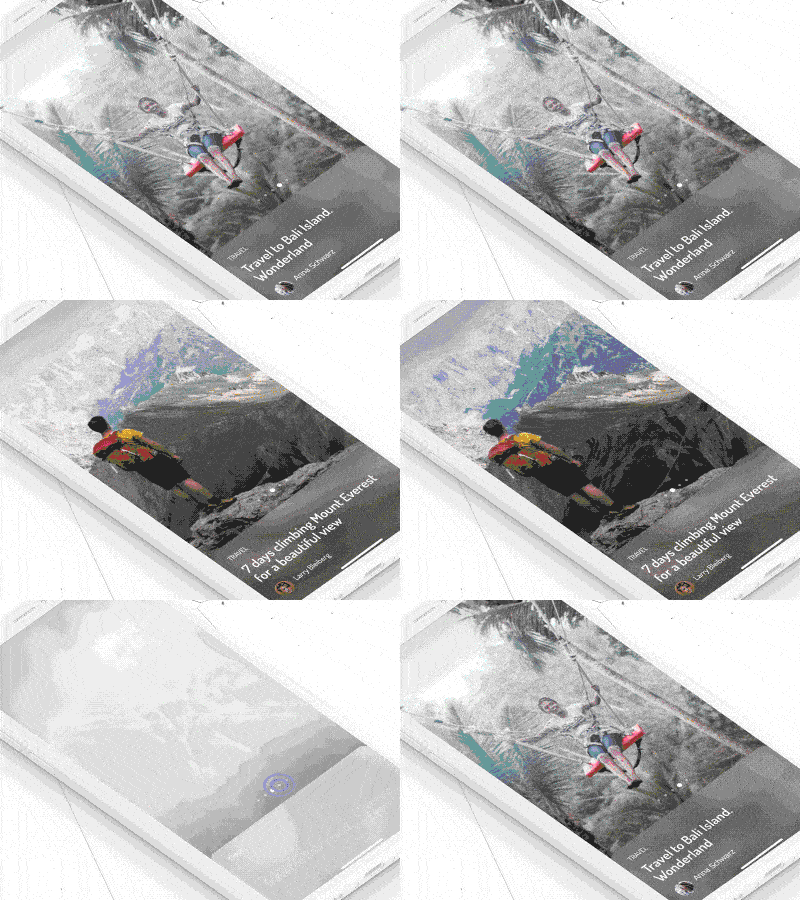
Transitions can also strengthen user engagement by catering to their desires. For example, this UI8 transition shows a travel app using parallax scrolling and a motion effect to actually bring users into the picture. The app embodies the user’s desire to enter a scenic destination. The transition is engaging because it’s built around the user’s wants and needs.

Loading and Progress Animation
It’s no secret that users don’t like to wait. A Google study found 53% of mobile users will leave a site for taking just 3 seconds to load. But while it’s important to make sure your apps load quickly, animation can also play a key role in making sure your users enjoy the experience — waits and all.
One thing loading animations do is to indicate that something is still happening — that your app hasn’t stopped working. Loading bars and other animations that track progress can also give your users a sense of control, by showing them where they are in the process. But cleverly designed loading animations can go further and make loading feel like a part of the user experience.
One really elegant example is this deleting animation by Hanna Jung. It shows paper going through a paper shredder, implying that the app is taking a little extra time to protect the user’s privacy. If the user chose that app because of its security features, they would (hopefully) feel like the app is being careful, not slow.
Loading apps can also entertain users. This sci-fi loading screen by Ramotion responds to the user tilting their phone. It’s not a core feature, but it’s fun enough to make up for a couple seconds of waiting.
In some cases, you can create the illusion of no loading time at all — in fact, apps do this all the time with the clever transition. As long as a transition doesn’t feel unnaturally slow, the user will just accept it as part of the app’s physics.

Attention-Getting Animation
How does your app provide helpful tips to new users, or draw attention to a new feature? When your user’s trial is ending, how do you remind them to upgrade their account?
While getting users’ attention is easy, it can be tricky to do right. The things you think are important won’t necessarily be what your users value, so you don’t want the animations to be too forceful. At the same time, being too subtle about it can allow important information to escape users’ attention or harm efforts at monetization.
Sometimes you need to take the direct approach, as in this pop-up animation by Wojciech Wasilewski. It provides clear instructions backed up by animation, and a “Got it!” button that users have to push to move on. This is a good approach for its use case. The animation is designed for Hive, a project management app. Users need to be able to carry out fairly complex, multi-step processes quickly, so they aren’t likely to mind the distraction.
On the other hand, Atlassian managed to do something very similar with this notification icon by Andrew McCay. It gives users all the information they need with just an image and allows them to activate or ignore notifications as they wish.
Delight With Microinteractions
We’ve talked about microinteractions before. Every time you perform a task in an app, you’re engaged in a microinteraction, be it swiping a screen or turning off an alarm. These actions can have different functions — sometimes they’ll provide you with feedback, sometimes they’ll allow you to navigate the app, or sometimes they’ll trigger a notification. No matter what, however, they’re all moments where the user is interacting directly with the app.
That gives you the opportunity to surprise and delight users during a particular action. This can be a special, rare event, such as Facebook’s “On This Day” updates, which show users what they were posting years ago, or they can be something a little more mundane. Microinteractions can make ordinary occurrences fun and engaging — even actions that already have a well-established visual language, like pressing play.
This play button animation by Joan Sterjo gives the app a playful look and feel, with its bright colors, animated icons, and bouncy movement. It’s cute and fun and provides a little surprise the first time a user taps it. It’s not a necessary design element, but it gives users a little pleasant surprise, which could make a difference in whether they load the app a second time.

From Mobile App Design to Animation
As a designer, you’re a visual thinker, and UI animation is a visual language. With the right tools, it’s easier to pick up than you think. Proto.io helps designers bring life to objects, with extensive UI libraries, interaction patterns, and animation effects.
Proto.io lets anyone build mobile app prototypes that feel real. No coding or design skills required. Bring your ideas to life quickly! Sign up for a free 15-day trial of Proto.io today and get started on your next mobile app design.
How do you like to incorporate animation into your mobile app design? Let us know by tweeting us @Protoio!


