As the year winds down and winter sets in, what keeps you motivated through the cold months? For us here at Proto.io, seeing the exciting mobile interaction designs that mobile app designers come up with is a huge motivation. The transitions, color choices, and animations—we love it all! Let’s jump right into the designs we chose this month.
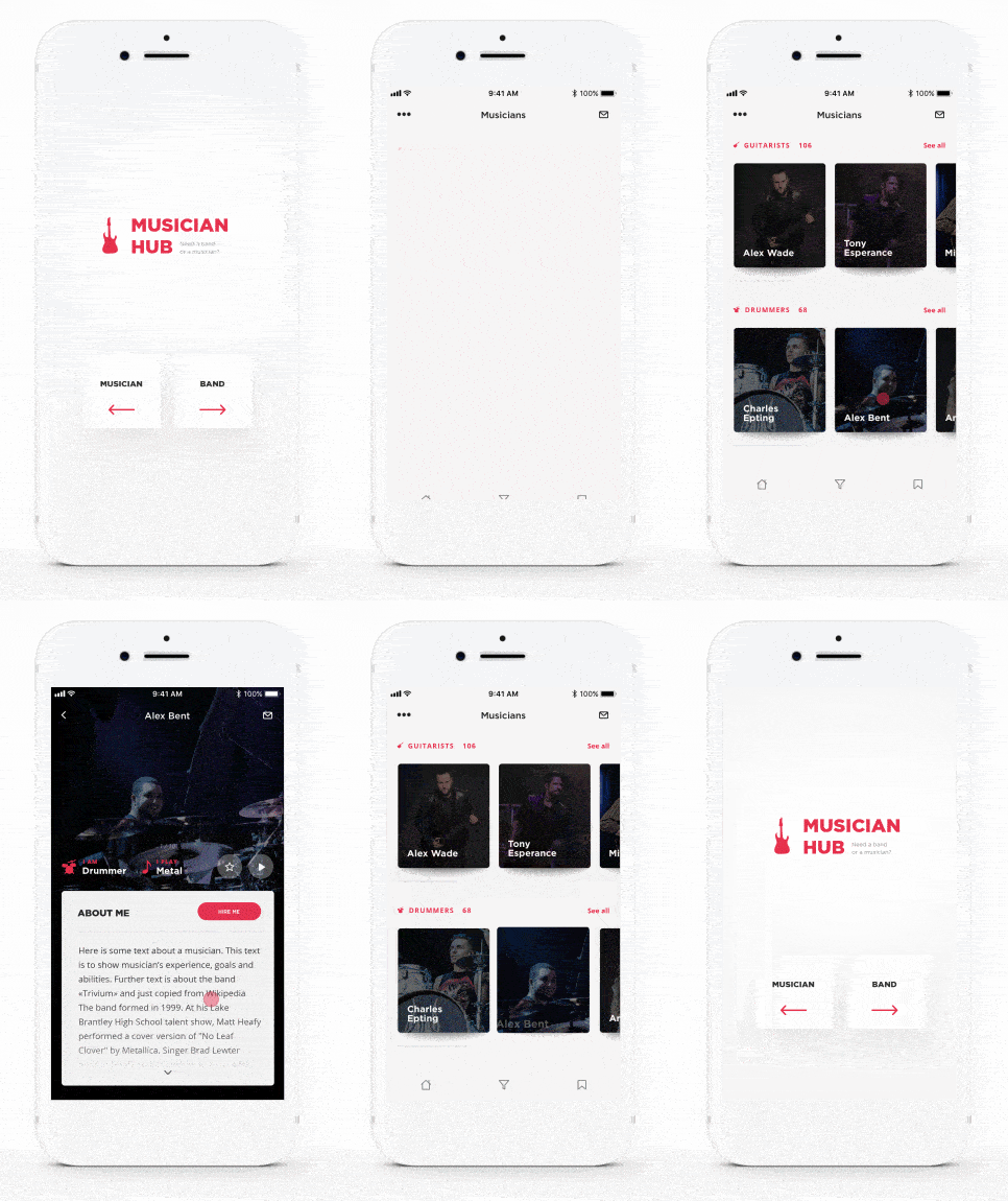
1. Musician Hub by Konstantin
This app concept aims to help bands and solo musicians find each other. It allows users to pick whether they’re looking for musicians or bands. Once you select one, the categories of musicians glide to the left into their places on the page. When you click into one of the musicians, their image expands and takes up the top quarter of the page, with information about them falling into place down the screen as well. Lastly, swiping down exits the individual page and returns the card of the musician to its original spot within the proper category.
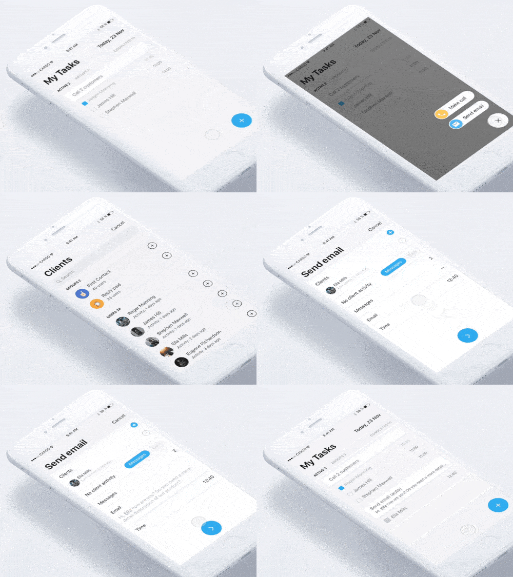
2. Follow up by Alexander Karpovich for Magora
This is an app concept of a follow up task presumably for a sales or customer success employee. It has their to-do list with the calls they need to make that day. Its seamless mobile interaction design allows the user to add a new item to their to-do list, either to make a call or send an email update. When the correct client and email is selected, templates pop up to help the user send out their correspondence faster. This is a streamlined process and would definitely help sales or customer success teams reach out to more clients faster than ever.
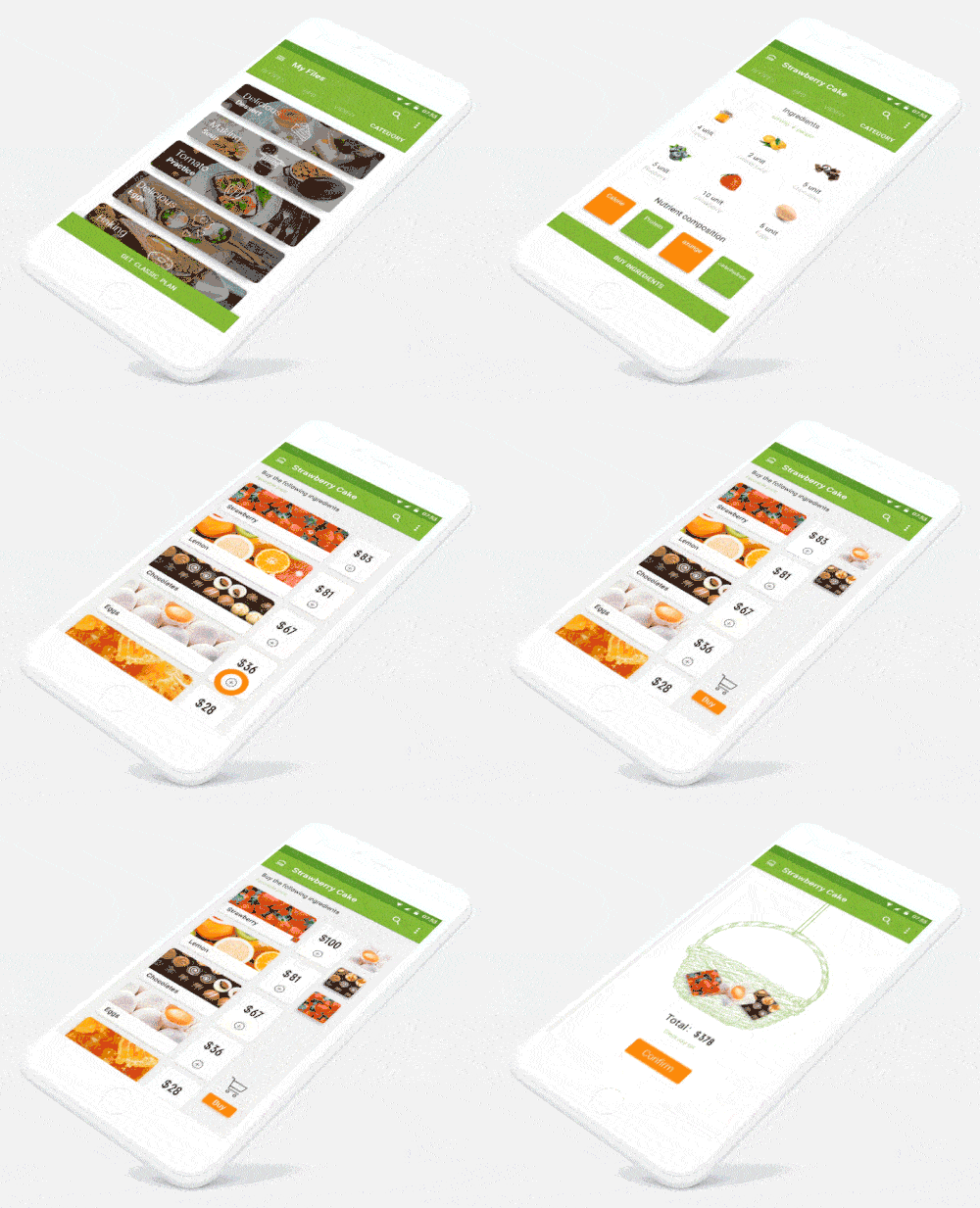
3. Green Food Interface by H-stepbackward for UIGREAT
What’s not to love when it comes to food apps? This app concept serves as a recipe for a gourmet cake and helps users buy the ingredients. Once the user taps into the cake and decides to make it, they can swipe up to get information about what’s in it. Tapping the plus button next to the ingredients adds a blank column to the right. Then the individual ingredients jump out and get situated in that column as you tap them. When you add more than one, it has the same movement and settles on top of the original image. Tapping “buy” below the images of the items erases them from the screen. Lastly, they land in a wicker basket with the total you have to pay and the option to confirm your order.
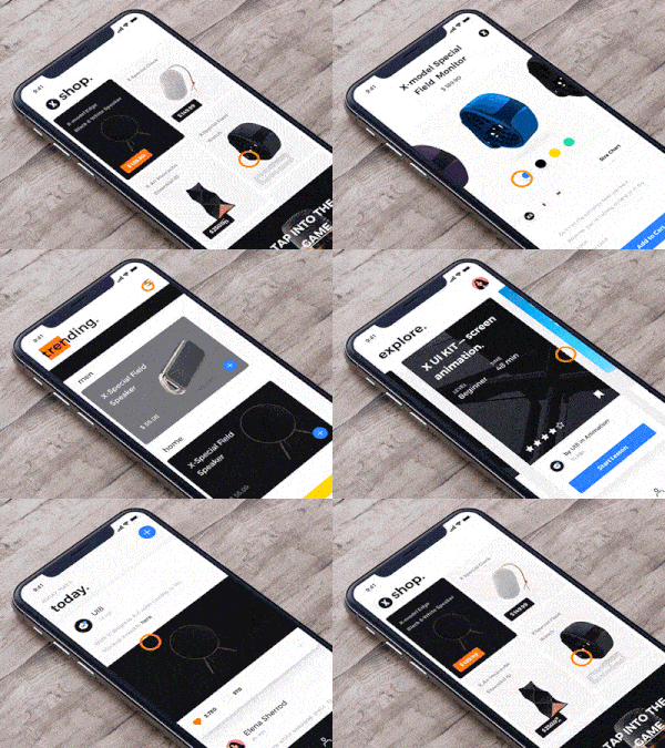
4. X Browse Interaction by UI8
There are so many great mobile interactions going on here; it’s hard to pick a place to start! This app concept has eCommerce capabilities, with trending products users can swipe through to find something new. The transition between a product page and the trending page has a particularly smooth mobile interaction design. Swiping right gets rid of the product you had been looking at, and trending products flip onto the screen. At the same time, a bright orange highlight goes halfway over the header that says “trending.” This browsing interaction has many surprising transitions and elements that move incredibly fluidly. In addition, on the “today” page, simply pulling down on the screen brings you to an entirely different page. That is something I haven’t seen in other apps.
5. Voice interaction by Kerwin1840
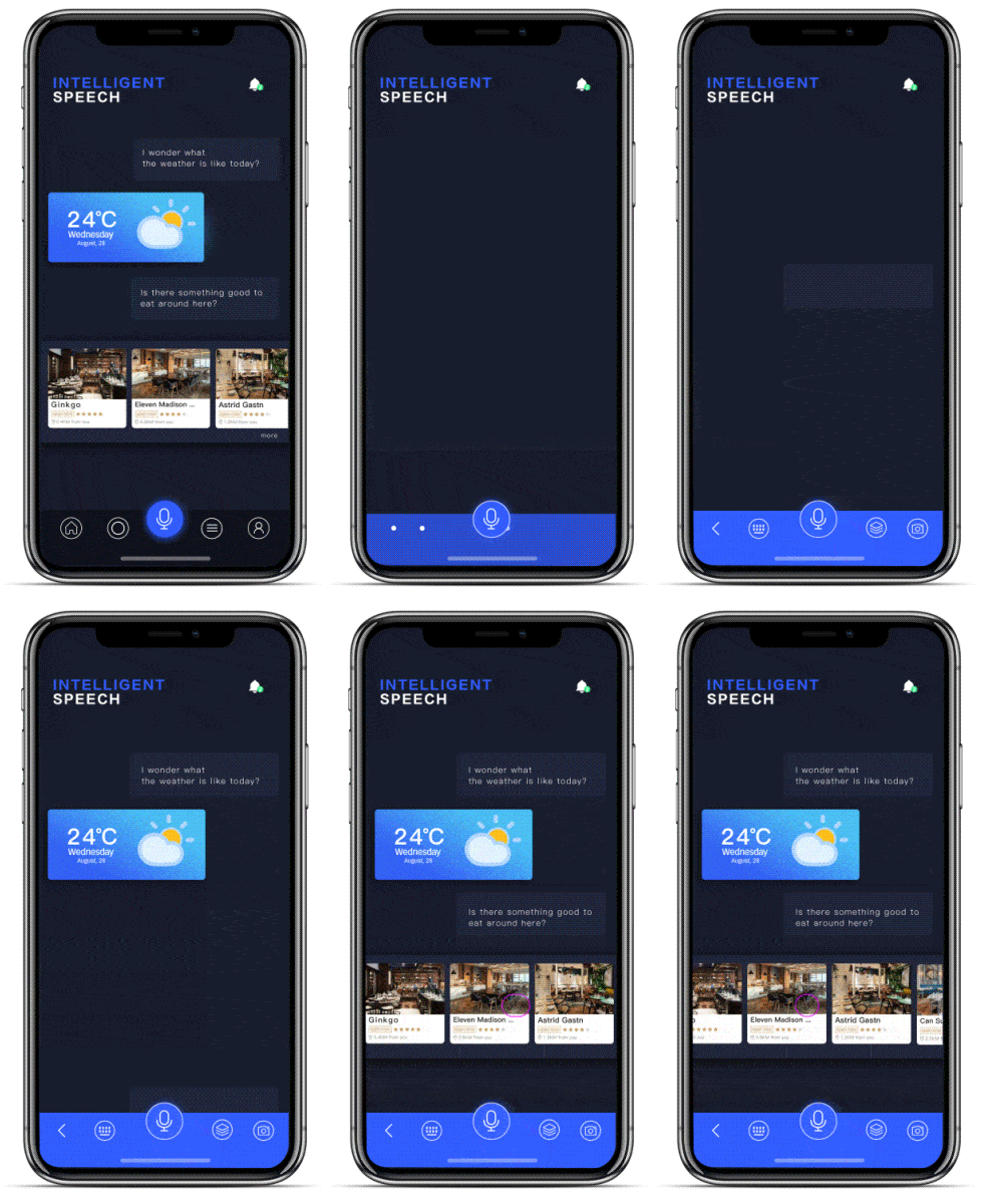
As artificial intelligence improves and chatbots get intelligent enough to understand nuance, there’s the potential that it could become helpful in our everyday lives. I’m not sure about you, but when I ask Siri straightforward questions like “what are the hours of XYZ business in my city?” she rarely delivers the answer. This app concept shows a chatbot that gets it for once. As the user speaks their questions, they show up on the mobile app screen, When asked about the weather, a quick forecast pops up below the question, complete with a delightful animation to bring the sunshine to life. Then, when asked about a good place to eat, multiple options appear below, which the user can easily swipe through to find the one they want. Conversational design is growing in importance and having a virtual assistant that gets it and is genuinely helpful the majority of the time is something I hope we can look forward to soon.
That’s all for November, but be sure to check out last month’s edition, featuring the best mobile interaction designs of October 2017.
Feeling inspired? Sign up for free with Proto.io and prototype your own interaction design in minutes.
Proto.io lets anyone build mobile app prototypes that feel real. No coding or design skills required. Bring your ideas to life quickly! Sign up for a free 15-day trial of Proto.io today and get started on your next mobile app design.


