We’re halfway through the year, believe it or not. Even if they’re working from the beach, someone out there is putting in the long hours to create the next mobile app UI design right now. Each month we pay tribute to our new favorite apps that have popped onto our radar, here at Proto.io. As the warm weather continues, we hope that you’ll enjoy our picks for July 2017. Let’s get started!
1. Anchor by Anchor FM Inc.
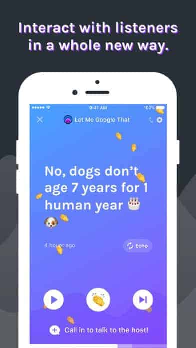
Saying podcasts are all the rage is an understatement. Anchor is not your dad’s NPR station, it’s a sleek podcast app that fits in nicely in 2017. It’s fun, colorful, and full of emojis. This app allows users to create and listen to podcasts, but much like Snapchat stories, many of them disappear after 24 hours. Whether you’re making a silly podcast for your friends to chronicle your travels or are exploring categories you’re interested in to learn about something new, Anchor is the most modern podcast app I’ve seen. Their use of custom icons for each category and podcast compliments the bright and ever-changing mobile app UI.
2. Holo by 8i (DISCONTINUED)
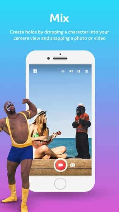
AR is a ton of fun to play around with and at the most recent WWDC, Apple gave us hope that it will be coming to iPhones soon. While they finish up development on their AR project, Holo is here for anyone who wants to get a headstart on AR. Basically, Holo lets you put holograms just about anywhere to imagine out of the ordinary things in everyday life. It’s certainly a good start to playing around with AR, as you can put 3D objects into your world. Holo’s mobile app UI is very straightforward to make it easy for users to create videos with their favorite 3D characters in less time. As AR becomes more mainstream, it’s clear that Holo will gain more options and hopefully even get holograms to interact with your world to make even more realistic videos.
3. Purp by Pepzen Ltd. (DISCONTINUED)
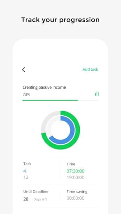
Managing your to do list seems like its own task sometimes. Here at Proto.io, we’re all about using apps to boost productivity, and Purp is one of the newcomers to the scene. It gives you timers for tasks, allows you to track progress with percentage completed of your goal, and maps out your success in graphs. Whether your goals are personal or professional, Purp can help you keep track of them with reminders and suggestions. As they say, “what gets measured gets done,” and that’s certainly the approach Purp takes. It follows a delightfully minimal mobile app UI, with white as the main color, accented with bright colors to help your personal metrics (how much you’ve completed, how long it’s taken you) stand out.
4. Aura by Aura Health Inc.
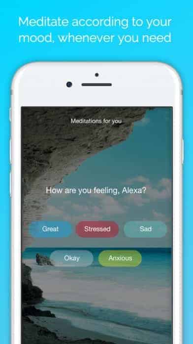
Mindfulness and meditation practices are much more common than they used to be, and it makes sense, as we’re faced with never ending to do lists and notifications that never sleep. That’s where Aura comes in. It’s a meditation app that works around your schedule, to help you practice mindfulness and check in with your emotions in just a three minutes each day. It has a calming muted color palette, with the ability to choose mediation sessions with your favorite teacher. You can even connect with the Aura community and post content that has been helpful for you. Overall, this meditation app effectively checks in with users to boost happiness and mood through sessions, journaling, and breathing exercises.
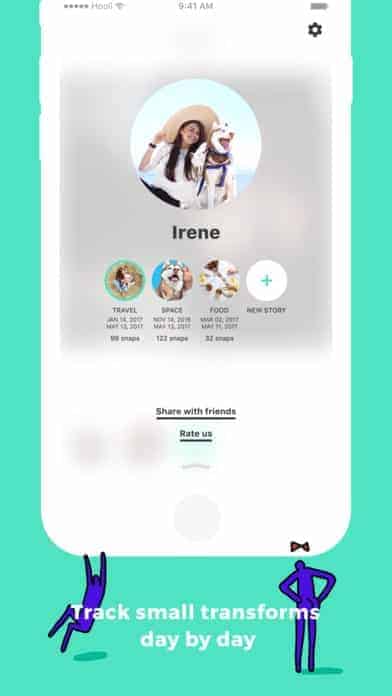
5. Daily Snap by HelloBaby, Inc
Daily Snap seems to be the latest addition to the “stories” craze among social media apps. What sets this app apart is that users are only allowed to take one second-long “snap” per day for each story. Growing out your hair or watching your baby bump grow? It’s perfect for that. Of course, you can have multiple stories. All of these snaps turn into a movie that you can share with friends. Since Daily Snap is a micro-story platform, understandably the layout is straightforward and the mobile app UI is clean. It is mainly white, gray, and turquoise, with circular icons for user profiles and the different stories they have been recording.
Get Daily Snap on iOS.
6. Omni by Omni Projects Inc.
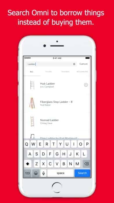
Storage is often a necessary evil. You might be downsizing apartments or need to keep seasonal gear from cluttering your garage. Omni makes the items easy to store and delivers them to you when you give them two or more hours’ notice. They take it to the next level with an intuitive categorization system and it even allows users to make their items in storage available to friends who also use the service or even strangers to rent. The mobile app UI is image based, as you can imagine, and features high quality images of your items in storage. Besides those images, they keep it to a simple red, white, and gray color scheme to help make it easy to use. The simple design helps users categorize their items properly and give access to the appropriate borrowers.
7. Curve by Curve
Curve is putting an end to clunky wallets by simplifying all your cards and linking them to a single Curve card. Of course, that can get a little tricky if you forgot that your primary card was your personal Visa, while you were supposed to be using the company card for your last purchase. Here’s the feature that gets my attention: you can change the card that you used for purchases after the fact. That’s pretty amazing if you’re credit card reward obsessed like I am. On top of that, you can use your Curve for withdrawals and purchases abroad with much smaller foreign exchange fees. The mobile app UI is basic, following the trend of cool blue financial apps that exude security. It focuses on the card information, but also has helpful pastel buttons that address problems and access features easily.
Get Curve on Android and iOS.

8. PDF Expert by Readdle Inc.
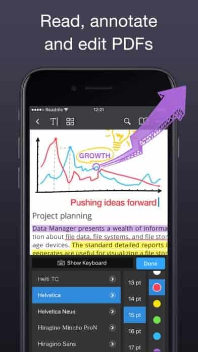
PDFs are so useful… unless someone needs to make a change. That’s where PDF Expert comes in to save the day. Whether you’re on your computer or mobile device, you can read, make notes on, and directly edit images and text in any PDF. What I love about this app is that it is solving a real problem that we’ve all experienced at work in a design-centric way. It keeps it simple to focus on those crucial PDF edits, while giving users all the change options they’ll need, from font types to colors. The creators of this app keep the focus on the PDF at hand but also allow for fun and colorful highlighting to brighten up any project.
Get PDF Expert on iOS.
9. Tally by Tally Technologies, Inc.
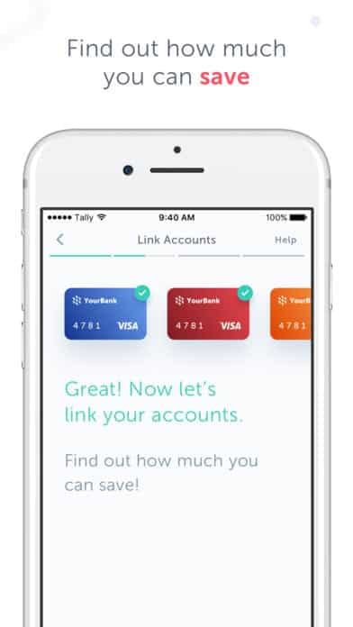
Personal finance is a hot topic these days and Tally is a brand new app aiming to help credit card users get their finances in order. The app automates small actions to help users pay off credit card debt, cut out late fees, and boost savings. You start by adding all of your credit cards to the app, and then it generates a customized plan with actions to meet your goals. What I love about Tally is its delightful mobile app UI design. While it is taking care of a financial need that isn’t exactly the most exciting, they find a way to keep the experience fun and engaging. They accomplish this with a bright color scheme and animations that make saving money a lot more interesting.
Get Tally on iOS.
10. Sift by SHOPINBOX, INC.
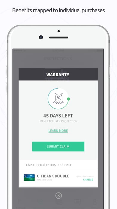
Buying online can be a little nerve wracking, especially when you see the price go down on something you just bought. Sift erases that buyer’s remorse by helping shoppers get money back when an item they bought recently dips in price. In addition, they help you pick your best credit card to check out with to maximize rewards. And finally, they help shoppers with extended warranties on electronics, etc. Sift reads all the fine print buried from your credit cards to produce this information and keeps you up to date on what warranties will expire when. The best part is that they pull all of this information into a smooth interface that has custom animated icons that keep the experience light hearted. The mobile app UI will pull you in and make you wonder how you ever made purchases online without Sift.
Get Sift on iOS.
That wraps up the apps for July, but if you’d like to explore some of our other favorite mobile app UI designs, check out our June installment.
Feeling inspired? Sign up for free with Proto.io and prototype your own app in minutes.
If you enjoyed this curated list of great mobile app designs, share it with your social network! Do you have a suggestion for the next edition of our Top 10 Mobile App UI series? Reach out to us via Twitter @Protoio or on Facebook.
