What makes a great website? To stay competitive, it’s important to build a website that incorporates the top elements of excellent web design seamlessly. Let’s find out what it takes to meet your audience’s expectations.
Usability
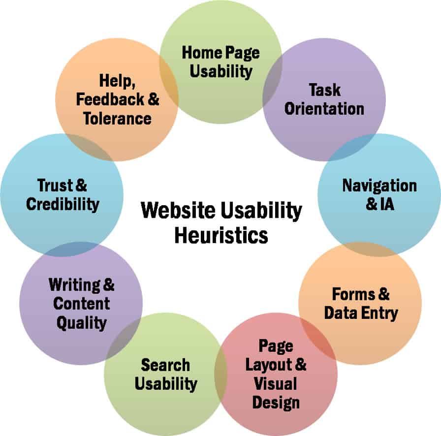
Plenty of designs might look pretty, but are they easy to use? That is likely the first thing about your website that your audience is going to discover. Whether or not your website is easy to use could determine how many users return. If you think about it, usability could be the most important element of web design because it’s largely responsible for how the website is received. Users usually only take a few seconds to determine if a site has what they need. Unless you have a website that’s easy to use, you could risk losing your audience. The best websites are built with the user in mind. When you test your website, try to think like your users. What would they find easy to use? What would confuse them? Once you have the answers to these questions, you’ll be able to create a website that fits with your audience.
Interactivity
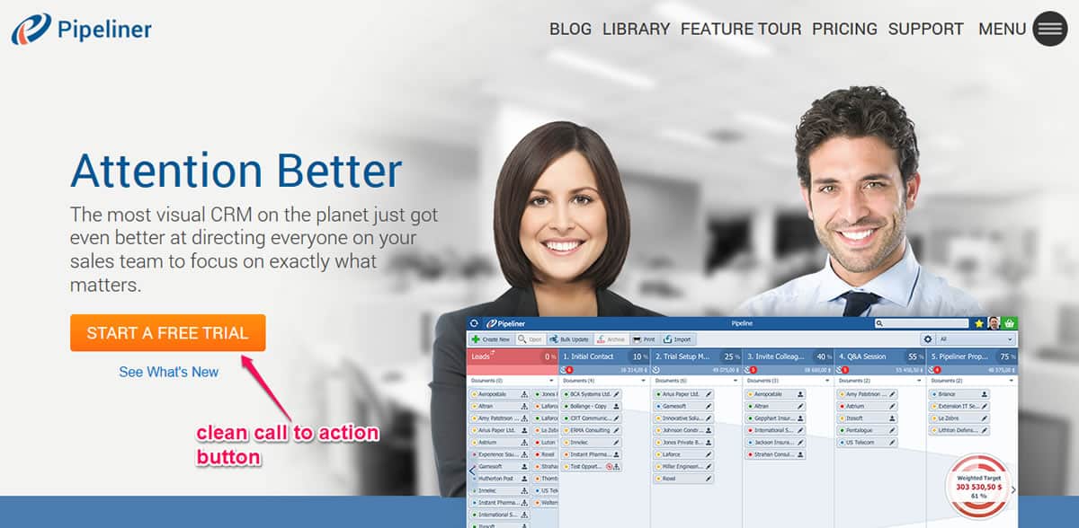
There are quite a few ways to build interactivity into web design. Some methods are quite common, and others are more unique. Contact pages and newsletter sign ups are some of the more commonly used methods, but they often work well at engaging audiences. Newsletters give you the opportunity to share content with viewers even if they haven’t visited your site in a while. On the other hand, the more inventive methods, like creating a call to action, could incentivize users to help you share your message, product, or website with new users. Overall, it’s important to keep these interactive methods fresh. Sending out the same old newsletter isn’t going to pique anyone’s interest. However, interactivity done right can really boost a site’s presence.
Intuitiveness
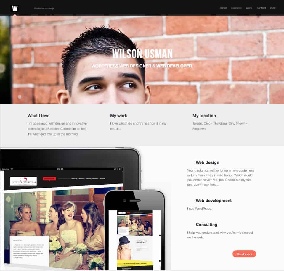
What does your average user want? It’s best that you spend some time learning the answer to that question if you don’t already know it. Determining why site visitors are coming to your website will help you better reach and maintain your audience. Then, you can build a website that is intuitive and makes users feel like you know exactly what they want. For example, if you’re selling a product, users should easily be able to locate where they can buy that product on your website. You know they’re landing on your website looking to buy your product, so why not lead them right to it? The fewer clicks required, the better the chances that you’ll make a sale during that first visit.
Simple Navigation
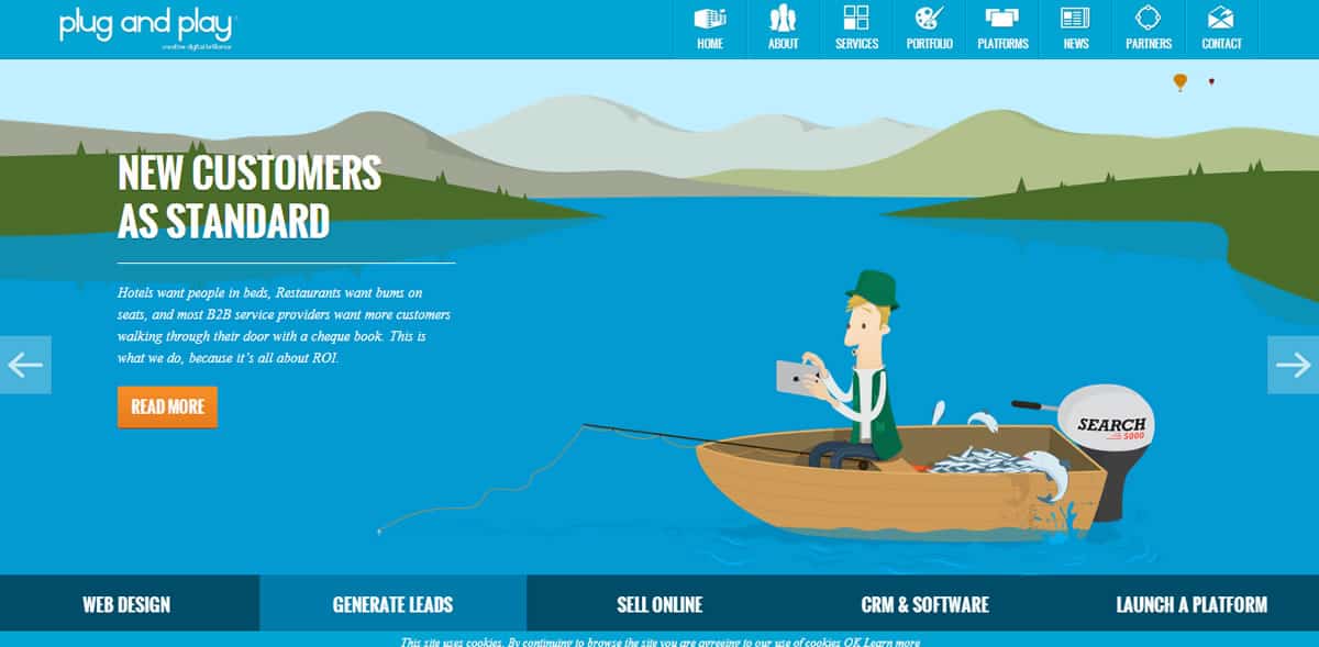
Simple site navigation also plays a role in user experience. Getting between pages on your website should be very simple. It really begins with the site’s menus. Since menus are the primary way that visitors will navigate your website, it’s important that they are logical. First, menus have to be well organized. Decide on categories, and stick to them. Menus also have to make sense to your audience. Make sure each menu header clearly represents what’s on the page. Finally, navigation menus shouldn’t be jam packed. Each page on your website should have a specific purpose. Avoid repetition, and make sure important pages are front and center, like the about and contact pages. When it comes to your landing page, focus on the things you want your audience to know. Find eye-catching ways to tell your audience what you want them to know about your company, brand, or product.
Visual Design
Web design is set apart from graphic design or traditional art because it requires a special understanding of interactivity. In fact, there’s a lot that goes into great visual design on a website. Web design combines elements of traditional art, digital art, and user interface design. It’s important to consider traditional art elements, like color theory, because a website should be aesthetically pleasing. In addition, elements of digital design should be included. Logo design and implementation are crucial to the success of the site’s overall visual design. For example, proper branding is necessary to make a website recognizable and memorable. The final element, user interface design, requires web designers to consider both form and function. This is a unique challenge because it impacts usability, intuitiveness, and navigation. Just remember: the best websites are good looking, well-branded, and easy to use.
Modern Aesthetics
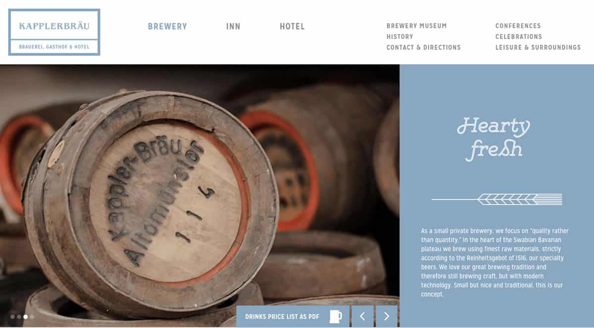
In web design, staying current with trends is essential. When visitors come to a site that doesn’t have a modern look and feel, they might think the company has outdated ideas, products, or processes. In fact, clients could be turned away because your website doesn’t look current.
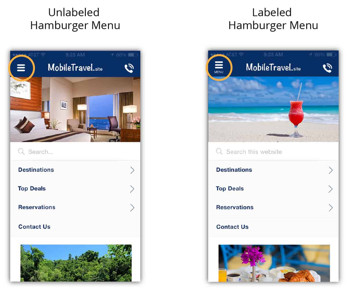
Modernizing your website’s design can even bring in new visitors. A redesign works like a rebrand. It says you’ve updated, renovated, and improved upon an already great product. The best way to figure out what’s trendy is to check out what the most popular sites are incorporating. Right now, there are a few standards that are a modern web design must. For instance, hamburger menus are really popular. They are tucked into the right or left corner of the screen on a mobile device, and allow smoother navigation and reduce screen clutter. Of course, incorporating a hamburger menu could mean updating other aspects of your website, like mobile responsiveness.
Responsiveness
Just because a website works that doesn’t mean it works well. These days, you have to think about many different visitor scenarios. It used to be that people could only visit a website from a PC, but these days, most people are accessing websites from their mobile devices. According to Marketing Land, phones and tablets are leading the market when it comes to website traffic. Since most people are probably viewing your website from their mobile device, it’s a good idea to make sure it still looks sleek and works great. A responsive website would allow users to have the same high quality usability, intuitiveness, and simple navigation on a PC or mobile device. Thankfully, there are simple ways to build a responsive website. The easiest approach would be to use a responsive WordPress theme.
Optimization
Optimized web design has several components. Initially, it’s important to make sure site load time is three seconds or less. If your site takes more than that to load, you risk losing viewers. Purging your site of anything it doesn’t need and optimizing your code can lessen site load time.
If you use a WordPress theme, make sure it’s not responsible for delays in load time. Broken links or images are also responsible for high bounce rates. You can correct 404 errors and replace broken images using WordPress plugins. Conversely, web design should also incorporate search engine optimization (SEO). Pages should be built with SEO in mind in order to organically boost the site’s presence on search engines. Web designers have several ways to go about improving SEO. Creating a site map allows crawlers to go through your website faster. SEO can also be boosted using focused keywords and content.
Content
Usually, users only go back to websites that offer something new each time they visit. Think about it: if there’s nothing new to do, why go back? Creating content helps bring viewers back to your website. Videos, blogs, promotions, and new products are all great ways to pull viewers back. However, there are a few rules when it comes to content creation. First, make sure the content on your website is relevant to your site’s purpose. Don’t distract users from their main objective. Also, blogs on your site shouldn’t just be blatant product advertisements or endorsements. Give users information they can use alongside mentions of your products or services. Finally, decide how you want to use content. Like everything on your website, content should have a purpose.

Inspiring Web Design
Modern web design brings together an array of visual and technical principles. It’s changing rapidly, so staying ahead of the competition requires paying attention to trends. Seek out websites that hit all the elements of excellent web design, and see how they’ve improved over time. Those improvements can act as a guide for your own.
Proto.io lets anyone build mobile app prototypes that feel real. No coding or design skills required. Bring your ideas to life quickly! Sign up for a free 15-day trial of Proto.io today and get started on your next mobile app design.


