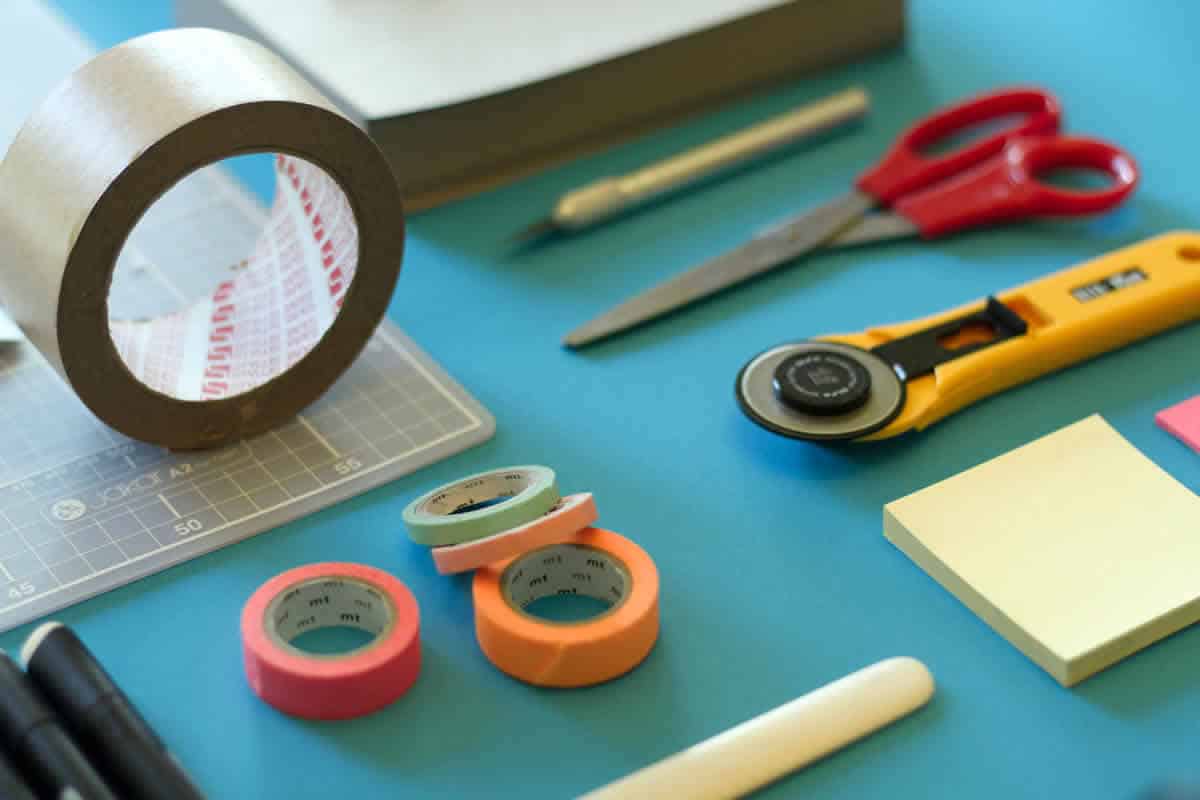
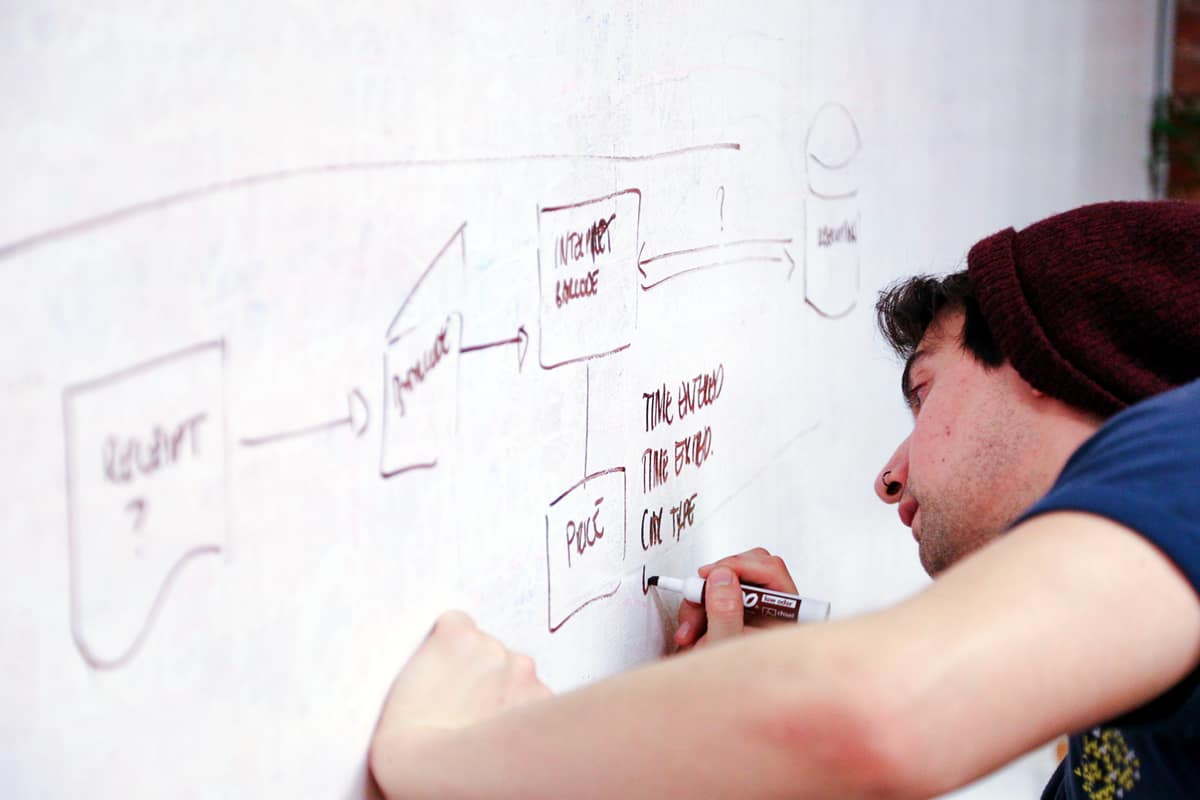
As designers, we are constantly being introduced to new cutting-edge digital tools to help transform and make our workflows more effective. That means we sometimes forget about the non-digital tools we should always keep at our disposal.
User experience is not about something looking pixel perfect right off the bat. It is about creating an experience for users at every touchpoint that is intuitive, functional, and hopefully enjoyable. You can’t accomplish that if you go straight into Photoshop. Spend time fleshing out your concepts and designs on paper for rapid and effective collaborative iterations before going digital.
User experience is about solving problems and there is no better way to solve problems than by freeing our minds with the use of these eight non-digital tools to help our ideas take shape.
1. The Power of Sticky Notes
It has become a bit of a joke in the UX community, but sticky notes are a serious necessity for UX designers and you too can become an all powerful sticky note ninja.
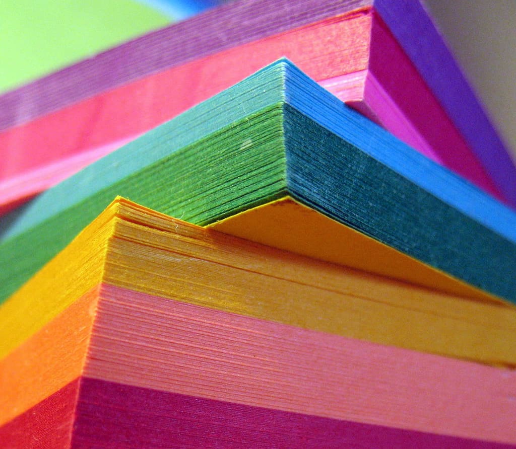
There are so many reasons to love sticky notes but what tops the list is that they are small enough to capture one idea, they can be moved around easily, and you can purchase them in a range of your favorite colors and sizes without breaking the bank. They are also great for defining interactions and concepts for paper prototypes.
Sticky notes are useful during sketching and brainstorming sessions. Once the notes are arranged on a wall, patterns will start to emerge, allowing you the opportunity to make smart decisions and create a plan for next steps.
2. My Version of the Portable Whiteboard – Sticky Flip Charts
I see sticky flip charts like portable whiteboards. They are perfect for meetings with clients that are out of the office.
I recently flew out to New York City to meet with a client for a strategy and sketching workshop for the redesign of their mobile and desktop sites. I am really happy we decided to forgo the whiteboard and instead we focused on filling page after page of large sticky flip-charts. These pages, which were full of our sketches and post-its, were stuck all over the office walls and iterated upon for hours.
The best part was that after the session was over, I was able to shove them in my suitcase, hop on the plane, and easily put them on the walls of my home office back in Denver.
3. Notebooks
Over the past three months, I filled over six notebooks with notes, scribbles, wireframes, flows, quotes for inspiration, and more. Nothing beats the value of a pad of paper and a pen for getting your ideas from your brain to fruition. The portability of a notebook makes it easy to capture those thoughts anytime and anywhere.
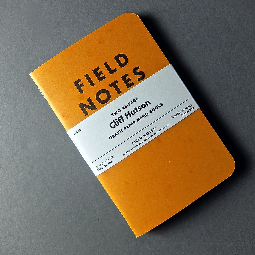
This Proto.io article, 10 lovely notebooks for designers, highlights some of my favorite notebooks including Field Notes and Pocket A6 by Leuchtturm 1917. The notebooks are small and flexible and don’t add too much weight to your bag. They also come in a variety of page styles, including grid, ruled, blank and dotted.
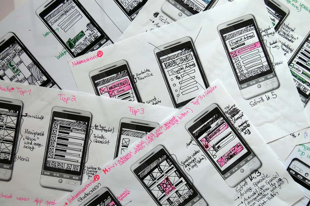
Keeping a few reams of A4 grid and blank paper around is also a good idea for sketching and paper prototyping. Having the ability to lay individual sheets of paper down on a flat surface, allowing you the ability to move them around, can prove to be really valuable, especially when it comes to strategy and planning. And, when it comes to prototyping – paper prototyping is an extremely quick and effective way to see how users interact with your designs.
4. Drawing Tools
I always like to start sketches with pencil. I prefer mechanical pencils, but when I don’t have one on hand the sharpest #2 does the job. The black Sakura Pigma Micron Pen is a great tool to turn my wireframes into something presentable, that look good, and that are easily readable to show clients and users alike.
Sharpies can also do the job. Fine point black markers are perfect for wireframing and annotation, while using thicker markers for the outline of the screen.
Gray scale markers are amazing at bringing sketches to life, allowing you the ability to play with hierarchy and reveal the differences in the designs in an easily understandable way. When creating paper prototypes, there is nothing better than a highlighter for depicting user interactions, especially when guiding a user or stakeholder through a flow.
5. Index Cards
UX designers are often presented with navigation challenges and need help evaluating a site’s information architecture. There is nothing better than using 3×5 index cards for conducting in-person card sorts and reverse card sorts to help designers understand user expectations and how they categorize the information presented.
The best part about index cards is that they are cheap and easy for users to handle and organize quickly. While assessing the cards, patterns start to emerge, providing you with valuable information to help in the creation of a seamless user experience.
If you are new to UX, this usability.gov article gives a good run-down on how to conduct a card sort.
Tip: Stash index cards in your bag for sketching. The size of the cards is similar to the size of the some of the mobile screen you might designing for.
6. Paper Templates
Templates are tools to help you structure your thinking. They are not meant to be a substitute for your creativity. You can find templates for everything imaginable, from Android screens, to scripts for user testing sessions, and even storyboarding.
Keep a pile of paper templates at your desk and in your bag. Templates are a great place to start getting your ideas down on paper without the overwhelming feeling you can sometimes feel when staring at a blank piece of paper. “Wireframing block” is something we have all felt at some point.
Templates also allow you to get a sense of what your site would look like on specific screens. You can find templates for every screen size imaginable for iOS, Android, tablet, and desktop.
You can find downloadable and often free templates at UiUxAssets, and eWebDesign.
7. Translucent Rulers
I don’t have a steady hand, not many people do, and rulers come in very handy when sketching wireframes. Don’t use them when initially starting to sketch, but rather after you have a few ideas on paper to help define your lines more precisely.
I am particularly drawn to translucent rulers that allow you to see what your lines look like compared to what is on the rest of the paper. You can also use the ruler when creating interactive paper prototypes. Take the edge of your ruler to quickly rip paper or a sticky note into a straight line that you can stick or glue back on for rapid iteration.
8. Whiteboards
A whiteboard is a great tool to get your ideas down quickly while working with other designers to solve problems. Here are a few things you can use a whiteboard for:
- Listing out details about your users, such as their motivations, frustrations, and goals
- Defining user stories
- Drawing the main screens that correlate to the user stories you defined in step two
- Adding more details (and erasing them)
Of course, throughout your whiteboarding sessions, you will continuously be gathering feedback and asking stakeholders questions while iterating on your sketches as you go. Whiteboarding helps solve problems quickly by prioritizing and iterating.
I have my own personal whiteboard in my home office. I use it to write down weekly goals, as well as thinking through some UX design challenges. Right now, there are a couple of inspirational quotes on it including:
“We spend a lot of time designing the bridge but not enough time thinking about the people who are crossing it.”
– Dr. Prabjhat Singh
I encourage people new and old to the UX field to invest in these non-digital essentials. They will help in every phase of your workflow from research, to design, and finally with testing and validation.
Let us know if you have any tools you think we should add to the list!
Proto.io lets anyone build mobile app prototypes that feel real. No coding or design skills required. Bring your ideas to life quickly! Sign up for a free 15-day trial of Proto.io today and get started on your next mobile app design.
