The true measure of progress isn’t what amazes or baffles us, but the things we take for granted. We now carry personal computers in our pockets, which we can use to play games, create art, shop, and communicate in real time anywhere in the world and it’s no big deal to us.
We can open a new app for the first time and figure out immediately where to tap and what to drag where to accomplish our tasks — and for most of us, it’s easier than assembling a bookshelf from IKEA.
Here are a few of the amazing app interface ideas that helped make so many extraordinary tools an ordinary part of life.
The Graphical User Interface
GUIs are such a fundamental part of how we use electronic devices, it’s hard to picture computers without them. But before the 1970s, most people hadn’t even considered the possibility of a GUI — outside of a radar screen, the idea was considered fairly outlandish. The first true GUI was the Xerox Alto, created in 1973.
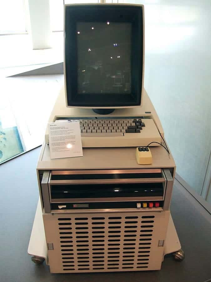
In many ways, it was extremely limited. The low resolution, black and white monitor and simple interface (its file manager used two immovable boxes) were far from the flexibility of modern window-based interfaces.
Its high price tag (it cost Xerox $12,000 just to build the first one in 1973 — over $69,000 in today’s money, adjusted for inflation) limited its adoption to Xerox labs and universities, and a few government sites, including the White House and House of Representatives.
However, what’s remarkable about the Alto is just how many things it got right. It had:
- A keyboard, mouse and monitor, powering a GUI — essentially the same input/output used in modern computers.
- Bitmap graphics.
- A WYSIWYG text editor, allowing users to visually lay out and print text.
- WYSIWYG painting and graphics software.
- Ethernet connectivity.
- Email.
- Removable storage.
Two computer science students even built Alto Trek, the first game to use a mouse and one of the earliest multiplayer networked games. Players could battle to conquer the galaxy using three Star Trek races with different strengths and weaknesses, and even send messages back and forth while they played.
Although Apple gets credit for putting the desktop GUI computer within reach of ordinary users, many of the big ideas that made them successful were first assembled by Xerox. The Apple Lisa, the Macintosh, and every other computing device using a GUI owe a great debt to the pioneering computer created by Xerox researchers.
The Mouse Wheel: Looking Beyond the App Interface
App interfaces have worked through visual metaphors since the beginning of the GUI. Desktops, folders, icons, and other visual conventions refer explicitly to the real world in order to make the user interfaces intuitive.
But some functions can’t help but transcend real world metaphors. Rapidly scrolling through a document by dragging it down breaks the metaphor of a collection of physical pages. Zooming in to see fine details (even with the use of magnifying glass pointers) doesn’t really have an equivalent action a typical person would perform at their desk prior to having a computer.
These functions are where user interfaces first made it explicit that computers are more than just an efficient way of organizing and processing information. Before app interfaces turned them into ordinary kinesthetic experiences, another innovation laid the groundwork: the humble mouse wheel.
Eric Michelman, inventor of the mouse wheel, didn’t set out to transform the user experience. He was simply trying to solve a common problem for office workers. Michelman had noticed that Excel users had trouble navigating through big spreadsheets and wondered if, “perhaps a richer input device would help.”
His original idea was a lever, which he prototyped using an ordinary joystick. The stick would zoom in and out and the button would navigate menus. However, the Microsoft engineers he showed it to weren’t as excited about the idea as he was.
While zooming is great for navigating Excel, it’s not as useful for something like Word. They soon improved upon his design by adding a wheel, and realized it could be used for scrolling instead of zooming in Word, but that posed another problem: Microsoft wanted consistent, intuitive behavior throughout Office. Adding a new wheel that did one thing in Word and another in Excel would be confusing.
The company actually started building the project while still debating scroll vs. zoom. Then, in the middle of the project they hit on a solution: making the wheel a button. Not only would this let the wheel control both scroll and zoom, but it also added other features, such as panning and continuous scrolling.
No more clicking the down arrow repeatedly, or hunting for the scroll button at the edge of the window. With just a button and a wheel, Microsoft had made navigation almost as simple and convenient as pinch to zoom.
The Multi-Touch Screen
Like the GUI, the multi-touch screen is an innovative interface idea associated with Apple, but not invented by it. We’ve written before about how the iPhone changed everything, but decades before Apple created the first mature, multi-touch smartphone, engineers, artists, and visionaries were already hard at work on solving touch UI.

According to Ars Technica, the first multi-touch device was created in 1982 by Nimish Mehta, then at the University of Toronto. Mehta mounted a camera behind a lighted screen made of glass and covered with translucent plastic. When users touched the glass, it created a dark spot, which the camera could detect. The camera then fed this dark spot to a computer, which calculated where the user’s finger was touching the screen.
However, the technology goes back even further than that. Doctor Sam Hurst developed a touch sensor as early as 1971, and a transparent touchscreen in 1974. And Hurst’s inventions used resistive touch — a technology still used today in many touch devices.
The first commercial touch device was released the very next year by Hewlett-Packard. The HP-150 was a desktop with a 9-inch green CRT display, which used a different technology to enable touch.
The screen was surrounded by a ring of infrared emitters and detectors. When you’d touch the screen, it would break some of the IR beams, which showed the computer where your finger was. Unfortunately, holding your arm out straight in front of you to control your desktop isn’t exactly comfortable, so the device was never commercially successful.
From there, the touchscreen developed over several decades, passing through a range of technologies that enhanced the possibilities of app interfaces by degrees. In the 1990s, PDAs using a touch stylus became indispensable productivity and organization tools for many professionals. By the end of the decade, multi-touch pads were being used to help people with repetitive stress injuries and other conditions. And in the 2000s, giant touch screens became popular with animators and other creative professionals.
New materials emerged, and other touch-based devices started to appear. Some failed outright, and others never achieved wide adoption, but they all contributed to the evolution of the touch interface. From there, developing the iPhone was simply a matter of understanding users’ needs and integrating the tech in a way that was portable, affordable, and powerful enough to reach a mainstream audience.
Like so many great app interface ideas, multi-touch was the product of decades of experimentation by academic explorers, commercial companies and digital artists. That’s a great reminder to anyone tackling a challenging app UI issue to stop, look around, and learn about the great work your colleagues are already doing.
The Augmented Future of the App Interface
One figure in the history of touchscreens we didn’t mention was Myron Krueger. As a computer artist, his work not only played a role in the history of multi-touch — it also showed us the possibilities of virtual and augmented reality, decades ahead of its time.
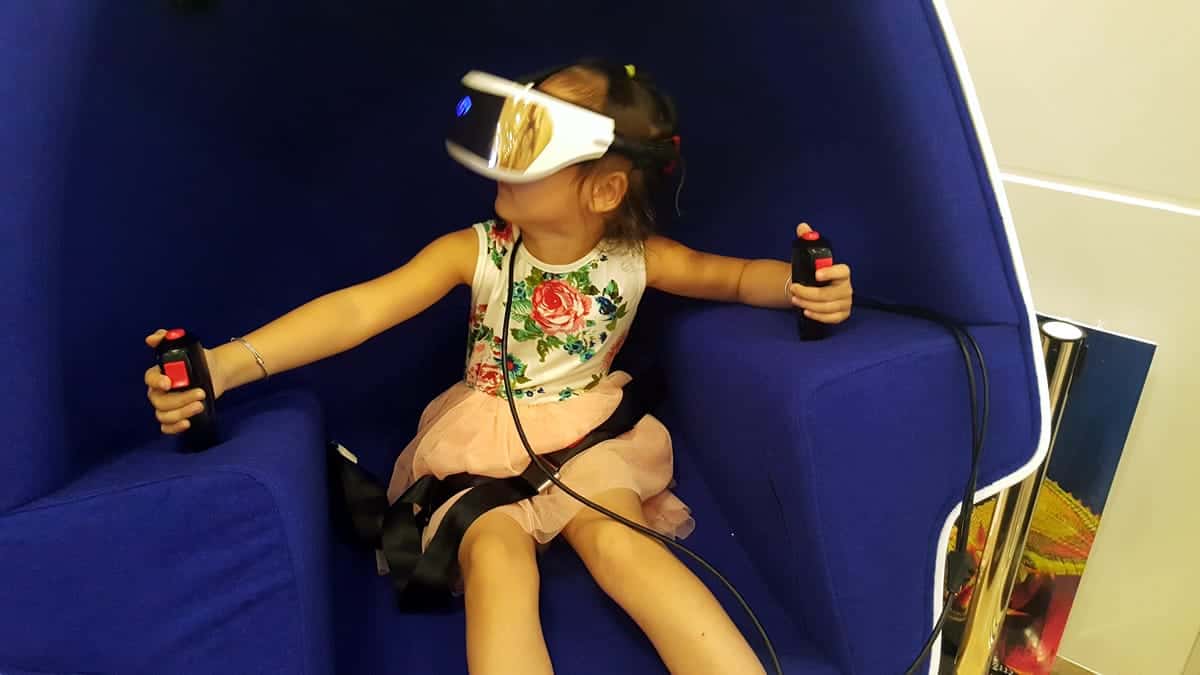
In 1983, Myron Krueger created Videoplace, another early camera-based system. Videoplace wasn’t technically touch, but there was nothing else like it at the time. It used a camera to track the position of the user, then project an image of them on a screen in front. By moving their body, they could interact with virtual objects, which were animated on the screen.
By that point, Krueger had already been working with computer interfaces for over a decade. His 1970 work, METAPLAY had the artist connecting with users from another building. The artist would project a live image of the user on a screen, juxtaposed with an image he drew. The users could then draw their own images on an electronic tablet, which would also be projected. He could even draw lines over their hands as they moved, creating what he called “live graffiti.”
Krueger’s work gives us a hint of what’s possible with VR and AR interfaces. As the tech continues to improve, maybe we can move beyond simulated worlds you can only access with a headset, to a future filled with real world experiences with seamlessly integrated technology. It reminds us that, no matter how good the technology gets, the true innovation is learning to serve the user.
Proto.io lets anyone build mobile app prototypes that feel real. No coding or design skills required. Bring your ideas to life quickly! Sign up for a free 15-day trial of Proto.io today and get started on your next mobile app design.
What app interface ideas do you think are most important? Let us know by tweeting us @Protoio!


