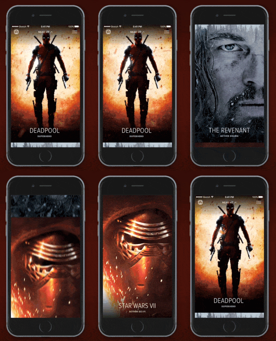
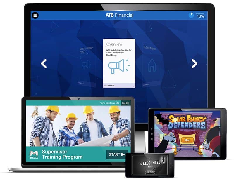
We asked seven UI designers, developers and entrepreneurs what mobile and web app UI design tricks they learned the hard way, or happened to pick up through the course of their careers. Either nobody ever told them about these tips, or nobody seems to know about the issues when they bring them up. In any case, here are 12 things you now don’t have to learn through trial and error — unless, of course, you already have!
Top 3 Design Tricks from Duffy
John Geletka is Executive Vice President of Digital Strategy at Duffy (@duffydesignx), an agency with over 30 years of design experience. Here are a few tricks he’s picked up over the years.
1. Two can be a magic number.
“With responsive design, always design two screens at once: mobile portrait (320px) and desktop (1200px). It makes the process so much faster,” says Geletka.
2. Start with a bare bones design.
“Reduce all features, bells and whistles at first. Get the junk out of your way and focus on the goal of the app,” says Geletka. “That means don’t add sharing, and saving and every integration to your design at first. Make sure you get the main idea down.”
3. Don’t be afraid to pick up a pen.
“Digital tools are great, but sometimes you can get more done on paper in 10 minutes,” says Geletka. “If you’re stuck or short on time, use paper.”
Achieve Balance With This Web App UI Design Trick
Brandon Termini is Founder and Creative Director of Handsome (@HandsomeMade), an agency committed to creating “purposefully beautiful and delightful” web app UI designs and digital products.
4. Use the correct optical weight.
“Balance is hugely important when making successful interfaces. Good balance allows your users to easily scan your app the way you’ve intended,” says Termini. “I see this rule being broken most often when using various icons in interfaces. Some icons are more horizontally weighted while others are more vertically, and it’s our job to make sure when they are put together they feel equally balanced.”
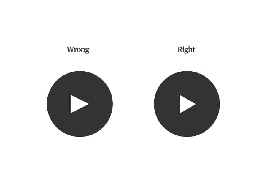
Optical Weight and Play Buttons
“If you are designing a play button the answer isn’t to stick a equal sided triangle horizontally and vertically centered inside a circle. Sure, geometrically they are centered, but the triangle optically feels heavier on the left because of its larger height,” says Termini. “Don’t worry — you can do two things to fix this: either move the triangle over slightly to the left to trick the eye into seeing it centered, or reduce the width of the triangle slightly to make all sides appear even.”
From Web App UI Design to Mobile
Our next three mobile and web app UI design tricks come from Christian Dodd, Vice President and User Experience Strategy Director and Nathan Koch, Creative Technology Director of Cramer-Krasselt (@cramerkrasselt). Cramer-Kasselt is the second largest independent advertising agency in the U.S., with clients such as Porsche, Corona Extra and Heinz, so Dodd and Koch draw from a rich reservoir of experience to bring us this advice:
5. Don’t forget any web hover interactions when porting to mobile, and have a clear plan to deal with them early in the design.
“Content hiding behind a hover state on desktop can be dealt with in several ways on mobile: directly on the page, and hiding behind a touch. No one solution for dealing with desktop hover events works in all cases,” say Dodd and Koch. “Explanatory/utility content often benefits from being floated up to show on the page, and exploratory content often makes more sense behind a touch. In general, as users get more comfortable scrolling across all devices, hiding content behind hover states and hide/show widgets is becoming less and less necessary.
6. Trying to get auto play video to work on mobile web usually isn’t worth it.
“Mobile OS developers don’t allow autoplaying video for a reason. In general, audio and video are more disruptive to the user on mobile,” say Dodd and Koch. “Mobile users are used to making deliberate choices to consume media.”
7. There’s more to responsive design than just shrinking your browser down.
“Feature detection is an important part of mobile web development as well,” say Dodd and Koch. “Don’t think you can’t second-guess touch events on a desktop website, the details of mobile interaction are more sophisticated than they might seem.”
There’s More to The Rule of Three Than You Think
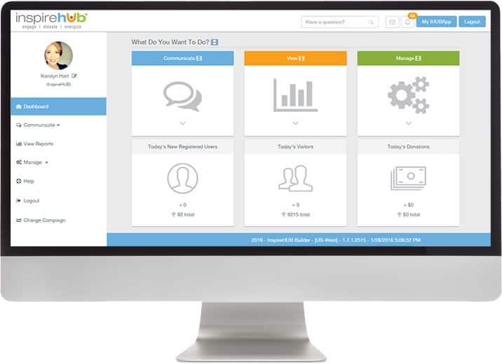
Karolyn Hart is Chief Operating Officer of InspireHUB (@Inspire_HUB) and creator of the IHUBApp, one of the earliest enterprise-grade mobile web apps in the market place.
8. Try to keep all web app UI design elements in groups of three.
“We stumbled across the ‘Rule of Three’ as we researched how to create confidence in our interface for our clients. V1.0 of our platform was not hitting the mark,” Hart says. “Research shows that three is the optimum number that increases confidence. Fewer than three and people feel unsure, more than three and they feel overwhelmed.”
“So we made a UX challenge that everything must be presented in threes,” says Hart, “from decisions to steps as our clients populate their apps. The rule has transformed our tool. Our back-end is extremely sophisticated to accommodate the simplicity of the design, but the payoff has been worth it!”
Keeping Gestures Simple And Intuitive
Jason Suriano is Founder and CEO of Rocketfuel Productions Inc.. With over 13 years experience with mobile and web app UI design, and having created online and mobile-based projects for companies like Discovery Communications, Suriano has picked up quite a few pro tips. Here’s his favorite:
9. On mobile, assume all fingers are clumsy.
“One trick we’ve implemented when designing mobile games is to make the entire start screen a tappable area. What this means is that if the user goes to tap the start button and misses, the app will still load the subsequent game play screen, ensuring that the user will continue in the app,” says Suriano.
“Because mobile UI/UX is defined by taps, double taps, swipes and gestures, a misstep designing something straightforward like a start screen can leave your user stranded or frustrated, forcing them to hit the home button and exit the app,” he adds.
Keeping an Open Mind to New Web App UI Design Tricks
Nolan Kier and is a Project Manager and Business Development Associate at Messapps (@Messapps), an app development firm headquartered in NYC. “Despite having been founded a little less than three years ago, Messapps has already rapidly grown into one of the most reputable and innovative app development firms in the app development field,” says Kier, “and we’ve learned plenty of web app UI design tricks in those three short years.”
10. Keep researching new, better ways to get work done.
“Many tricks or new methods for completing a task we learned either through researching the problem or by digging deeper into a particular development issue to determine what answers could be teased out,” says Kier. “Examples of this include learning to write cool documents by writing new code snippets to LaTeX, which is something akin to a text editor with a programming style/format. Also, Mathematica, which is like Mathcad for MacOS, had this neat hidden feature that allowed a user to create a difficult 3D scheme using the software.”
“For design, stumbling upon how to compress frames using things like modifying alpha channels and the ability to compress individual images using custom algorithms were small tricks that aided the process,” says Kierk. “Being in the web app UI design and development business demands innovation that matches the evolution of technology. As a result, our designers and developers constantly rework our internal and external processes to “reinvent the wheel” and discover new ways to design and develop.”
Finding the Right People to Work With
Robert Pieta is an iOS engineer and CEO at Porter Key (@PorterKeyboard), a smart iOS keyboard that provides contextual suggestions. Here’s his biggest piece of advice as both an engineer and entrepreneur:
11. Find a developer designer, or designer developer.
“Someone that understands and has senior experience from both sides will help resolve communication issues and help keep a project on schedule,” says Pieta. “There are two main benefits to this. First, a person with design and development experience can help bridge communication gaps. Both design and development have their own key terms, slang, implicit assumptions and core tenants. By knowing both worlds, communication issues can be caught preemptively.”
“Second, a developer with design experience can estimate complexity and resource requirements much better than a single developer, single designer, or even product manager,” Pieta adds. “Often, small design changes can lead to a significant decrease in development time. This is especially true on mobile, where certain design paradigms are virtually premade. Understand what customizations are easy to implement and what animations are simple to use will help ensure both developers and designers enjoy the process.”
“Some existing teams can claim that standup meetings with developers and designers solve these issues,” says Pieta, “but often, this is not the case. The meeting is too short to accurately delve into the implicit design assumptions, previous user research, existing code architecture decisions, language choice, and more choices that define the project. Only a person with experience from both worlds will be able to bridge the gap quickly and effectively.”
And One More Trick From Us: Use the Right Prototyping Tool
Some mobile and web app UI design tricks can be taught, and some can only be learned the hard way, through experience. Luckily, today’s designers and developers can build their expertise, as they say, on the shoulders of giants. Better yet, we’ll give you one tip that will spare you a ton of headaches: invest in a good interactive prototyping tool, like Proto.io.
With Proto.io, you can quickly create breathtaking prototypes of your UI design for a multitude of devices, from phones to tablets to smartwatches and other wearables. Even if you don’t have much design experience, the drag-and-drop editor makes it easy to bring your best ideas to life, then use your prototype to drive new business. Plus, by using your prototype for testing and iterating, you free up developer bandwidth for more (and more challenging) projects.
And the best part is, you can sign up for a 15-day trial of Proto.io completely free of charge.
What mobile and web app UI design tricks did you have to learn the hard way? Let us know by tweeting us @Protoio!
