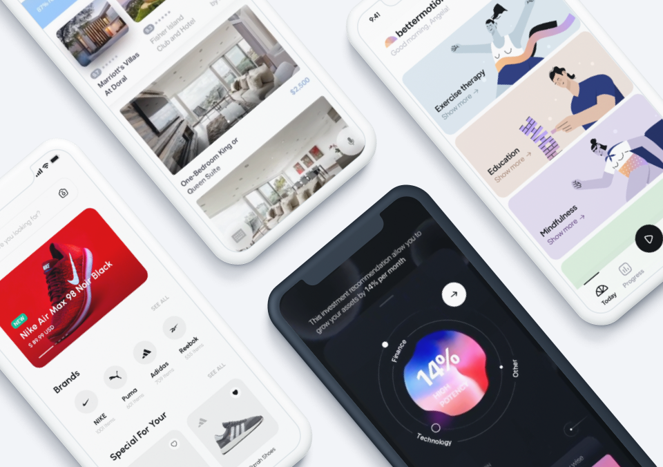
There are over 3.4 million apps in the Google Play Store — and just over 2 million in Apple’s App Store. That means that, on average, 3,389 apps are added to the Google Play Store per day — and while Apple is a little bit more selective, 1,557 apps still make it to the App Store daily.
If you’re a mobile app designer who wants your app to stick out from the daily deluge, you’ve got to create a product that’s both beautiful and enjoyable to use.
Need a little bit of guidance to make sure you’re doing everything you can to design a successful app? There’s no need to climb a mountain — we’ve got your 10 commandments of mobile app design right here:
1. Thou Shalt Not Overcomplicate Things
As an app designer, it’s easy to get carried away. When you’re bringing a new app to market, there’s a sense that you need to cram in all sorts of features that (in the moment) just feel so necessary. This is especially true when you’re working on a project with a team. No one wants to be the person who is constantly holding an axe over everyone else’s ideas — or the one known for cutting a killer feature out of a project. Yet with mobile app design, including extra features on the periphery often just leads to user confusion, and a cluttered, unfocused UI.
“Mobile users want a sleek and fast user experience. Loading up your app with a bunch of extra steps, or even trying to copy a desktop experience for a product, is the wrong design approach,” says Mark Tuchscherer, President of Geeks Chicago. “Mobile users will embrace a minimalist approach over anything else.”
We agree — limit your features to only what’s necessary, and while you’re at it, make sure your UI reflects a similar mindset. Your UI should do exactly what the user needs and nothing more.

2. Thou Shalt Ensure Your Design is Accessible
As we’ve said before, accessibility isn’t just something that’s nice to have — it’s a crucial feature that absolutely must be present in your app. To be blunt, if you aren’t placing accessibility in the forefront of your mobile app design, then you need to head back to the drawing board.
For one, it’s absolutely necessary to capture a representative audience, considering that 57 million Americans have a disability. In fact, there are more Americans on the Internet with a hearing impairment than there are total Italians in the world. The same goes for Americans with a visual impairment. Keep in mind — that’s just Americans!
Beyond that, accessible design is simply good design. Accessibility design best practices suggested by both Apple and Android highlight things that you absolutely should be doing anyway, like accurately labeling your UI controls, offering up focus-based navigation and avoiding audio-only app feedback.
And of course, regardless of if you’re designing for Android or iOS, you absolutely need to test your app with a wide audience. Don’t just pass it around your office — get it into the hands of a diverse population. The last thing you want is for your app to be unusable by a large part of the market.
3. Thou Shalt Not Reinvent the Wheel
While there might be a lot of devices out there, there are a few universal design and UX cues that almost everyone follows. Consider your own experience using apps: when you interact with your screen, you expect certain things to happen. In some apps, that could mean that you expect a menu to pop out from the side when you slide your thumb over it. For others, it could mean touch gestures that are logical and familiar, such as moving objects with a drag and drop.

We’re not suggesting that you simply put your app together piecemeal based on UI elements that are already out in the wild, but you should be aware of what your users are expecting from their app experience. Any new elements you add in will need to be explained, either by a custom onboarding process, or by intuitive learning. That adds an extra layer of complexity for your user. Unless you absolutely have no other option, it should be avoided.
Think about it this way: if you downloaded an app for browsing your photos and it required you to learn an entirely new way of interacting with your screen (say, by using gestures that you weren’t familiar with), would you continue to use it? What if there were another app that let you use gestures that you were already familiar with?
Don’t throw away convention just to differentiate yourself from your competitors.You should always work within the design language your users are familiar with, unless adding new elements is unavoidable and adds something to the app experience
4. Thou Shalt Always Remember Who You Are Designing For
If you’re designing a mobile photo editing app for photographers, you’re going to have different priorities than if you’re designing a word memorization game for toddlers. Every audience you design for will have different expectations, and each will be responsive to different types of designs.
It can be helpful to develop personas for fictional users of your app to model how you expect people to interact with it. Are you designing for a professional? A student? A doctor? An enterprise? A small business? Are you creating something that’s designed to be used by customers or staff? Programmers or designers? Musicians or runners?
Before you start sketching out a design, make sure that you know exactly what you’re creating — and who you’re creating it for. You should be able to boil down your goal and your target demographic into a single, simple phrase: “A dating app for travel lovers.” “A studio mixing app for novice producers.” “A network diagnostic tool for IT professionals.”
If you’re struggling to do that, consider why that’s the case — are you really focused on creating the best experience for your user, or are you just trying to design something that looks cool to you? Never lose focus of your target.
5. Thou Shalt Use Fonts That Aren’t Obnoxious
This design sin is something we’ve all experienced. It doesn’t matter if it’s in an app, on a letterhead from your doctor’s office, or on a PowerPoint slide — when a font doesn’t belong, we notice.
Enough has been written about the downfall of Comic Sans or Papyrus that you’d think mobile app designers would be paying a little more attention to the fonts that they use in their designs — but that’s not always the case. And simply avoiding a few bad fonts isn’t enough to make your app beautiful. You’ve got to find a font that fits your app and that doesn’t detract from your UX.
“Typography is an integral part of user experience, so it’s important to use clean and simple web fonts,” says Mike Spencer, the Senior UX/UI Engineer at Pointman. “I prefer sans-serif fonts for mobile apps, but what really matters is that it fits your design and is readable.”
6. Thou Shalt Stay Consistent
You need to make design choices, and stick with them throughout the app. Don’t have a top navigation bar on every page before abruptly switching to a slide-out side panel on a few select screens. Don’t use mellow earth tones for the splash screen and switch to pastels once it loads. If one button in your app has a certain amount of padding, then all of them should have the same padding. Your app needs to have a unified feel throughout, or it will be jarring and unpleasant for the user.

Maintaining consistency isn’t just about aesthetics. The design elements you use are subtly teaching your potential user something about your app. If you suddenly change the rules, then you’re going to throw them off and confuse them.
If there are other apps that are similar to yours, take note of what they’re doing designwise. This will show you what expectations users will bring to your app. You’ll notice that all of Google’s apps have a consistent look to them — same for Apple. If you’re designing something for a particular company or industry, make sure your app matches their style. Likewise, if you’re building an app for a certain industry, it should aesthetically feel “right” for that industry.
7. Thou Shalt Keep Mobile in Mind
Mobile app design is… well, mobile. Despite this, many designers seem to forget that users will be navigating their apps with their fingers (and in many cases, only their thumbs). While phones have gotten larger in the past few years, there are still plenty of users and use cases that require one-handed usability.

You should also think about the environment your users will be in. They may be sitting in a moving vehicle, or tapping buttons while they walk. If you have too many buttons stacked too closely or a screen cluttered with unnecessary design elements, your app will be difficult to understand, and unpleasant to use. Your UI needs to be clean and uncluttered, so your users can find the function they need and press the right button with ease.
Robert Grashuis and Jason Moccia, CIO and CEO of OneSpring respectively, note the importance of using plenty of negative space to help users navigate your app. “Too much activity on a screen distracts readers. Use white space judiciously to reduce clutter and help the user focus.”
8. Thou Shalt Remember User Flow
No matter how clean your design is, if your app doesn’t have a natural flow, it won’t win over users. Before you dive into mobile app design, you need to ask yourself a few basic questions, such as:
- What purpose does your app serve for the user?
- How will they navigate through it to get to the functions they need?
- How many pages will they have to parse?
- How many menu clicks will it take to access a certain button?
- Which functions need to be the most accessible?
This can help guide your design, by showing you exactly what needs to be included on each page. Ideally, this step should happen before you start sketching (or prototyping) your app. In a blank document or on a piece of paper, you can map out the user flow for various tasks. For example, if you were designing an app that helps musicians tune their instruments, you could have a flow that looks something like this:
Main Screen > Select Instrument [Guitar] > Select Tuning [Standard] > Select String [E]
You might decide to simplify the flow for common tasks. For example, your tuner could allow users to save a particular instrument and tuning combination to a button on the main screen. Once they’d selected their preferred instrument and tuning, the flow would look like this:
Main Screen > Saved instrument/tuning > Select String [E]
Mapping out user behavior like this can help you design an app that flows naturally. It also ensures that you won’t forget to add in a particular design element that might be crucial for your app’s success.
9. Thou Shalt Create a Realistic Prototype
Designing an app — not to mention coding it — can be a long, frustrating process. Nearly every designer or developer has had the experience of coming up with an incredible design, coding it and sending it off to a client, only to be told that it just isn’t what they’re looking for.
Likewise, juggling sketches can only get you so far. There’s a pretty big difference between something etched on the back of a napkin and a realistic prototype that you can actually test. While a sketch might get the general idea across, an interactive, realistic prototype can make your client jump out of their seat. And even if they aren’t thrilled with it, a working prototype will make it much easier to get feedback and make necessary changes.
Proto.io gives you the power to design realistic, interactive, fleshed out prototypes that behave just like “real” apps without requiring you to write a single line of code. That way, you can give your client and QA team a true, hands-on experience before you dive in too deep.
And speaking of QA…
10. Thou Shalt Test — Then Test Some More
Truth be told, when we first started outlining this blog post, we were tempted to make 1 – 10 “testing” — that’s how important QA is. This is something that should be obvious — in fact, almost every developer or designer on the planet will tell you that testing is crucial to creating a smooth UX.

And yet, we’ve all had that same experience of downloading an app and being utterly baffled by just how badly it runs — maybe it doesn’t boot up properly on our phones, or maybe the onboarding process is so horrific that you immediately delete it. Alternatively, it might work fine technically, but have design elements that don’t make sense, or text that isn’t legible.
Even if your app doesn’t have a fatal flaw, users can be fickle. One tiny mistake might be all it takes for them to never use your app again. To avoid this, test your app throughout the process. From your first prototype, to the moment you sent your launch-ready app off for validation, you should always be looking for things to fix or improve.
While these 10 rules will keep you on the right track, mobile app design isn’t just about following guides or checking items off your to-do list. You’ve got to get creative — the best apps find complex problems and solve them elegantly.
Need a little inspiration to get started? Check out our list of the 7 Best Designed Apps of 2017.
Proto.io lets anyone build mobile app prototypes that feel real. No coding or design skills required. Bring your ideas to life quickly! Sign up for a free 15-day trial of Proto.io today and get started on your next mobile app design.
Let us know what your personal 10 commandments of mobile app design are by tweeting us @Protoio!


