Color: when a design gets it right, you likely never notice it — but when it gets it wrong? It doesn’t matter if it’s an overly bright, eye-singeing background, or black text on a dark gray background, sub-par color choices can ruin even the most functional app. Much like other aspects of design, color isn’t just there to spice up an app. Color can be a tool just like any other feature of the user experience.
The graphic design philosophy used to design an app — from the size of each element, to how it slides across the UI, to yes, the color — impacts user behavior. There’s a good reason why designers frequently spend the first months of a project agonizing over color palettes and not wireframes, after all.
Picking the perfect palette can be the difference between designing a meditation app that actually helps users relax and one that causes them to want to toss their phone at the wall. It’s the difference between a banking app that makes you nervous about checking your balance and one that can soothe your anxieties about when that next paycheck is coming in.
So how do you get it right — and what can you do to master color in your design?
Graphic Design Philosophy: The Theory of Color
Before getting into the thick of graphic design philosophy (and psychology!), it’s important to understand some basic principles of color and design. While color might not seem like an exceedingly complex subject, there’s a good reason why every art class begins not only with a lesson on how to use color, but how to make color.
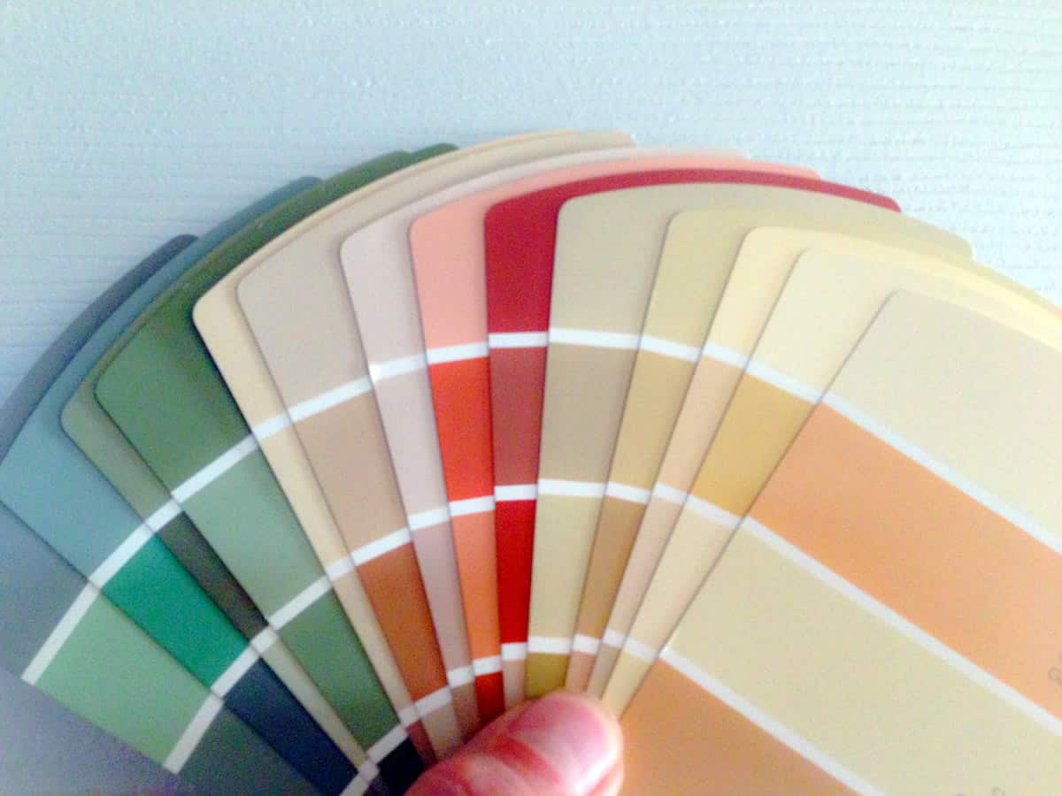
The basics — as explained by the color wheel — are simple: primary colors (red, yellow, and blue) can be combined to create secondary colors (green, purple, and orange). Likewise, various fractions of white can be added to a color to create tints, and black can be added to create shades.
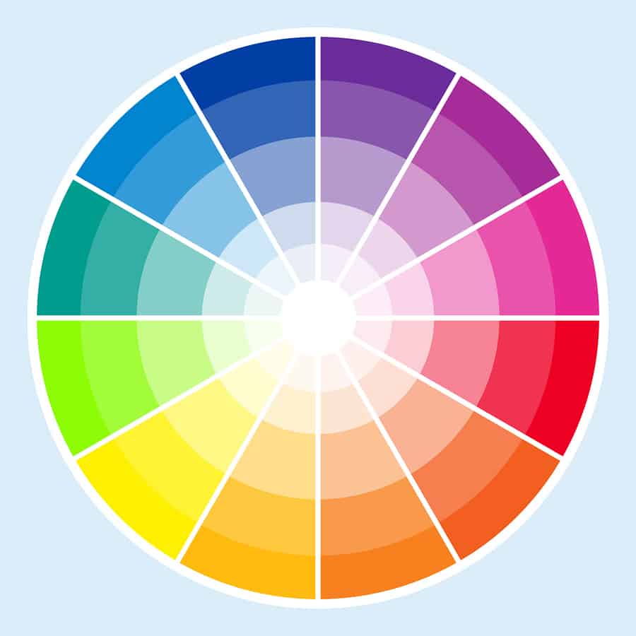
Colors opposite from one another (like red and green, or blue and orange) are considered complementary. These colors contrast strongly, making them stand out when next to (or on top of) each other. Colors that are next to each other are considered to be analogous. These colors have much lower contrast, meaning that they tend to not stand out as much when close together.
There’s nothing inherently “right” or “wrong” about colors with high or low contrast. Sometimes an application will call for bright colors that starkly contrast against one another. Other times, you’ll want something that’s a bit gentler. Generally, the more you want something to stand out, the more you should rely on contrasting colors.
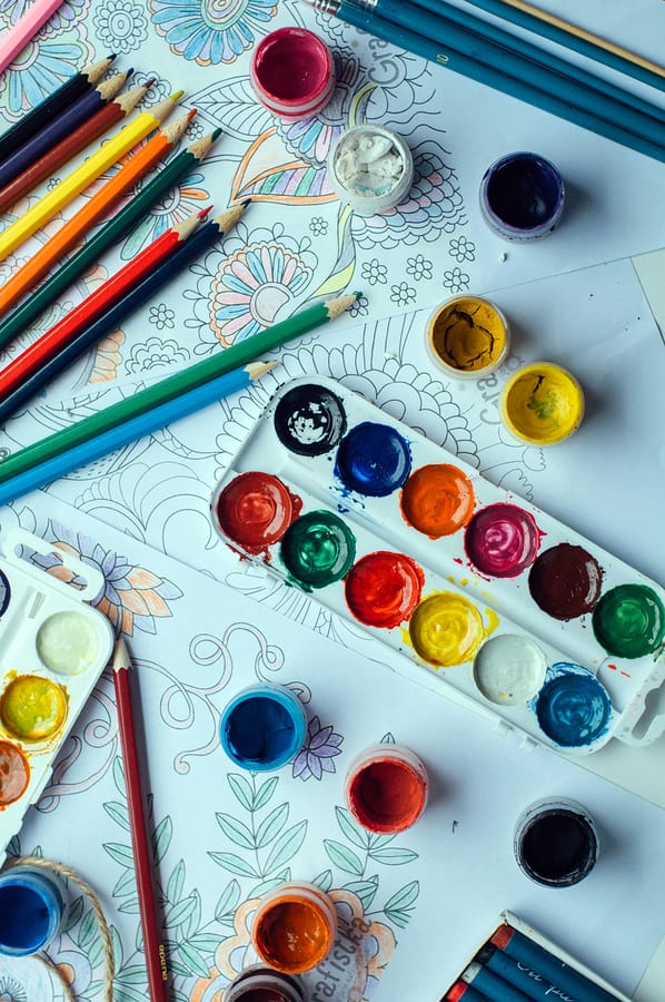
The best way to get a feel for how colors go (and don’t go) together is to play around with them. Even if you aren’t working on a project right now, a quick spin of Adobe’s color wheel might get your mind thinking about color in a new way.
Swatches of Emotion: Color and Psychology
When you’re solidifying the graphic design philosophy behind your app, you can’t just be thinking about how things look — you have to think about how they feel. We’re not talking about haptic feedback, either. Ever since Johann Wolfgang Goethe studied the physiological effects of color, we’ve been obsessed with using color to produce physical and emotional effects.
Even today, color takes center stage in many brands’ philosophy of design. Healthcare, business, and government all tend to use blue, as it gives off a sense of trust and professionalism. Green is seen as a youthful color that’s full of energy — and, of course, reflects a sense of environmentalism and closeness to nature. Red is energetic and impulsive, giving off the impression of speed, efficiency, and power. Every color that we see (and certainly every color that we intrinsically associate with certain brands) implies something, either directly or indirectly, that helps drive our perception of individual brands.
Think about the brands and symbols you recognize as being very color-centric. Apple, Wikipedia, and the New York Times all feature grayscale colors, symbolizing a calm trustworthiness. These brands are viewed as balanced and reliable. Whole Foods, John Deere, and Starbucks all feature green shades in their logos, connecting nature and wholesomeness to their brand and their products.
Some colors even go beyond their brands, defining entire industries. Think about how many fast food or restaurant chains use red or yellow color schemes, for example. These colors help trigger us mentally, placing us in a certain psychological place that primes us to purchase some sort of product.
While this is something that marketers figured out long ago, science justifies a lot of our mutual feelings about color. Red, for example, has been found to make some people react faster and more forcefully to certain stimuli. It also can intimidate: researchers found that when test takers saw the color red, their scores were worse.
Even stranger? The color of a pill has a mild effect on how it works. Blue pills work best as sedatives, yellow works best as an antidepressant, and in all cases, bright colors work best. While this is likely just the placebo effect boosting our responses to active medication, the effect is strong enough for companies to consider it when producing new pharmaceuticals.
Now, we’re not saying that using a yellow-based color scheme in your mood tracking app is going to make it effective as an antidepressant, but the color palette you choose could reasonably have an impact on a user’s mood — so choose wisely.
Color and Usability
Design isn’t just about looking pretty — it’s about functionality and usability, the two principles that are arguably the most important to any UX designer. If the UX isn’t smooth, it doesn’t matter how beautiful your chosen color palette is, or how stunning your UI is. If a user can’t swipe through it efficiently, it’s not going to have any staying power.
But what does color have to do with all of that?
Simple: color is a tool that can help guide the eye. If you can use color efficiently, you can guide a new user through your app without a lengthy tutorial, a series of complex videos, or even a single word. An intuitive UI uses color to direct not just the user’s attention — but also their interactions with the entire experience.
Imagine, for a second, that you’re developing an app for a catering company that helps large organizations easily customize food orders. A potential customer downloads your app for the first time and opens it up. What do they see?
In the app, most of the menu items — including the background and any information boxes — are colored in a muted, dulled palette of gray scale colors. The one exception is an orange-red box that says “order.” As the designer, you know that the number one thing users want to do when they’re using your app is painlessly set up their food order. Instead of hiding this feature deep in the app, or requiring them to scroll down page after page to get to it, you’re putting it front-and-center. Not only that, but you’re drawing their eye to it immediately. Color helps it stick out, and shows new users exactly where they need to go.
Likewise, we interact with color in various ways on a daily basis and build up certain social associations in our minds. Take a stoplight, for example: green means go, red means stop, and yellow means slow down (or it alerts us to something up ahead). By putting an important warning in yellow, or by using red to highlight something, you can powerfully convey a message that primes a user for their input.
That same logic can be used for more than just warning screens, however. Changing the color of a button on your app that leads to in-app purchases can significantly impact conversion rates. While it wasn’t inside of an app, HubSpot found that they could increase their conversion rate by 21 percent simply by making a button red instead of green. Now, this doesn’t mean you should change every in-app purchase button to a bright crimson, but there is an argument to be made here that color can’t just be part of your philosophy of design: it has to be central to your entire app development philosophy.
Using Color Wisely: A Philosophy of Design and Accessibility
At Proto.io, accessibility is always at the forefront of our design philosophy. To be blunt, accessibility is something that must be baked into good design. If it’s not there, then the design simply isn’t very good.
Around 8 percent of men and .5 percent of women have some form of color blindness. Contrary to popular thought, there isn’t a singular kind of color blindness, but red/green color blindness tends to be the most common. Someone suffering from this form of color blindness will generally have trouble seeing variations of both red and green. While the severity of this form of color blindness varies quite a bit, even mild red/green color blindness can make using many apps virtually impossible.
Outside of color blindness, nearsighted users often struggle to read text with low contrast unless they move the screen close to their face — something that can potentially break the usability of many apps.
The solution to both of these problems is fairly simple: avoid using non-contrasting colors when you’re displaying text on a background. While you can’t guarantee that everyone will be able to see your app the way you intend, if you’re using contrasting colors, you’ll at least be giving people an app they can use. Likewise, using high contrast colors will make text easier to read for everyone — even if they don’t have a vision problem.
Another option to increase accessibility is to offer swappable color palettes in your app. While this isn’t an option for everyone, it can greatly boost the accessibility of your app. You could also allow users to change the color of specific features. For example, you could have an option that changes your app’s accent color, or the color of the text throughout the app. While both of these options might take some control away from you, they will ensure your app is accessible to a wider audience.
If you’re still struggling to figure out how to integrate color into your design philosophy in a way that doesn’t harm the accessibility of your app, we suggest checking out Google’s material design library.
Picking the Perfect Palette: Solidifying your Design Philosophy
Even though it should be clear that there are some rules to follow when it comes to color, it isn’t necessarily a science either. Color is often about more abstract things, like feel. Even if your app isn’t trying to manifest some sort of emotion in a user, that doesn’t mean that it won’t. While finding the perfect palette isn’t a black and white endeavor, we do suggest starting with something grayscale.
Build a flat prototype of your app in a grayscale gradient and use that as your baseline. Take note with how it looks and feels: pass it along to your QA team, and see what they have to say. Is your onboarding process murky without color? Are you drawing attention to the wrong parts of your app? With this feedback, design a few more prototypes, this time bringing in color. Don’t rely on a singular palette. Instead, take a cue from Google’s material design website and play with a few of their swatches.
Send these revisions to QA, too. Don’t be afraid to A/B test them against each other (and against the original grayscale version). Make sure that you’re asking some hard questions about the colors you’re bringing into the fray. Are you using color to guide the user’s eye in the app? Are you just throwing color on the screen for the sake of adding a spark? Is color distracting the user from getting to where they want to be going?
Don’t forget about user psychology or accessibility. If you are creating a travel app, do you really want everything to be bright red? If you are creating a healthcare app, should your background really be green? Do your colors contrast enough for text to be legible?
Good UX design takes all of these questions into account — after all, color has a definitive impact on user behavior and enjoyment. If your design philosophy isn’t taking this into account, you could be making an app that isn’t as accessible or useable as you think it is. Make sure you’re prototyping your design every step of the way, and don’t get too hung-up on one or two colors. Experiment, pick another color, and continue to revise until you land on a palette that’s perfect for you.
Proto.io lets anyone build mobile app prototypes that feel real. No coding or design skills required. Bring your ideas to life quickly! Sign up for a free 15-day trial of Proto.io today and get started on your next mobile app design.