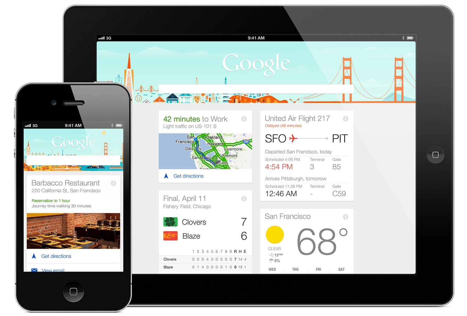
Usually when we think about tech companies and design trends, Apple rises head and shoulders above the rest as a linchpin of digital aesthetics. And Apple certainly isn’t backing down from its position — with the Apple Watch, it’s positioned to reinvent the way we think of smart watches in the same way it did mp3 players, smartphones and tablets, all of which have set the standard for user interface design in mobile devices.
However, over the past few years, Apple has had to make room for some other players. First, Microsoft helped to usher in the era of flat design with its geometric, brightly colored Metro UI. Then, Google moved in, bringing with it the card-based aesthetics of material design.
But what is material design, exactly, and does it breathe life outside of Android? How will it grow and evolve from here? While only time has guaranteed answers, one thing’s for sure: material design is picking up steam, and whether or not it has lasting effects on the way mobile app companies approach mobile interface design, its principles merit a closer look by designers and developers alike.
Flat Design and Skeuomorphism
Before diving into what material design is on a philosophical level, it helps to get an idea of the aesthetic struggle that begat it, and the conflict it sought to resolve. Looking at a few examples of material design, you get the idea that it combines geometric elements with a sort of physics.
Unlike with flat design, there are shadows, and a sense that the elements live and interact with each other in space, as opposed to inhabiting the same plane. Unlike with skeuomorphism, the elements don’t resemble textures and patterns found in nature, nor are they overly glossy.
In essence, material design is the natural answer to the flat design vs. skeuomorphism debate. Team flat design, championed by the likes of Microsoft circa 2010, argued that the digitally synthesized textures dominating skeuomorphic user interface design were gaudy, phony and outdated. Think of the faux wooden textures you saw a lot in mid-2000s web design, or integrated into the first generation of iOS. What made these any different than the faux wood paneling we now associate with furniture from the 1970s?
A Visual Language Evolves
While in the mid- to late-2000s, it wasn’t uncommon to see high-gloss corporate logos, mobile interface design that applied generous quantities of drop shadow and highlighting and websites that looked like they were coated in a rich, shiny lacquer. The flat design revolution quickly took over.
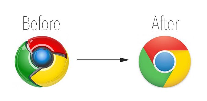
Perhaps the most visible evidence of this for the web-going populace was the 2011 update to the Google Chrome logo. The old logo looked like a three-dimensional aperture doused in a generous coating of car wax, with ample highlights and shadows. The new logo was all but completely flattened and matte, with a few subtle gradients to show Google hadn’t abandoned the third dimension all together.
Around that time, web and mobile interface design started unfolding, flattening and mattefying to pick up the trend. Meanwhile, bloggers and commentators were breathless over 2010’s Windows Phone launch. Sure, it might not have the ecosystem of iOS or Android, they were saying, but that Metro UI tile-based design — full of brightly colored, flat rectangles — was surely the harbinger of things to come in the design world.
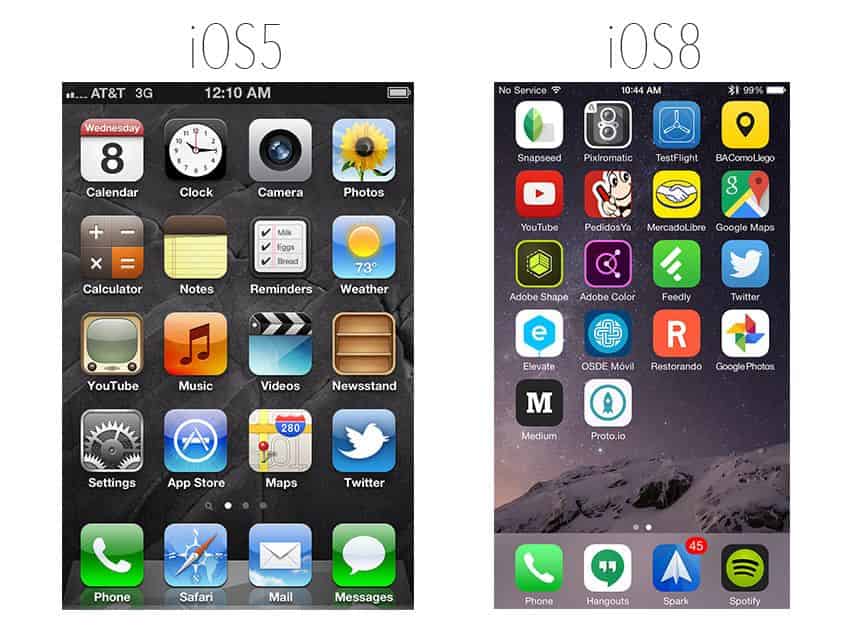
And as many millions of websites and apps have proven over the past few years have proven, they were right, though Windows Phone has yet to bring flocks of Android and iOS users into the Microsoft fold. Even Apple, arguably the master and biggest mascot for skeuomorphic design, flattened its aesthetic approach with 2013’s release of iOS 7.
Form Versus Function
But flat design also wasn’t without its detractors, or its usability flaws. While Metro was a brilliant user interface design on a mobile phone or on the Xbox 360, when Microsoft brought it to Windows 8, there was quite the hue and cry from both enterprise users and consumers. There were a few reasons for that, but one of them was just that form was getting in the way of function.
As it turns out, the drop shadows and highlights that made skeuomorphic design look cheesy or garrish to flat design fans also make things easier on the user. If you have two windows stacked on top of each other, a subtle shadow can help you tell them apart. A simple highlight makes it easier to discern which tab is open.
All of this wasn’t as big a concern in the mobile world, since mobile user interface design tends to be much simpler, and you don’t deal with as many stacked layers of elements. But mobile also doesn’t exist in its own little bubble, separate from desktop web design. Moving from flat design branding and mobile experiences to a skeuomorphic web experience can be visually jarring, and doesn’t promote a consistent visual language across your brand.
In short, skeuomorphic design was looking kitsch and outdated, hitting on real-world metaphors too literally. Flat design, while en vogue and visually appealing, wasn’t functional enough to solve user interface design problems, especially across different platforms. The designers at Google, at least, felt that there had to be another way.
What is Material Design?
While skeuomorphic design sought to bring textures from the physical world into a digital context, and flat design sort of rebelled against the idea that the digital world had to reflect “meatspace,” material design takes user interface design a step further, asking, “How should elements living in this device behave?”
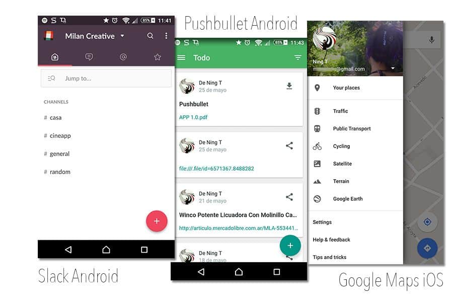
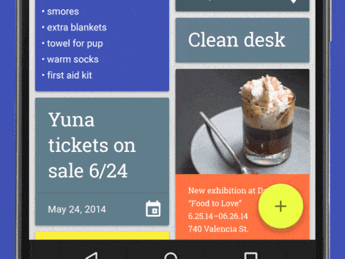
One of the first examples the world saw of material design was in 2012, with Google Now, Android’s personal assistant app and answer to iOS’ Siri. Google Now’s user interface design borrowed from the card-based layout aesthetic made hugely popular by Pinterest a few years back, but with its own twist. The typography (Google’s Roboto font) is simple and unobtrusive, and the cards animate in a way that makes them feel almost as though they move and populate within the physical device. As one card slides up, the other slides out of the way with a certain inertia, as though it has some heft to it.
Even the way you open the Google Now interface — by swiping right on your Android phone or tablet, rather than tapping on an icon — speaks to a new way of imagining the way digital elements should behave inside of a device.
Source: Google Official Blog
Without diving into Google’s visual philosophies behind material design, a casual onlooker might sum it up this way: it’s a card-based user interface design language that employs material metaphors. Now, these metaphors aren’t as literal as what you would see in skeuomorphism. Rather than seeing overly glossy surfaces or elements that resemble wood or paper, you’ll see shadows, three-dimensional animated responses (press a button, and the button will appear to move from the back of your phone to the surface) and other qualities you’d expect from objects that have physics.
Unlike with flat design, in material design, there is depth. Unlike with skeuomorphism, there’s no unneeded shine. The elements in material design don’t mimic nature — they have their own nature.
Basic Principles of Material Design
“Maybe this is Google’s way of filling the void left by the demise of richly textured skeuomorphic designs? In any case, we can only hope it will add a little warmth and humanity to digital design and save us from a world where every app looks and behaves the same.”
– Sacha Greif, Designer, on material design
Google lists three basic user interface design principles to its material design philosophy:
- Material is the metaphor
- Motion provides meaning
- Bold, graphic, intentional
Together, these form an overall philosophical approach to user interface design that Google Vice President of Design Matias Duarte hopes form an enduring visual legacy:
“I don’t want to be looking four years down the road, ten years down the road and saying, ‘Well, material design — all those ideas, those frameworks — they’re over.’ The principles behind them, I think, should be timeless. Maybe we don’t have them right yet, but I believe we’ll get there.”
So is material design not just a specific aesthetic cooked up by the creative minds of one of the world’s biggest brands, but actually a disruptive way to look at the way users interact with their devices? Let’s take a look at each principle to see what Google’s getting at.
“Material is the metaphor.”
This is the basic credo behind material design: it tries to conceive of what the actual materials in the digital world (specifically inside of the digital device) look and behave like. This gets a bit heady and metaphysical, so imagine it like this: your phone has depth to it, right? Maybe a few millimeters of actual, physical materials. Glass, aluminum, plastic. There’s a certain distance between the screen and the back of the device.
Instead of thinking of the screen as a completely two-dimensional plane, material design conceives of it as almost a looking glass into the device, which now contains digital objects in place of its physical materials. That means that there is now space for these objects to move around in — not just laterally, but also from the back of your device to the surface.
“Motion Provides Meaning.”
“The emphasis on motion and nailing microinteractions is an intensely refreshing component.”
Grace LaRosa, Senior Experience Designer at R/GA, on material design
But now, we have to consider the physical properties of these digital objects. They have to have some sort of weight and inertia, some physics when they bump into each other or move around each other. This is where it gets tricky, because while the physics should make sense to those of users who live and move in the physical world (and occasionally bump into things), you can’t just replicate real world physics in the digital world.
That’s where skeuomorphism goes astray: it ignores the native possibilities of a digital world where gravity isn’t 9.8 m/s/s and perpetual motion isn’t an inventor’s pipe dream. Says Google, “The flexibility of the material world creates new affordances that supercede those in the physical world, without breaking the rules of physics.” The user should at least feel some familiarity with these digital physics — light casts shadows, close-up objects look larger than farther ones, etc. — but the designer shouldn’t ignore the “new affordances” that are possible when you’re not dealing with real, physical materials.
Source: John Schlemmer
Quantum Paper
What are these “new affordances,” exactly? To understand them better, you can look to the original working name of material design: “Quantum Paper.” True to the geekiness that forms the basis of Google culture, the designers looked to the strange, sometimes kooky realm of quantum physics to inspire its user interface design principles.
Without getting into stuff like the Heidegger Uncertainty Principle or whether light is a particle or wave, quantum paper is basically just a paper-like digital material that can “expand and reform intelligently,” according to Matias Duarte. “Material has physical surfaces and edges.” Imagine a sheet of paper with many different sections of content — with quantum paper, you can divide that sheet into its various sections, reorganize them, bring some to the surface, hide some, expand some.
How does the user know all this? You need to make it intuitive with “seams and shadows,” says Duarte. If all goes well in your user interface design, your user should get a natural hang of the physicals of the digital world, knowing what can be touched, moved or altered.
“Bold, graphic, intentional.”
But there’s more to Google’s design philosophy than physics. Material design takes after many of the same things we associate with flat design: simple, but bold color schemes, clear, readable typography and plenty of “intentional white space.” In terms of color and layout art, you want the user interface design to be unobtrusive, so that the “emphasis on user actions” remains the highest visual and kinetic priority. Don’t distract your users, but guide them to interact with the digital objects inside of their devices in a way that is both natural and visually pleasing.
If you’re designing a UI based on material design principles, let your photography and other imagery stretch across the screen, rather than corralling it into a box or a corner (of course, this is a popular visual trend outside of material design). Choose fonts that are easy to read across a multitude of devices and a small, simple palette of colors that look striking, but pleasant against each other. (Google provides sample color palettes in its material design style guide).
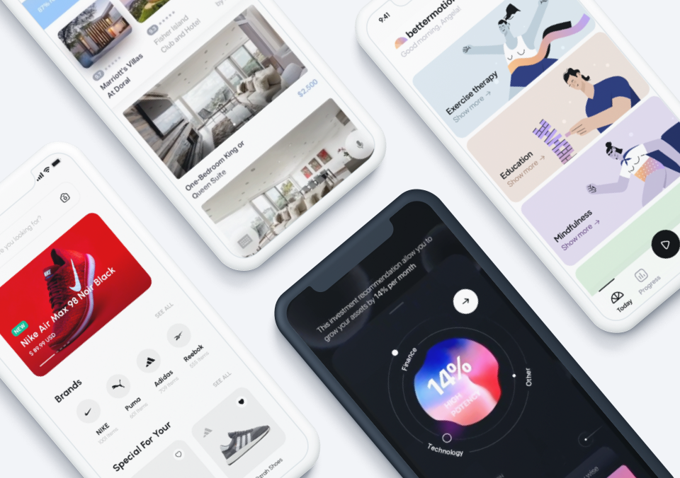
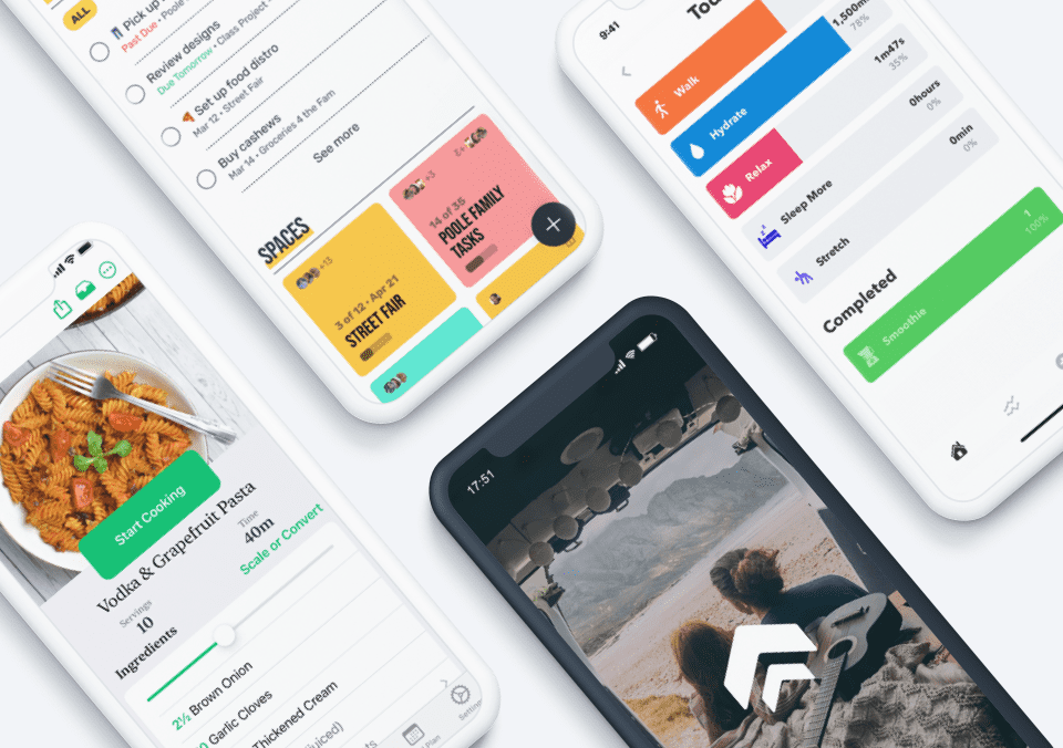
Card-Based Design: Focusing on User Behavior
One of the reasons to believe material design might pick up some serious steam over the next year or so is the already on-trend nature of card-based design, which has seriously influenced Google’s current design philosophy. By de-emphasizing more traditional menus and buttons and revamping user interface design with “index cards” with pertinent information and illustration, card-based design gives the user a more curated web and mobile experience, putting less onus on the users to navigate to the content they need and instead serving up that content based on the user’s previous behaviors, likes, searches, etc.
Source: Ramotion
Given the curated nature of card-based design, first made famous by Pinterest and followed shortly by social networks like Facebook, Twitter and Google+, it’s no wonder Google is capitalizing on it. User behavior algorithms are, after all, what it does best.
OK Google, What’s Next?
It is without doubt that material design has already had its fair share of critics, such as the expected complaint that material design simply does not fit well with iOS. Nonetheless, it’s been a year since material design was announced and we’ve definitely seen a rising number of app developers and designers scurrying to update their designs to match the more modern and sleek material design.
How will all of this evolve? How will the experts at Google Design further develop and refine material design? Only time will tell, but for now, the principles of material design are interesting enough — and the results beautiful and usable enough — that we think it’s definitely something designers should look into, if they’re not already. Even if you mainly design for iOS, the notions of material metaphors and object physics can still play a role in your user interface design.
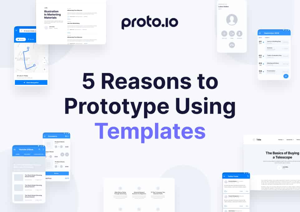
Using Material Design in Your Digital Prototypes
One quick way to take material design for a spin is to throw together a quick prototype of an app using material design principles. We recommend you read through Google’s guide on material design for any specific layout or animation questions you might have, then go to Proto.io to create a fully interactive prototype of your user interface design. Two-dimensional wireframes can’t give you the full experience of material design — for that, you need movement. With Proto.io’s interactive Material Design UI library, you can create a living, breathing Material Design-inspired prototype, complete with animations and user interactions, in a matter of minutes.
Don’t have Proto.io yet and anxious to get started on implementing Material Design? No problem. You can sign up for a free trial of Proto.io today.
What do you think of Material Design? Is it a passing craze, or an enduring way to look at user interface design? Let us know, tweet us @Protoio.