Arthur C. Clarke’s Three Laws are batted around technology and design communities so frequently that they almost have become cliche — especially the third:
Any sufficiently advanced technology is indistinguishable from magic.
 The term “magic” as it applies to technology and app design has become part of the common parlance since Steve Jobs described the iPad as “magical” back in 2010. But what does magic mean in the context of designing a mobile app? Some mobile experiences just stand out. There’s beautiful design, there’s functional design and then there’s magical design, which weaves the two together in a way that dazzles the user. If you’re looking to inject a little magic into the process of designing a mobile app, consider the following:
1. Heed Arthur C. Clarke’s Second Law by venturing “into the impossible.”
While the famed science fiction author might be memetic for his Third Law, Arthur Clarke’s Second Law gives us an idea of how we might accomplish making technology “indistinguishable from magic”:
The only way of discovering the limits of the possible is to venture a little way past them into the impossible.
When designing a mobile app that you want to feel like magic, start by considering what’s currently thought to be impossible — and then make that your aim. Think of every great design breakthrough that has revolutionized its industry. The Ford Model T made it possible for middle-class people to have horseless carriages. The original Macintosh computer made personal computing easy-to-use and intuitive with its GUI (though Xerox should really get the credit for that innovation). When Atari brought arcade games into the living room and turned millions of television sets into interactive conduits for gameplay, it stretched the limits of what was possible at the time. 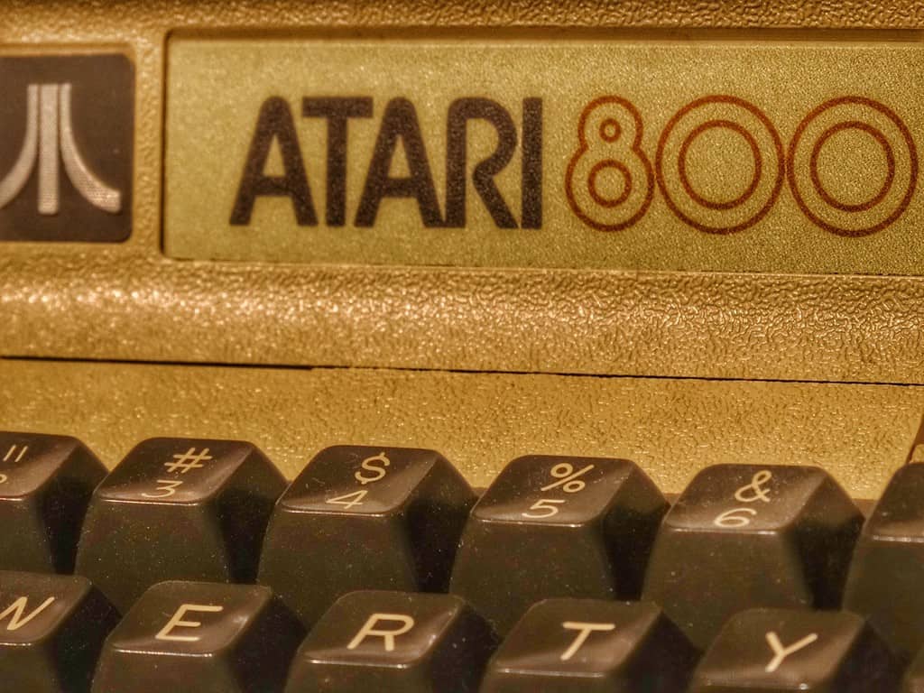 In graphic, web and mobile app design, we have had plenty of those moments ourselves. Before @font-face and WOFF, designers were restricted to using “web-safe” fonts in any live text. If, while designing a mobile app or website, you wanted to include beautiful typography, you’d have to render it static inside an image. The thought of using typography as a major element of web design was impossible in the era of Arial, Trebuchet, and Comic Sans (cue collective shudder). Now, we have robust libraries of beautiful typefaces at our disposal. Maybe the biggest moment of the impossible becoming possible in mobile app design was the introduction of the touchscreen. Before we made what now seems like the obvious move of touching our phones to move from element to element, screen to screen, we had to rely on arrow keys and haphazard controls. This was a massive enough paradigm shift that it eventually brought down the once triumphant BlackBerry, which seemed to have a corner on productivity apps with its QWERTY keyboards and trackballs. Before 2007, the idea of huge touch-enabled app ecosystems available on smartphones with the computing power of yesteryear’s supercomputers seemed pretty far-fetched.
 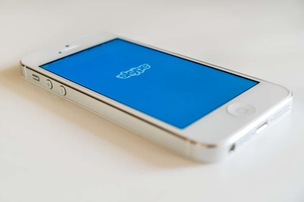 Try bringing this ethos into your process while designing a mobile app. Consider the most revolutionary and ubiquitous apps, and the impossibilities they make real. With Instagram, everyone is a photographer. With Google Maps, you can find where you need to go simply by entering your destination into a search engine. Skype not only allows you to see the person you’re calling (from anywhere) but does it for free. The most memorable and magic mobile apps make what before seemed impossible not only possible but impossible to live without.
2. Make the experience, so natural the user barely has to think about it.
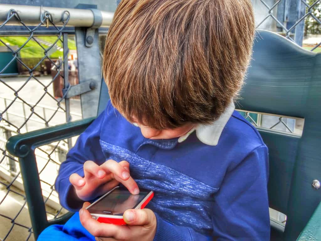 What’s the difference between magic and technology, from the user’s standpoint? Cinderella didn’t have to press a button or type a series of commands to summon her fairy godmother. Gandalf doesn’t kill the Great Goblin by inputting a sequence into a terminal guiding a missile. The less you have to fuss with technology, the more it feels like magic. Not only should the technology do the work for you, but it should do it in such an unobtrusive way that the user is taken aback by its elegance. A lot of this comes down to your UI/UX design, and the gestures the user has to perform in order to interact with your app. After all, using a touchscreen feels more magical than using a mouse. Giving voice commands and hearing Siri, Google Now or Cortana answer your beck and call is more magical than touching a screen.
It's the moment when it just makes sense, and you wonder why we haven't been doing this all along.
says James Carolan, Digital Media Manager at MetroMultiMedia, an audiovisual production firm that helped run the Windows 8 launch event. “The first GUI, the first time you used a mouse and the cursor moved with the mouse. Or when Steve Jobs pinched his fingers together to zoom on the very first iPhone. The first time you connected a device to your TV and didn’t having to figure out the correct resolution. When I can just tell my Xbox to go to Netflix and never have to pick up the controller.” The bottom line? Says Carolan,
When tech works the way it's supposed to work, it creates an experience. All of a sudden you're Tom Cruise in Minority Report.
Think about Tinder for a minute. Right now, the dating paradigm for millennials is swipe left, swipe right. The user puts in the least amount of effort to register an input, and that swipe adds another person to your dating pool. An otherwise complex process (find a person in your area, determine whether you find that person attractive, save that person or exclude that person from your list of options, notify the person that you’re interested) is reduced to a fraction of a second. Magic. While we’re on that note, it’s also important to…
3. Keep it simple.
If you look at VentureBeat’s 14 most beautifully designed apps of 2014, you’ll see a common trend: simplicity. They cite Evernote for its “distraction-free” functionality. With Acorns, you “simplify investing.” Overcast is “a smart and simple podcast player.” As Henry David Thoreau would say,
Our life is frittered away by detail... simplify, simplify.
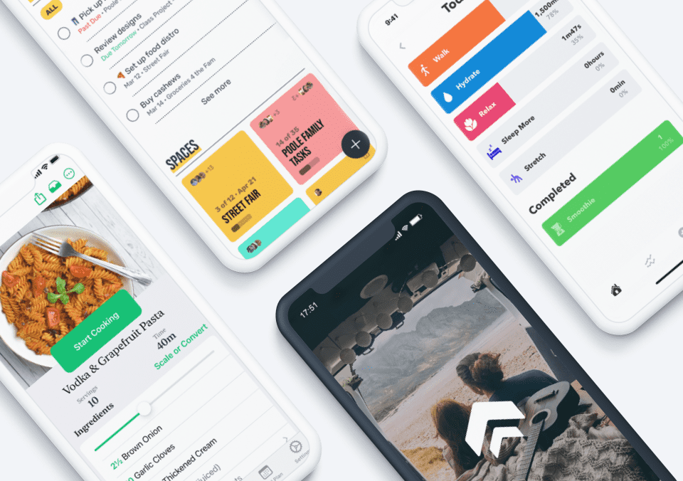
But while simplicity makes for a better aesthetic experience, does it also make your app more magical? Again, the less the user has to think about the app, the more magical the experience. That doesn’t just go for user inputs and gestures, but also the layout and graphic design. When designing a mobile app, remember that the fewer elements the user has to look at, the less the user has to think about the app, wondering which buttons to tap or swipe at. When in doubt, cut it out — try making any instructions or copy as short as possible, and remove any imagery that isn’t necessary to the experience. Meerkat is a fantastic example of a simple UI with a simple design delivering a powerful user experience. All you have to do is tap a single button to start a video stream viewable by your Twitter followers. The user input (two buttons and a text field, for naming your stream) shares the screen with the adorable, unobtrusive cartoon meerkat that serves as the app’s logo. That’s it. There’s no room for a user to get confused about what to do, and no distracting imagery or copy.
4. Create a consistent, immersive experience.
To illustrate this point, think about the most successful fantasy worlds out there. Anyone who has read a Harry Potter book can picture Hogwarts in an instant. The same thing with Middle Earth in Lord of the Rings. How about Westeros? What makes these worlds so successful?  A big part of it is imagination (seriously, how does all of that political intrigue even fit in George R. R. Martin’s head?), but another part is consistency. You’re not going to walk into Rivendell and see a bunch of rowdy high school kids playing Quidditch. We know what to expect from these fantasy worlds because they’ve been so meticulously crafted, and the details are consistent. Any nineties kid can even picture the font used for the chapter names of the Harry Potter books. When designing a mobile app that feels like magic, the same principle applies. The gestures you use should be consistent from screen to screen — the same goes for your typography and color scheme. Think about Instagram. The output of the app follows the same aesthetic: perfect squares, usually with some sort of colored filter to add a nostalgic feeling to the photo. You can close your eyes and picture what an “Instagram photo” looks like as easily as you can picture the dining room at Hogwarts. If you can create the same level of immersion and recognizability when designing a mobile app, you’re doing magic.
5. Don’t skimp on quality assurance when designing a mobile app.
The most surefire way to ruin any magical effect your app may have is to shortchange the QA process. Magic wands don’t require you to turn them off and on again several times before they cast a spell, and no user will get lost in an immersive, well-designed experience if they encounter a crash or an error message. We get it. Clients have deadlines, and QA is the last step, and often the most likely to get squeezed. Sometimes you go through so many rounds of design changes, copy changes and legal QA before you can even start programming the actual app, and then you’re mostly focused on getting it out the door. Your client probably won’t be the wiser, right? And if they do, you can work out the bugs in a later update. Wrong. The fact is, magic is sort of the law of the land when designing a mobile app, and users are getting used to the one-touch functionality of apps like Meerkat, or the powerful reliability of Evernote. The most beautiful interface in the world won’t save your user experience from breaking if the app crashes, or fails to do what it’s supposed to do. All it takes is a single one-star review on the iTunes App Store or Google Play to turn off a potential user, and even if the user downloads your app anyway, they’ll seek another as soon as they encounter an experience-breaking bug. And of course, don’t forget the platform. Sometimes, what breaks the experience of your app has less to do with how you’re coding or designing a mobile app, but with the platform it runs on. When people complain about the bugs and issues in Android 5.0 (Lollipop), they’re complaining about how those issues affect their individual app experiences. It’s crucial that your QA team keep on top of potential issues in each of the platforms you’re releasing the app on, and test those issues once you have an available beta. When designing a mobile app, it’s also important to test it on multiple devices. While there are programs available that simulate how your app will look on varying screen sizes, it’s still best to open the beta on actual, physical devices of different types. This is especially true of Android, since the OS runs on devices made by a multitude of manufacturers. QA helps you ensure that technology is “sufficiently advanced,” and therefore magical. Remember: magic is what makes fairy tales and technology delightful. “Delight” isn’t the word that comes to mind when the app you were excited to download keeps crashing.
6. Keep development separate from the design process.
Maybe this sounds familiar: you’re designing a mobile app for a client, and you go through so many rounds of little design or copy tweaks that you’re not hitting any goalpost deadlines. This is especially true with clients who have multiple compliance teams checking for legally kosher copy, accessibility guidelines and brand consistency (you better make sure there’s enough white space around that logo!) To save time, you decide to start programming while the designers and copy teams are still updating the mock-ups, and then you end up with a coordination mess: the client comes back with feedback, the feedback must be reflected in both the design comps and the beta, and you end up with a million revisions to track. Invariably, something gets lost in translation, and QA becomes a mess. And that leads to our prior problem: poorly QA’d apps are not magical apps. Design first. Develop second. QA thoroughly. If you need to push back deadlines, do it. If an app is dead on arrival, it doesn’t matter if you made it in on time. When you tighten up management, the entire process of designing a mobile app goes much more smoothly, which makes for a better (and more magical!) product.
A Magic App Begins with a Magic Prototype
When designing a mobile app that feels like magic, a lot of pieces have to come together. The design has to be tight. The experience has to be simple, accessible and powerful. And you have to have time for every part of the process, from concepting to QA. Having the right tools makes all the difference. Imagine putting the power of creating the entire user experience in the hands of the designer. That means you can show the client or potential user a prototype that’s as close to life as a beta of the actual app, complete with movement and animation. Any feedback can be ironed out in the design process, so the developer doesn’t have to worry about incorporating endless rounds of design revisions. With Proto.io, that’s what you get. Whether you’re a veteran designer with years of agency experience under your belt, or you’re designing a mobile app for the first time, Proto.io’s intuitive drag-and-drop interface makes it easy to take your static designs and turn them into a living, breathing prototype.