It’s a widely-known fact that mobile app designers tend to favour designing for iOS. However, Android devices are dominating the smartphone market largely due the lower price-points especially when compared to the high-end iPhones. Given the proliferation of Android devices across the globe, you’d think that it’s about time for mobile app designers to take Android seriously.
To be fair, Android hasn’t always been the epitome of great design — the approval system for the Google Play Store is lenient resulting in many apps that lack even a modicum of UX design. But yet, let’s not forget that the days of Android Ice Cream Sandwich are over. With the release of Material Design, Android has demonstrated that it’s not about to be dismissed into the abyss of bad design. In overall, Material Design is gorgeous, effective and meaningful.
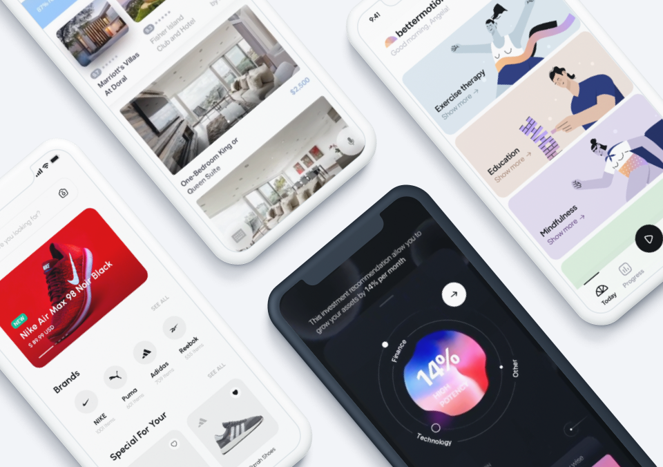
Despite Android’s shift towards a greater emphasis on design, resources to become a better Android app designer aren’t exactly abundant. The knowledge bank is still growing. So we’ve rounded up our expertise to share with the community 4 important things to keep in mind when it comes to good Android UX design.
1. Adaptive
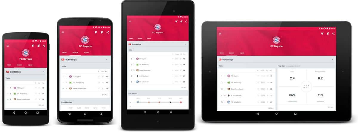
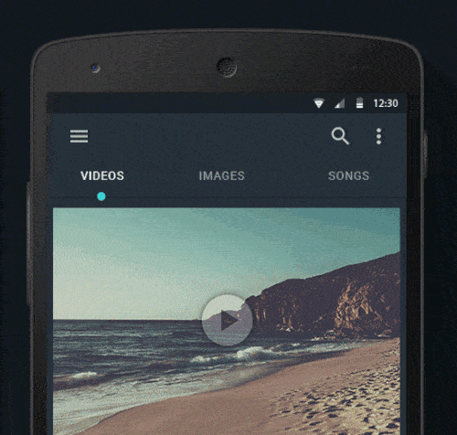
We’re already mentioned the one catch of Android apps: fragmentation. Too many devices, too many screen sizes. It’s no wonder designers tend to opt for iOS instead. Designing for varying screen sizes and resolutions is a headache that no one wants to deal with. But such a challenge requires nothing more than greater creative thinking from designers, which can ultimately lead to better Android UX design. The design strategy that best handles this potential problem is Adaptive Android Design.
The adaptive approach is nothing new. Those coming from a web design background would already be familiar with responsive design frameworks. If you’ve read the Google Design guidelines, adaptive UI is well-explained and detailed. The idea behind Adaptive Android Design is to accommodate to as many different screen sizes as possible. It’s to not make the phone user feel like they’re using a tablet and the tablet user feel like they’re using a phone.

When designing apps, we tend to start with smaller screen sizes. Often, designing for larger screens becomes secondary and an app ends up looking somewhat ridiculous on a tablet. Scaling up should not be an afterthought but a factor to consider throughout the entire design process. Especially when an app is content rich, optimizing screen usage is a challenge. You have to consider how to adapt the layout in a way that still makes sense to the user. No doubt, it’s more work for designers but to ensure an optimal user experience for Android users, it’s necessary.
For instance, tabs may look and feel great on smaller phones due to limited space. But when displayed on a larger screen, there is a risk of grossly under-utlizing the available screen real estate. Cards-style UI, an increasingly popular trend of mobile app UI design, are highly flexible. Using cards allows for adaptive re-arrangement of content from smaller screens to larger screens without breaking consistency. When aiming for great Android UX design, don’t neglect the larger screens. Think adaptive, design adaptive.
Source: Android UI Patterns
2. FAB
The Floating Action Button, better known as FAB, was introduced along with Material Design. FABs are loud, attention-grabbing circular buttons that are usually located in the bottom right-hand corner of the screen. Typical FABs are given bold colors and shadows. They are used for “a promoted action”, as indicated by Google, and they represent the one action users perform regularly.
Source: Google Design
FABs are wildly popular in Android apps that went Material. They are also becoming increasingly common in iOS apps. But is the FAB good Android UX design? The arguments seem to go both ways.
Those arguing against FABs claim that they are just too much in the way and distracting for the user. Granted, the size and fixed position can serve as an obstacle for touch points that just happen to sit under it. The bold colors just demand to have users’ eyes on them. What’s worse is that it’s often difficult to determine which is the one action that users usually perform and therein lies the potential of a UX failure.
Those in favour of FABs argue that the point of using a FAB is indeed for it to stand out as the action it represents is too important to ignore. Besides, how often do users look at the bottom of a screen? To avoid blocking content, there can be workarounds in the app’s UI. The FAB offers a quick and easy access point to a primary action. If the action represented isn’t a primary one, then the design team has failed to understand their users.
Source: Proto.io Spaces
Whether you think that the FAB is fabulous or frightful, the main takeaway is that understanding the users and thinking through the average user flow are crucial for good Android UX design. Does the app need a FAB? Is the action important enough to justify having a FAB? These are important questions that can only be answered with insights derived from users. If you do decide to go with FABs, be sure to follow Google Design’s guidelines and implement them accordingly. Otherwise, an inconsistent and unfamiliar FAB might just ruin the UX of your app.
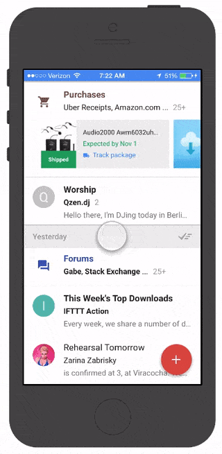
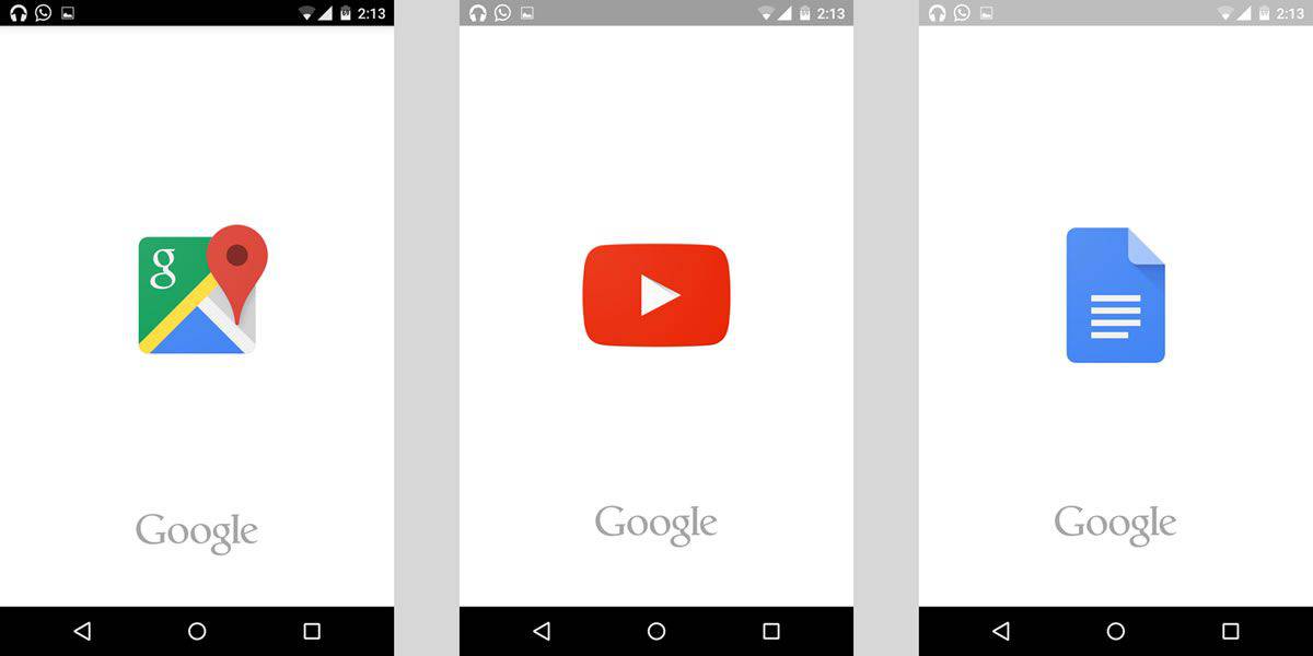
3. Splash Screens
When Google introduced splash screens in their apps (or launch screens as they call it in their design guidelines), the Android community has been in deep in discussion. Most of the feedback has been rather negative. It’s understandable why this is so.
A splash screen consists of an image that takes up the entire screen space and is visible while the app is loading. Usually, what’s shown is a logo or other branding information about the app. Instead of leaving the user staring at a blank screen while the app loads, a splash screen creates the impression that the app is loading faster. Also, it helps bring across the brand image.
Source: Pocket Meta
But the use of splash screens begs the question, is it really good Android UX design? Many in the Android community have argued against it, stating that if an app takes that long to load, then the problem is the app itself. Good Android UX design calls for fast performance and delivery of the app’s UI to the user, not wasting a user’s time with unnecessary screens. Furthermore, if an app’s UI design fails to effectively convey the brand image without the use of an otherwise non-functional screen, then the app design has failed.
In the case of complex apps and slow internet connections, it is true that having users stare at a blank screen while the app loads isn’t ideal. It is nonetheless still possible to show the app’s UI as the data loads into it so that the user gets familiar with the UI, thus providing consistency for a good UX design.
This discussion brings us to the question: is it good Android UX design just because Google says so and makes use of it in their apps? Android app designers have to decide on this in relation to the app and the context of user behaviour. For instance, if a user wishes to quickly add a task to a todo app, it would be annoying to see a splash screen every time the app is launched. However, for an app like YouTube, it may be less bothersome as users may not always be in a hurry to watch a video.
4. Navigation
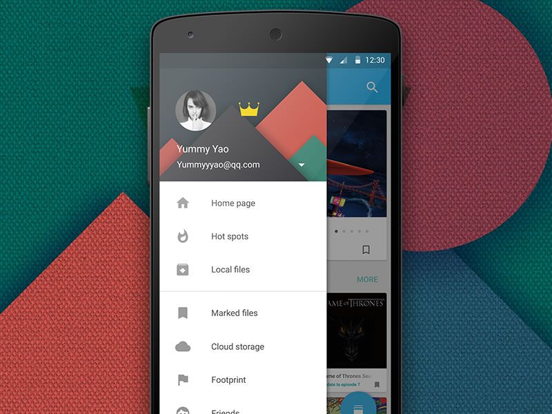
An app’s navigation design is the user’s direct contact with its architecture. If a user faces navigational problems when using the app, then it is structurally flawed. Good Android UX design entails a solid navigation design that is easy to make sense of and in accordance to navigation patterns of Android. Remember, your app is but one app in a mobile device filled with apps. It’s important to maintain a certain level of consistency across the device with the use of familiar UI patterns.
Android favours the navigation drawer that slides in from the left, activated by tapping the now-infamous hamburger icon. Tabs are also found in Android but unlike in iOS, they’re always at the top. It’s true that the side drawer, or hamburger menu, has received a lot of flak from the UX and design community. Many have already tried to come up with various alternatives to the hamburger menu, citing research proving that it kills user engagement and is inefficient. The more popular alternative is to use tabs along with a “more” icon to show less important items.
Source: Srikant Shetty’s Dribbble
But users like hamburger menus because they’re recognisable due to widespread use. Imagine that you’re hungry in a foreign land. People stop you on the streets to offer you many exotic foods that have names you don’t understand. You just don’t know what they’re made of even though they look delicious. Then, you come across a McDonald’s. Some of you adventurous souls might go for the exotic options but a large majority would settle for a big, fat hamburger. Even though they know that it’s not the best, it’s familiar.
So let’s not do away with the hamburger menu just yet, especially since it’s become ubiquitous across Android apps. Its also proven to be a scalable mobile navigation, which conforms to Google’s goal to allow for “a unified experience across platforms and device sizes”. The real question to ask, then, is whether an app actually requires a hamburger menu or not. Is it good Android UX design in the context of that specific app?
Source: ethanma’s Dribbble
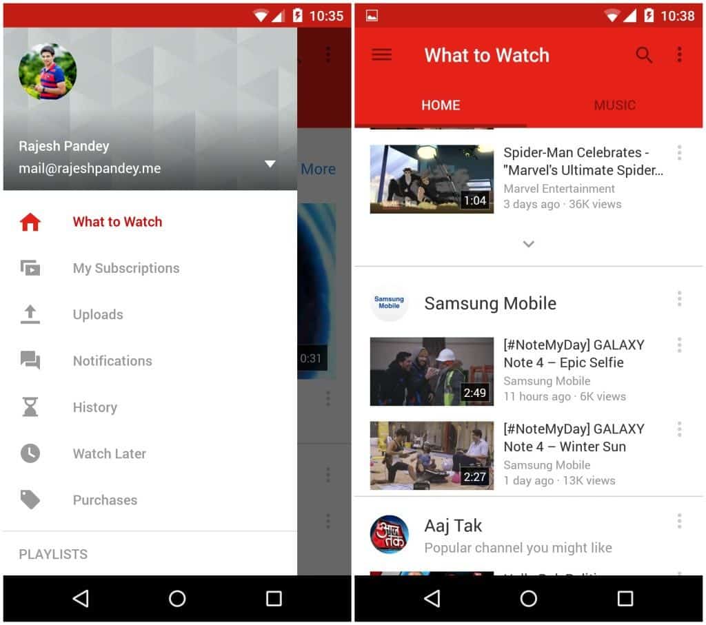
Unlike websites that have the primary function of providing tons of information to the user, mobile apps are typically task-oriented. In many instances, a side drawer is unnecessary and can be avoided by placing the primary navigation items on the screen itself. Even complex apps like YouTube managed to avoid the hamburger menu. To start off, Google Design guidelines offer a rather comprehensive overview of how to define your app’s information architecture and what type of content should go where.
Source: Android Beat
If an app is really complex, such as an email app that needs to provide access to many different folders and settings, a navigation drawer could be befitting. In this case, be sure to do it right. Pay attention to Google’s guidelines on navigation drawers, keep in mind the specs, the states and the acceptable variants. Whatever the case, don’t port iOS UI elements to Android. A bottom tab navigation bar looks odd and simply strikes your app off the list of good Android UX design.