From Uber to Vine, we’re starting to get a good sense of how mobile app trends are shaping up for this half of the decade. Many factors go into determining what mobile apps look like at any given time, from social trends, like the sharing economy, to changes in technology — this year, we’re looking at huge phone screens paired with tiny wearables.
The more users incorporate mobile tech into their everyday lives, the more bandwidth they sink into thinking about their applications. Checking a work email? Booking a hotel room? Ordering a gluten-free margherita pie for delivery? The applications that stand out among the crowd, like Airbnb and GrubHub, minimize the amount of thought that goes into using them, so users can spend more time multi-tasking and doing, and less time thinking about how to get to the option or screen you need. The more users multitask, the more they demand mobile app design that anticipates their needs and gives us what they want, when they want it.

With that in mind, the following mobile app design trends are giving users what they want right now:
1. Bigger phone screens.
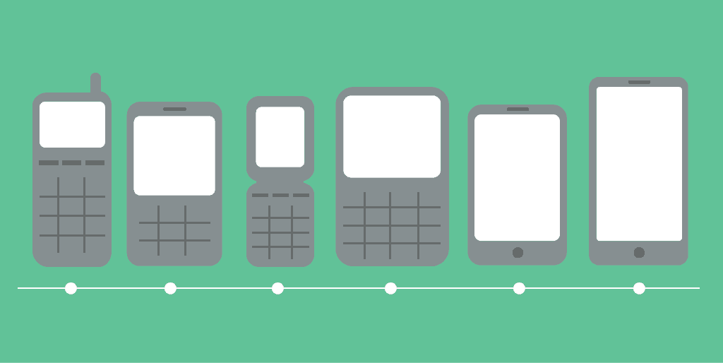
Love it or hate it, the rise of the phablet has been consuming more and more hand real estate. What does that mean for mobile app designers and developers?
Moving beyond the obvious “Design bigger,” it’s important to consider how users will be holding their devices while they use them. That means making the most important navigation elements easily accessible to a person’s thumb, which probably won’t be able to reach the top corner opposite it. Easy, right? Just position your interactive elements in the bottom right-hand corner of the screen. Except it’s not that easy, given that about 10% of your users are left-handed.
You could force your southpaw users to adopt a two-handed grip — and given how large our mobile devices are getting, that will be a more frequently used hand position anyway — or, if you really want a usable, accessible experience (and you do), you’ll make sure all interactive elements are large enough to be accessed from either side of the device. After all, you do have more screen real estate to work with. Another idea is simply to use a customizable interface, including an option to flip the UI.
But whether your users are right-handed or left-handed, it’s important to approach mobile app design with the understanding that certain design choices might result not only in a less usable or intuitive interface, but also in hand cramps and fatigue. This is an important detail to iron out in testing and QA.
Of course, when tackling larger screens, it helps to remember the following:
2. Swiping is the new tapping.
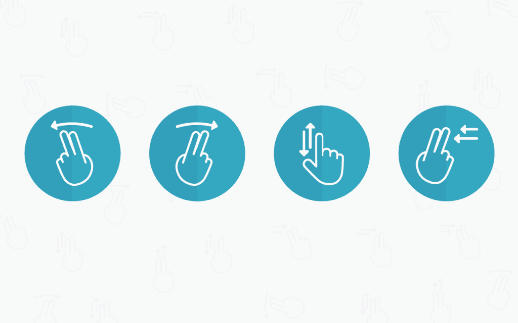
When touchscreen-enabled mobile apps first arrived, designers and developers had to grapple with the reality of programming for a dramatically different type of physical object. Pinch to zoom was a pretty novel feature when we first got our hands on the iPhone in 2007, but being forced to zoom to read content isn’t good mobile app design. With that said, we’ve all encountered the button that’s just too small to tap, unless you have that rare combination of tiny fingers and a concert pianist’s motor skills.
Swiping is a much more natural way to use mobile devices, especially if you only have one hand free. Want proof? Hold your hand like you’re cradling your mobile phone. Now pantomime your thumb tapping on the invisible phone’s screen. Make a note of how that feels. Now sweep your thumb across the screen. Which one feels more comfortable?
Of course, the most obvious example of application swiping is Tinder, which takes the famously complicated nature of dating and distilling it down to two easy options: swipe right or swipe left. In less time than it takes to watch a rom-com trailer, you’ve sent a signal out to a potential pool of beaus, all with a single thumb. Tinder seems to have the right idea, as evidenced by the fact that it has over a billion users,
3. Wearables begin to influence mobile app design.
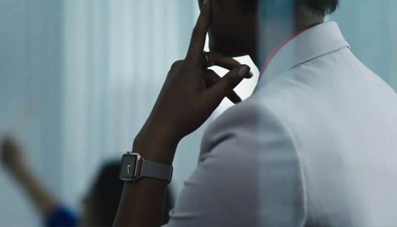
The flipside to the larger screens of the phablet craze is that they are increasingly being accompanied by much smaller screens on the wrist. The International Data Corporation predicts that vendors will ship 45.7 million wearable tech devices in 2015, including wrist wear (the largest percentage, at 40 million), clothing and eyewear.
What began as the wearable fitness device craze is now moving into bigger territory with the release of Apple Watch and Android Wear. Wearables are no longer just glorified pedometers with sleep and heart rate trackers — they’re bona fide smart devices, capable of telling you how long your work commute will last, what tomorrow’s forecas, or reminding you to put the kettle on for your aunt when she visits. How will this impact the way mobile app designers do their jobs?
We’re still in the early stages of this burgeoning trend, so Apple and Android are offering a number of suggestions for their respective products. As makers of watch-like devices, both emphasize the importance of the glance. Unlike with phones or tablets, which users expect to stare at for extended periods of time, apps designed for wearable devices should deliver just enough content, at just the right speed, for the user to digest in a quick glance, even out of the corner of the eye. That means that typography, color contrast and context (where is the user? what data does the user need right now?) are especially important when designing and developing for wearables.
And because this is a relatively new technology, it’s more important than ever to pay attention to actionable user feedback and work it into future updates. While Apple and Android may have their suggestions, it’s their users who will craft the future of wearable mobile app design.
4. Layered layouts.
In the eternal flat design vs. skeuomorphism debate, can there ever be a middle ground? On an aesthetic level, skeuomorphism seems, to detractors, like a hackneyed appropriation of real-life textures in a digital context, as tacky as obviously fake wood paneling on your car dashboard. But flat design, despite coming to prominence as this decade’s digital aesthetic, isn’t without its own issues. With all texture removed from mobile app design, it can be hard to tell which elements are interactive, if you can discern the boundaries between different design elements at all.
Google, Google Material

The compromise that’s emerging is layered flat design, or what Google calls “material design.” This aesthetic still skews heavily to the side of flat design, but with a few principles borrowed from skeuomorphism. As with flat design, the elements in layered or material design are still geometric in nature, with blocks of color rather than facsimiles of natural textures or obvious shine and gloss. But like skeuomorphic design, layered flat design borrows metaphors from the natural world — specifically, how objects move and interact with each other. That means that shadows and other light effects are back.
What results from this melding of flat design with natural physics is that the user has a more intuitive understanding of how elements on a screen work. Objects have weight and inertia when you manipulate them on your device. They may seem to have weight when you slide them around the screen, or cast shadows on elements beneath them. It brings the usability of skeuomorphism together with the aesthetic of flat design to create an elegant user experience.
5. More movement.
Your smartphone has more computing power than the NASA team that sent a man to the moon, as well as the Deep Blue supercomputer that bested Garry Kasparov, world chess champion, in 1997 (PhoneArena). And it’s only getting smarter. Not only are our mobile devices becoming more and more powerful computers, but with 3G having given way to three types of 4G, each trying to outdo each other in terms of speed and power, you have a lot more freedom to animate your mobile app design.
Timeline Page, Sergey Valiukh

Movement offers so many benefits to mobile app design. It can draw focus to a specific item, guide the user to the necessary action and simply create a more delightful and surprising user experience. Smartphones are now advanced enough, and their networks strong enough, to take advantage of the HTML5 animation or parallax design you’re already using on your desktop experiences. With fewer restrictions on bandwidth and power, we’re seeing a lot more movement in mobile app design this year, and that’s only going to ramp up as our smartphones get smarter.
6. Simple, soft color schemes.
Every year has its chosen palette, and right now, we’re focusing on very simple color schemes that emphasize soft contrast. This is a natural consequence of the overall minimalism of flat mobile app design, but it also reflects the colors that are on trend right now (Pantone’s Spring 2015 color palette emphasizes “cooler and softer color choices with subtle warm tones”). Try a layout with various shades of one color, with white typography and contrast elements. Or, try a layout with only two or three cool, muted shades.
The result of this simplicity in a mobile app design context is a less scattered experience, where stark color contrast demands more attention from your eye. Staring at a screen that emits light is already harsh on your eyes, but toning the colors down and muting the shine (again, a strength of flat design) makes your mobile app design feel smoother and more pleasant.
7. Typography steps up.
It doesn’t seem too long ago that mobile typography was limited to whatever web-safe fonts were readable at low resolutions. In the past two years, both iOS and Android have been optimizing their operating systems for more fluid, scalable and readable fonts. Another side effect of larger screens and technological innovations (thank you, TypeKit) is the use of typography to add beauty and expression to your mobile app design. Whether paired with a trendy large background image or negative space, you can let your typeface do the talking and deliver a powerful message in a minimalistic way.
Wild Canada iOs App, by Marshall Lorenzo

8. Built-in blur.
One mobile app design trend that adds instant usability to your translucent apps is background blur. While mobile apps that live on top of a user’s background can give the user a clean, unbroken experience, sometimes they can cause usability issues.
UI - Weather, by Nathan Smith

Depending on which background your users select for their devices, as well as how many icons or widgets live on that background, the lack of opacity can make your app very difficult to read. Embedding a Gaussian blur effect into your mobile app design makes your app more readable and easy on the eyes, while retaining the custom feel of the user’s background.
9. Innovations in accessible mobile app design.
As a bonus, today’s design trends are de facto more accessible. Simpler layouts with large elements and fonts require less visual processing, while macro hand gestures (swiping) as opposed to movements that require more fine motor control (pinching to zoom, tapping) are easier on people with movement restrictions. As Typekit allows us to use more live text in our mobile app design without sacrificing quality typography, it also makes our applications more accessible for people with visual impairments who use reading devices. Even just the wider availability of larger devices and phablets makes mobile app design accessible to a larger population.
An example of the built-in recognition flow for a speech recognizer that uses a SRGS-defined constraint. In this example, speech recognition is successful.

Remember that building usability into your mobile app design means thinking critically about how accessible your product is. Is the layout customizable for somebody who requires larger, more readable text? Are you building a haptic feedback option in for those who need more response from interactive elements? It can help to use an accessibility checklist while you’re working on your design. The Accessibility Project offers a number of resources for designers and developers to make their products available and usable for a broader audience.
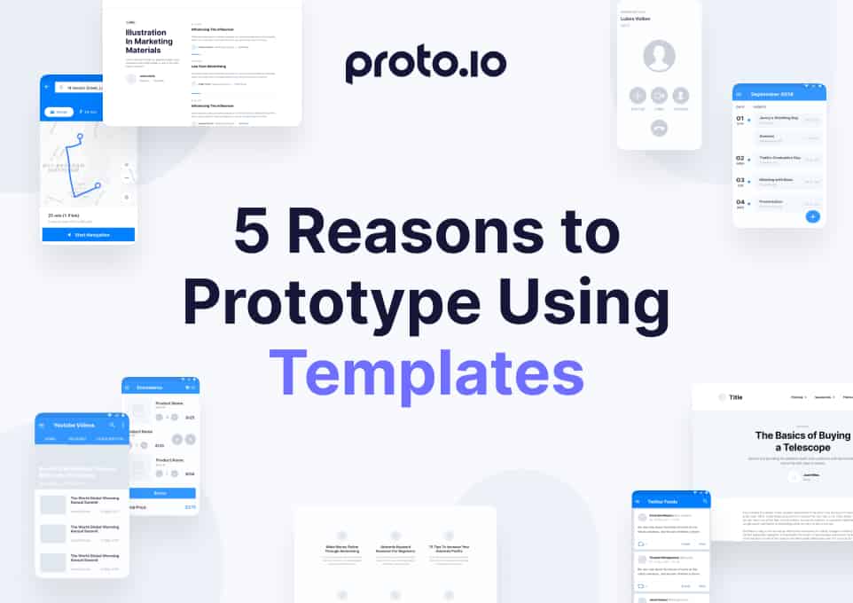
10. Smarter prototyping.
Every app we use was, at one time, a prototype. Many proofs of concept began as a simple wireframe, printed out on a few pieces of paper or saved out as a static PDF. As mobile app design becomes more complex, it isn’t enough to show a few static frames and force the client or the developer to imagine the movement you’re considering. If your app heavily depends on animation to direct the user or provide visual interest, your client is losing out on much of what makes the app interesting and usable. Plus, flat wireframes simply don’t offer a lot of “wow” factor.
Spotify App, prototype made with proto.io

However, programming a proof of concept comes with its own set of headaches, as developers sink bandwidth into coding elements that might not even make it into the final prototype. Either designers have to communicate their intentions very clearly with developers to avoid wasted effort, or designers have to take creating the prototype into their own hands so that it reflects their vision.
Thankfully, with today’s prototyping solutions, designers can do just that. With minimal or no knowledge of coding, the designer can create a proof of concept that shows how the user is meant to interact with the app, as well as any animations or movement critical to the mobile app design. This not only results in a prototype that stuns a potential client or customer, but also in a simplified process when the app lands in development. Since you’ve hammered out all the details around how the app should move and interact with the user, all the developer has to do is create the product — without coding endless rounds of design revisions.
Ready to give today’s hottest mobile app design trends a spin? Try using Proto.io to create a prototype of your next project. Whether you’re an experienced designer or a novice with a great idea, Proto.io can bring your inspiration to life with easy-to-use features, UI libraries to get you started, touch and mouse event support and much more. With the mobile Proto.io app for iOS and Android, you can also test your prototype on multiple devices to ensure it plays nicely across resolutions and operating systems.