Sure, iOS is known for attracting enthusiasts, but for every Apple fanboy or fangirl there’s an equivalent Android geek making the most of Google’s mobile OS. (We assume this would be one of Newton’s Laws of mobile app design, were he alive today.) There’s something about the openness of Android relative to its fruitarian counterpart that can feel liberating to a designer or developer. But while Android UI designers don’t have to deal with the often frustrating Apple review process, they have plenty of their own challenges to face.
Whether you’re an Android loyalist or a cross-platform designer, there are a few things you’ll need to know before becoming a mobile app rock star. To kick your skills up a notch, you should keep these three tips in mind:
1. Become a material design expert.
Material design is Google’s answer to the question, “Can a mobile UI design philosophy stand the test of time?” While other design aesthetics were competing for trendiness points, Google wanted to create a sort of digital language that would create lasting ideas about how mobile UIs should look and behave.
Just getting started? We’ve already written a beginner’s guide to material design that goes deep into the design philosophy and can guide Android UI designers to the resources they need to create elegant, usable apps using this design language.
Material design is, in part, an answer to the raging battle between skeuomorphic design and flat design. While flat design was all about removing the “unnecessary” fluff from app design, skeuomorphic design employs everything from drop shadows to “realistic” looking textures to make the digital landscape resemble that of “meatspace” a bit more closely. When flat design began to edge out skeuomorphism some years ago, the thought was simple: that stuff is useless, so let’s design something that much more minimalistic.
Unfortunately, flat design, while visually striking, wasn’t winning points across usability categories. While drop shadows and faux-wood and metal textures might look gawdy, hearkening back to 1970s era interior design, it turns out that they don’t just act as a garnish. The variance in texture actually helps the user navigate the screen and tell various elements from one another.
While flat design was having its day in the sun, with the Windows Metro UI receiving accolades for its beauty and simplicity, Google had other ideas in mind. Material design is much more than an aesthetic approach — it’s a fully realized design philosophy that actually gets pretty heady.
The Metaphysics of Material Design
Yea, that’s right: metaphysics. The study of being, the nature of reality. Don’t worry! You don’t have to be Aristotle or Descartes to become a killer Android UI designer, but to fully understand the principles of material design, it helps to look under the hood and see what Google was getting at, conceptually, with this design philosophy.
Material design treats individual elements as units in space. In other words, info and text boxes behave as if they have “weight.” If you slide them over, they react with physics that feel intuitive. They seem to have inertia as they bump into other elements. There’s a predictable speed with which the elements move. It’s as if there’s an entire world living inside of your smartphone or tablet.
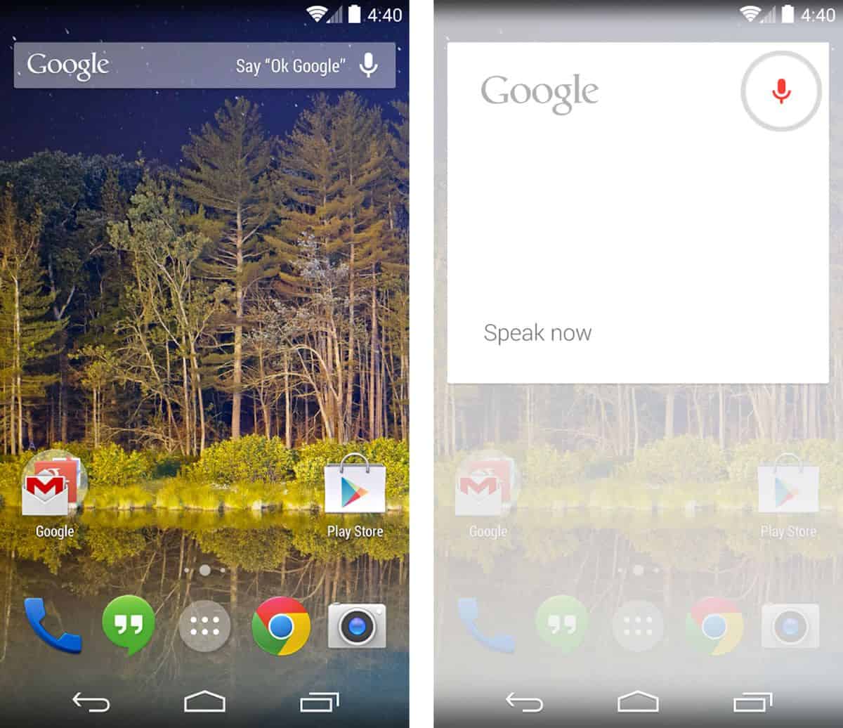
The best example of this in action is Google Now. If you swipe an info box to the right, it’ll appear to slide across the surface of your screen. If you press on a button, it will seem to sink into the screen, much as a real button would if you were pressing it in real life. With material design, there is depth (and, as such, added usability) simply because every element is an object in space. Of course, that depth doesn’t mean there are tacky approximations of “real-world” textures — you won’t find faux-woodgrain backgrounds here when you’re browsing your eBook collection, for example.
Designing Highly Usable Android Apps
One of the biggest components of material design is intentionality: design elements are not present just to be pretty, they are present to do something. This means that every aspect of a UI is crafted for a reason, right down to the blank space between buttons. Material design isn’t about overwhelming the user, or showing off what a killer Android UI designer you are with flashy visuals and avant-garde design choices. At the end of the day, material design is about presenting a UI that works in a way that’s logical and easy to use.
While these principles are fantastic for any type of design, Android UI designers need to pay special attention to them, as soon every Android user will be accustomed to how material design looks. That means that if you use the same principles Google is using when they are developing their core apps, then users will intuitively know how to use your app, too, making them more likely to keep using it months after that initial install.
2. Never forget Android’s notorious “F” word: fragmentation.
While fragmentation is something you have to deal with regardless of whether you’re developing for iOS or Android, it tends to be a much thornier issue for Android UI designers — and there are many reasons for that. For starters, when you’re developing for iOS, you might be developing for multiple devices, but you can know for sure that most of your users will be on the latest version of iOS thanks to Apple’s automatic push updates.
At the same time, you know that every device is made by Apple, so you have a pretty good idea of all the resolutions you have to squeeze your UI design into — not to mention how it looks relative to the rest of the phone or tablet. While you might encounter a few design surprises along your journey, it’s pretty realistic that you’ll be able to get your design to look good across every Apple device. Plus, there are only a handful of different devices you need to worry about, making designing to specs a pretty smooth process. Testing and QA for an iOS app? Pretty much a cakewalk, compared to Android.
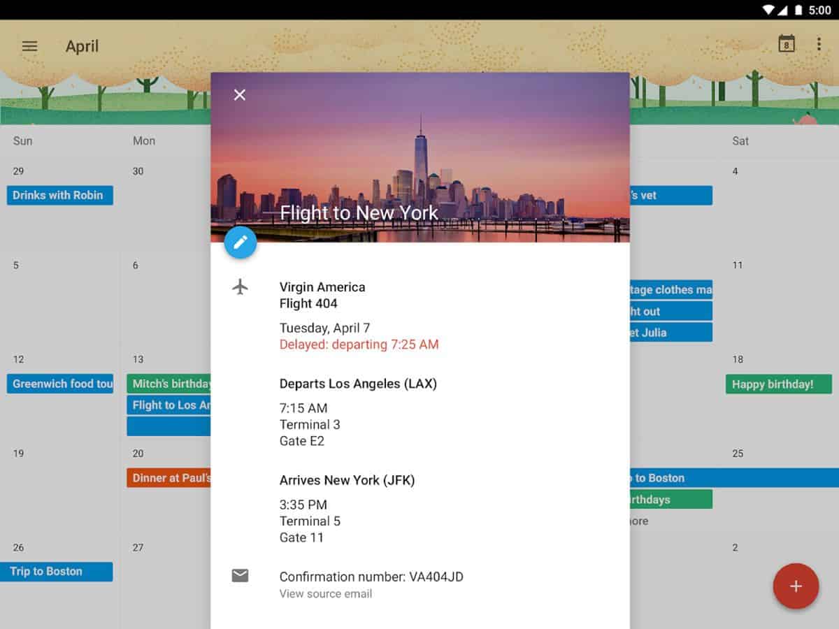
Source: Google Calendar, Google Play Store
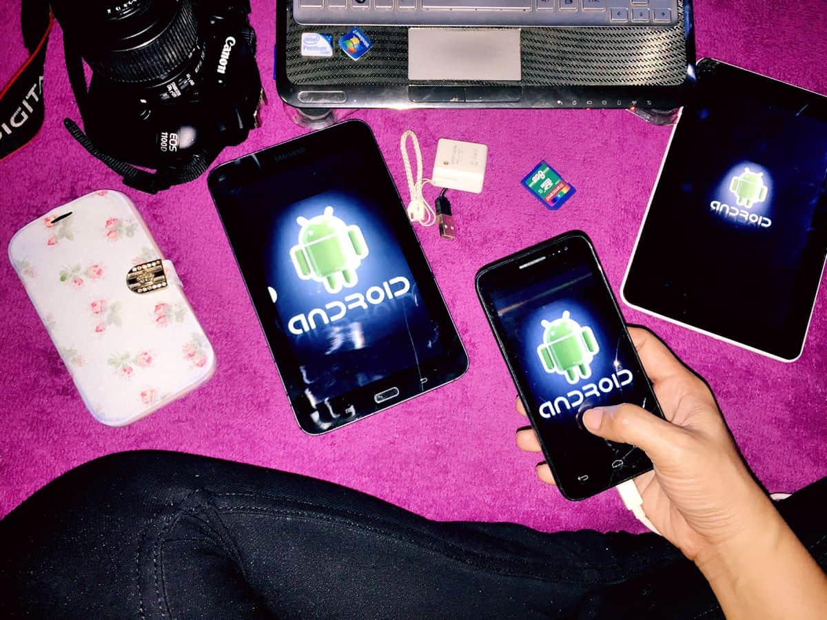
If you’re an Android UI designer, though, you’ll be running into far more snags when it comes to fragmentation. For starters, there isn’t just one company building Android devices. Samsung, LG, HTC, Sony, ASUS, Motorola and plenty of other electronics companies all are designing their own smartphones, tablets and phablets, each with their manufacturer’s own particular quirks. And each of those brands has multiple devices in the wild, many of which have multiple iterations.
OS Fragmentation
On top of that, while most devices using iOS are using the latest version of the operating system, that isn’t the case for Android phones. In August 2015, while 85% of iOS users were using iOS 8 (which was, at the time, the latest version of iOS), only 2.6% of Android users were using 5.1, and only 15.5% of users were using 5.0. In fact, more users were using a Gingerbread-era (2.3.x) version of Android than there were using the latest version.
And Countless Variations of Specs
And we haven’t even started talking about screen sizes. Or annoying add-on software that phone manufacturers insist on sticking on their devices. Or all the different button configurations that Android phones can have (they even sell Android phones with keypads still!).
As an Android UI designer, it can seem impossible to develop for all the potential phones and devices that might be running your app. How can you possibly accommodate every device? How can you possible test your app on all of them?
The easiest way to go about things is to start by picking a specific device that will best represent your target market. Make a prototype of your UI for that specific device — figure out where you want all of your individual design elements to go, along with your palette, fonts, and anything else you can think of. Once you’ve got the basics down, it’s time to figure out what specific elements are most central to your design. What absolutely has to work? If a screen is too small, what element could shrink, or maybe move elsewhere?
One of the best way to overcome all of these challenges in the design and development phases of your mobile app project is to think in terms of responsive design, just like if you were designing a page on the Internet. Don’t approach your user interface as though it’s a static, immovable piece of art — rather, think of it as a group of elements that come together to form a cohesive piece of design, each of which can grow, shrink or move depending on the context (device, OS, user settings, etc.)
3. Test your app on as many devices as possible.

Making sure your testing and quality assurance process is thorough for every single project is important for any ecosystem you’re designing or developing for, but it’s especially important for Android UI designers specifically. That aforementioned UI fragmentation can get you into a lot of trouble when it comes to usability and accessibility.
Sure, your app may look incredible on a Galaxy S6, but what about the S4? Or how about an HTC One? Yea, it’s great on Lollipop, but how about Ice Cream Sandwich? (By this time, your QA team is probably just hungry — and we haven’t even gotten into testing on tablets versus smartphones).
Testing for all of these variables is an extensive process, and unfortunately, it’s nigh-impossible to cover off on every potential scenario. That’s why it’s important to use a good Android device emulator to recreate as many devices and operating systems as possible.
But even the best emulators can’t replace testing on a bonafide meatspace device, especially when it comes to using gestures. Something as simple as “Can my thumb comfortably swipe from one corner of this screen to another?” becomes complicated when you think about how many different screen sizes there are in the Android device universe, from smartphones to tablets to phablets.
Granted, it would be prohibitively expensive to invest in the multitude of popular devices your users will have in hand, especially if you’re an independent Android UI designer, or working for a small start-up. One way to get around this is to collect a team of volunteers — if you’re a one-man or one-woman operation, this could include friends and family, and if you’re an agency, this can include your coworkers — to let you test your app on their phones. This works especially well at companies with a physical office and set hours, since you’re all in the same place anyway.
Make a spreadsheet listing the various devices and Android operating systems this group of volunteers uses, and refer to it when you need to test your app on a few different devices. This can make a wonderful adjunct to your emulator when it’s testing time.
Alternatively, if you don’t mind making some capital investments, you can find inexpensive mobile phones on eBay, or even among your group of friends and colleagues. Keep a “testing and QA” box in the office full of these devices for quick and easy access.
Killer Android UI Designers Create Killer Android UI Prototypes
The Android app ecosystem contains over 1.6 million applications. That means there are plenty of Android UI designers out there, and plenty of great ones. Don’t let that overwhelm you, though — there are plenty of resources out there to help you pull ahead of the pack.
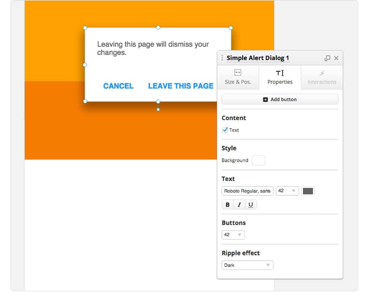
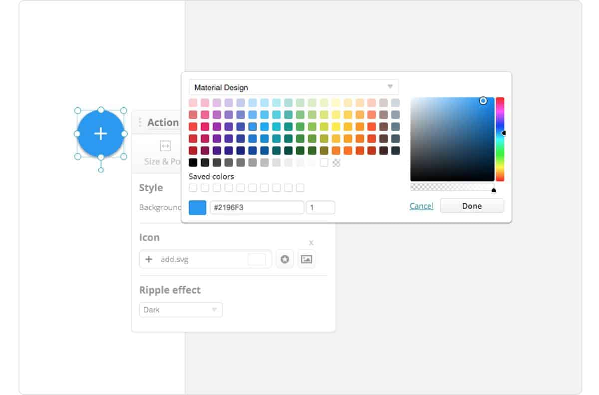
With Proto.io, you can access a rich interactive Material Design UI library to create a lifelike prototype of an Android app using the design philosophy. With drop shadows, ripple effects and forty-nine handcrafted UI components that look and behave just like native material design UI elements, you can become a material design expert without touching a line of code. You can play with some of these elements here, or sign up for a free 15-day trial of Proto.io to get the full experience.
If you’re an Android UI designer, or just a strongly opinionated Android user, we want to hear from you: what do you think separates killer Android UI designers from the rest? Let us know what you’d add to this list by tweeting us @Protoio!


