Back then, if you had mentioned ‘interaction designer’, I would have imagined that guy working at the Walt Disney Animation Studios. Now, with the rise of mobile devices, touch screens and interactive systems, interaction designers are in almost every creative studio, digital agency, big IT or software company.
Interaction designers deal with what happens when a user touches an interface of a product. It is still a relatively new field and crosses over with many other fields such as UX design, graphic design, software engineering, and psychology. As with any new discipline that is constantly being defined and redefined, the scope and must-knows of an interaction designer are not always precisely articulated.

In this post, we skip the debate on what and who an interaction designer is. Instead, we focus on 3 goals of interaction design that are key to gaining success in the world of digital products.
1. User First
Perhaps the single most pernicious sort of folly I have seen over nearly 30 years in the computer field is the belief on the part of engineers, designers, and marketing people that they “just know” what will work for their audience. -Brenda Laurel
Interaction design is goal-driven design; users interact with an interface to accomplish a goal or better yet, a set of goals, whether it’s buying something, getting somewhere, contacting someone, and so forth. The ultimate goal of interaction design is to design for those goals.
Although interaction designers aren’t usually required to do user research, they need to be able to design based on insights gained from user research. Great interaction design is knowing what those user goals are, understanding the emotional and psychological drivers behind those goals, being aware of external circumstances surrounding those goals, and predicting the potential impediments to achieving those goals.
How To Get There:
From Brenda Laurel’s remarks above, we know that we cannot simply assume that all interaction designers naturally know and empathize with their users. As such, many interaction designers these days make use of user personas, scenarios and experience maps, all of which help in a great way to build empathy, refine a focus and humanize the product.
– Personas are realistic representations of the different types of users that might use a product. These are created based on user research and are only as effective as the research insights behind them.
– Scenarios are descriptions of how and why users deal with a product. They sketch out the various circumstances, processes, and contexts of using a product while outlining the goals and expectations of a user.
– Experience maps are a much more complex extension of the above two methods. It is a model of visualizing a user’s journey by taking into account the interconnected nature of using digital products across various devices, platforms, and channels.

However, at times there remains a gap between ground zero and phase 1 of the design process. Many clients simply do not have a full picture of their users and worse yet, some have no clue at all who the users are. To bridge that gap, Jeff Smith of ThoughtBot introduced ‘Phase 0’ of their design sprints involving an ethnographic research exercise.
Ethnography brings to most people’s minds an image of spending extended time living among grass-skirted tribal folk (I know this from having an MA in Anthropology). Living among the natives is essentially the idea, but the methods are appropriately adapted when applied to the design context.
Think about it. If you build digital products, your ‘tribe’ consists of the people who use those products. You already do live among them so why would you not take advantage of not having to pay for a flight to some distant lands and reach out to your potential users? Doing ethnography for design research can take only a few hours should your methodology and objectives be clearly defined.
It is more about the practice of removing yourself from designer mode and entering an in-between mode of being both a ‘native’ and an observer in everyday situations. No doubt, interaction designers are not user researchers. Yet, goal-driven interaction design revolves around the dynamics between user and product, not that of designer and product. As such, interaction designers could think about incorporating an ethnographic exercise as ‘phase 0’ of the design process so as to get one step closer to the user.
2. Transparency
Good interaction design is orchestrating magic without the fancy stage lights. Your goal as an interaction designer is to not exist in the minds of the users and to be as out of their way as possible while masterfully assisting them in achieving their goals through your designs.
As a principal researcher at Microsoft Research Bill Buxton puts it,
“In some sense, a successful interaction design would be transparent, almost invisible, to the point that the user would be almost unconscious of the experience until after it’s over. It is just like magic.”

By transparency, it is not meant that we should begin to turn user interfaces invisible by getting rid of as much content on it as possible. In fact, sometimes the best place to ‘hide’ is being right out in the open.
We should not view interfaces in terms of the dichotomy of visible and invisible or equate ‘invisible design’ to a seamless experience. After all, it is not by merely looking at a product that we truly determine whether a product is usable and whether we desire to use it. We determine that by actually using it and reflecting upon the whole experience thereafter.
The Nest Thermostat that is sensor-driven, self-learning, WiFi-enabled and programmable has been one of the shining examples of the No UI or invisible interface movement. What a perfect example, one would think.
You install this beautiful, minimalistic product to your wall, it starts learning your habits and routines and before you know it, you do not even remember that it exists while you bask in glorious perfect climate at home every single day. Without the high energy bills too.
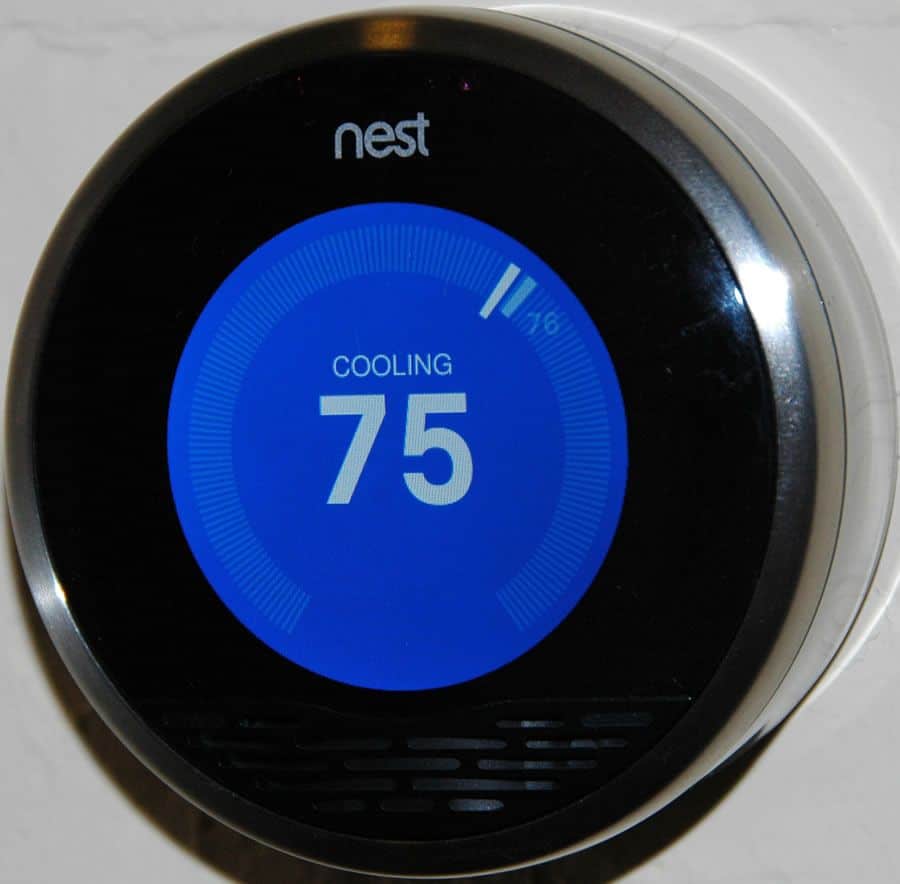
However, the Nest aims to feel invisible, not actually be invisible. As Timo Arnall points out, the Nest actually has a highly visible interface that shows you the temperature, tells you when it’s learning and basically gives you exactly what you want to know from buying a smart thermostat in the first place. Nest also comes with an app that allows you to manually adjust the settings.
The UI of the Nest isn’t invisible; a Nest with no UI would be a decorative round knob. It is transparent in the sense that it is flexible enough to help you in a precise manner to achieve your goals as a Nest user but without bombarding you with the extra shenanigans that you do not really need to know about.
Once you the user have become comfortable and trusting of it, the Nest’s interface fades into the background. But it is still flexible enough to resurface when needed like in the case of something gone wrong.
How To Get There:
Design to give users what they need to accomplish their goals based on an understanding of the larger context in which users interact with your product. Aim for transparency that allows for fluid interaction and active control.
Do not make your users resign to fate or think too much about what is going on behind the screens. Do not leave them bewildered on how to manipulate the interface. Be forgiving. Users make mistakes, as do designers. Provide alternative routes and encourage exploration.
3. Learnability
When I travel to new cities, I always try out the public transport system because I have an aversion to urban car rides. The first time riding on the subway or getting on a bus in a new city is always an experience filled with either bafflement, frustration, or surprise. Not only are the ticket machines usually different from the ones I know, getting through the turnstile for me is also like being a noob passing Level 1 of a video game.
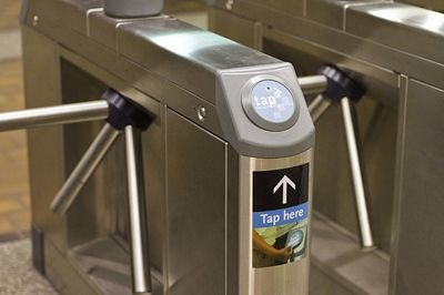
You see, I am used to the Oyster/Tap card system which made moving about in LA and London relatively stress-free. It was familiar, predictable, and the clear sign that says ‘Tap here’ couldn’t be more noob-proof.
Then, I went to New York and they have the MetroCard that you swipe through this thin space between two metallic protrusions, but not too fast or it will not read and not too slow either or it will not read. You are also never too sure whether it is supposed to be swiped this or that way. After a few rides, you somewhat get it right.
In Madrid, the 10-trip ticket comes in the form of a small piece of thick paper that you are supposed to insert, God only knows where, then withdraw as you enter. Do not forget to grab the ticket on your way in so you could use it for the next ride but oh heck, it is so small anyway you would probably just lose it in your pockets or to the rain, just as I did.


Sources: The Source, NewsOne, MetroParaQuito
All this is so utterly confusing. Why can’t every city with a subway just stick to a system that has proven itself to be highly user-friendly?
Eventually, what I always do is step aside, observe exactly how people go through the turnstiles, and then attempt to replicate what they just did. Such a noob, I know, but hey, most of your users are going to be noobs until they get past the learning curve. Your goal as an interaction designer is to help them learn by improving the overall learnability of your product.
How To Get There:
Aim to create consistency and predictability to boost learnability when designing interactions and that is not to say that it always has to be boring and the same. Consistent, predictable, and hence learnable interaction design contributes to making a user feel comfortable with your product. Therefore, it actually gives you more space thereafter to introduce new interactive elements. You can be as disruptive and innovative as you like without compromising too much of learnability.

Make use of UI patterns that give your users some grounds of familiarity to begin interacting with the product but without killing your creativity. Ideally, your user should be able to anticipate what will happen before he/she performs a certain action.
When coming up with unusual interactions, make use of signifiers that are already familiar to users so that they can grasp the affordance and learn quickly. Provide visual feedback to optimize learnability and enhance the experience of your users. As much as you like to know that your users got it right, users also like to know that they are doing something right.
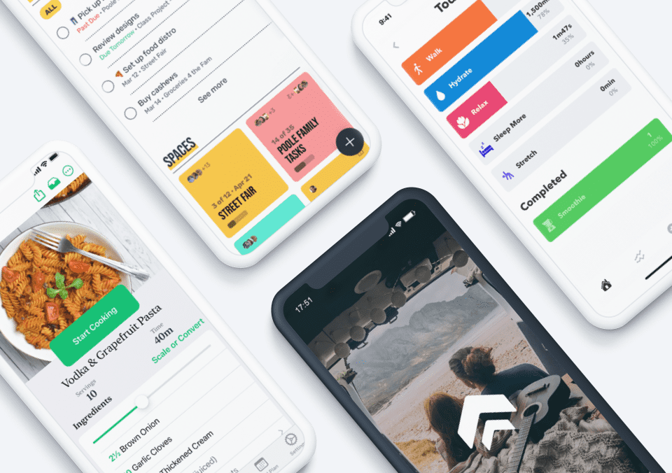
Striving to achieve these 3 goals of interaction design is a fantastic step towards being a more successful designer. However, how do you know whether you have effectively designed for user first, transparency, and learnability? You just have to test your interaction designs with real users to see how it works. Proto.io allows you to create high-fidelity, fully-interactive digital prototypes, no coding needed. You can even bring your prototypes with you in our native mobile apps for easy user testing. Don’t settle for still mockups, try Proto.io today.