Wireframing is a quick and effective way to identify usability issues early on in your design process. If you are a web designer, I am sure you are familiar with wireframing and if you are a user experience (UX) designer, like myself, you probably spend a large percentage of your time creating wireframes either by hand with paper and pencil or using a digital tool like Proto.io. This article is for those of you who have heard the term and would like to learn more about why wireframes should play an important role in your design process. We’ll also cover how they can best be utilized in conversations with relevant stakeholders and clients.
Let’s start off with answering the question “What is a wireframe?”
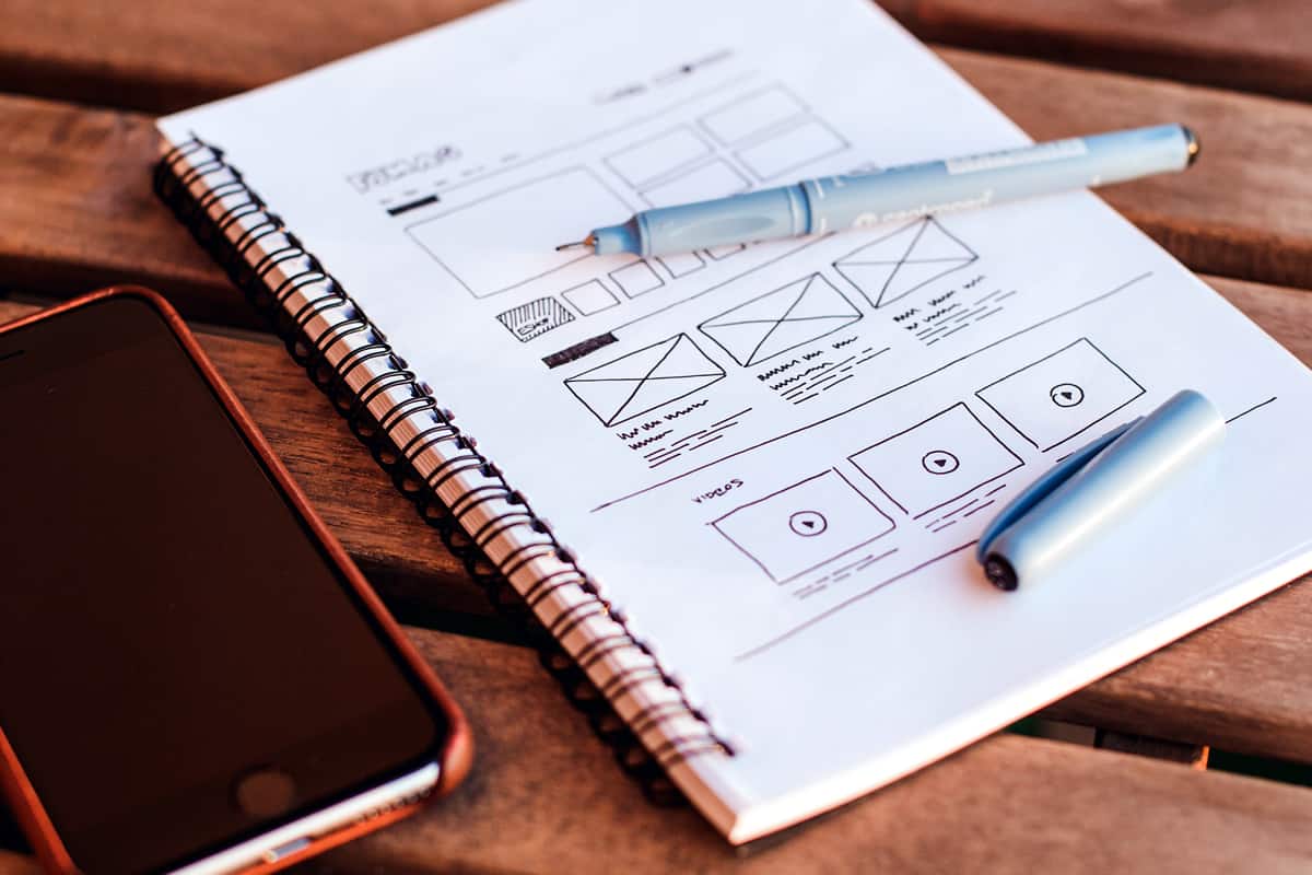
I like thinking about a wireframe like a skeleton of the page. This skeleton is a two-dimensional depiction of a page’s interface that shows the spacing of elements on the page, how content is prioritized, what functionalities are available, and how users will interact with the site. They also play a vital role in connecting information architecture to the visual aspects of the design by showing pathways between the various pages. Wireframes are intentionally void of color, graphics and stylized fonts.
If we don’t have a strong skeleton to start, then all the stuff we put on top of it, like the functionalities or style, really don’t stand a chance.
Think about the process of building a new house. If you focus all your energy on the interior design, like the colors of the walls and the fabric for the couches, rather than the blueprint of the structure of the house, do you think it will serve its purpose? Probably not. Starting with the interior design, rather than the foundational structure of the home, is counterintuitive.
What should not be included in a wireframe?
It is really important to keep your wireframes simple. This is because the point of wireframing, as stated above, is to show how elements are laid out on the page and how the site navigation should work. Too many colors or images can distract the reader from focusing on the layout and navigational elements. Make sure to eliminate or reduce the use of color, images, graphics, and stylized fonts to achieve your goal of depicting a simple visual representation of the skeleton.
Keep these in mind:
- Keep your colors to grays, whites, and blacks.
- Use a generic font. This helps prevent the user from being distracted by the style of the typography. Showing the hierarchy of information through font is still important, though, and can be shown through simply changing the size of the font and whether it is “regular,” “italic,” or “bold.”
- Avoid highly stylized graphics and images. Instead, I suggest using rectangles and squares as placeholders, adding an “x” through the middle of the box to show where the image will be placed. You can also do the same thing to show where videos will be positioned with a triangle as a play button at the center of the box.
The 5 Main Reasons to Use Wireframes
1. Wireframes are a great tool to get your clients to focus on what you want them to think about early in the design process. Wireframes are a great way to walk clients and stakeholders through the structure of your designs without giving them a chance to get distracted by colors and images. If the goal of your meeting is to get your clients to think about what elements should be on the page and how those elements will function on the site, simply taking out colors, images, and stylized pages makes it much more straightforward. You can then easily gather feedback from your client and stakeholders on the site’s navigation and allocation of elements on the pages. rather than them focusing on how the color red is “just not working for them” as a call-to-action button. It sounds funny, but it happens a lot!
2. Wireframes allow you to map out the functionality of the pages, catch problems early, and save time on revisions later. It is much less painful to make changes to a wireframe than to a high fidelity mockup with lots of design elements. Having to rework a high fidelity mockup takes a lot more time to make changes. If you invest the time in thinking through the functionality of the pages through wireframing early on in your design process, you will be so happy you did. It is definitely time well spent and highly efficient.
In other words, mapping out the functionality early will reduce the amount of back and forth that often comes with the development phase. It is definitely easier to rewrite the function in a wireframe, compared to a web application.
3. Wireframing allows you the opportunity to get to know your client better. You will start seeing patterns in behaviors and motivations the more time you spend with your client. Over time, the knowledge you gain from their feedback will only impact how best to work with them in the future and how to make your time with them most productive.
Wireframing is also a great way to get your clients to focus. Clients like to jump five steps ahead because it is exciting to start thinking about the end product. But eliminating opportunities for clients to get distracted from thinking about functionality and structure of the design will be something you will find greatly rewarding.
4. Wireframing is a great tool for gathering feedback and figuring out flaws early. If efficiency is a goal of yours, which most likely it is, then wireframing is where you should start. There might be occasions where you feel pressured to start designing a high fidelity mockup right off the bat due to time or money constraints. Try to remember that without gathering quality feedback early, you might create a more painstaking and time-consuming revision process later, making everything much less efficient.

5. Wireframes are a great way to prioritize content by helping reveal space constraints and designing the hierarchy of elements on the page. Having the opportunity early on to to visualize the hierarchy of your pages and begin visually displaying the space constraints will save you a lot of time later when you begin stylizing the pages and filling them with content. You should be gathering feedback on your wireframes from stakeholders, quickly moving things around on your wireframes based on the feedback you receive, gather feedback again, and iterate until you reach your intended goal.
Conclusion
Wireframes push usability to the forefront and using them is a strong way to illustrate the layout of pages and the functionality of the elements on the page.
Using wireframes early on in the design process forces you and your clients to look objectively at ease of use, conversion paths, element placement and helps point out flaws early. These are all things that lead to intuitive, functional and delightful products.
Proto.io lets anyone build mobile app prototypes that feel real. No coding or design skills required. Bring your ideas to life quickly! Sign up for a free 15-day trial of Proto.io today and get started on your next mobile app design.


