You are now living in a post-mobile world. After Google’s “mobile-friendliness” algorithm update went through in April, some very big sites took a major hit in search results. Sites that suffered from being deemed unworthy included Reddit, NBC Sports, Census.gov, and Google’s own Spanish site. There were also some big surprises in the winners’ category, with the political journal Foreign Affairs seeing a 771 percent improvement and the text-heavy Q & A site Quora gaining a small but substantial boost.

Here are two important qualifications to those changes:
1. The new rankings only hurt mobile-unfriendly sites on searches that don’t specify a company name. Google stated that it would be bad for user experience if it didn’t return a specific company that the user was searching for at the top of the results. This will be true even if the site doesn’t function very well on a mobile device.
2. The changes apply to rankings of specific pages, not entire sites under a single domain. That means that if even one of your pages works better on mobile, that page alone will benefit from higher rankings.

Eight Insights into Google’s View of Mobile Design
As a designer, you may be wondering where to go from here. If you don’t know where your site stands, go to Google’s Mobile Friendly Test. If your site doesn’t pass, Google will guide you on which issues the bots have found. However, even if your site does earn the title “mobile-friendly,” you should evaluate ways to make your site more attractive on those tiny screens.
Here are eight suggestions on designing sites that mobile devices will love.
1. Responsive design is the most flexible but also the most expensive way to design for mobile. Google currently considers responsive design, separate mobile URLs, and dynamic serving sites as mobile-friendly, but that could change with the next update.
2. The number one reason sites are failing Google’s “mobile-friendly” test is unreadability. That means that either the text was too small and/or the links were too close together.
3. Look more closely at button sizes and other interaction points. Are they easy to use and well spaced even on the smallest of screens? Make navigation options more “thumb-friendly.”
4. Link your contact information to actions. Phone numbers should be able to trigger calls and addresses should open up maps.
5. This update could really mean the end of Flash. Google will be looking for image motion and slide shows that don’t use Adobe Flash or other kinds of software not commonly found on mobile devices.
6. Reduce image size and quality for faster loading. Only 39 percent of mobile connections are 3G or 4G. Balance this need for speed with user hunger for beautiful images.
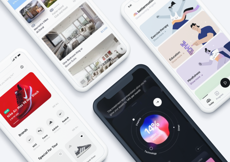
7. Consider where card-style architecture can better serve up content.
8. Avoid keyboard entry wherever possible. One way to do this is to add more options for social login or email instead of a full registration form.

What Comes Next
Crawl errors and page speed are top priority in Google’s new ranking program, but new developments in Wi-Fi and cellular hardware could soon eliminate those bottlenecks. It’s best to start thinking in terms of attracting more thumbs instead of clicks. After you make the above changes, start investigating what Google is likely to be prioritizing next. If there’s anything that you can count on in the online world, it’s that the rules are about to change again very soon.