Virtual reality’s journey from high-tech, futurist dream to mass market consumer product has been long and bumpy. In fact, without the patience and enthusiasm of dedicated experimenters and researchers, we probably still wouldn’t be there.
Even the astounding success of recent VR products like the Oculus Rift shows just how hard it’s been to get the tech ready for the mainstream. When Palmer Luckey sought out funding in 2012, it had already been about two decades since early headsets like the Sega VR and the Virtual Boy had tried (and failed) to bring the virtual reality user experience to the commercial market. Outside of well-funded research labs and enterprising hardware hackers, pretty much no one had access to the technology, and it took a Kickstarter campaign to get an affordable developer kit in the hands of enthusiasts.
Even now, headsets like the Rift and the HTC Vive are still a pretty niche market. If not for the spread of smartphone VR options like Google Cardboard, most consumers still wouldn’t be able to use VR.
This reveals a difficult truth for mobile app design and development professionals: VR is still a new and uncertain technology. Yes, it’s received a ton of buzz, and there’s been a rapid growth in sales and enthusiasm, but consumers are fickle, and this isn’t the first time we’ve all been told VR was the key to the future.
Will VR really change everything, or is it destined to remain a niche market? Well, that depends on us, the mobile app design and development community.
Virtual Reality and Immersive Experience
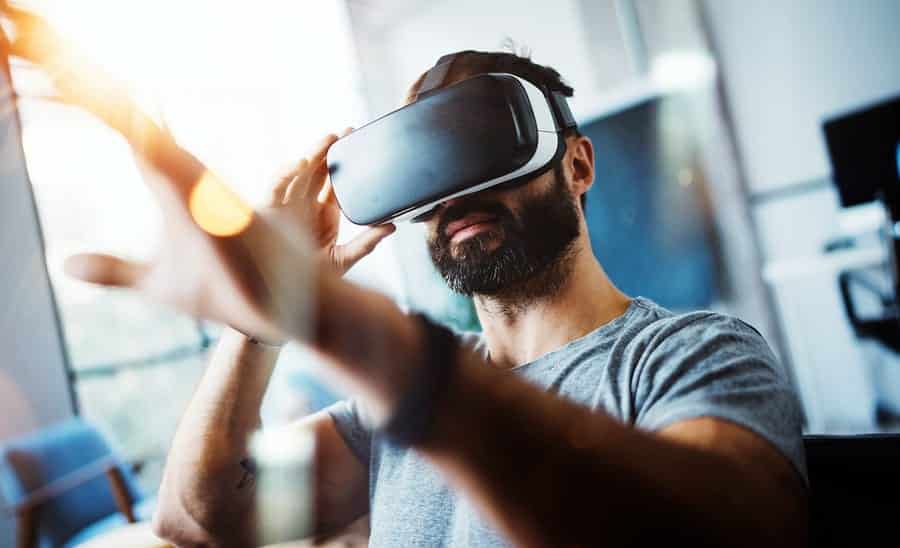
VR is synonymous with giving users an immersive experience. Instead of interacting with a flat screen that’s separate from them, the user dives into a simulated world that’s all around them. It asks for a lot more from the user. Physically, the display is literally strapped to their face, covering their whole field of vision and (in many cases) their ears as well. Psychologically, they’re not using an app you designed, they’re inside a world you created.
To make it worth it, you need to create a world that feels compelling, real (although not necessarily realistic) and immersive. However, the tools you have to do that will vary between devices.
At its most immersive, VR would enable your users to interact with the virtual world in much the same way they interact with the real world around them. They’d be able to:
- Look around to see objects in three dimensions.
- Perceive sound, shadows, light and so on as if they were located in three-dimensional space.
- See objects interact with each other and the user in a fluid and believable way.
- Physically manipulate and interact with virtual objects and characters using their actual body movements.
- Move around in physical reality, and have those movements reflected within the virtual world.
However, there are obvious obstacles to this. If you’re walking around, and can only see the virtual world, you’re liable to trip and fall or walk into traffic. In a completely immersive experience, you’d need to be able to interact with the virtual world and your physical environment simultaneously, with the virtual environment layered on top of the physical world around you.
This model, called mixed reality, is already under development. Technologies like the Microsoft HoloLens can project Minecraft creations on top of real tables, or let you battle insectoid robots that come out of the walls.
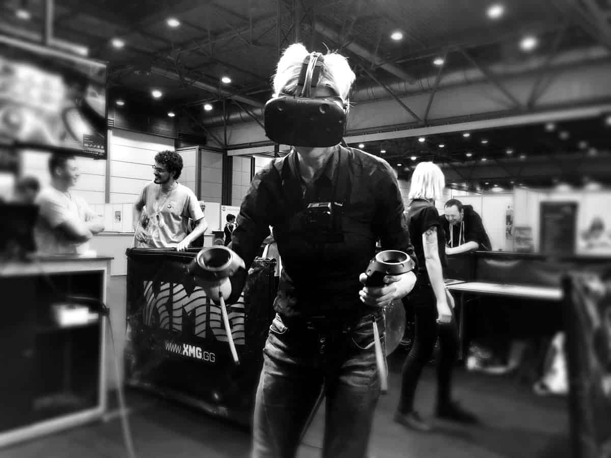
However, for the vast majority of users, that type of immersive technology isn’t available. Each virtual reality tool places its own constraints on how users can interact with software, and by extension, what VR UX design can accomplish. The dedicated VR headsets like the HTC Vive, Oculus Rift, and PlayStation VR offer a fairly immersive virtual reality experience. They can all track head movement, and can also track body movement within certain constraints that depend on the headset, peripherals, and configuration. The HTC Vive in particular offers 6 Degrees of Freedom (DoF) with room-scale VR. That means it can track user movement through an entire room, up to 15’ x 15’.
They offer sophisticated controls, that can enable the user to interact with objects in the world using a combination of motion and button pushing, but the exact capabilities also depend on the technology. However, even at the high end, VR headsets have limits. The user generally needs to be in a room setup with a clear area, and most need to be connected by a cord to a powerful computer or gaming console.
Smartphones also let you interact with the world, using a range of handheld controllers, like the higher end VR tools. In some ways they’re more limited — for example, they only allow 3 DoF, which means it can track which direction the user is looking in, but can’t track forward and backwards, side-to-side, or up and down movements reliably.
Even in that domain, what’s available to users will vary a lot. If your user has nothing but Google Cardboard and a phone, you generally won’t be able to track their hand movements or provide them realistic, three-dimensional sound.
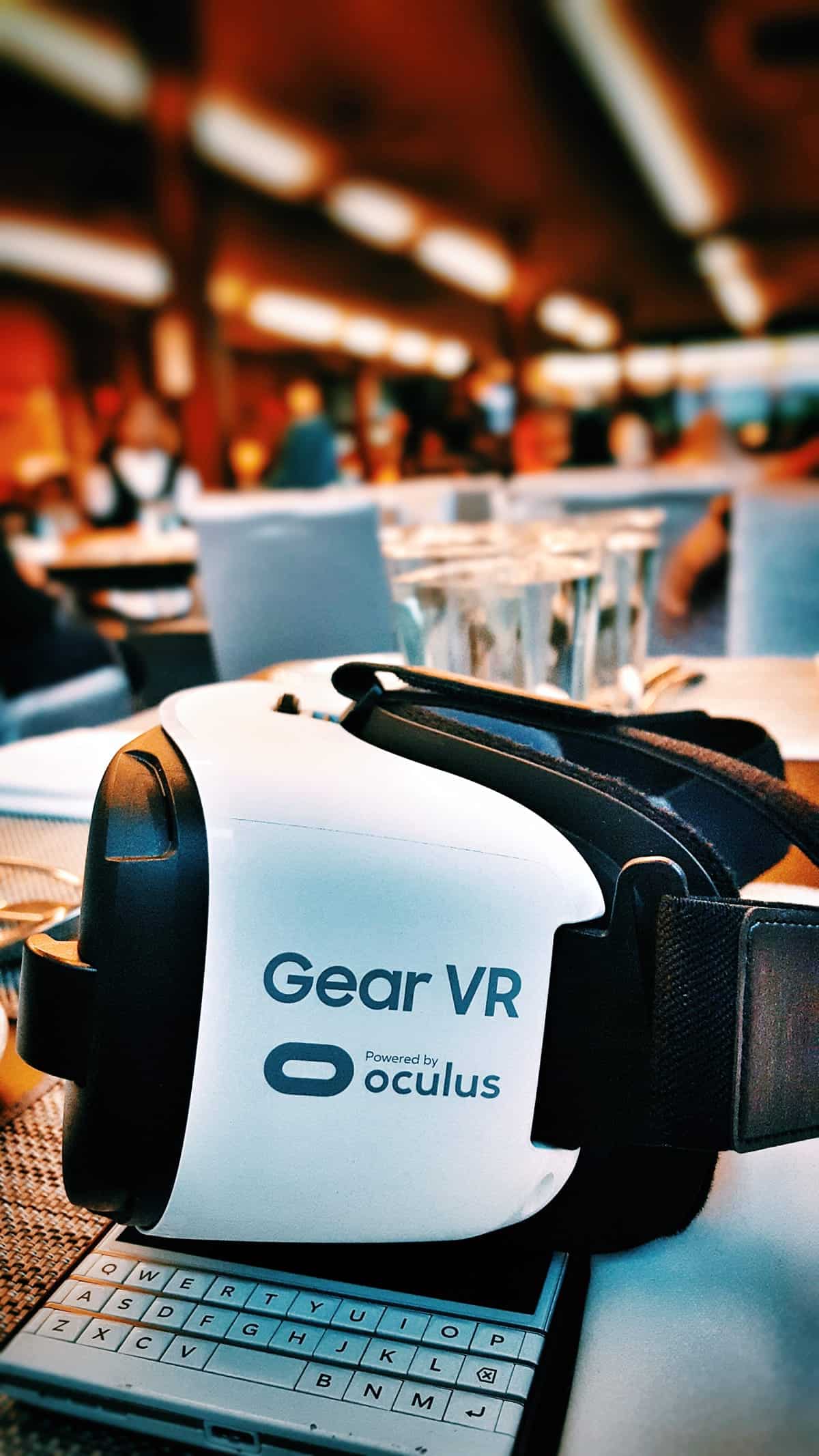
If the user picks up a relatively inexpensive VR headset like the Samsung Gear VR, a decent controller and a pair of headphones, they’ll have a more immersive experience, and the ability to interact with hand movements and control pads. Additionally, they’ll have some freedoms that a typical HTC user won’t, such as the ability to use VR on the go, without having to attach it to any pricey computer gear.
The question is, what will your users have? If they’re using a barebones setup like Google Cardboard, you’ll need to be clever with UX design. All you’ll have is what’s on the phone minus the touch screen, which means your users have to trigger the app with their gaze, verbal commands or sounds, or possibly head movements. Add a basic controller and a pair of headphones to track sound, and you have more tools to use to interact with the user, and so it goes on up to a full room tracking setup.
For a mobile app design professional, this imposes some challenging user experience decisions early on in the process:
- Do you want to aim for the widest audience, or harness more sophisticated VR setups for a smaller audience?
- Is it possible to make your UX design flexible enough to address the needs of barebones VR users, while providing added value for users with more sophisticated gear?
- What setting does it require for users? Is it something they can use at work with a few minutes of downtime, or do they need to be in an undisturbed environment?
- Is it worth it for the users? If they have to wait until they’re at home to interact with your app, will they do it?
- Can you provide 2D functionality as well, so users can make use of the app on the go? How will that format affect user experience? How should you change UX design to compensate?
Compare that to normal mobile app design, where everyone’s smartphone has more or less the same capabilities, and you can see the complexity of VR. Sure, mobile app designers have to compensate for differences in screen size, design, and functionality from device to device, but there are standardized elements. For virtual reality designers, finding your niche and understanding your users is more important than ever.
Mobile Apps vs. Virtual Worlds
Mobile app design is free and flexible. Usability is a constraint, but physics is not. Small buttons can pop up into full-screen menus. Objects can zoom on and off the screen. Games can transition to dramatic cutscenes, with rapidly shifting perspective without even warning users ahead of time. And because it’s all on a screen in front of the user, they can quickly adapt to the logic of your app without any problem.
VR, on the other hand, is all about physics. The user experiences an actual simulated world around them, and that world shouldn’t shift in ways that don’t meet their visual and kinesthetic expectations. The landscape shouldn’t suddenly move, unless the user moves it (or moves relative to it, e.g. in a racecar).
Objects shouldn’t appear out of nowhere to take up the user’s field of vision. Even something as basic as having the screen fade out and fade in on a different screen needs to be handled carefully, to avoid disorienting the user.
Good VR UX design needs to treat the virtual world as… well, as a world. That doesn’t necessarily mean every app needs to be deeply interactive. If you’re using VR as a way to look at panoramic photos, you may not need many interactive elements, beyond a way to let them select the photo.
However, if users are interacting with the world, that world needs to behave in a realistic manner. Buttons should “feel” like real buttons. Instructions and menus may be able to hover in the air, but they can’t just suddenly pop up out of nowhere — they need to appear in a way that’s visually believable and natural.
Similarly, objects will typically have to interact with each other in more complex ways than traditional apps require. If a user puts their hand over a lever, it should cast a shadow. If the user throws a rock in a lake, the splash should react to angle, speed, and other factors. Interactions that might look great in traditional mobile app design can end up flat and unbelievable in a VR user experience.
Understand the Optics of Virtual Reality Experience
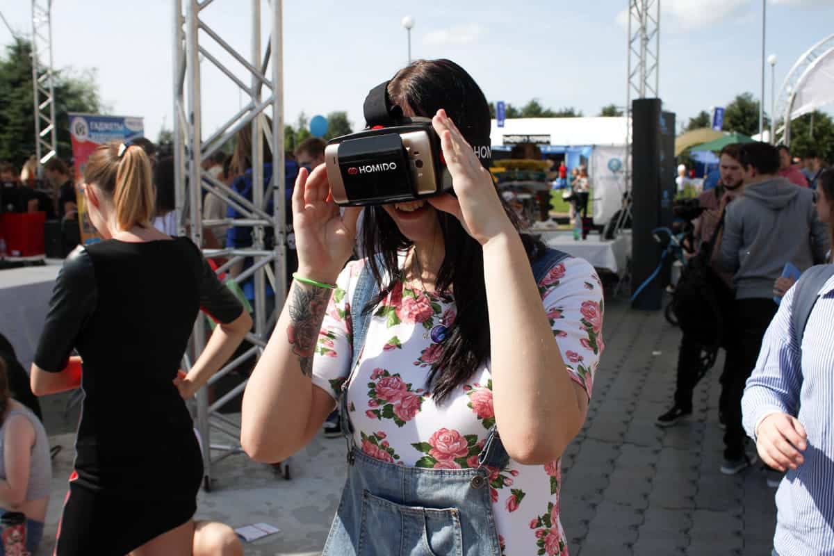
All virtual reality headsets depend on a screen that’s held very close to the user’s eyes. Your UX design needs to factor in how your users’ vision works in that environment, and avoid practices that cause disorientation and eye strain.
One example is what the Oculus UI guidelines refer to as “The Infinity Problem.” This occurs with simulated heads up displays (HUDs), where the same image is displayed on each eye. HUDs have a lot of obvious uses for VR. You could have stats, like your score or health, continuously display within your field of vision, or post important messages in the corner so users can see them, no matter how they’re oriented within the VR world.
But in this case, this practice is verboten.
The problem has to do with how your eyes focus. If an object is relatively close to you, your eyes see two different images. Your brain processes the difference between those images to show you how close the object is, and create a three-dimensional image of it. The only time both eyes see the same image is if you’re looking at an object very, very far away — at visual infinity.
A HUD creates the impression of an object that is both behind everything else and in front of everything else. It’s located focally at visual infinity, but it’s also layered on top of the world. Neither your brain nor your eyes deal with this paradox well, and it can cause disorientation, eye strain, and a generally unpleasant experience.
If you want to display data, it needs to be on a surface modeled in 3D space. One way to do this is by simply displaying a flat screen in front of the user — like Virtual Desktop does. However, in many applications, it may make sense to use more creative ways of displaying data. For example, you could have a control room, or put plaques under objects that glow when the user looks at them.
Depth occlusion is another problem VR designers need to take into account. In traditional mobile app design, you can generally stick a menu whenever it’s needed without worrying too much about what it blocks. For example, if users are playing a game and want to turn off the music, or change some other setting, you can just pause the game and slide an “Options” menu on top.
In virtual UX design, however, if you put a menu in front of the player, it might end up inside a wall, or stuck halfway through an object. This will break the visual coherence of the world, and be disorienting to the viewer, causing similar problems to a HUD. There are a lot of different ways to address this problem, such as:
- Projecting the menu closer to the user than other objects are displayed.
- Fading to another scene when the user loads the menu.
- Temporarily making objects closer than the menu disappear.
- Changing to flat, two-dimensional display when the player calls up a menu.
- Storing the menu in a particular location that the user can move to.
- Displaying the menu on an in-world object — for example, a notebook or wrist computer that the user carries.
Explore and Experiment With Virtual Reality
VR is still new, thrilling and uncertain. The technology is evolving rapidly, as is the art of creating a compelling virtual reality user experience. At this point, there’s really no way to play it safe from a UX design perspective. Many of the hard and fast rules you’ve learned about mobile app design will not translate well to virtual worlds.
Just as importantly, some design ideas that might seem excessive or inelegant in a traditional mobile environment will help create a more natural, compelling virtual reality experience.
The best way to figure out what works is to get out there and try it — both as a user and a designer. You need to spend a lot of time trying out the apps other people are making, and learning from their successes (and failures).
Proto.io helps designers and developers quickly make the jump to virtual reality prototyping using the same powerful, intuitive workflow you use to build traditional apps. With our new VR Components library, you can build your first VR demo in minutes, and test it out on your platform of choice. Whether you’re designing for Cardboard users, or high-end VR rigs, you can dive right in and start designing compelling experiences for your users.
Proto.io lets anyone build mobile app prototypes that feel real. No coding or design skills required. Bring your ideas to life quickly! Sign up for a free 15-day trial of Proto.io today and get started on your next mobile app design.
Got any great VR user experience tips? Let us know by tweeting us @Protoio!


