As we settle into this new year, there is so much we all learned from 2020. Looking forward, the world remains hopeful that 2021 will bring positive change and a ubiquitous vaccine. In the middle of all of this, designers have stayed as active as ever, pumping out amazing mobile app designs that help us all get healthy, keep our finances in order, and stay informed. Let’s jump right into our top mobile app designs that we picked out this season.
1. Auro by Flexible Fitness Technologies Limited
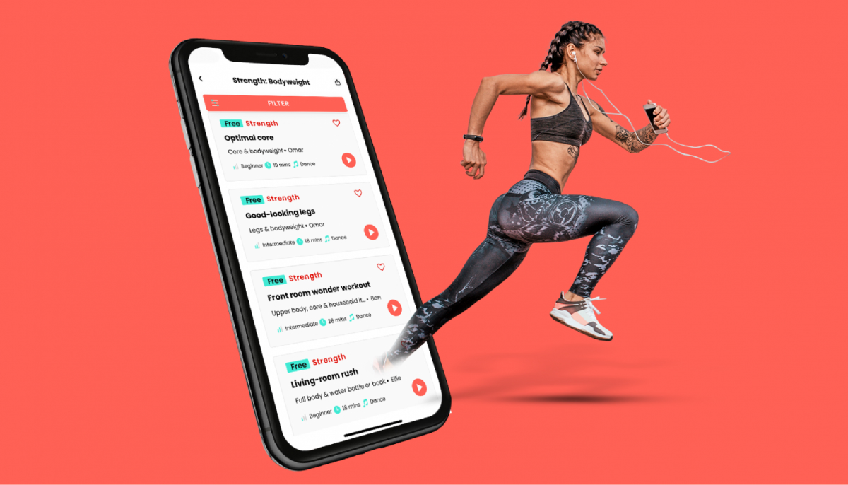
Around this time of the year, people around the world set their resolutions to improve their lives. Working out more is a common one, which is why Auro caught our attention. It is a mixture of podcasts, music, and audibles that make for great audio-based training sessions. Auro’s mobile app design packs in hundreds of workouts with numerous trainers into the gray background and uses their signature coral for a pop of color. The trainers practically jump off the screen with colorful lines hugging their bodies in motion. Whether running or yoga is your thing, this app experience offers plenty of personalized fitness content with the help of AI.
2. Wellory by Wellory
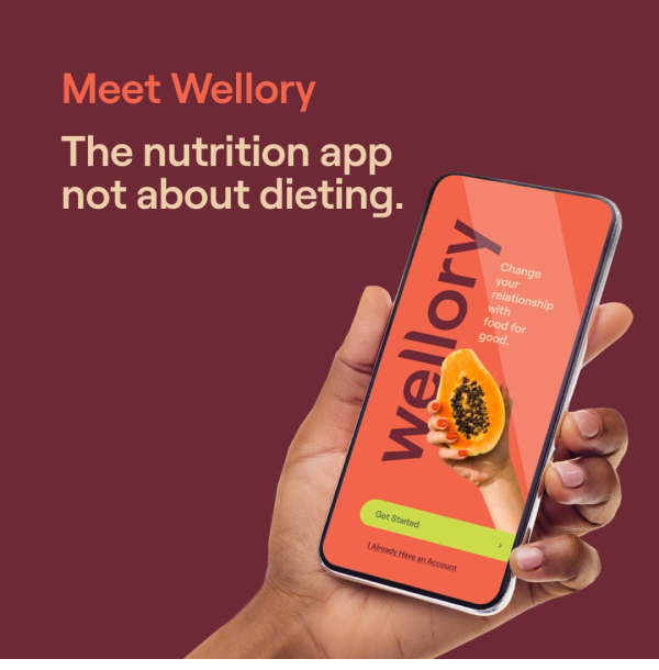
Another new year’s resolution that many people start the year with is a pledge to eat healthier. Wellory is an app that is like a nutritionist in your pocket and does away with yo-yo dieting schemes that do more harm than good. It offers a highly personalized nutrition experience that is deeply rooted in science. Sending your personal nutrition coach a picture of what you’re eating can help them make suggestions for future meals and help nudge you toward a healthier path over time. The mobile app design is largely messaging-based and includes attention-grabbing images with orange call to action buttons that remind us of nutrient-dense foods that should fill our plates.
Source: TechCrunch
3. Gawq by Gawq LLC
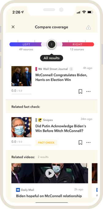
Gawq is a new media company that can be summed up by their clever tagline,” unbreaking the news.” Over the past decade, those with internet connections have started relying on social media for news. However, what we see on our timelines is determined by an algorithm, basically presenting us with posts and content, social media companies think we will like or engage with, instead of just presenting unbiased information. Gawq cuts through that and provides a way to read news from over 150 publications, fact check stories, and filter out topics or features that are not a fit. The mobile app design aspect that we enjoy most is the clean layout that allows users to dive deep into topics with large images that detail the story. If you find a topic that has a partisan angle, you can easily understand the other side of the argument by seeing how many publications covered it from either end of the political spectrum with a fun gradient feature at the top of the screen.
4. Google Pay by Google LLC
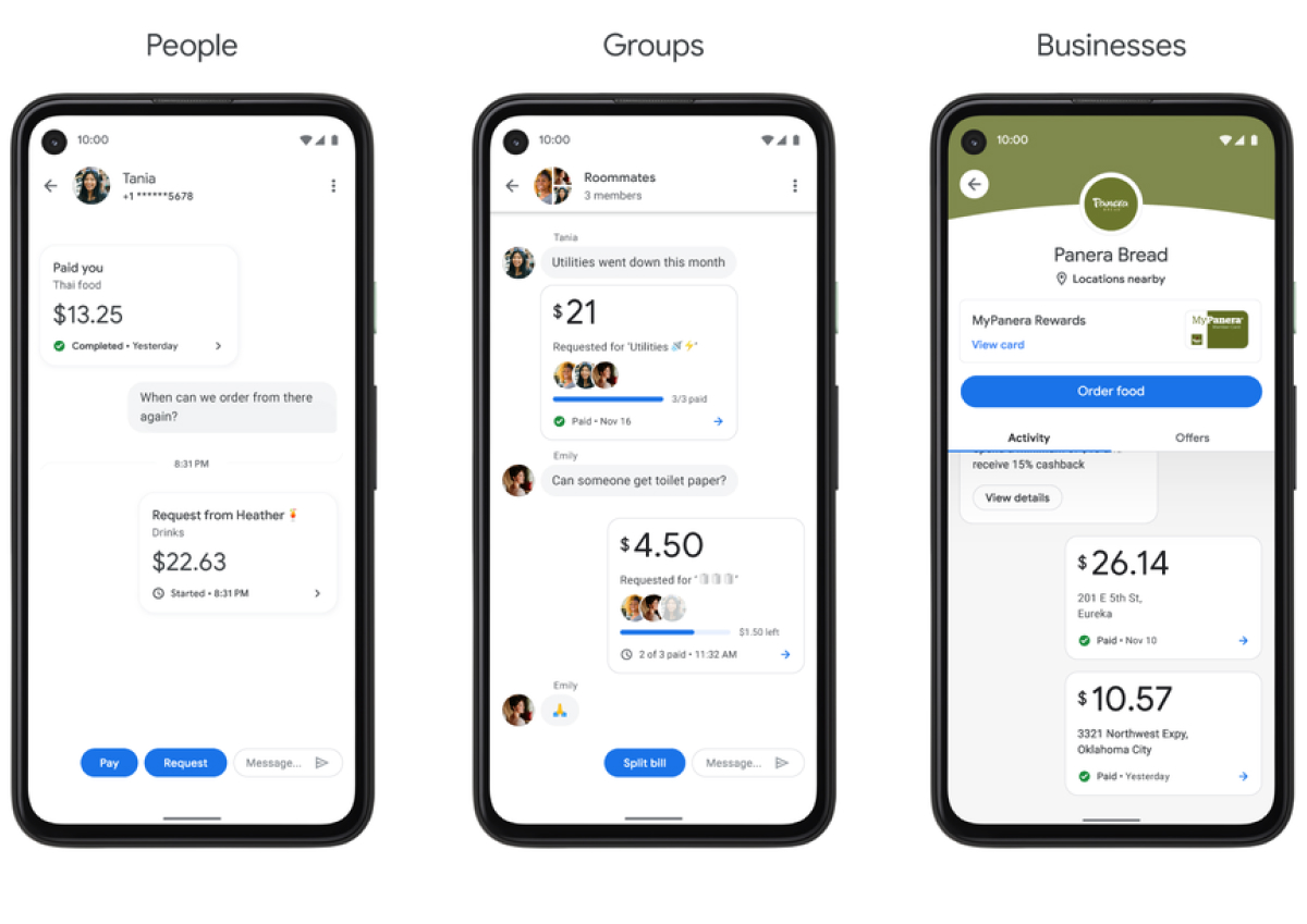
Mobile payments have surged during the pandemic because consumers and merchants alike want low-touch payment options. Google Pay recently revamped its payment app for iOS and Android to offer a more holistic financial experience. This mobile app design packs in so many functions within a sleek and minimal package, from expense splitting to easy to understand spending metrics. In particular, we are fans of the metrics functionality that helps users keep track of their spending. This mobile app design is a classic Google design, with a largely white interface and blue buttons. All the white space leaves room for branding from partners, such as Panera Bread’s signature green.
Source: Google
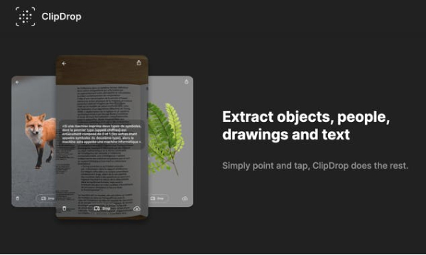
5. ClipDrop by Init ML
Our last mobile app design is sure to be a treat for all creatives out there. ClipDrop is an AR tool that can help users select an image of anything in the real world and quickly drop it into the digital realm to resize it and include it in digital creation, such as a mood or vision board. The app design is quite simple to enable quick clips. The main screen of the app is largely taken up by the camera view. It also has a more options icon in the top right corner and text and upload buttons down at the bottom. Mainly, users will tap the clip button along the bottom of the screen. Once the technology detects the item that the user has clipped, they can move their phone around, and the image will move with the phone. At this point, the clip button transforms to a drop button, and a quick tap of it (when in front of a computer) will either add the image into an open program such as Sketch or open on their desktop.
Source: Product Hunt
That’s all for winter but be sure to check out last season’s edition, featuring the best mobile app designs of fall 2020.
Feeling inspired? Sign up for free with Proto.io and prototype your own app in minutes.
If you enjoyed this curated list of great mobile app designs, share it with your social network! Do you have a suggestion for the next edition of our Top 5 Mobile App Designs series? Reach out to us via Twitter @Protoio or on Facebook.
