When building digital products, the greatest contribution of interaction design is the focus on human experiences rather than product features. The use of digital products isn’t merely function-driven. People also relate to products in an emotional and psychological way. A human-centric approach to design therefore augments the inherent value of a product in the mind of the user.
Great interaction design sees to it that people associate a product not only with utility but also with relevance, delight, and positive emotions. In this month’s edition of the Top 5 Mobile Interaction Designs, we look at 5 mobile apps and design concepts that effectively weave function with experience to create human-centric digital products for everyday use. In no particular order, here they are.
1. Boomerang by Instagram
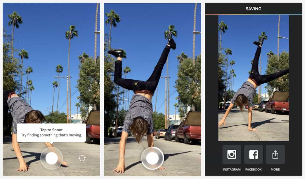
Gifs and videos are all the rage on social media right now. We’re no longer satisfied with still images in our Facebook and Tumblr feeds. We want to go beyond the static and capture motion to share with the world. It’s only befitting that Instagram, the popular online photo-sharing app, has come up with an app for the sole purpose of making short video snippets. It’s not a gif nor a photo, it’s a Boomerang.
What’s great about Boomerang is its ultra-simplistic user interface that serves the one sole purpose of the app. Sure enough, we can already imagine how future user demand would probably lead to Instagram rolling out more features for the app. However, such simplicity brings us to question the need for apps overladen with features. Great interaction design can be achieved with a lot less. In this case, a camera view, a shoot button, and voilá, we have a Boomerang of this cat ready for sharing.
Source: Instagram Blog
Get Boomerang on iOS. (DISCONTINUED)
2. Assembly by Pixite LLC
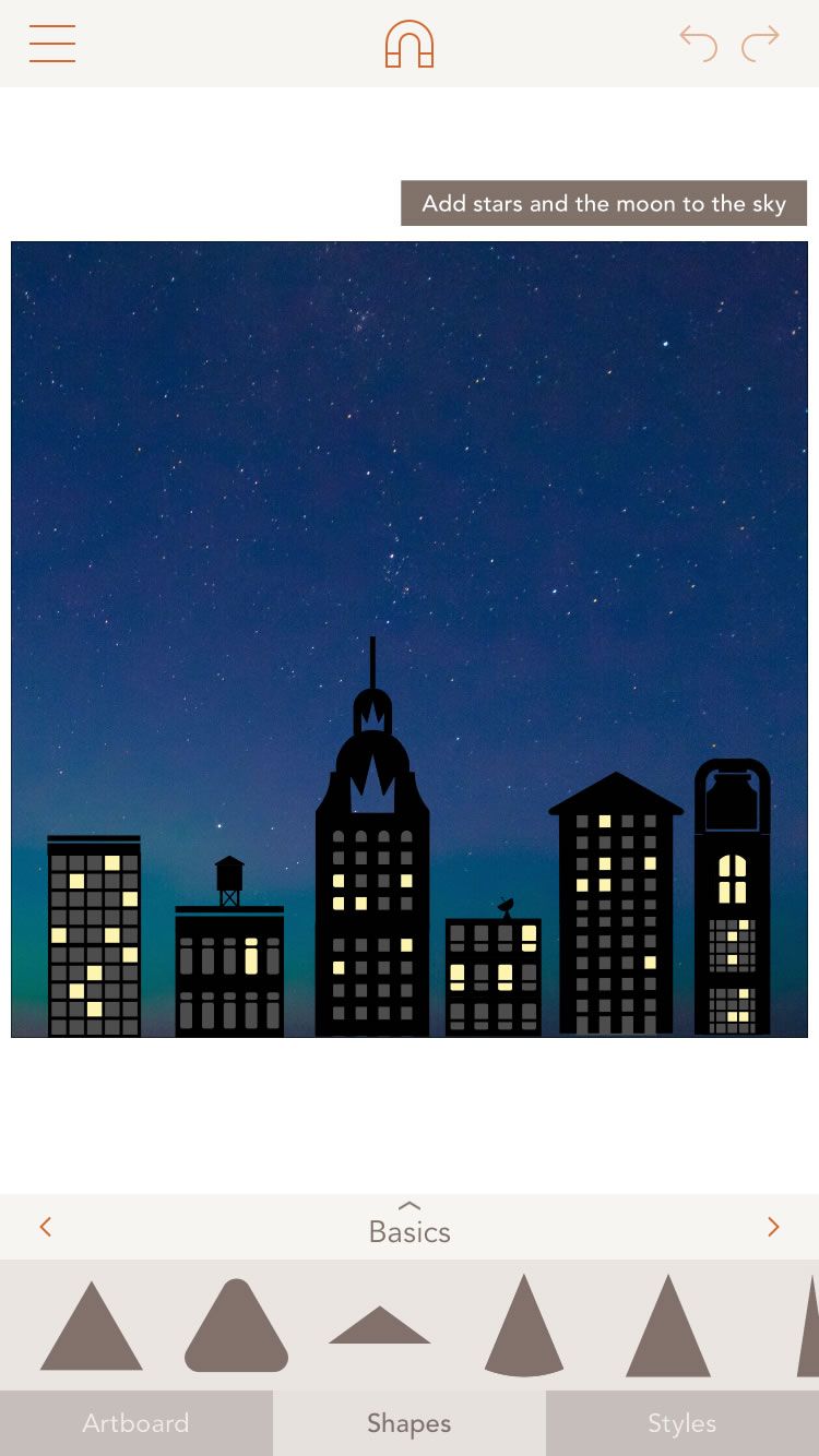
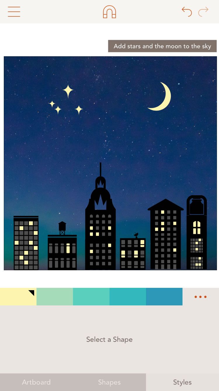
Tools to empower designers are pretty awesome. Easy-to-use design tools like Proto.io that empower non-designers belong to a different level of awesome. Assembly is one such app that lets anyone create beautiful vector art without having to deal with the jargon and the steep learning curve of the Adobe Creative Suite. It comes with a vast library of shapes that you can easily manipulate to create professional-looking designs.
As an app that promises to bring you the future of design, it is delightfully easy to use. The clean design that greets you from the start makes you feel very much at ease using the app. If you start off at beginner level, there are some tutorials and guides to go through. It’s generally very self-explanatory thanks to the clear layout of the app and the thoughtful interaction design behind it.
Get Assembly on iOS.
3. Alarm Interaction by Gleb Kuznetsov (ALARM DISCONTINUED)
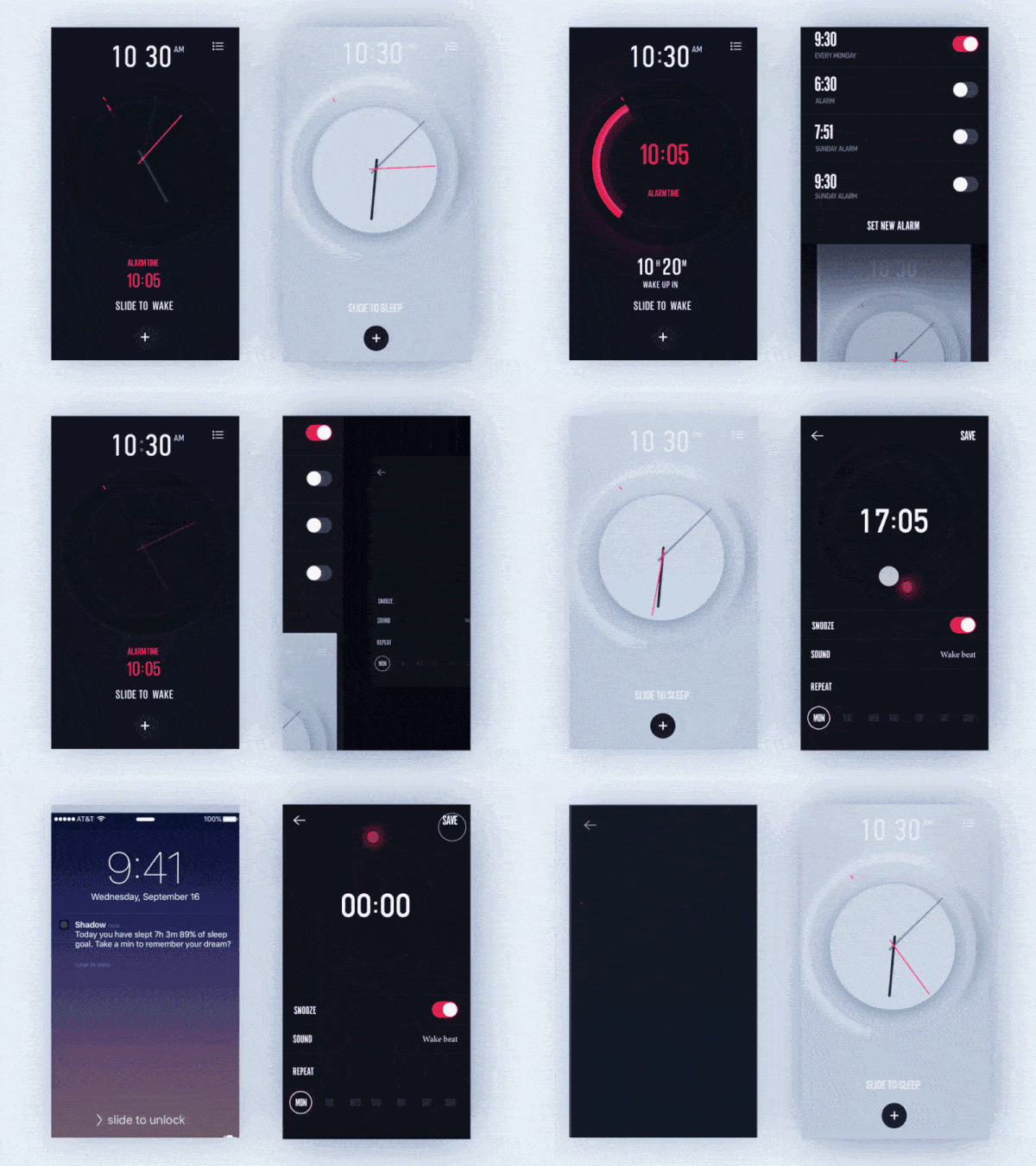
These days, many of us use our smart phones as an alarm clock. And for those among us who aren’t morning persons, grappling with the alarm app can be somewhat of a nightmare. Fortunately, great interaction design can help alleviate the dread of facing the clock in the morning. As designer Gleb Kuznetsov shows us in this great alarm app concept filled with beautiful and delightful UI animations. It also comes with push notifications that lets you know how well you’re doing in terms of your sleep goals.
4. Magic Flute: Puzzle Adventure by LabLike (DISCONTINUED)
Puzzle games, Mozart, and Japanese opera may seem like the unlikeliest combination ever but here we have it. A charming creation by studio LabLike, Magic Flute is an enchanting game based on the story of the Mozart’s opera of the same name, in collaboration with Japanese stage director Amon Miyamoto. This is just the app for those who have been yearning for a game that lives up to the standards of Monument Valley.
The gameplay mostly involves moving tiles and solving puzzles to get the character to higher levels. What’s truly remarkable about Magic Flute is the marvellous blend of distinct art forms to create an engaging experience. The interaction design behind the app pays close attention to the sensorial experience of playing the game. The visuals are notably stunning.
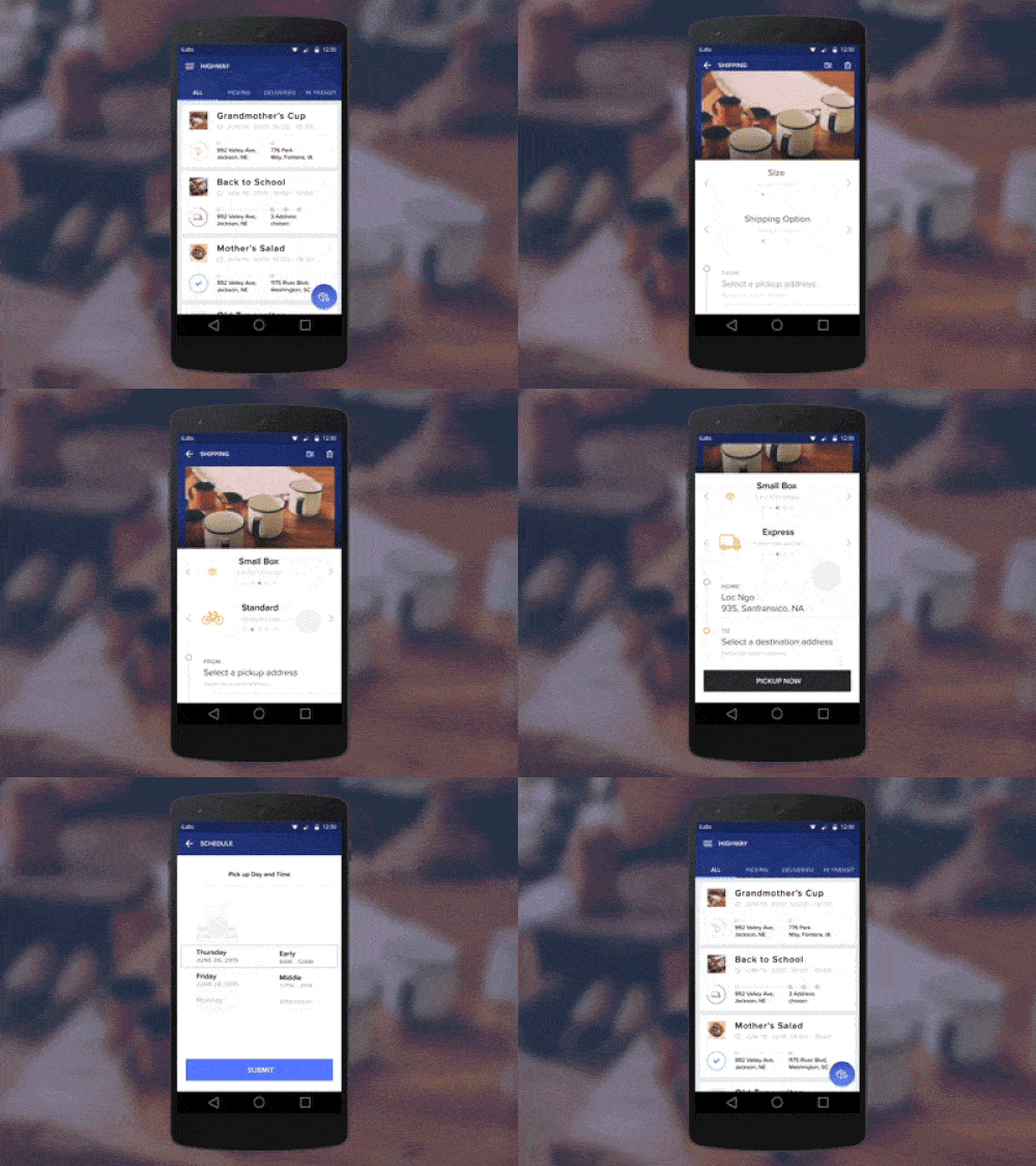
5. Shipping App Concept by Hoang Nguyen
Shipping and logistics may not be the most exciting of things. Just think about the last time you bought something online. Quite likely, you had to go through the whole process of filling in data, perhaps running into an error somewhere, and having to start over etc. However, this shipping app concept with its lovely Material Design style and great interaction design will surely transform the way you feel about shipping.
The flow of creating a shipment has obviously been well thought over to ensure that the user has a smooth experience. From taking a picture of the items to be shipped to selecting the arrival date and time, the process has been streamlined for easy user input. Just a few swipes and taps and your items are well on their way to their destination.
Know of a mobile app that deserves praise for its great interaction design? Recommend it for feature in our Top 5 Mobile Interaction Designs monthly series. Tweet us @protoio
