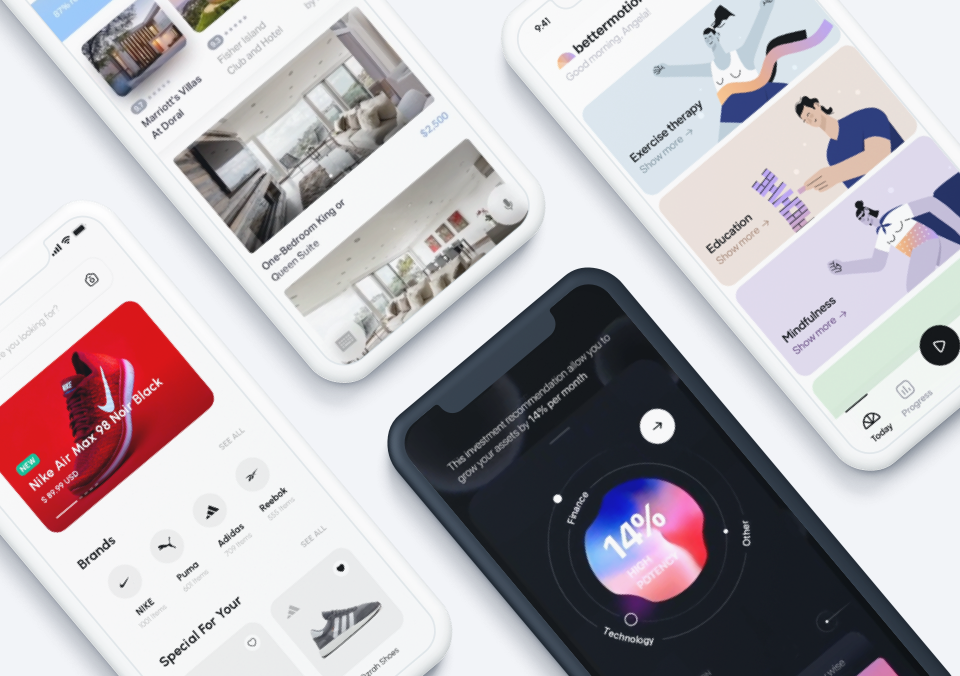
This month’s round-up of the top mobile interaction designs has it all: from the important to the trivial to the whimsical. What is design if not a window into what matters to designers around the globe? The app concepts featured in this edition cover several different parts of the human experience, especially when it comes to the need for healthcare and hope for a better future. Let’s get right into these designs.
1. Elfie – Healthcare App by Etheric
Having a high-level view of your health is essential these days. Elfie tracks the number of health metrics and gives users a score of their progress that day. This app concept shows users their heart rate, how many steps they’ve taken and even helps them keep track of the doses they’ve taken of their daily medications. In particular, the mobile interaction that stood out was the pill animation. Tapping into your “doses taken today” section of the app shows the dosage you are taking and a 3D rendering of the pill. Swiping on it twirls the pill and tracks one more dose taken for the day, as noted by one of the three lines that turns from white to pink.
Source: Dribbble
2. Activity Tracker App by Afterglow
Another important part of staying healthy is staying active. Opening up this app concept shows several options for workouts, from yoga to biking. Tapping on the small gray cards while swiping through them enlarges them, turns them bright, and even brings a fun animation moving across the card. Selecting cycling pops up a suggested biking route, complete with an animated map showing where you’ll go in the city. Lastly, tapping on “start session” brings up an interactive map to show exactly where to go when you hop on your bike.
Source: Dribbble
3. Private Jet Booking by Ethertic
As the pandemic presses on, it’s hard not to dream about when life will be normal again. Well, maybe private jets weren’t our usual way of getting around, but we can dream! The UI is much simpler than the average travel app that requires so many options and filters to work correctly. Instead, the user simply types where they would like to go and selects a time and date. The time selection feels the most luxurious for anyone who is used to terrible flight times. Being able to scroll through the rolodex of times and select the one that works best for your schedule is about as good as user experiences get. And, as always, we can’t help but love a nice map with an animation of the user’s journey.
Source: Dribbble
4. Event – Mobile Design by Outcrowd
Beyond traveling, another part of pre-pandemic life that we can’t wait to get back to is having nights out on the town. Remember attending shows with friends? Sooner rather than later, we hope we can get back to these events. This mobile app designer reimagined the ticket buying experience to make the UI as smooth as possible. We love the ease of tapping on the type of show of interest and then hitting the plus button until the correct amount of brightly colored tickets flutter onto the screen. We find the sharing feature beneficial, as it allows you to share a ticket directly to a list of friends who pop up with their names and images. That ticket then zooms off the screen to the right, indicating that it is being sent to a friend.
Source: Dribbble
5. Bottom Navigation by Alex Arutuynov
Last but not least, we always like to end with a “less is more” design. This month we have a pop-out bottom navigation bar. Bottom navs on mobile apps have become way too busy. Anything with more than four icons easily looks cluttered. Alex Arutuynov created a plus button that sits in a divot between and just above the calendar and friends icons to combat this. When users tap it, it looks almost like a cell dividing; three more icons (this time in pink) spin-out above it to give users three more quick options. As is customary with interactions of this type, the plus sign shifts to become an “x,” which users can tap to reel the three additional icons back in.
Source: Dribbble
That’s all for July but be sure to check out last month’s edition, featuring the best mobile interaction designs of June 2021.
Feeling inspired? Proto.io helps you bring your idea to life in no time, with no coding skills required. It’s ideal for UX designers, entrepreneurs, product managers, marketers, students, and anyone with a great idea. Sign up for a free 15-day trial to start building your first prototype today!


