In this month’s edition of the Top 5 Mobile Interaction Design, we look at an interesting variety of apps designed to help you create beats (no, not the Apple kind), predict your future using ancient knowledge, immerse yourself in the world of mobile games, and take the public transport.
What do these apps have in common? Nothing, really, except for their marvelous and detailed interaction design incorporated in the app to help deliver a great user experience. Presenting the Top 5 Mobile Interaction Designs – we showcase the creativity of mobile app designers and reward them for the hard work they’ve put into crafting great interaction design.
1. Keezy Drummer by Elepath, Inc
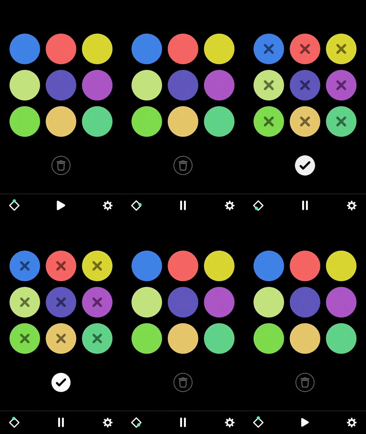
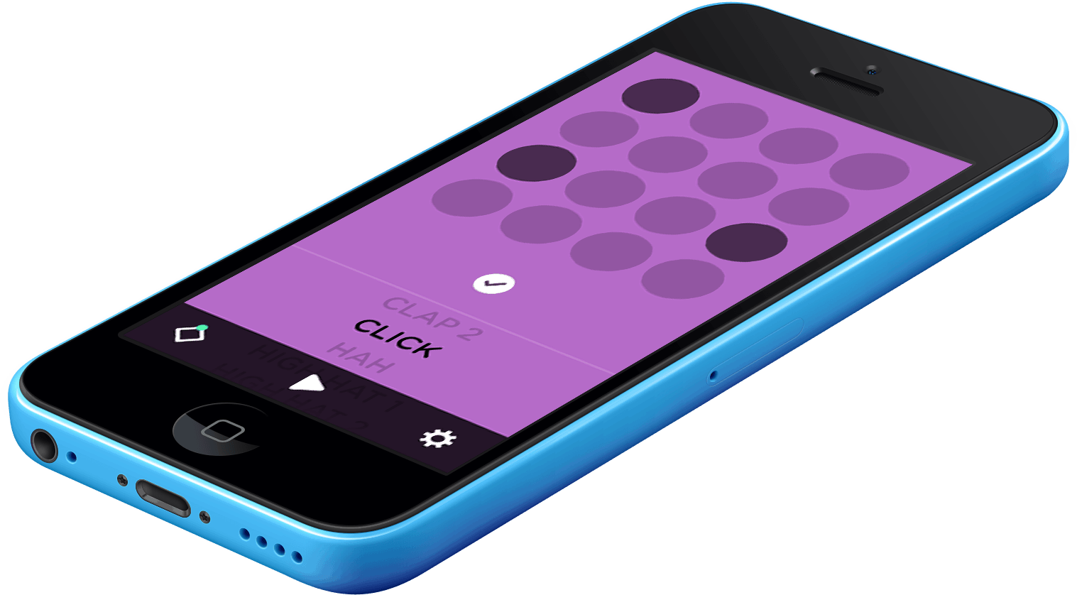
Being an occasional musician myself, I have so much love for the Keezy Drummer app right now. The app lets you create beats in the easiest possible way, by activating different sounds of the drum with a tap on circles on the screen. The circles represent each count of a beat and this is clearly signified with the great use of animations.
You choose the sounds you’d like to add, select which count it should play on, and voilá, you have a beat going. You can also change the tempo, delete or add new sounds as you go. It’s very learnable and usable. Just watching the video once already gave me a clear idea of how to use the app and as expected, I was jamming to the beats I made within five minutes of downloading Keezy Drummer.
Download Drummer by Keezy for iOS
2. Kicuby by Kicody
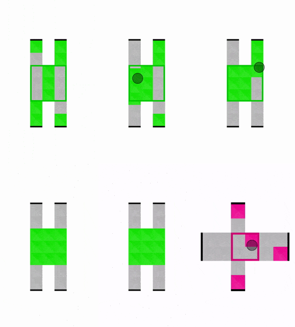
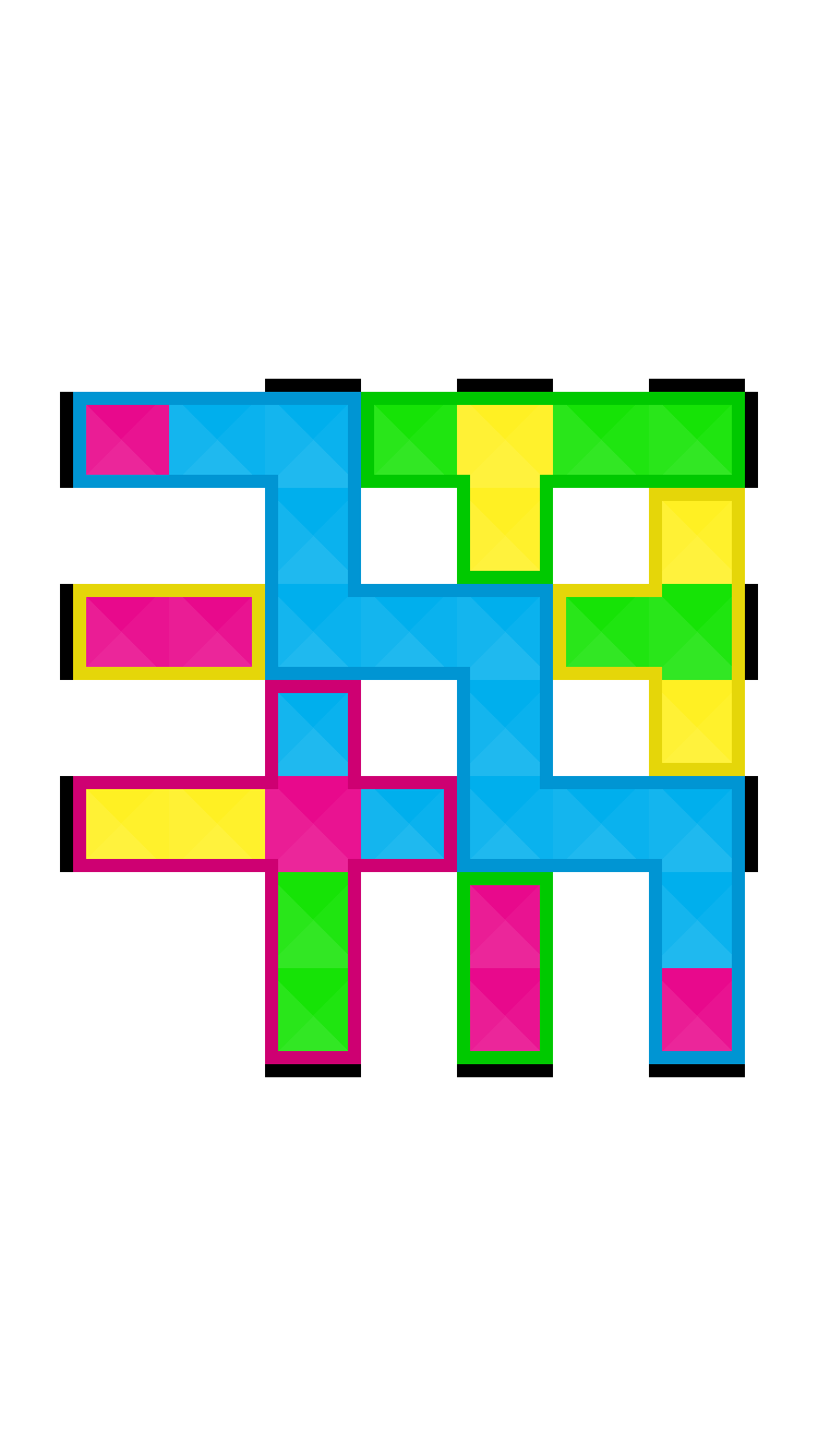
The fine folks of Kicody reached out to me via Twitter one day with a link to their new iOS game, Kicuby, which resembles a touchscreen version of Rubik’s cube. Now, I absolutely hate Rubik’s cubes, as I can think of better ways to give myself a headache. However, the attention-calling, beautiful bright colors of the Kicuby app got the better of me and an hour later, I was completely engrossed in moving colored squares into outlined areas.
Kicuby is indeed a very well-designed game. It’s challenging, yet doesn’t make you give up in despair. Sliding the blocks feels very natural and even without the preliminary explanations provided during the first level, you can easily grasp the idea of the game thanks to the interactive elements and the great use of simple, vivid colors.
It’s getting harder to do my job these days since all I wind up doing is either make music or play games. Nonetheless, it seems about right that a list of amazing interaction design would be filled with mobile gaming apps. If a game wasn’t interactive, there’s something wrong with it!
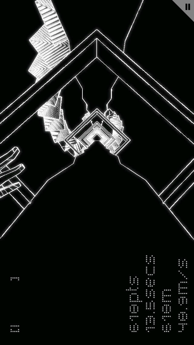
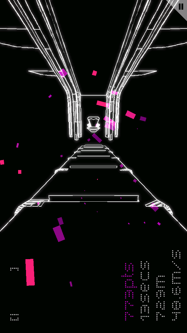
Fotonica is a first-person runner game for mobile and desktop that is dazzling and mesmerizing. What’s special about it is that it truly immerses the player in an intense albeit surreal experience. It’s not just a figure running in a game, it becomes you.
The game UI design is simple, monochromatic with a slight touch of colors that’s just enough to inject life and lift the mood. There are no elaborate characters or exquisite illustrations but just vectorized landscapes that flash by as you speed your way to more points.
Download Fotonica for Android
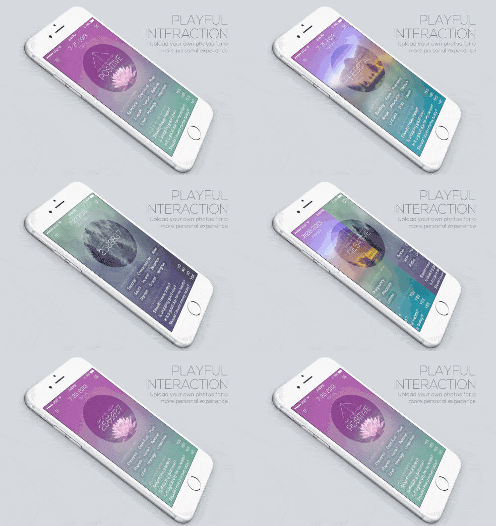
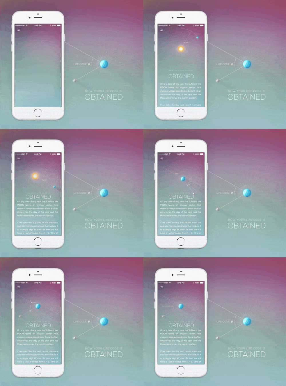
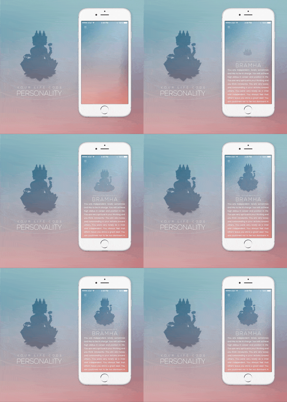
Life Code is a mobile app that uses the ancient knowledge of Vedic mathematics to calculate and predict your future. I’m not a big fan of fortune telling and future predictions but I’ve been thoroughly captivated by the beautiful animations and well-implemented transitions of this app design.
Visually, Life Code is lovely with its gorgeous combination of images, icons, and colors. The content is well presented with clarity, proper spacing, and adequate contrast. The animations help to bring text to life and add a delightful spin to the interface.
As I can’t find the app anywhere on the store, I’m assuming that it’s still in the concept phase. If it were to be released, I’d be sure to check it out just to have a feel for the flow of the app as it appears to be wonderfully smooth.
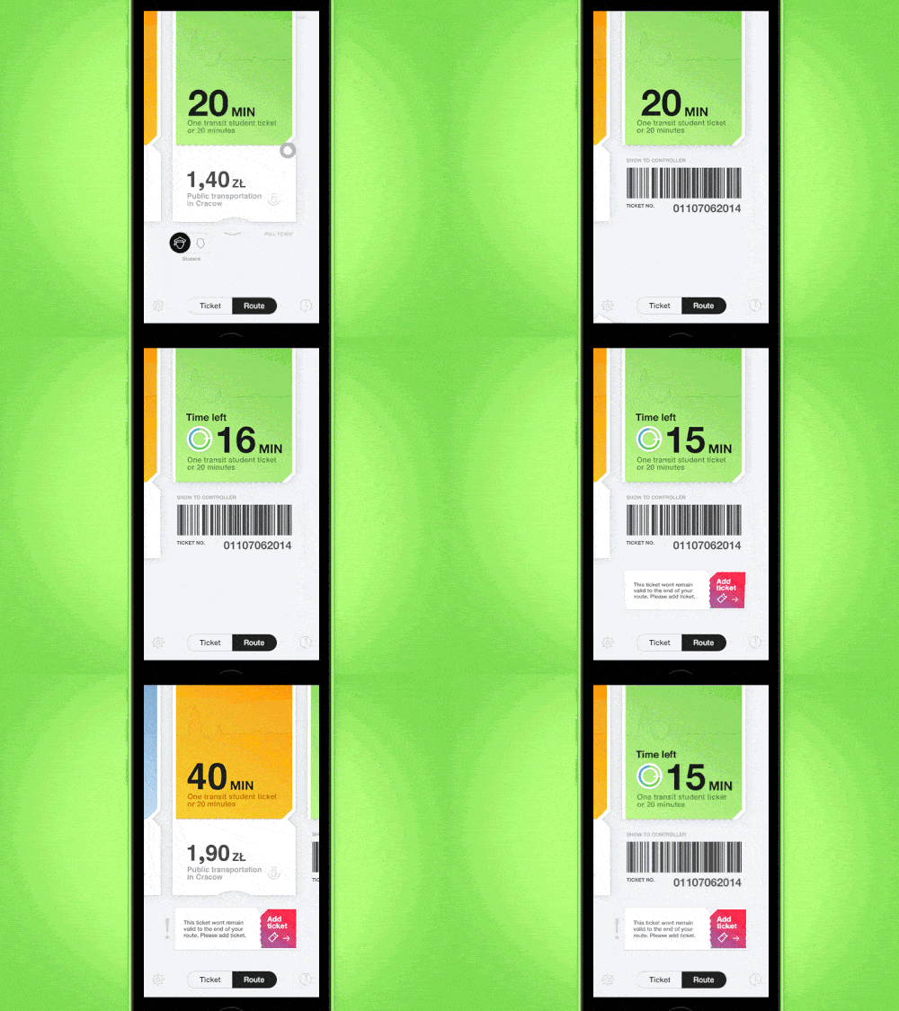
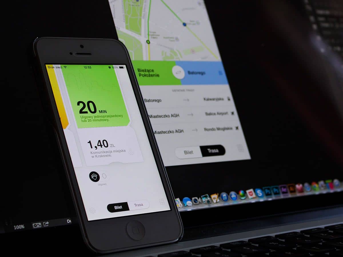
Although a simple app concept to manage your public transport tickets, Ticket is very rich in interaction designs. You buy the ticket with the app, show it to the ticket controller when you board, and ‘peel’ off the bottom section just as you might do with a paper ticket in real life.
As someone who has a tendency to lose her public transportation card in any one of the five bags she uses on a regular basis, this app would clearly come in handy for me. It also shows you the route you could take and a history of how much you’ve spent on public transport, giving Ticket extra bonus points for the user-centered design factor.
Do you have an awesome mobile interaction design that deserves a spot in the Top 5 Mobile Interaction Designs series? Or perhaps an amazing app design that you’d like to see featured in our monthly Top 10 Mobile App UI series? Let us know! Tweet @protoio or @wildningja
