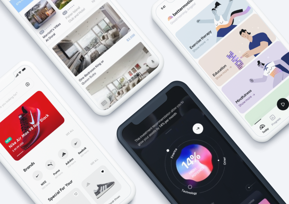
Just like that summer is over and it’s time for bright colored leaves and nights by the fire. But before you mourn the loss of summer, we’ve got a roundup of some of the most thought-provoking mobile interaction designs to start the season on the right foot.
1. Royal Caribbean App by Minh Pham for FΛNTΛSY
Since we’re still clearly dreaming of summer, we’ll start off with this Royal Carribean cruise line project. This colorful design serves as the homebase for cruise passengers, providing them with all the information they might need. And as an added bonus, it also has some fun design interactions to bring the app concept to life. Swiping to the right reveals all the menu and swiping back to the left brings the ship back into focus with a whale even swimming by! Below the image of the ship, the user is provided with attractions they can look forward to on the ship. Lastly, tapping on the ship itself sends the user’s vantage point high into the sky, showing a map of all the different ports the ship with visit, quickly appearing on the screen in order.
Source: Dribbble
2. UGEM Wallet Tracking App by Liev Liakh for UGEM
If you’re anything like us, the credit card bills that rolled in from summer vacations certainly took you by surprise. Lucky for us all, this mobile app interaction has a smooth way of setting daily spending limits to get your finances back to normal. The feature that we enjoy the most is adjusting the daily limit. Tapping on the button next to the amount of money pops open a ticker that moves with oscillating lines as you swipe up or down to the desired number. Secondly, we also enjoy the motions when the graphs populate on the screen showing recent spending habits. The line graph at the bottom of the screen populates from the bottom of the lines and extends until they reach the amount the user spent for that day.
Source: Dribbble
3. Credit Cards Slider by Gleb Kuznetsov
Staying with the financial theme, this is an app concept that helps friends split costs. Tapping to confirm the payment brings several credit cards flipping up onto the screen. They are arranged as a rolodex and scrolling through, both left and right, flips through the available cards. Tapping on one in particular halts the card in the middle of the screen in a sudden motion. We enjoy the realistic movements of the credit cards that bring this mobile interaction design to life.
Source: Dribbble
4. Foodly UI Kit II by by Anton Tkachev for UI8
This food app is jam-packed with motion that’s sure to please designers around the globe. Swiping up and down this app shows different restaurants that app users nationwide enjoy. These cards with delectable photos of dishes the restaurant is offering flip up as if they are literal playing cards being turned over to reveal what they have on the other side. Next, the user can explore more local options by swiping to the left and right at the top of the screen using the rectangular cards that shake a bit as the user moves through them. Lastly, users select filters to be sure they are served with options they will like. Tapping on the options “selects” them and shows this by turning the tan rectangle or circle green in a motion that moves outward from the center until it fills the entire area.
Source: Dribbble
5. Iceland Moss by Outcrowd
As plant lovers ourselves, we saved this mobile interaction design gem for last. This eCommerce app concept helps users bring new greenery into their lives—even if they choose a red or purple plant instead! Tapping on the plus sign in the top right corner of a card adds that product to their shopping cart, causing a “1” to join the bag icon in the top right corner of the frame. Swiping up makes the header section disappear (as the search and filter buttons jump to the top of the screen) and the user is faced with a choice between moss of several different colors laid out in different sized cards and at various price points. Tapping on a product expands it to take over the entire screen for a moment. Then, the product information pops up to occupy the bottom half of the screen. In addition, three little dots appear above it, signifying more image options, if the user swipes to the right or left. They appear on the screen in a wave-like motion that is such a delight to notice.
Source: Dribbble
That’s all for fall, but be sure to check out last season’s edition, featuring the best mobile interaction designs of summer 2019.
Feeling inspired? Proto.io lets anyone build mobile app prototypes that feel real. No coding or design skills required. Bring your ideas to life quickly! Sign up for a free 15-day trial of Proto.io today and get started on your next mobile app design.


