Interaction designers are the key to making sure that users are able to interact with a product and have a meaningful and fulfilling experience. That is to say that a product should carry out its purpose in the least conflictive manner possible, with its purpose being defined by the user’s needs.
Creating a mobile app with a beautiful UI is worthless these days without great interaction designs to smoothen out the experience of the user, to provide feedback, and to leave the user feeling fulfilled in that his or her motivations to use the product in the first place no longer exist after. In our third edition of the Top 5 Mobile Interaction Designs, we take a look at 5 mobile apps with noteworthy interaction designs.
1. Escape by Ketchapp
Escape is the one mobile game that has been dominating my household lately. The simple one-button, yet highly addictive gameplay combined with an amazing app UI and great interaction designs make this game an all-time favorite when you have time to kill. You navigate a little space rocket through a bleak world of ruins and try to rescue stranded humans while avoiding falling rocks, giant gyrating gears, and a number of precarious situations involving UFOs with laser beams.
The way that Escape provides feedback through appropriate animations and sounds just goes to show that the creators are top-notch professional mobile app game developers. The graphics and atmosphere are great, provoking enough suspense and excitement to urge a player to play on. What I like about Escape’s Adventure mode is that each level gives you a little sneak peek into the more difficult levels to come by revealing challenges you’d have to face so that you’d have a better clue as to what you could expect.
Download Escape for iOS and Android.
2. Workout Book by Vitaly Rubtsov
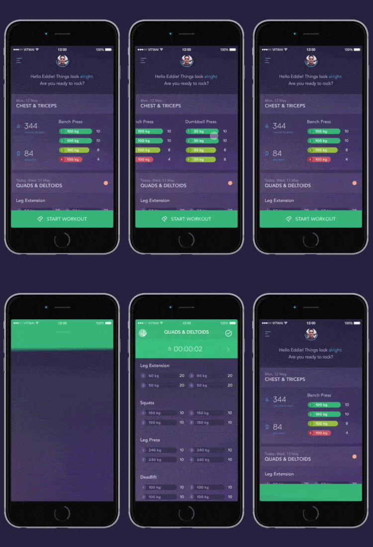
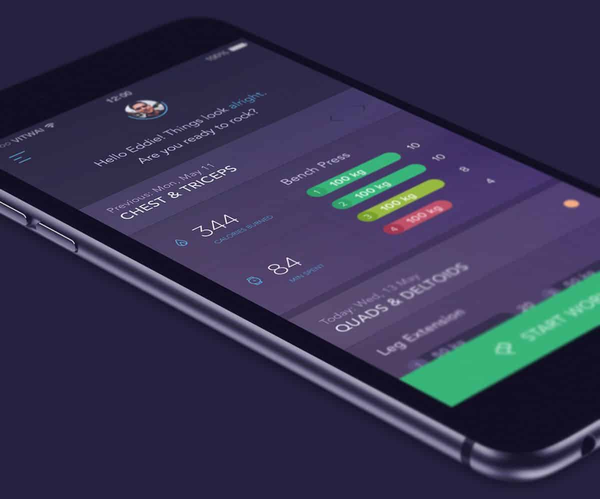
Health and fitness apps these days are all about complex tracking and analysis but what if you just need an app to easily record your workouts? Vitaly Rubtsav’s Workout Book wants to do just that with a touch of great style and a dash of brilliant interaction designs.
From planning a workout to recording it, Workout Book will have you covered. The gorgeous app UI makes use of a subtle color palette with vibrant tones for the UI controls and fluid screen transitions such as this one that brings up the workout recording screen.
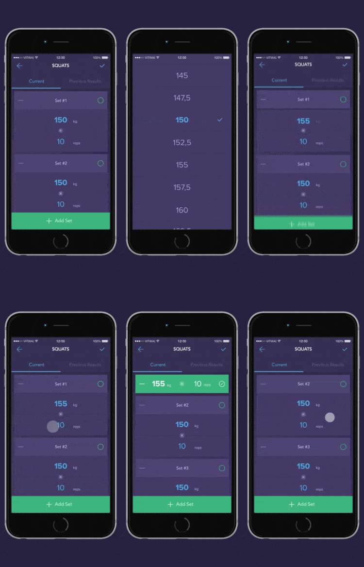
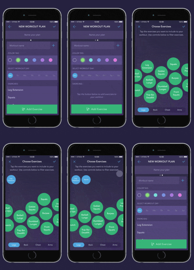
Or what about these animations that expand an element into options that are easy to select instead of the usual selector method that is usually cumbersome to navigate?
The bouncing green globes that you can select to add exercises to your workout remind me a lot of Apple Music’s fascinating UI design except that they don’t move around that much.
I just love how motion works in this app concept and should the app be developed, I’d be sure to try it out even though I only work out a little.
3. MixRadio by MixRadio
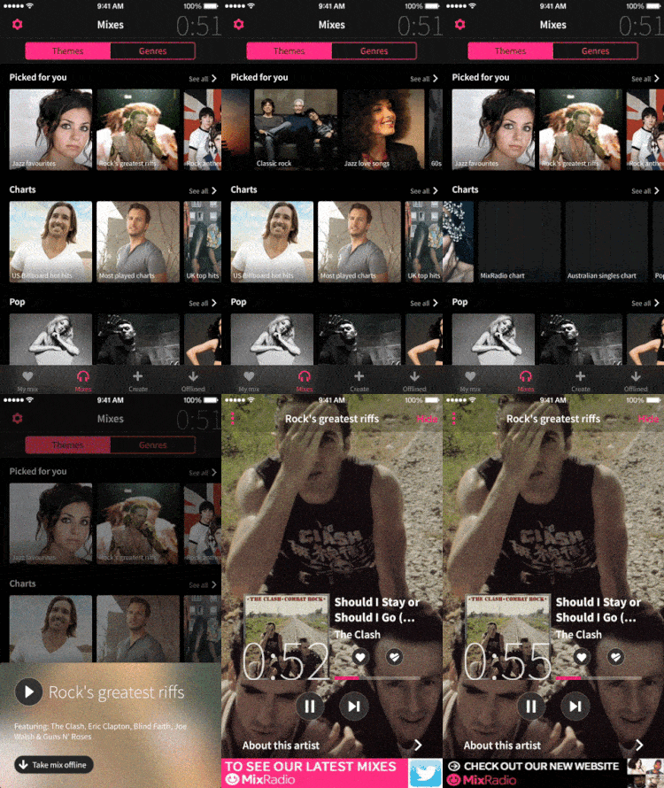
For a long time, MixRadio was exclusively available for Windows Phone users. Fortunately, they’ve recently released a version of the music streaming app for iOS and Android, with a revamp of the app’s UI. The result is a beautiful app that not only streams your favorite music but also learns the type of music you like based on the artists you listen to.
Right from the beginning, interacting with the app feels utterly natural and intuitive. The choice of bright pink against a dark theme to indicate selected state provides clear, unmistakeable feedback. The appearance of the heart icon next to selected genres is also a nice touch. I also really enjoy how upon selecting an artist that I like, three other related artists pop up.
As for the quality of the mix itself, I’m not complaining. I created a mix throwing in some Blues Rock artists, and the app spun a pretty impressive mix for me in a matter of seconds.
4. Wish2Wish by Naomi Benensen
Wish2Wish is an app for anonymous wishes that users can post to garner support from other dreamers, kind of like Whisper but with a greater slant towards positivity. The app was actually created by a 14-year-old girl who is a dancer, and I stumbled upon it through the Behance page of Ilya Tsuprun who did the amazing interaction designs of the app.
Wish2Wish Project from icelanderus on Vimeo.
The app makes excellent use of animations from the finger-crossing icon to the rotating star to the finger-wagging. Screen transitions are well-timed and used appropriately. Given that this is an app targeted at the younger crowd, I find it brilliant and adorable to use the spinning star in the place of a typical loader animated icon.
5. DeeDay by Calumaa (DISCONTINUED)
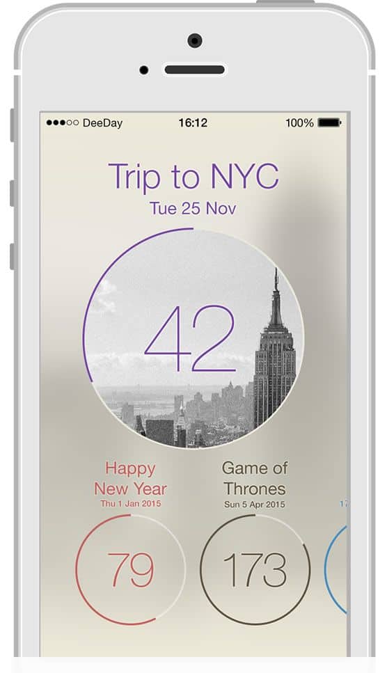
Everyone loves having something to look forward to, even the Grinch who probably is overly thrilled at the prospect of ruining Christmas. DeeDay is a simple, beautiful app with the sole purpose of having a countdown right there on the home screen of your phone with a glaring red badge icon.
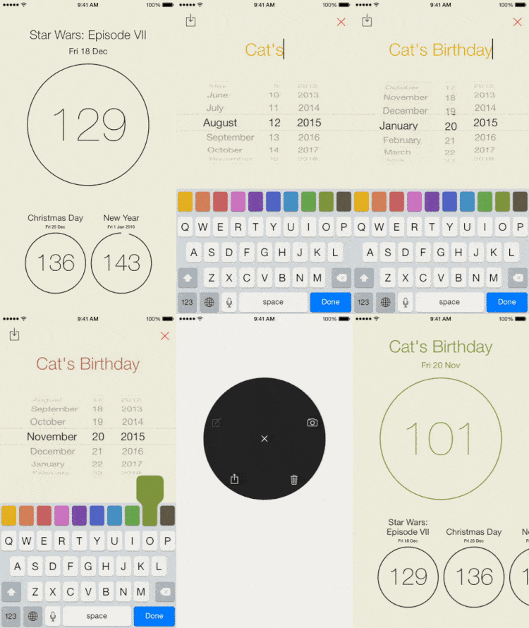
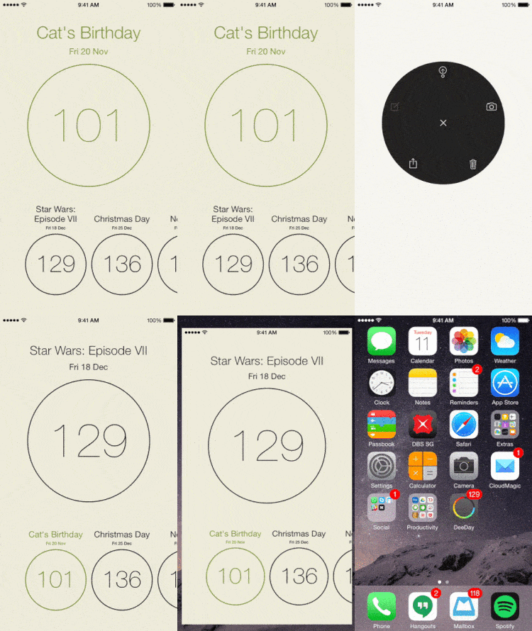
The app makes ample use of gestures, which is expected due its very minimal UI design. What’s missing is a set of pointers to onboard new users. It took me a few random swipes and taps to get a hang of what I was doing. After I’ve added my cat’s birthday as an entry to count down to, I bring up a beautiful wheel menu consisting of icons to move my cat’s birthday as the main event, all with just a few simple taps and swipes.
The app’s simplicity is perhaps a little overwhelming for new users but once I got the hang of it, the minimal UI composed of sleek pencil-thin icons and the gesture-driven interaction designs got to me.
Do you have an awesome mobile interaction design that deserves a spot in the Top 5 Mobile Interaction Designs series? Or perhaps an amazing app design that you’d like to see featured in our monthly Top 10 Mobile App UI series? Let us know! Tweet @protoio.


