It’s that time of the year again when we make a list of things we’re thankful for. Besides all the people we appreciate, I think it’s time to show mobile apps some love as well. With countless apps on the App Store and many more coming out each day, quantity certainly isn’t a problem. But when you find an app with a mobile interaction design that clearly incorporated a lot of thought—that is another thing to be thankful for that you can put on your list.
For this month’s installment of the top mobile interaction designs, I compiled concepts that put a smile on my face. Check them out below:
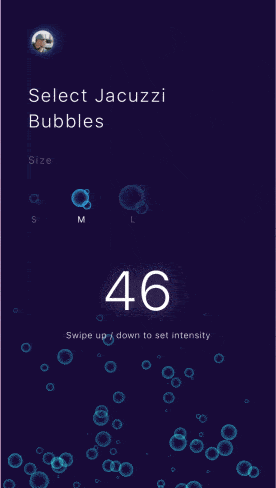
1. Jacuzzi Bubbles by Awesomed
Smart home products are all the rage right now. From locking your door to turning on the lights, there’s an app out there that can do just about anything you can think of to make your life a little easier. This app concept stuck out to me because the bubble animation is spot-on. If you’re in a jacuzzi, your goal is to relax and this app definitely accomplishes that with it’s simple UI. It allows you to tap to choose the size of bubbles you desire and swipe up and down to adjust the intensity. It’s a smooth interaction that is much more pleasant than pressing a physical arrow button several times to change the intensity.
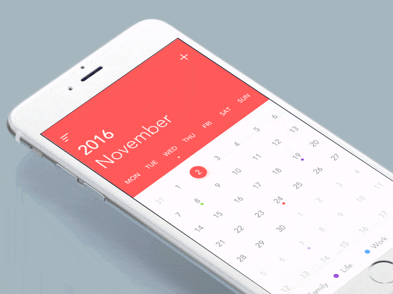
2. Calendar Interface Animation by luking
This calendar interface mobile interaction design is simplicity at it’s finest. I really appreciated the revolving months as you scroll into the next month. I typically use the standard calendar iPhone app and it works fine, but it certainly isn’t anything to look at. This app concept stays within the standard red and white color scheme, but adds a little bounce to each screen, which makes it more interesting to use.
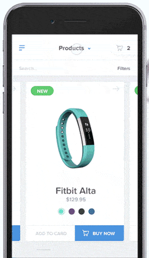
3. Mobile Shopping Interaction by Artiom Piatrykin for EL Passion
Shopping online can be a drag. You can’t try items on or hold them in your hands. And shopping on mobile is even harder, with such small screen sizes. This app concept takes on the task of making mobile shopping into an enjoyable experience and I think Piatrykin more than accomplished that. It uses the popular swiping through cards interaction and packs it with tons of product information, complete with simple and appealing icons. With all the drop down options and cards full of information, this app concept greatly improves the mobile shopping experience.
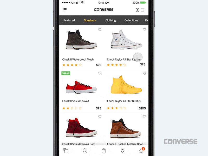
4. Add to Cart Interaction – Converse by Divan Raj
Here’s another example of an app concept making mobile shopping exciting. The aspect of this app that I like most is the zooming motion of the shoe going onto the screen once it’s selected. The other feature that is out of the ordinary is selecting a size. Usually there’s a drop down menu that you have to choose from, but in this case it’s a spectrum and you click the dot below the size you would like.
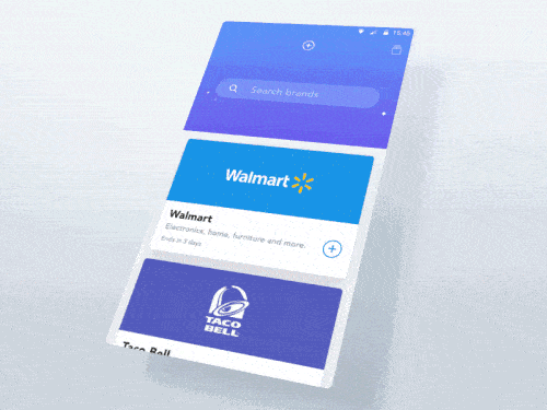
5. Add Brands by COBE
This app concept is centered around brands. As you scroll through them, the search bar gets tucked further into the heading so you can see more information from the brands themselves. The fact that the plus buttons for each brand match the color theme of the brand is definitely a nice touch to further drive home the branded concept. Once you tap into a brand, it effortlessly displays all of the information you’ll need with a neat “activate” button that flips and makes it clear that you’ve turned it on. Overall, it is a very straightforward mobile interaction design that takes into account brand consistency.
That’s all I’ve got for this month, but stay tuned for the December edition. If you’d like to see other top mobile interaction designs, check out the October designs installment.
Did I miss some of your favorite mobile interaction designs? Feel free to tweet @Protoio or message us on Facebook with your suggestions!
Proto.io lets anyone build mobile app prototypes that feel real. No coding or design skills required. Bring your ideas to life quickly! Sign up for a free 15-day trial of Proto.io today and get started on your next mobile app design.


