Motion design in a mobile UI is what gives meaning to the sequence of actions that a user performs when interacting with an application. Why motion matters isn’t so much about the fancy effects that beautify your app’s screens. It is about telling a story that the user can relate to in the context of using a product. Defining a consistent and meaningful motion language is as important to an app design as the graphical components that make up its interface. In an ode to the significance of motion in mobile app design, we curated a list of 5 app designs and concepts that effectively incorporated motion design in their UI. We present to you the Top 5 Mobile Interaction Designs of the month, in no particular order.
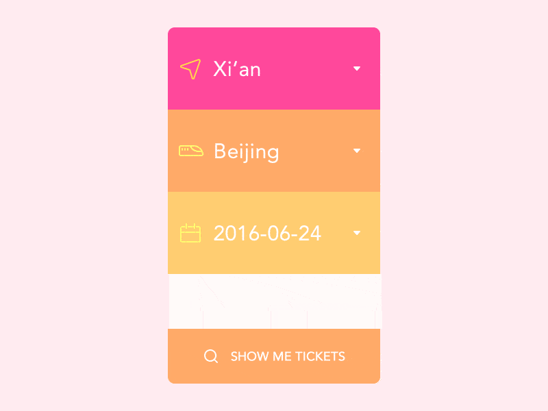
1. Ticket Concept by Dea_n
Mobile UI designer Dea_n seems to be very fond of bright and vibrant colors. We have no complaints about it as his Dribbble portfolio adds a dash of positivity to our search of great motion design for mobile apps. This ticket concept feels lively with its smooth UI animations and screen transitions. Upon selecting a destination city, an illustrated train pulls into the ‘station’ by sliding into view, visually representing the mode of transportation in a way that the user can easily relate to. It is a great example of how motion design can give meaning to the graphical elements of a mobile app UI.
2. Poncho: Wake Up Weather by Poncho, Inc
Some of us might already know Poncho, the daily text/email service that sends you the weather forecast along with hilarious gifs via an adorable mascot in the form of a cartoon cat. We know already that cats are basically our overlords in the realm of the Interwebs. This particular cat, however, comes with no malice and only wishes to bring you laughter and a warm fuzzy feeling. The Poncho app is a natural extension of the service, including an alarm clock feature. What better way to wake up than by giggling to the musings of a weather cat? Of course, the app embraces gifs in all their glory and it’s no surprise that the motion design is geared towards conveying fun and friendliness to the user.
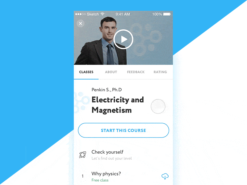
3. App Pricing and Purchase by Vladislav Ponomarenko
Great motion design doesn’t call for a good deal of fanciful transitions or extravagant animations. Just look at any Pixar movie and you’ll see that the beauty lies in the implicit and not so much in the evident. This sneak peak into an upcoming app by Vladislav Ponomarenko also demonstrates the power of simplicity in motion design. The clean and distinct interface together with the fluid transitions from one state to another gives the app a feel of natural progression as we move from one screen to the next. The zoom-in transition upon selecting a payment plan is a prime example of this. Although a tiny detail, it visually and effectively relates a storyline that goes, “So you’ve decided on the annual payment plan. Great! Let’s focus on this right now.”
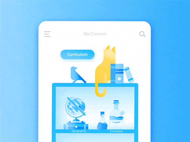
4. Animated UI Flow of Mr Meow App by Daz_Qu
Without a doubt, great motion design for mobile apps isn’t just about having elements bounce all over the place in your app’s UI. In this case, however, bouncing cats and Chinese guardian lions take the delight level up a few notches. Mr Meow is an educational app for middle school students to learn in an interactive and fun program. Besides our already established deference to cartoon cats, the motion design for this app is particularly interesting due to the good use of easing. It gives a game-like look and feel to the app which is a great approach to building a learning app for young students. What better way to motivate kids these days than by gamifying their course materials?
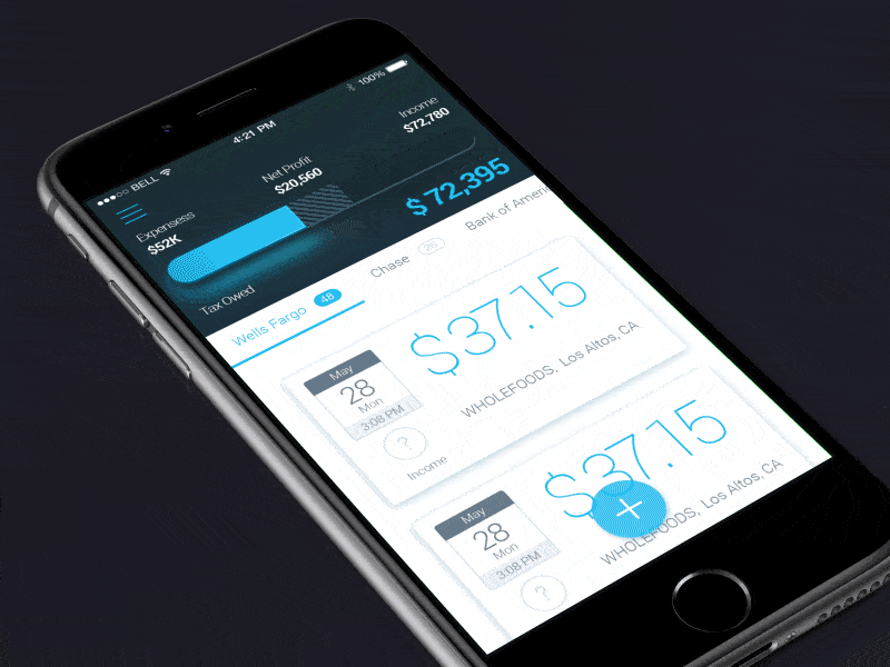
5. Finance App by Nikolay Apostol
Flat design is about the most prevalent design trend of recent times. Ever since Apple abandoned skeuomorphism with iOS 7, we’ve witnessed an almost ubiquitous flattening of all sorts of user interfaces, from the web to mobile. But the problem with flat design is that it’s, well, flat — in other words, it runs the risk of becoming lifeless, dull and incompatible with our perceptions of the physical world in which we live. This gorgeous example of motion design for a finance app by Nikolay Apostol is evidence that flat isn’t the only way to go. The action of swiping a card right and lifting it to reveal further possible actions that a user can take is downright classy. Well-applied shadows and motion design are effectively combined to give meaning to an action without the need for textual content.
The future of the mobile app UI depends greatly on how far we advance to incorporate motion design into our design workflow. Get started by taking a step away from static UI mockups. Instead, move towards building interactive prototypes with the help of powerful tools like Proto.io, no coding required. Ready to step your game up to become a motion design whizz? Sign up now for a free 15-day trial.
Would you like us to showcase a great example of motion design for mobile apps? Tweet us @protoio or message us on Facebook!


