Apps are a lot more fun when it’s clear that the designer put a lot of thought into the mobile interaction design. This takes apps beyond the realm of functional and adds an element of surprise. Remember when you found an “easter egg” in a program or app you use all the time? Great mobile app designers work these little moments of delight into the apps they develop to keep users coming back.
Below you’ll find the top mobile interaction designs of January.
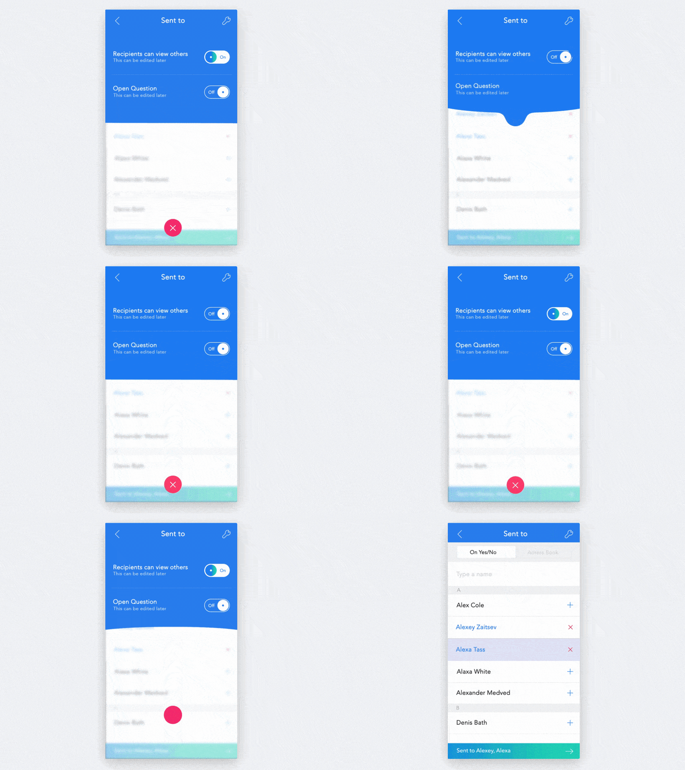
1. Conversation Settings Animation by Luboš Volkov
This app concept caught my attention because the design is literally fluid. The movement is soothing, as you tap in and out of settings. Changing the settings on an app is never a very exciting part of using it, but when one section flows so smoothly into the other, it’s hard not to enjoy the microinteraction. I really like the cohesive feel, as the droplet that brings settings down turns into a button to exit out of it and take you back to the original screen. Clicking it sends the button back up and wipes away the settings.
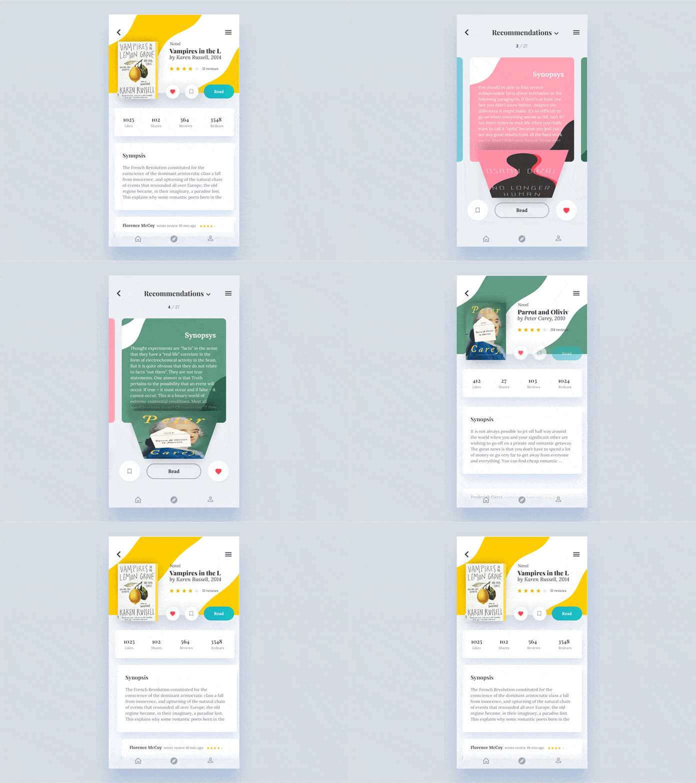
2. Water Effect by Nikita Duhovny
On the topic of fluid designs, Nikita Duhovny created a beautiful app concept that flows together nicely. In this book concept, when you tap on a certain book, the cover bows down to uncover the synopsis. You can also swipe left or right to see the summary of the book before or after the one you initially picked. All the while, colorful designs flow to create a unique pattern from the book. Once you click on the synopsis, more information on the book is revealed, with reviews, likes, shares, and more. This concept makes for a very artsy book app and also makes reading more of a social activity with recommendations from others.
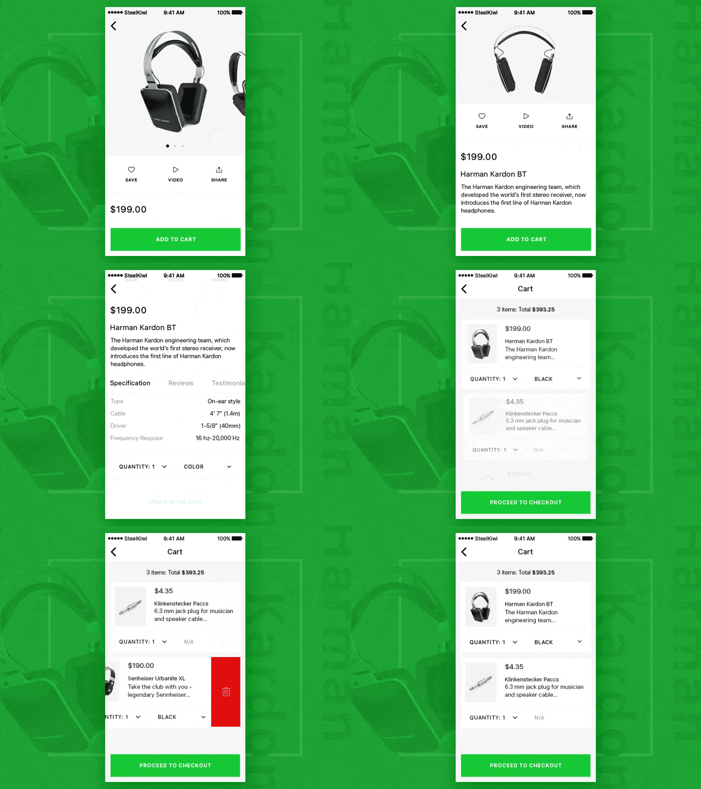
3. Product and Cart by Skiti for Steelkiwi Inc.
This app concept really makes shopping mobile friendly. It gets the swiping and tapping movements we’re used to and applies them to the online shopping experience. I’m impressed by the smooth transition when you add an item to your cart. The designer added an interesting syncopated rhythm when you swipe through through the product options. Lastly, if you decide against the product you chose, it’s easy to delete it from your card by a simple swipe and tap. This is a nice addition because mobile users are used to swiping left to delete everything from emails to people they’d rather not come across on Tinder.
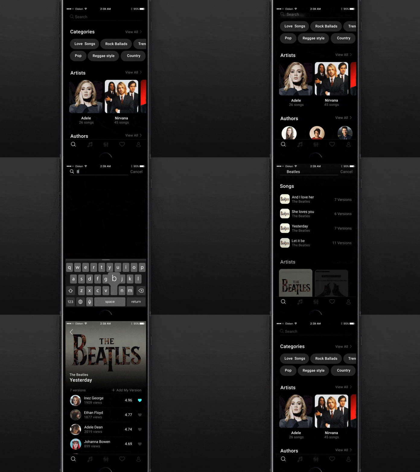
4. SongBook App Search by Eleken.
The mobile interaction design that makes this app concept stick out is the way it populates each screen. It isn’t all at once. Instead, it loads by sort of falling down the page in a wave. Also, the main screen before the search is quite comprehensive, with options from categories to artists. An interesting aspect of this app concept is that there are multiple versions of each song, it seems to cater to creative takes on original songs. With a simple color scheme, this mobile interaction design is straightforward and effective.
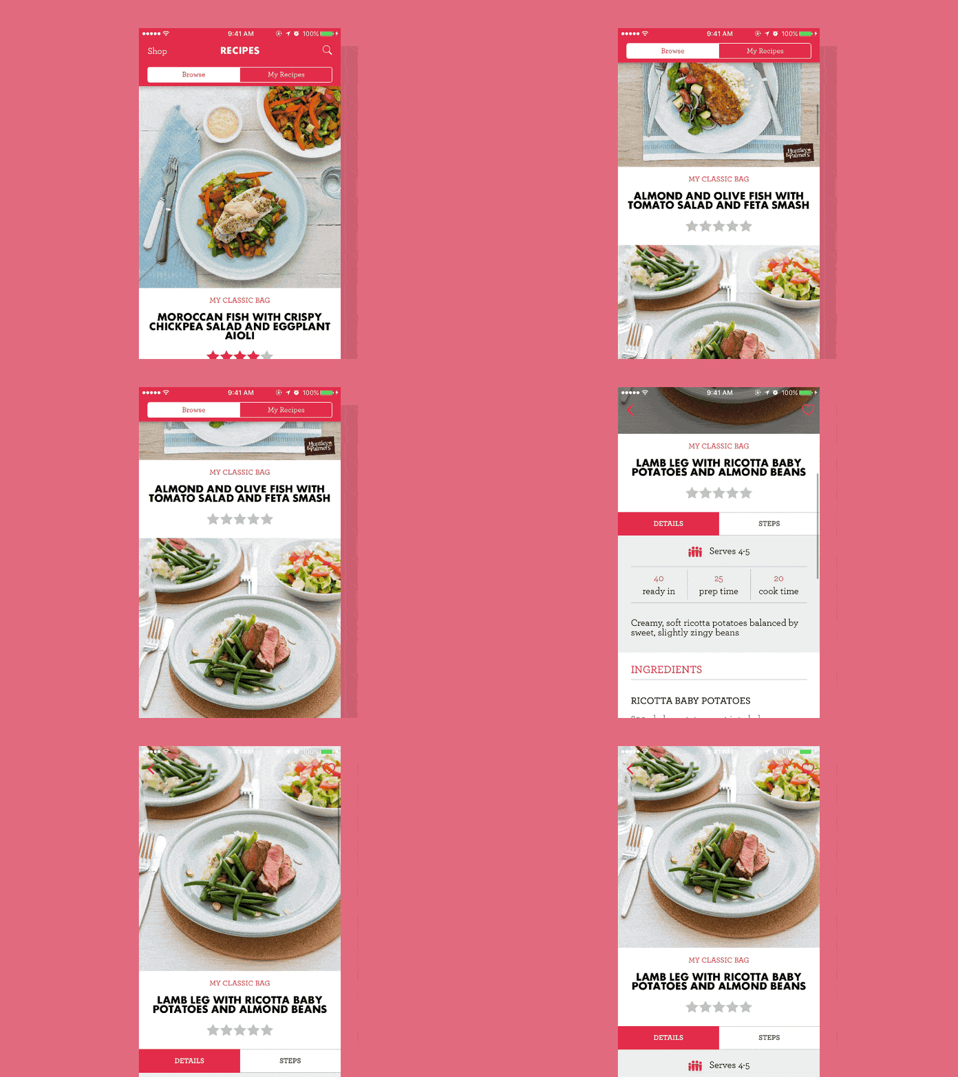
5. My Food Bag by David Lau
I loved this app because it puts images first and they literally pop out. My Food Bag is similar to Blue Apron in that they have ingredients and recipes sent right to your door (if you happen to live in New Zealand). When searching through recipes, images can be really inspiring, and David Lau understands this fully. It offers endless scrolling down the screen through mouth-watering images, complete with descriptions and ratings from other app users. Once you tap into one in particular, it expands with full details on the ingredients needed, how many servings it will make, and more.
That’s all for January, but be sure to check out last month’s edition, featuring the best mobile interaction designs of December 2016.
Feeling inspired? Sign up for free with Proto.io and prototype your own interaction design in minutes.
Proto.io lets anyone build mobile app prototypes that feel real. No coding or design skills required. Bring your ideas to life quickly! Sign up for a free 15-day trial of Proto.io today and get started on your next mobile app design.


