Mobile interactions make the app world go round. When apps first came out, we were ecstatic that they worked, but designing apps in 2017 is much different. Beyond getting them to work well, designers also need to make sure their apps are enjoyable. That comes in the form of easy to find buttons and appealing colors, but it also extends to the mobile interactions.
With that said, let’s get started with the top 5 mobile interactions for this month’s roundup.
1. Interaction Design by Dhipu Mathew
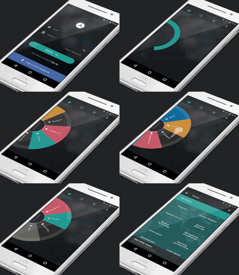
There are a lot of exciting things happening in this app concept, but by far, my favorite is the spinning wheel. We’re used to scrolling down or swiping to the side to go through options, but Mathew puts a delightful spin (pun intended) on that. Especially when it comes to mobile apps, hamburger menus are quite common, so spinning a wheel to choose which section of the app you want to use is definitely refreshing. The other interaction that I really liked was the “Sign in” button to spinning circle transformation. This gives the user an immediate cue that the app is working to sign them in and they know that they’ll be on the next screen in no time. The spinning circle then expands to take over the screen and takes the user to the category selection wheel. Overall, it is a very cohesive concept that drives home the spinning feel.
2. ANZ goMoney Australia by Ee Venn Soh
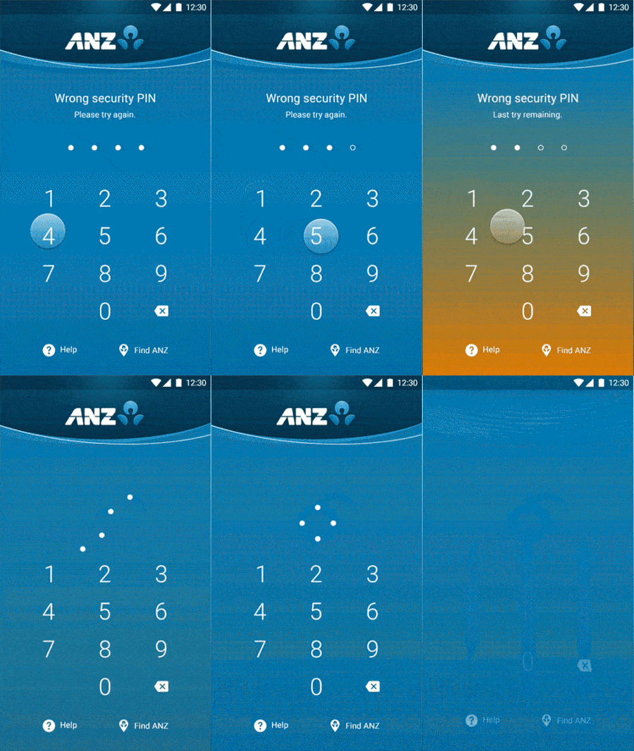
Entering the wrong password or PIN is always a drag. You get one letter or number wrong and it’s back to square one. This financial app changes color when you enter the wrong PIN, which can add to the stress of making a mistake, but what can you do? But after that is when the magic happens. The dots representing each number of your PIN seem to dance together into formation like synchronized swimmers, essentially unlocking the app. Then it all fades away into the top of the screen and presumably pulls up your specific financial information. Finance apps can be dry and ANZ takes it to a new level, even with a feature as mundane as entering your PIN.
3. Music App Playlist Interaction by Chun-Chuan Lin
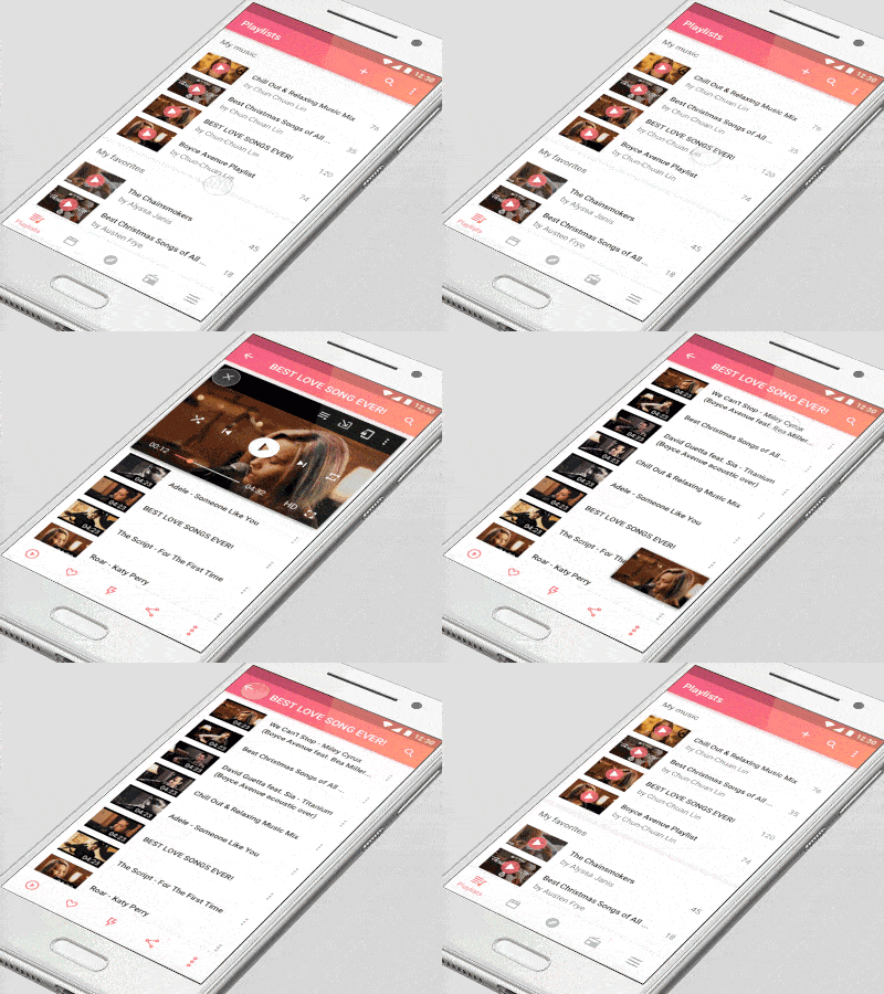
I liked this music app because it’s so seamless. When you click into your playlists, they easily appear at the top of the screen, then you can scroll down to see all of the videos included in it. Next, when you choose a particular video, it simply pops up to the top of the screen instead of completely reloading it. That way you can still see the other videos on the playlist down at the bottom. You can also easily exit out, minimize the video, or delete it by dragging it to the bottom of the screen. This mobile interaction design concept makes it so easy to create video playlists and move between them smoothly.
4. Co-Play Interaction 1 by studio&more
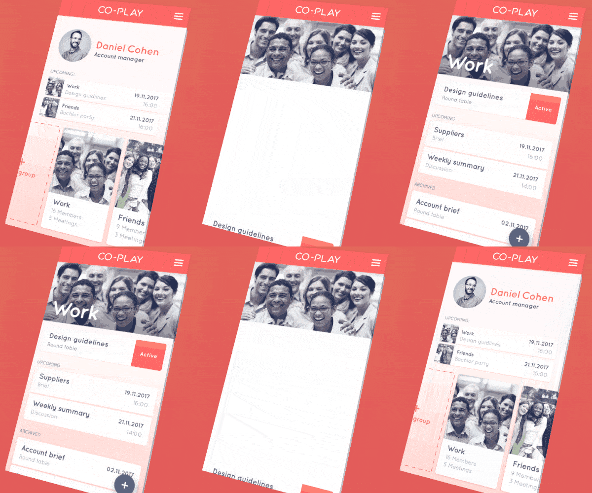
Co-Play has a fun way of pulling up information and minimizing it. This social and business tool helps groups stay on the same page when designing a product, so of course, the mobile interaction design needs to excite users who understand design first-hand. In the app, when users click on a specific card, it expands to occupy the entire screen and each section appears one by one, in a swiping up motion. Then when exiting out of the specific card, it goes neatly down to the bottom of the screen where it originally was on what looks like the profile page for this specific user. The rising and falling motions of the Co-Play app make it a soothing option to make group work easier.
5. App Interaction by Pol Sabata Bracons
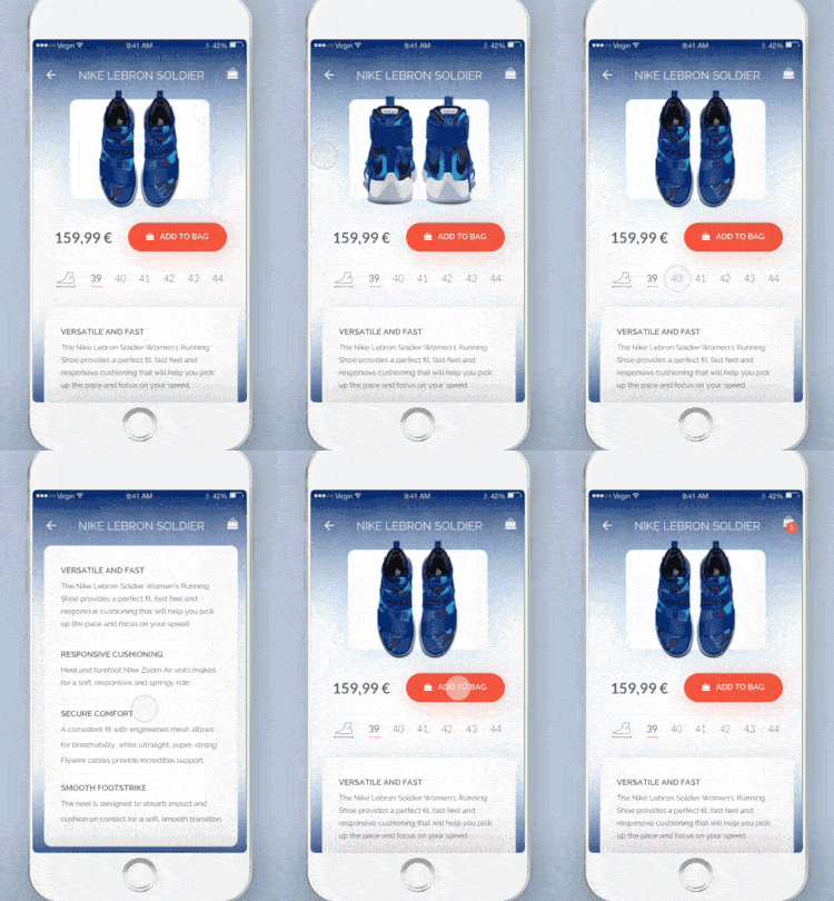
There are plenty of eCommerce apps out there, but this concept caught my eye because of the circular movement of the product images. When users swipe left and right to see different angles of the product, instead of just swiping linearly, they swipe in a circular motion, which I hadn’t seen before. It feels almost like flipping the page of a catalog to me. In addition, all the product details are waiting for you right at the bottom of the screen and they easily expand with one tap. The last feature that I noticed was the “Add to Bag” function. When you click the button, the bag icon temporarily expands and gains an orange number, showing clearly that your item has safely made it into your bag.
That’s all for February, but be sure to check out last month’s edition, featuring the best mobile interaction designs of January 2017.
Feeling inspired? Sign up for free with Proto.io and prototype your own interaction design in minutes.
Proto.io lets anyone build mobile app prototypes that feel real. No coding or design skills required. Bring your ideas to life quickly! Sign up for a free 15-day trial of Proto.io today and get started on your next mobile app design.


