2016 has been a year for the record books. We’ve gotten used to beautifully designed products that have continuously raised the bar for what excellent design is. Our mobile apps have gone beyond function and have entered the realm of delight. Not only do they work well, but they are also a pleasure to use.
With that said, let’s get started with the top mobile interaction designs of the month:
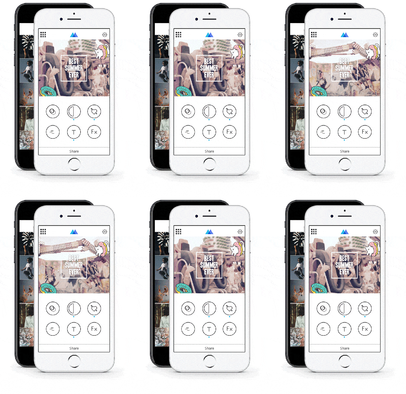
1. Momento by Genady Okrain
Momento started out just on the iMessage App Store, but it quickly grew and is now widely available on the Apple App Store. It allows users to make a gif from their own camera reel and share it out on Facebook, Twitter, and beyond. It incorporates filters, stickers, and more which add up to a whole lot of fun for users. Gone are the days of making do with the gifs out there. Momento lets users be as creative as they’d like with a slick mobile interaction design.
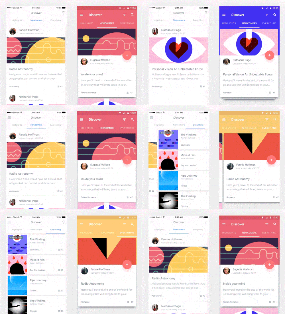
2. Snipsl Mobile App
Snipsl is a fascinating concept that puts readers directly in contact with authors and helps them vote on and craft their stories. The goal of the app is to get people reading and compiling their own personal library. They chose to design the Android version first and made sure to incorporate Google Material Design and next they made the iOS version according to Human Interface Guidelines. While you can see the distinct differences in the look and feel of each version, the mobile interaction design holds true. Both incorporate clean swiping motions to move through the app. One of the biggest differences between the iOS and Android versions is the use of the Floating Action Button that follows Android users throughout the app. It seems a bit clunky in my opinion.
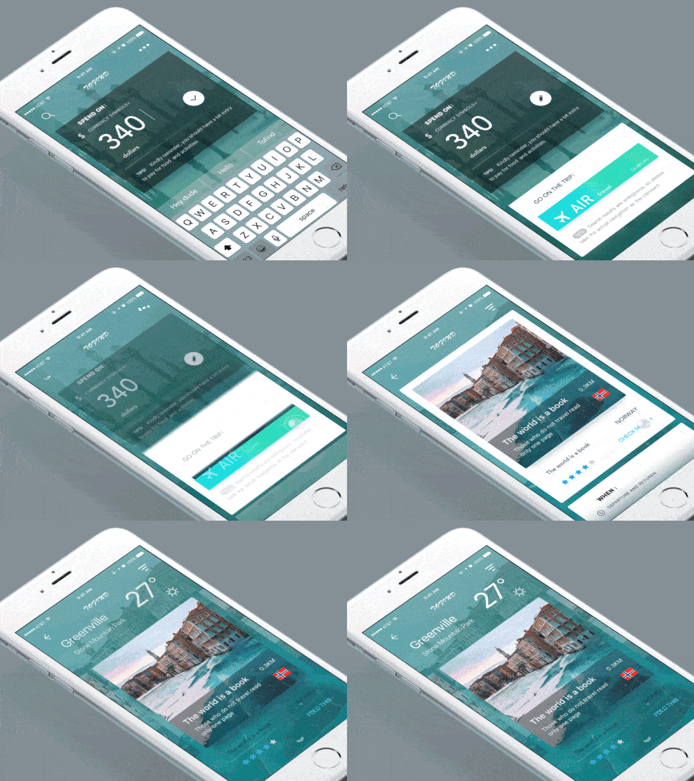
3. Process-Guided Interaction by Leo Leung
This travel app concept is full of smooth mobile interactions. Users can easily tap through the app, from booking travel in their currency to learning more about a destination. I especially liked the micro interaction that features a spinning sun below the temperature. This is a delightful way to show that it will be a lovely, sunny day.
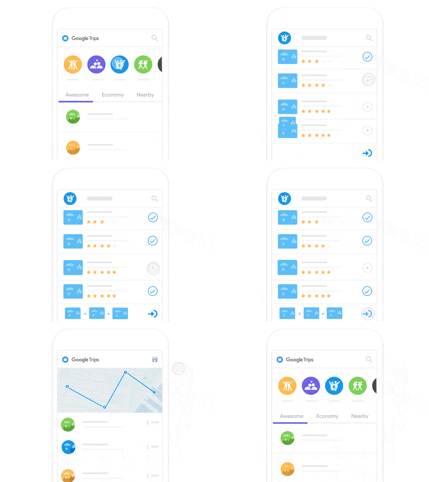
4. Google Trips – Multicity Tour Planning by Johny vino™
If you’re always on the go, like me, then this app concept would be helpful to you. Trips aren’t always point A to point B, there are often stops in between. Johny’s concept makes it possible to visualize all sections of your trip when you select your destinations and see them fly down to the bottom of your screen in order. Then when you get the order right, a comprehensive map of where you’ll be going and details about those places populates. On top of that, you’re able to plan trips based on who you’re with, because you’ll probably want to go to different places if you’re with your whole family, compared to traveling just with your significant other.
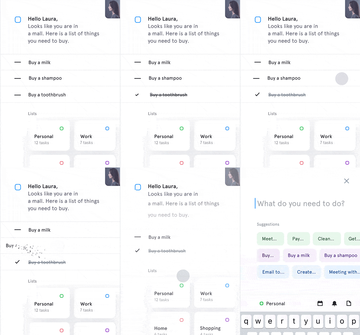
5. Microinteractions for To-Do List App by Jakub Antalík
You’re in for a treat with this one. If you’re always looking for ways to increase your productivity, this app concept is for you. It takes the best element of accomplish tasks (crossing them off the list, of course!) and brings it to the mobile format in such a satisfying way. You can push and pull to complete tasks and delete them as well. On top of that, the app uses your location to suggest things you can accomplish near you. It also supports a number of lists based on how you choose to group them.
That’s all for 2016, folks. But we’ll be back at it again with the best mobile interaction designs in January.
Did I miss some of your favorite mobile interaction designs? Feel free to tweet @Protoio or message us on Facebook with your suggestions!
Feeling inspired? Sign up for free with Proto.io and prototype your own interaction design in minutes.
Proto.io lets anyone build mobile app prototypes that feel real. No coding or design skills required. Bring your ideas to life quickly! Sign up for a free 15-day trial of Proto.io today and get started on your next mobile app design.


