With graduation season finally behind us and a summer full of sunshine up ahead, it’s time for the design community to take a quick breath. And a breath of fresh air is exactly how we’d describe the mobile app designs we chose for this month’s roundup.
1. Triller by Triller
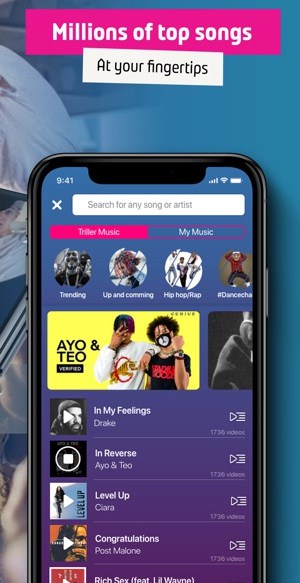
Triller is a social media app taking the world by storm with its easy-to-create videos. The company has partnered with a number of record labels, enabling users to make music videos with the top songs they know and love. Triller allows users to follow friends and celebrities to see the video content they’re producing, as well as even generating revenue for some power users through an app specific currency. The mobile app design is bright and colorful, with a hot pink as its accent color of choice. The creators took it upon themselves to use a number of different but complementary design techniques, from cards to swipe through with suggested music to a glow effect around certain profile pictures. In all, this mobile app is destined for social media greatness, as it helps users explore music, videos, and wraps it up in a playful design.
2. Cardhop by Flexibits Inc.
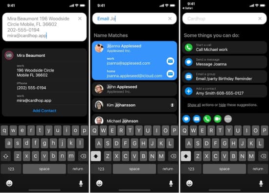
Cardhop is a contact app that makes staying in touch easier than ever. Cardhop leapfrogs the average contact apps that are preloaded on our phones by allowing users to save profile information across social media accounts and get in touch with WhatsApp (or a number of other services) with just the tap of a button, instead of having to exit the contacts app. These integrations make it much more useful for individuals who want to be able to reach friends and family easily, plus remember their birthdays without having to search on Facebook. The app enables electronic business cards and fits in with the sleek round feel of iOS products. The color scheme is a simple black or white background with pops of orange, green, and blue to underscore different actions users can take within the app.
3. Breethe by OMG. I Can Meditate! Inc.
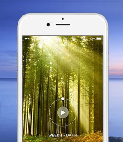
Health and wellness have exploded, as more people recognize that being calm and centered can help in endless areas of our lives. Breethe is a sleep and meditation app that features meditation classes, breathing exercises, and alarm functions to help users start their day on the right foot and unwind whenever they need to. The mobile app design is quite simple, breaking up each section and denoting each one with an icon on the left side of the screen. Tapping into them creates as immersive an experience as the user wants. For example, they can choose to calm down with sounds from nature that take over the entire screen with a soothing video that goes along with it. This app design focuses on the images and sounds that users need to meditate effectively, without any extra frills to complicate the experience.
4. Seconds Interval Timer by Runloop Ltd
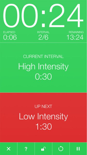
Once you’ve got your mind right with Breethe, it’s time for your body to follow. Seconds Interval Timer is a timer app build for athletes and meditators alike. If you’re doing interval training, it can enable users to load in what exercises they need to do, for how long, and in what order. This makes it possible to keep up the momentum, instead of stopping and starting. The mobile app design is a crisp red and white, with the ability to color code the activities and durations. Once all the settings are complete, the timer portion of the app is beyond simple. It features very large text and bright colors to show users how much they’ve completed, what’s left, and the ability to start a new interval. This is especially user-friendly because if you’re knee deep in a workout, you don’t want to be squinting at tiny text a few feet away to try to see how much time is left. The mobile app design Seconds Interval Timer created makes it clear how deeply they understand the needs of their target market.
5. Scooter Map by Opolis, LLC
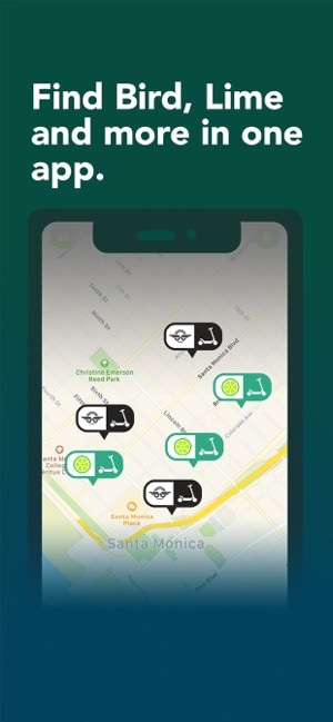
While no one could have predicted the scooter craze, the reality is that they’re taking over cities around the world. But the only issue is finding one when you need it—and making sure that it has enough battery to get you to your destination. Scooter Map is an aptly named tool that helps users find a scooter, no matter what brand it is. This way, they can open the app, see the closest scooter that has ample battery and walk over to it. That certainly beats opening two or more apps to search for available scooters. Scooter Map’s mobile app design brands and color codes the available scooters placed on a map of a user’s surrounding area. Its user experience is so simple because it allows users to unlock scooters from any company using a single app. The design and functionality increase efficiency and help riders get to where they’re going faster without requiring multiple apps cluttering their phones.
That wraps up the apps for June, but if you’d like to explore some of our other favorite mobile app designs, check out our May installment.
Feeling inspired? Sign up for free with Proto.io and prototype your own app in minutes.
If you enjoyed this curated list of great mobile app designs, share it with your social network! Do you have a suggestion for the next edition of our Top 5 Mobile App Designs series? Reach out to us via Twitter @Protoio or on Facebook.
