With winter comes another opportunity to dive deep into creative projects. Designers around the world have jumped out of hibernation and created apps that blew us away here at Proto.io. This month we explore apps with pixel perfect icons, bright color schemes, and smooth buttons. These mobile app designs are sure to get your creative juices flowing. Read on to learn more.
1. Quiz Date Live! by East Meet East
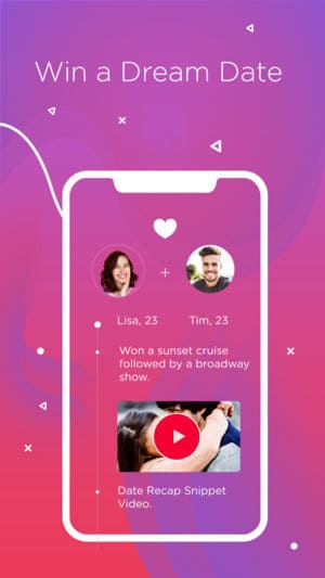
Quiz Date Live! takes a different approach to the often draining online dating process, blending the success of HQ Trivia with Tinder. In each round of the game, contestants answer questions in hopes of winning the bachelor or bachelorette’s affection. If selected, the contestant gets to go on an adventurous date—courtesy of the company behind the app. The mobile app design is colorful, with bright pinks and purples to add a bit of flair to the quiz. As with quiz apps we’ve grown used to, this app offers rounded buttons and an ever-present feed of comments from other participants scrolling through the bottom of the screen. Will this app lead users to find true love? Maybe not, but it sure seems like fun!
2. Centr by Loup Pty Ltd
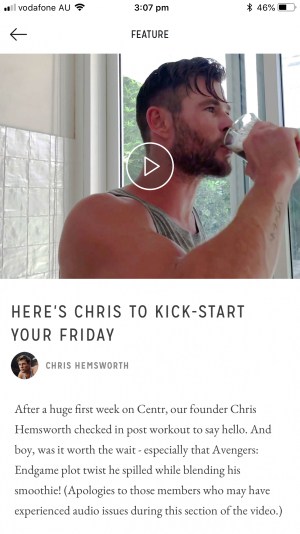
If you even remotely like superhero movies, you most likely know and love Chris Hemsworth. And you’re in luck, because just a few weeks ago he released a fitness app that is a true all-in-one. Whether you’re looking to boost your fitness game, meditate more often, or plan your meals better, this app can help. It centers around a planner to help you pick meals and activities that work for you. For example, you can scroll through trainers to select someone that will motivate you to work on an area you’d like to target. This mobile app design brings together crisp icons for straightforward navigation and a simple color scheme of black, white, and yellow—easily calling attention to actions the user might want to take, such as signing up for a particular workout.
Source: Mama Mia
3. Aloe Bud by Aloebud LLC
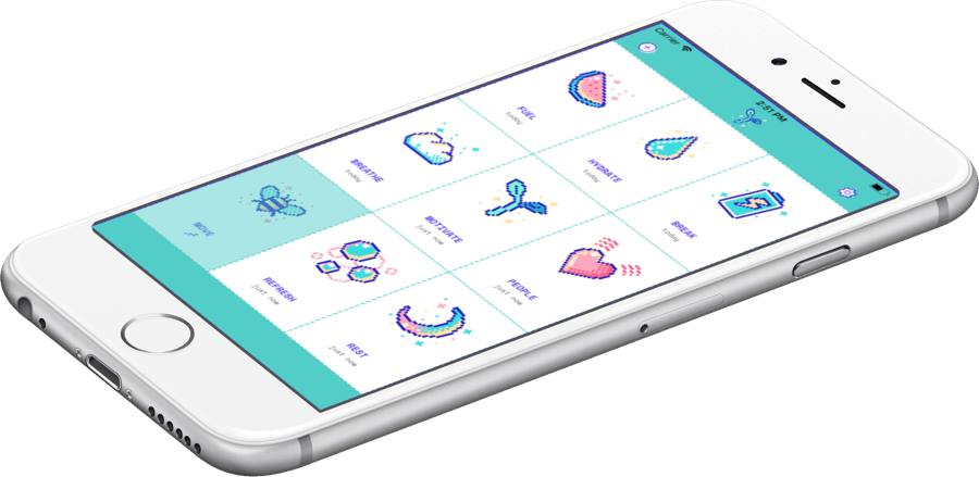
In such a fast paced world, it can be easy to consistently run on empty. But the reality is that when we take care of ourselves, we show up better in every part of our lives. In order to make this a reality, early and often self care is a must. That’s where Aloe Bud comes in. The mobile app design strips self care down to its core and packages it almost as an old school video game—complete with pixelated icons from a candy coated palette. (Does anyone remember Tamagotchis? This app gives us a complete flashback to our digital pets of the 90s). It breaks away from the muted color schemes of the average self care app and instead focuses on the reminders and reflections needed for a consistent practice.
4. Truebill by Truebill, Inc.
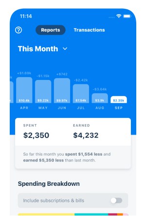
Continuing on the theme of wellness, everyone could use a refresher on how to have healthier finances. Truebill is an all-in-one financial app that helps users track their spending, negotiate lower rates on certain monthly expenses, and cut the cord on subscriptions they don’t use. The mobile app design is colorful to make the experience of monitoring and improving finances a more enjoyable process. It features easy to understand graphs, alerts to swipe through to stay up to date, and rounded edges for a comfortable mobile app experience.
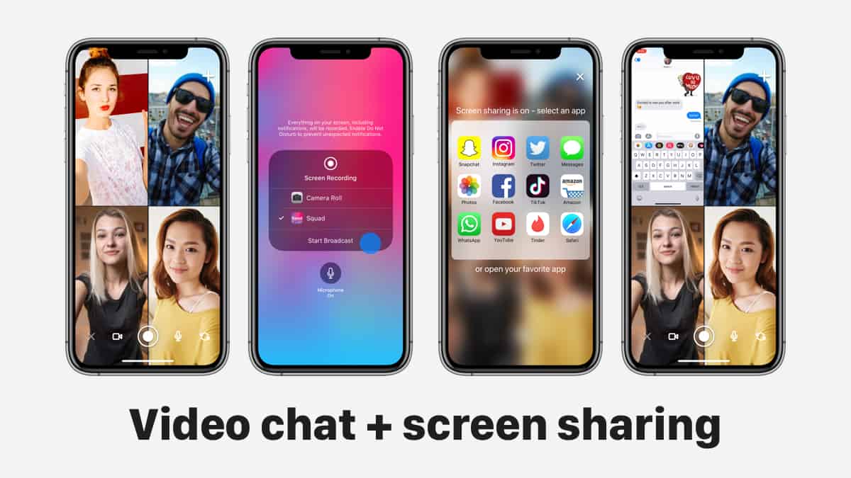
5. Squad by Squad
Squad is a new social app that allows users to video chat, share their phone screens, and more. Already a hit with teens, this app makes it simple to communicate with up to six friends at once. Screen sharing is no longer just for business, many friends want the chance to shop together on mobile, as one example, and Squad makes that possible. Squad is taking mobile connections to the next level and leaving behind friction at the same time. The mobile app design focuses on the folks users are video chatting with and offers just a few simple buttons at the bottom of the screen, similar to what you might see with FaceTime: the opportunity to flip your camera, exit the chat, and more. Beyond these buttons, there is also a messaging function. Overall, users can focus on what their friends are saying and doing by viewing their screens or what their cameras happened to be focused on—all within a bright design that reminds us a bit of the Instagram gradient.
That wraps up the apps for February, but if you’d like to explore some of our other favorite mobile app designs, check out our our top mobile app designs of 2018.
Feeling inspired? Sign up for free with Proto.io and prototype your own app in minutes.
If you enjoyed this curated list of great mobile app designs, share it with your social network! Do you have a suggestion for the next edition of our Top 5 Mobile App Designs series? Reach out to us via Twitter @Protoio or on Facebook.
