The countdown to summer is here and designers all over the world have been busy building the latest and greatest apps. The mobile app designs we chose to feature this month have bright call to actions that users can’t ignore. In addition, they bring an element of joy to our lives with GIFs, emojis, and logical layouts. Let’s get right into the top mobile app designs of the month.
1. Digit by Hello Digit, Inc
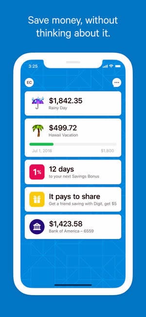
Saving money can help us reach financial goals and be ready for costly emergencies that come when we least expect them. Digit automates saving and pulls it together in a clean mobile app design. The minimalist, simple white design is offset by buttons and backgrounds with their signature blue. In addition, there are fun emojis and icons to give life to things users are saving for, such as a palm tree to represent a family vacation. In all, Digit is a highly effective tool to help make saving easier and, as an added bonus, it comes in an uncluttered layout that uses white space very effectively.

2. Google Pay by Google
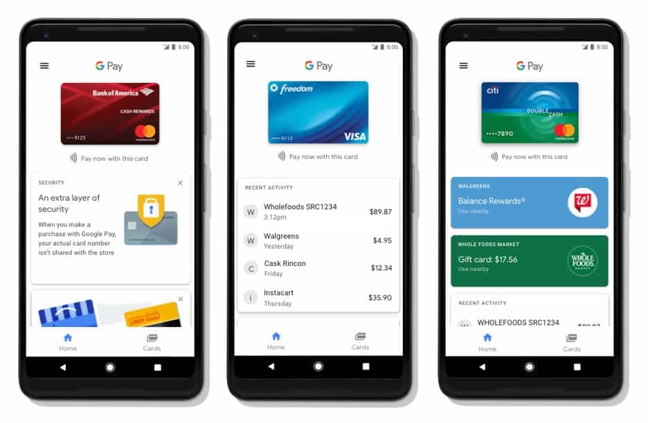
Android Pay has rebranded to Google Pay and the app is full of new features. It now allows for peer to peer payments, holds boarding passes, and more. One of my favorite features of the mobile app design is how it keeps track of all of your credit cards and aggregates the recent transactions for each one. The page that features this information starts with a high quality image of the card, gives the ability to pay now with that card, and has recent charges and nearby locations you can use the app. It meets the criteria of a personal finance app, as it has a clean white layout, with pops of color to draw the user’s attention to actions they might want to take.

3. Giftagram by Giftagram Inc.
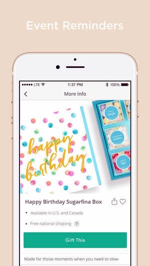
We’ve finally reached wedding season and that means it’s time to find the right gift for the newlyweds—or maybe you want to find the right thing for Father’s Day coming up. No matter the occasion, Giftagram helps with gifts on demand and you don’t even need the recipient’s address to send it out. In order to pick a gift, users scroll through cards with beautiful photos of gifts available in their country. Tapping into a gift expands it to show where the gift is available, the shipping policy, and a bright button to buy the item. What we love about Giftagram is that they don’t overcomplicate the process. Instead, in three easy steps users can swipe through gift options, learn more about them, and check out with just a few taps of their finger. This mobile app design is crisp, with a tranquil color scheme, and even makes us feel like we’re in a quaint boutique looking for a gift.

That wraps up the apps for May, but if you’d like to explore some of our other favorite mobile app designs, check out our April installment.
Feeling inspired? Sign up for free with Proto.io and prototype your own app in minutes.
If you enjoyed this curated list of great mobile app designs, share it with your social network! Do you have a suggestion for the next edition of our Top 5 Mobile App Designs series? Reach out to us via Twitter @Protoio or on Facebook.


