Fall is in full effect and as the days get shorter and cooler, getting up to date on the latest mobile app UI designs seems like a great thing to do while curled up with a mug of tea. This month we’ve found some colorful, fun, and dynamic designs that are sure to inspire you. Read on to learn more about this month’s installment.
1. Stockpile by Stockpile
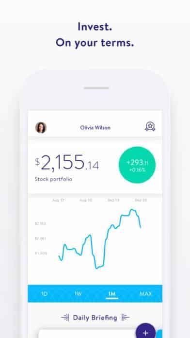
Personal finance is a hot topic in the tech world. For the first time, tech is lowering the barriers to entry for saving money and building wealth, even for those who don’t have piles of cash lying around. Stockpile is an investing app that allows users to buy fractions of stocks so that anyone with as little as $5 can start out on the stock market. At 99 cents per trade, it has much lower fees than other companies. What I like about Stockpile is that it includes financial learning in its app, with a section that explains industry terminology. The interface is easy to navigate and dedicates one tab to each stock to clearly show your progress graphically and monetarily.
2. flowkey by flowkey
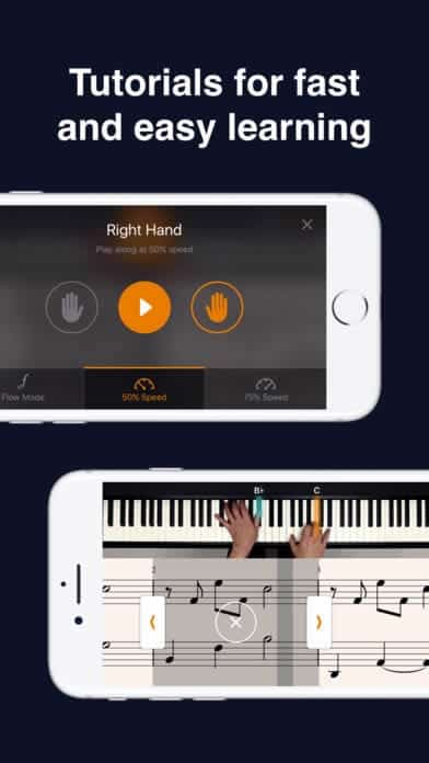
It’s never too late to learn a new instrument. You might think you’re too busy for a class or private lessons, but flowkey allows you to learn at home (or wherever there’s a piano) and in-app. Just like a teacher would, the app lets you pick your level and recommends popular songs to learn that are appropriate for your level. I really like the colors used within the app to differentiate between levels that add a bit of personality outside of the black and white sections that mirror your piano. They use bright orange, in particular, to help build skills, like playing with one hand versus the other and speed. The mobile app UI keeps the design simple to facilitate learning but puts bright colors to work when the user needs to make a choice or pay attention to a specific feature.
3. Forks Over Knives by Forks Over Knives
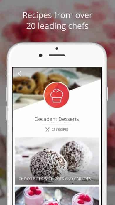
Do you ever get stuck in a rut, cooking the same meals week after week? Fork Over Knife puts an end to that with a strong repertoire of recipes and much more added each week. The app lets users go through hundreds of recipes with decadent images, build grocery lists based on what they plan to cook, and add their favorite recipes to a list. The mobile app UI design is a clean and minimal white, with pops of red to accent, and of course tons of mouth-watering images of the recipes you have the option to make.
Get Forks Over Knives on iOS.
4. 8bit by Urbanite
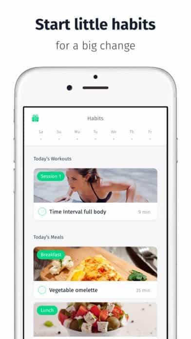
If you need a bit more customization in your life, 8bit has the meal and workout plans just for you. They tailor their recommendations based on your needs and goals. This app stands out because it puts healthy eating and exercise together, reminding users that putting these two actions together will lead to the outcomes they’re working towards. They put together what app users need to do each day, regarding of workouts and meals. It has a minimal design with pops of bright green to let users know what kind of workout they’ll be doing, what to look forward to cooking for each meal, and call to actions within workouts. 8bit is a very comprehensive app for anyone who wants to make a healthy change in their life.
5. BloomThat by BloomThat
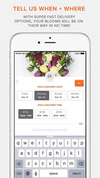
Giving and receiving flowers is a joy. Whether it’s sending a card and flowers to your mom on her birthday or your significant other when they’ve completed a big project at work, it can indeed brighten someone’s day. BloomThat is a relative newcomer in the space, but their presentation blows the competition out of the water. Also, I’ve seen their delivery people biking through San Francisco with a basket full of flower, and you can bet that put a smile on my face! The app simplifies the process of picking out the right flowers and/or gift, personalizing the card, and choosing a delivery date, time, and place. The entire process is enjoyable, as you get to look through beautiful bouquets with clear and brightly colored pricing and an easy way to add it to your cart. With this mobile app UI, BloomThat has nearly made the flower ordering process as delightful as the smile on the recipient’s face.
6. Record Bird by Record Bird
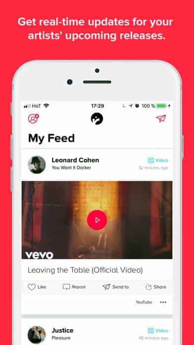
Have you ever missed the release of a new album and felt entirely out of the loop? That no longer has to be an issue with Record Bird. It syncs up nicely with music apps, such as Apple Music, so that it imports all of your favorite artists. As those artists release new music, it is automatically added to your Record Bird feed, along with music that your friends have shared. This music aggregator has a mobile app UI similar to Apple Music in my opinion, in that it is primarily white and red. But it takes music a step further than the average music app by making the experience social. The paper plane icon to send a post out to friends is a subtle and nice touch that helps make the design more casual and friendly.
7. TickPick by TickPick
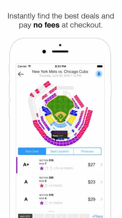
Continuing on the theme of music, don’t you just hate it when your favorite music artist is coming to town, but you snoozed, and the tickets are sold out? Many companies help you get there with tickets from the secondary market, and TickPick is one of the latest additions. The beauty of TickPick is that you don’t have to meet a stranger outside the venue and there are no extra fees that get tacked on at the last minute. The app takes it beyond music and also offers tickets to sporting and theatrical events. The bright app has many different colors for sections, such as events you’ve liked and notifications. It even has seat ratings and uses these to color code the arena. Then you can filter by the quality of the seat because sitting in the nosebleeds isn’t always the most fun. One feature that helps it stand out is alerts when prices drop. It mixes a modern card design with all the functionality you’d hope for in a ticket app.
8. Tumbleweed by Tumbleweed
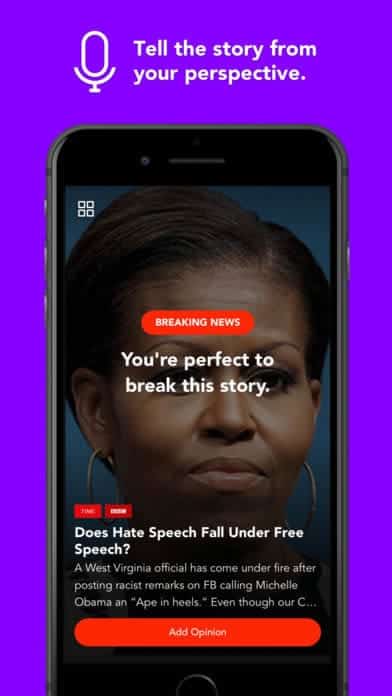
Following the news can be rough. There seems to be an endless stream of negative events, but what about getting a different perspective? Reading news from journalists is great and in addition, you could be hearing the viewpoints of others from around the world. News is more than headlines, it affects real people, so why not hear from them and use those to form a more well-rounded opinion on pressing issues? On any given news story, app users get to read through what happened, and when they scroll through to the bottom, they are met with videos with opinions from others who had something to say about the story. The layout of the app is based on cards for featured stories, app users you follow, and topics you follow. Tumbleweed is image-based, with a clean black layout that is accented by red buttons and section headers to call attention.
9. Musement by Musement Spa
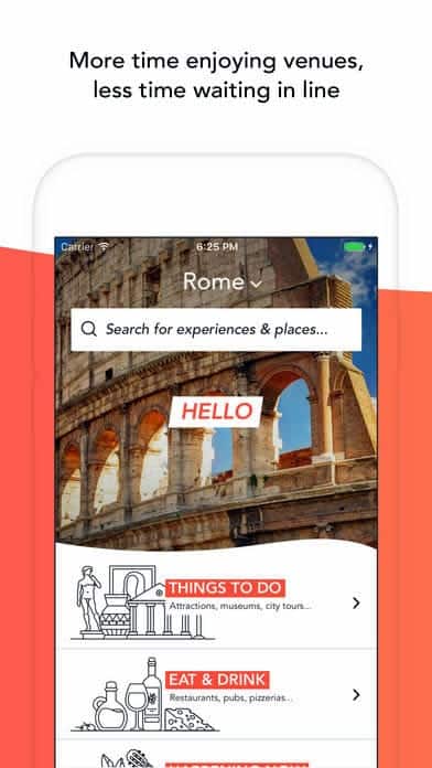
Traveling is great fun, but getting stuck in tourist traps because you trusted random advice on the best things to do in a new city you’re visiting is not. Musement takes the guesswork and even the lines out of exploring a new place. It helps travelers get recommendations on things to do, eat, and drink from locals who know the area well. You can even buy tickets on the site and skip the line at museums and other popular destinations. The wave-shaped design is an indication of how much fun using this app is. It also seamlessly blends animations of activity categories and rich images of the activities themselves. Get the most out of your travels with this smooth mobile app UI design that presents the most useful information in an appealing way, so that you can quickly start exploring.
10. PartyWith by Amplify Media
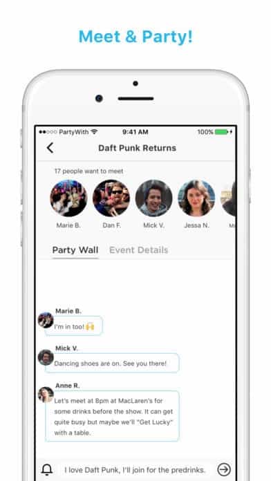
Whether you’re traveling alone or need some inspiration for where the best nightlife is, PartyWith has your back. They’ve just gone through a significant overhaul to make sure that app users can easily make friends and find events that interest them. It’s highly customizable, as it asks users precisely what their scene is during the onboarding flow. There are options to go for craft cocktails or go to a punk rock show. Whatever you’re into, you can find others interested in the same thing and meet up at events that you’ll all enjoy. Some features remind me of event behemoths like Facebook, as there is a “Party Wall” where event attendees can have a group chat. The app is part a social network, part a messaging platform, and part an event planner. They put together all these functions seamlessly into one mobile app UI.
That wraps up the apps for October, but if you’d like to explore some of our other favorite mobile app UI designs, check out our September installment.
Feeling inspired? Sign up for free with Proto.io and prototype your own app in minutes.
If you enjoyed this curated list of great mobile app designs, share it with your social network! Do you have a suggestion for the next edition of our Top 10 Mobile App UI series? Reach out to us via Twitter @Protoio or on Facebook.
