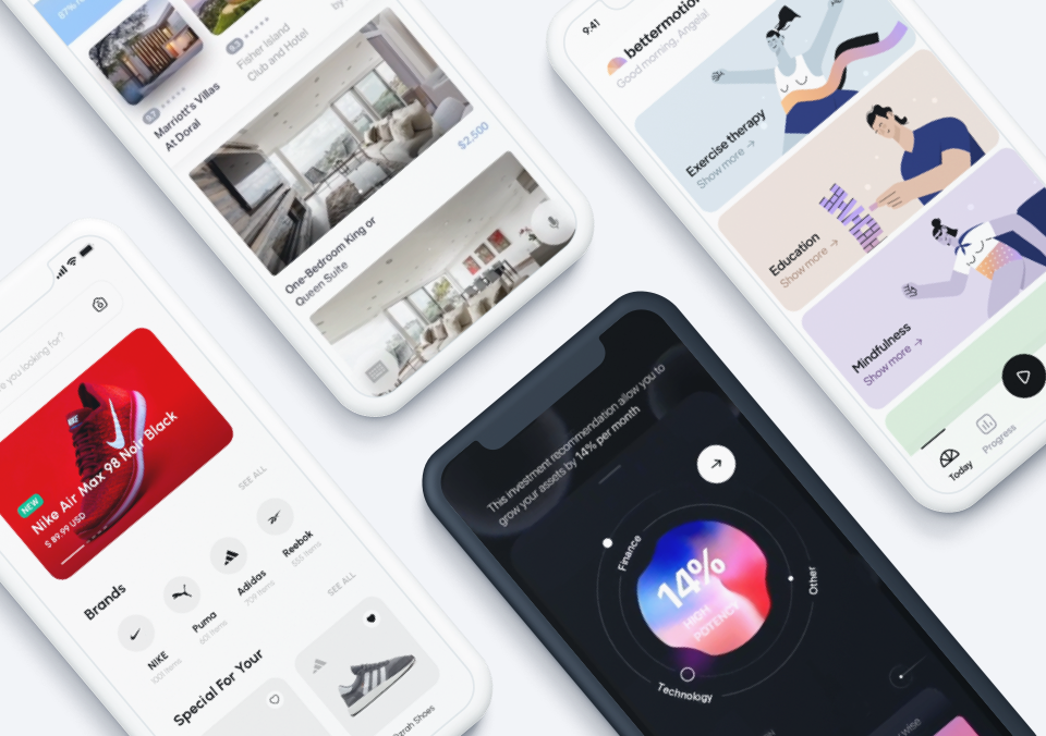
In the October edition of the Top 10 Mobile App UI Design series, we are thrilled to feature a set of rather diverse apps that cater to different types of users. From apps for students to remote working teams to astronomy enthusiasts, the featured apps have been selected for their outstanding app UI design. In no particular order, we present the 10 mobile apps with stunning UI designs that will undoubtedly inspire you and get your creative juices flowing.
1. MORECAST by Ubimet
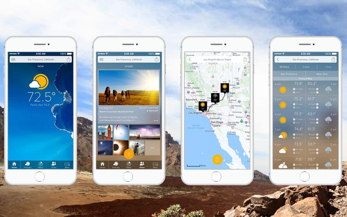
At times, the weather forecast can be a little like gut feeling — we rely so much on it but we’re never too sure whether to fully trust it. Fortunately, when it comes to the former, MORECAST app intends to bring us some real changes. The app claims to be the premium weather companion. It offers precise forecast data, side-by-side comparison of the weather of two locations and Doppler radar among other fantastic features.
On top of the nice range of premium features, the beautiful app UI design is also worthy of praise. The clear display of information and the great choice of images let you get a good sense of the upcoming weather with a glance. I also like the set of clean, flat icons. MORECAST app UI design is almost impeccable, except that the Android version of the app could be more, well, Android. It is a beautiful app design nonetheless.
2. Meter by Google Creative Labs
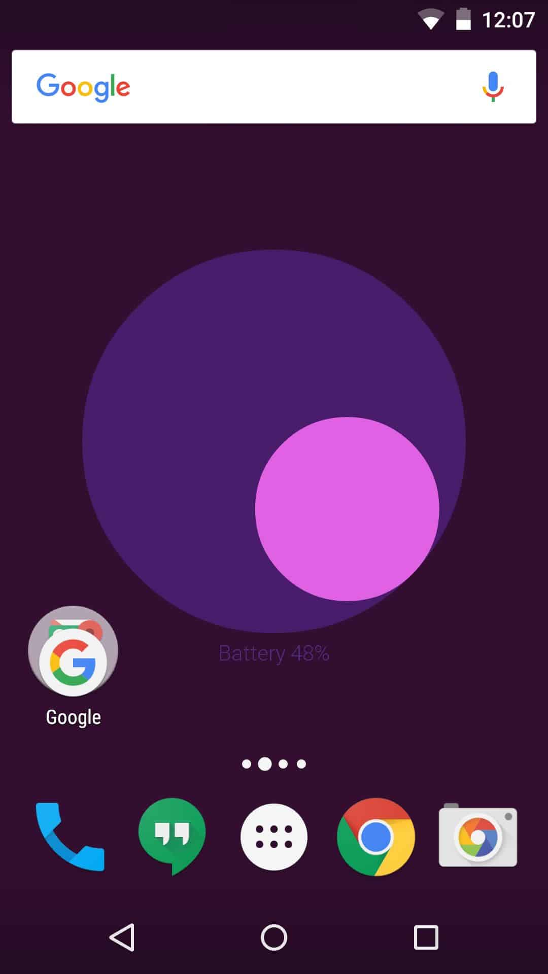
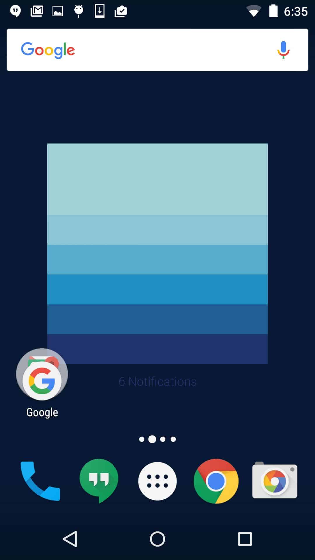
Apps like Meter make me want to return to Android once again. Not so much a typical app but more like a Material Design wallpaper add-on, Meter gives your Android device a funky beautiful look. More importantly, it serves as great evidence that beauty doesn’t have to be useless. Meter visualizes live information about your device, such as battery life, WiFi connections, and notifications, and displays it on your wallpaper. Tilt and move the device to manipulate the wallpaper.
We’ve gotten so used to seeing information about our devices displayed in tiny font along the status bar that this idea comes as a refreshing change. Also, Meter gives us a real sense of the creative potential of app UI design for Android, an area that designers have pretty much neglected until recently.
Get for Android.
3. Onetime by Lunar
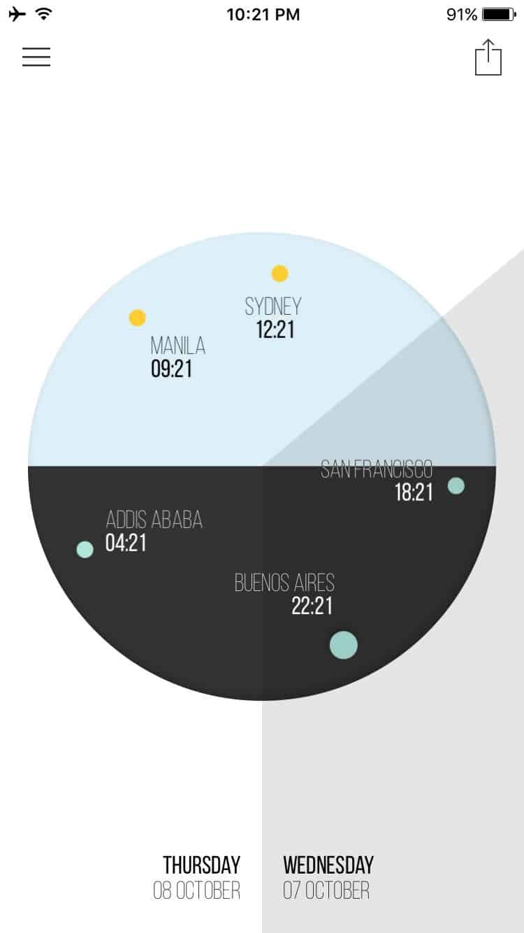
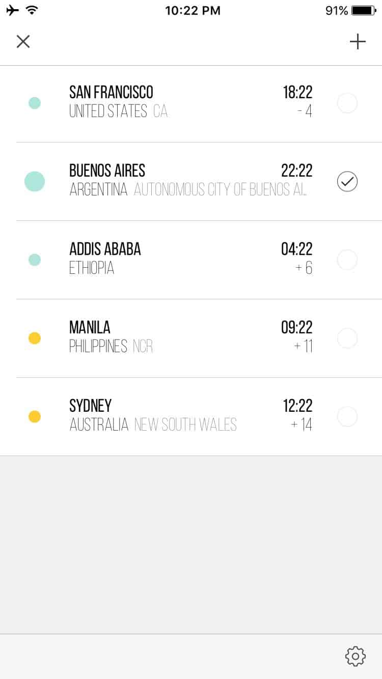
Working in a remote team? Living halfway across the world from family? Then you’d know the pain of having to deal with different time zones. I certainly know it, since calculating time differences makes up about one half of the math I actually do. Onetime is the app for people who regularly find themselves Googling, “What time is it now in…?” The app shows you all your favourite time zones on one simple dial.
The app UI design is gorgeous. Simple, minimalistic, and clean. It makes great use of shades, colors and contrast to represent day and night, today and tomorrow. There could not be a more effective app UI design than one that conveys information with utmost clarity. I love the way you can rotate the dial to easily check the hour across various time zones.
4. Brainly by Brainly
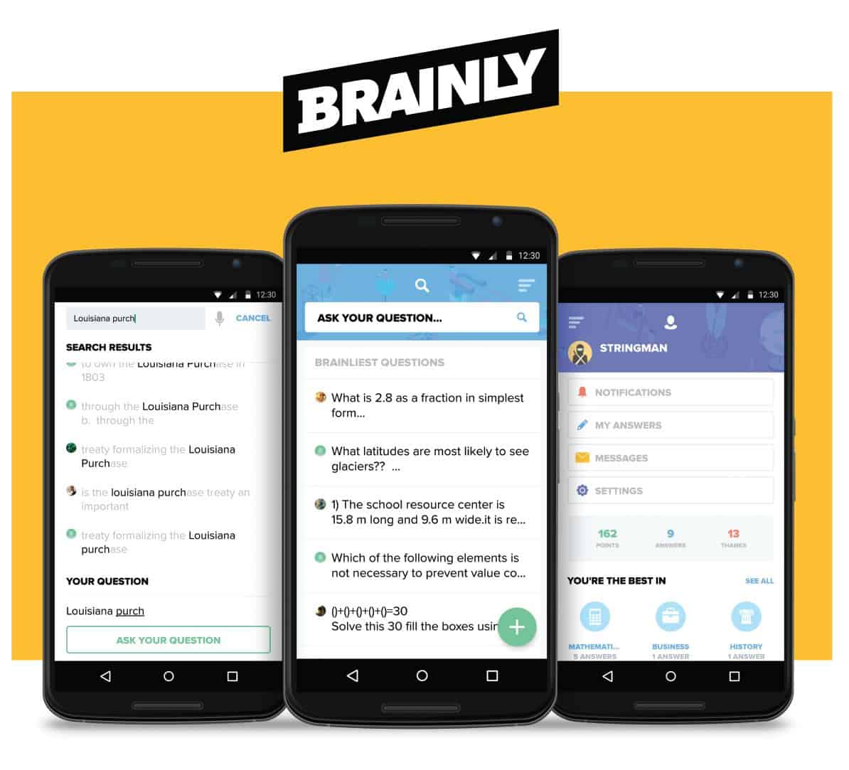
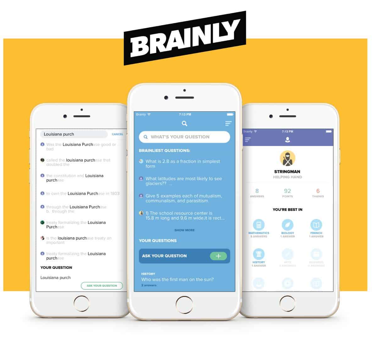
Brainly is to kids what Stack Overflow is to geeks. A collaborative community for students to learn and share knowledge, Brainily aims to inspire kids to become active Quora users when they grow up. I’m kidding, although the idea is not too far off. Students post questions they need help with and others can answer to gain points (street-cred). The app idea is brilliant, to be honest, weaving homework into a social network.
Young students might also just draw inspiration from the lovely app UI design of Brainly and become great designers in time to come. I’m particularly impressed by the clean layout and visual hierarchy using lightweight colors and text size contrast.
5. Prettyclose by Prettyclose
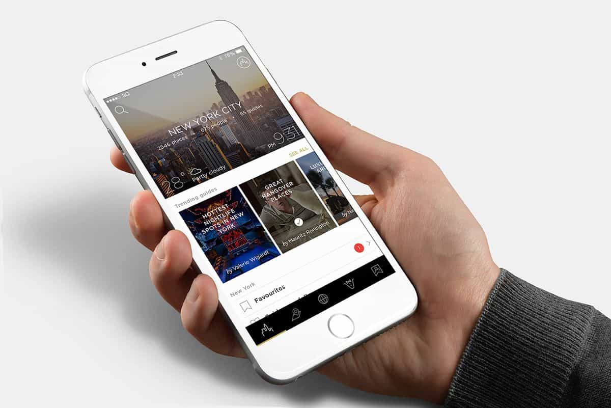
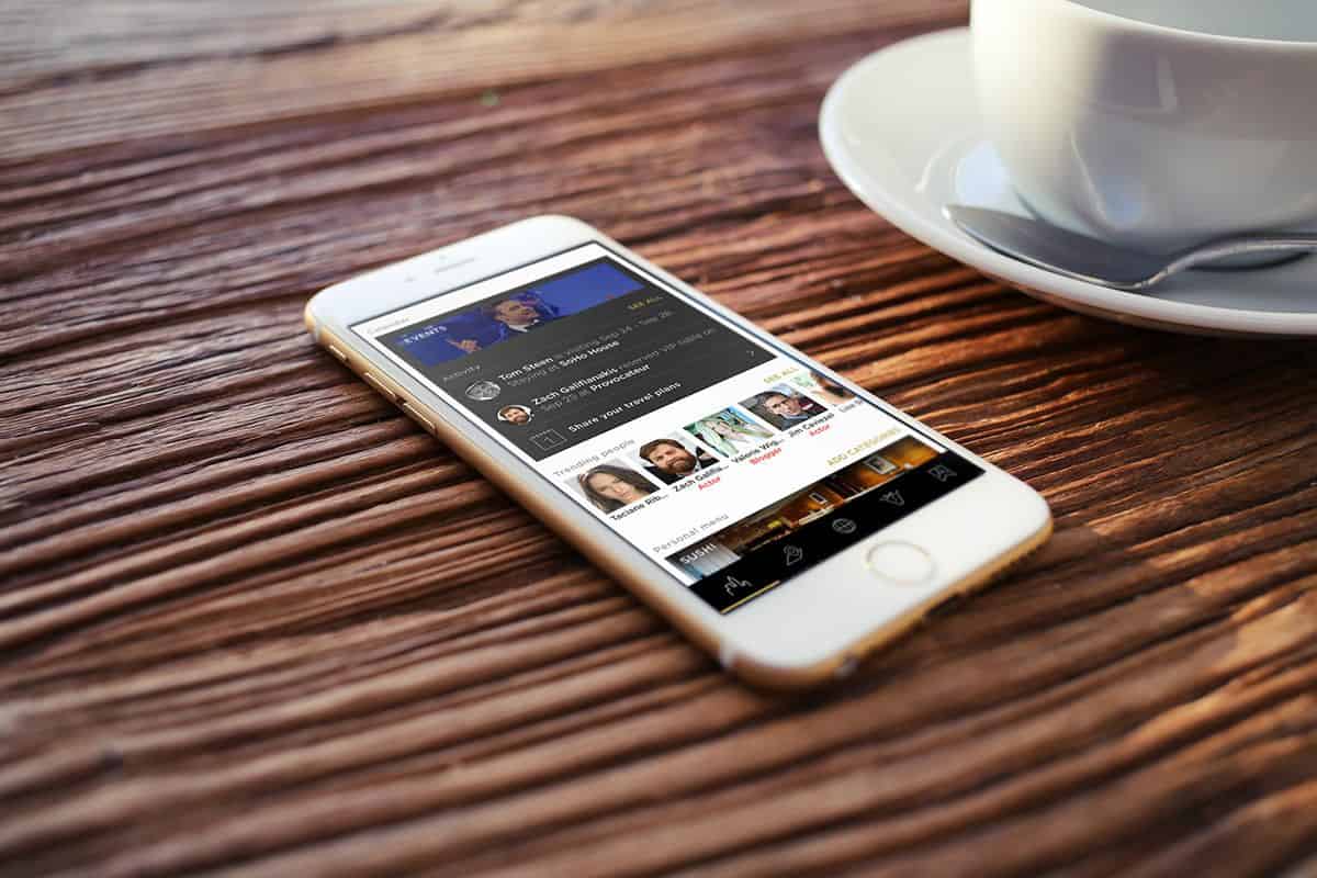
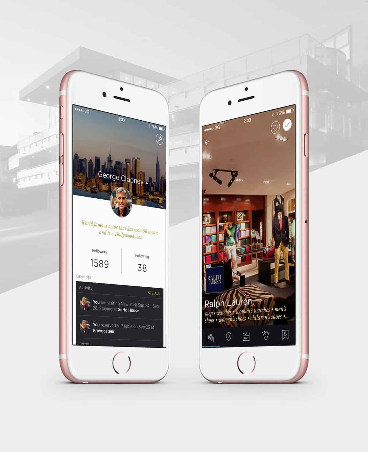
Traveling to big cities can be a real hassle. There’s so much to do but never enough time. Trying out recommendations pulled off Google searches can be a bit of a gamble. You want quality and you don’t want to waste too much time getting it. In comes Prettyclose app, a global digital concierge service that promises you only the best of big cities. Get recommendations from your friends and social networks. Make reservations digitally. This app wants to be your best friend in the city.
It’s also a marvellously fine-looking app. Professional, sleek, and elite from every angle. The app UI design intends to keep up with the level of premium quality that the service offers to people who travel like George Clooney. From typography to iconography to IA to background images, every design detail seems to be calculated to simple perfection.
Source: Rolf A. Jensen’s Behance
6. Strgzr App by Nickolay Yukhnov and Katerina Yukhnova
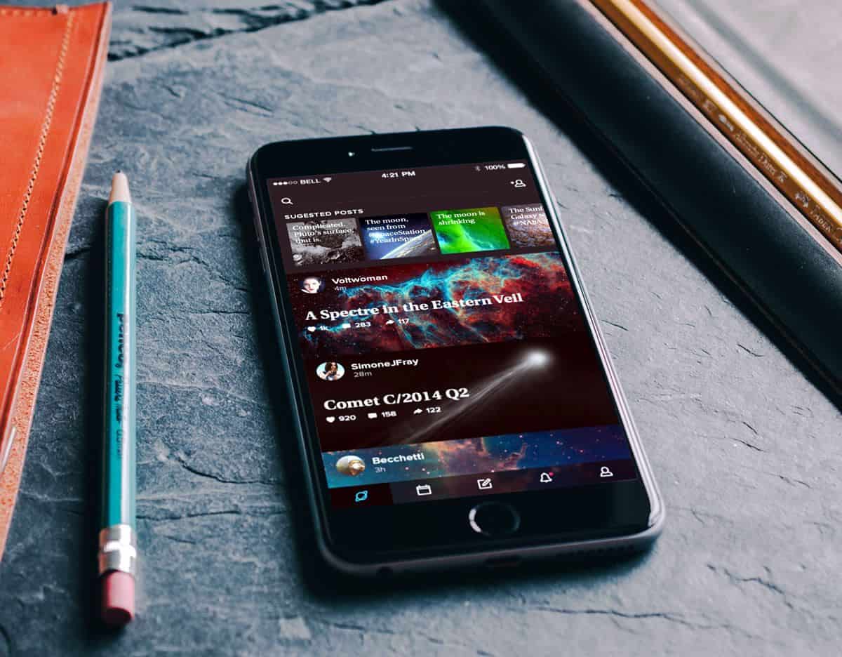
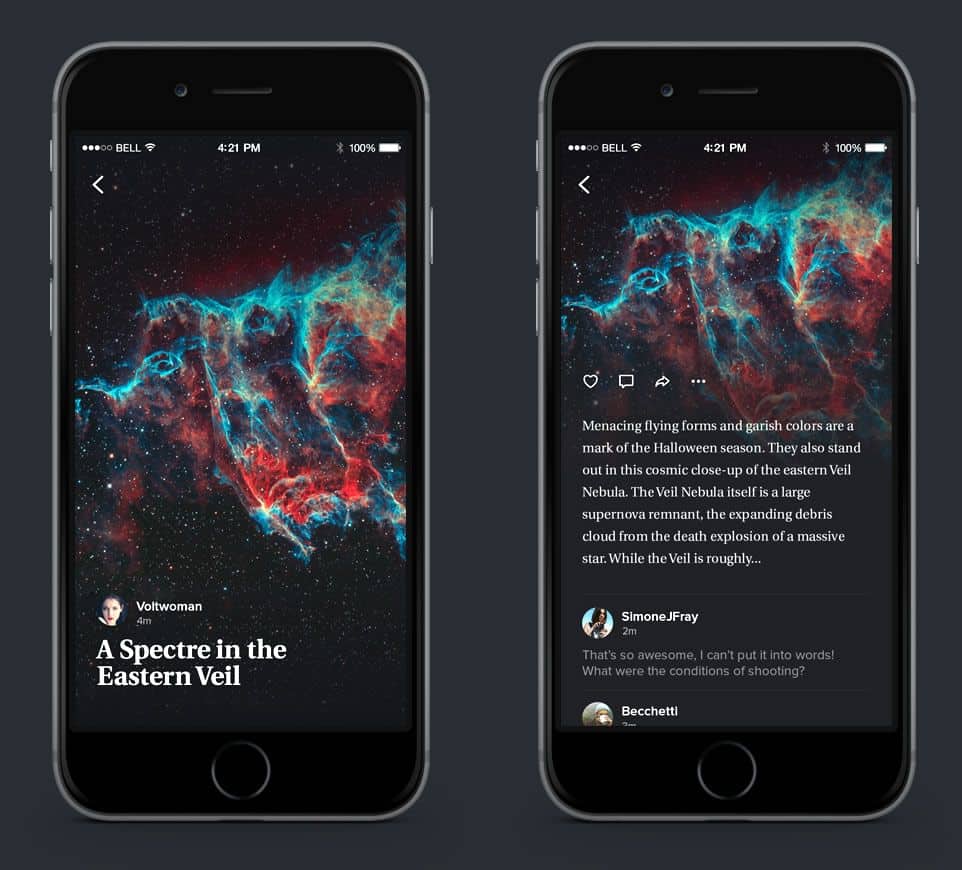
Ever gazed up at the stars on a clear enchanted night and found yourself with a sudden desire to know what’s out there? I’m a big fan of the Hubble Space Telescope gallery and beautiful app UI design. It comes as no surprise that the Strgzr app I encountered in Behance caught my immediate attention.
“The sky is the ultimate art gallery just above us,” claim the designers behind Strgzr app. Instead of going to an actual gallery, you can gaze at enthralling images of space and our universe with this app. The soothing yet enigmatic mood of deep and desolate space is well conveyed through the app UI design. I especially love the custom space icons in that shade of electric blue.
7. Linute by Linute
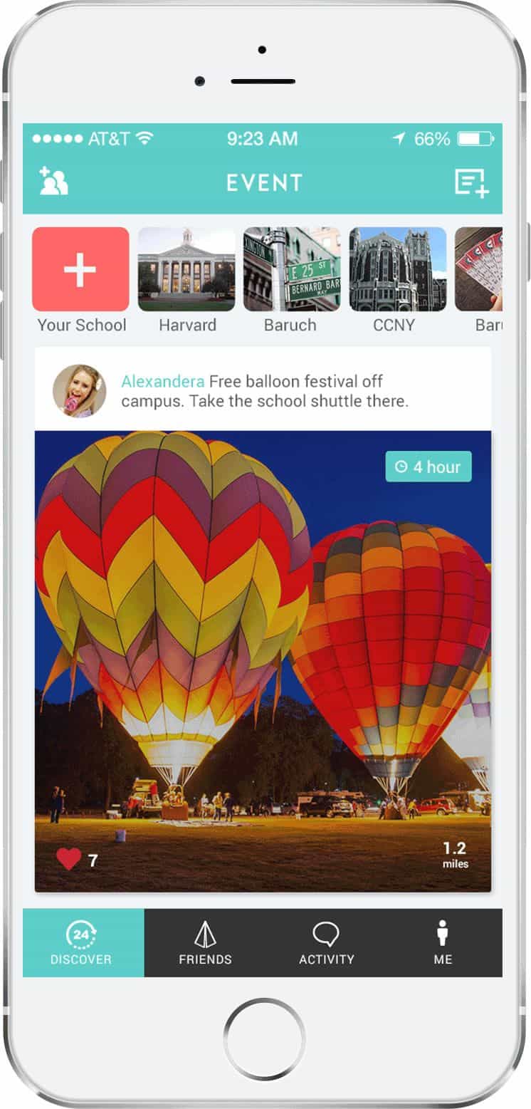
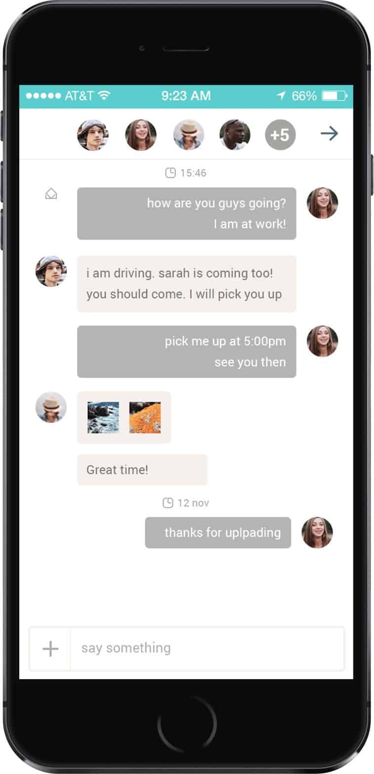
College kids are indeed the maestros of last-minute hangouts. I remember my college years to be filled with hours of “Dude what’s going on tonight?” type of messages with absolute zero commitment whatsoever. Somehow, we always managed to end up in the same place at around the same time. Linute is an app to better manage the organized chaos of college life, to discover and create last-minute events around campus.
The app UI design of Linute is also delightful. With its simple layout, nice choice of fun colors and plenty of ample, the app has a casual feel to it. I really like that the row of profile thumbnails make up the title bar rather than a list of names.
8. The Earth by Tinybop
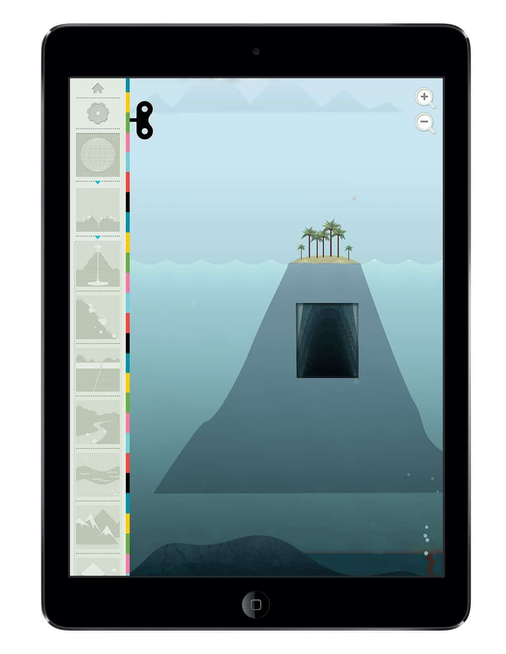
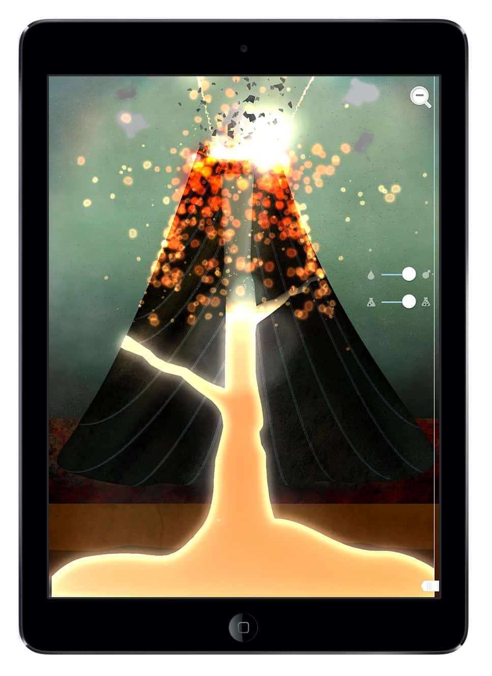
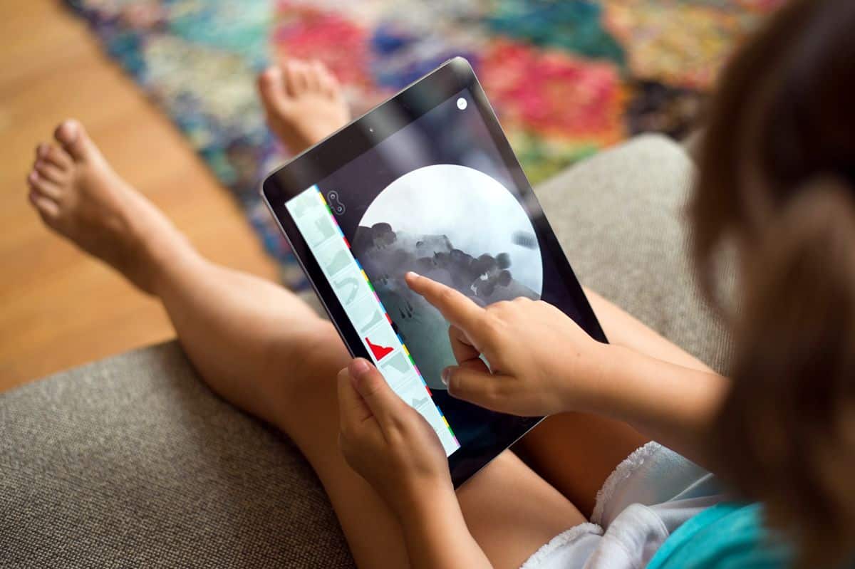
With the number of amazing educational apps available for kids these days, I wonder how the little ones manage to sit through hours of school. Textbooks and worksheets must seem so static to the new generation of children. The Earth is one of these beautiful, creative apps designed to stimulate curiosity in kids through interactive learning.
The illustrated landscape created by the designer at Tinybop was a 32-foot long Photoshop file. Mind-blowing, isn’t it? No doubt, the app UI design is beyond gorgeous, it’s practically a full-blown illustrated digital masterpiece. You’ll probably enjoy The Earth as much as your kids will. Besides, it’s always good to have a memory jogger to recall those Geography lessons.
Get for iOS.
9. Sinappse App by Diogo Akio
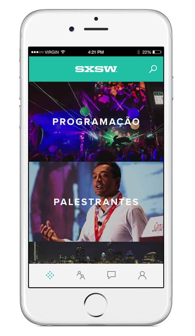
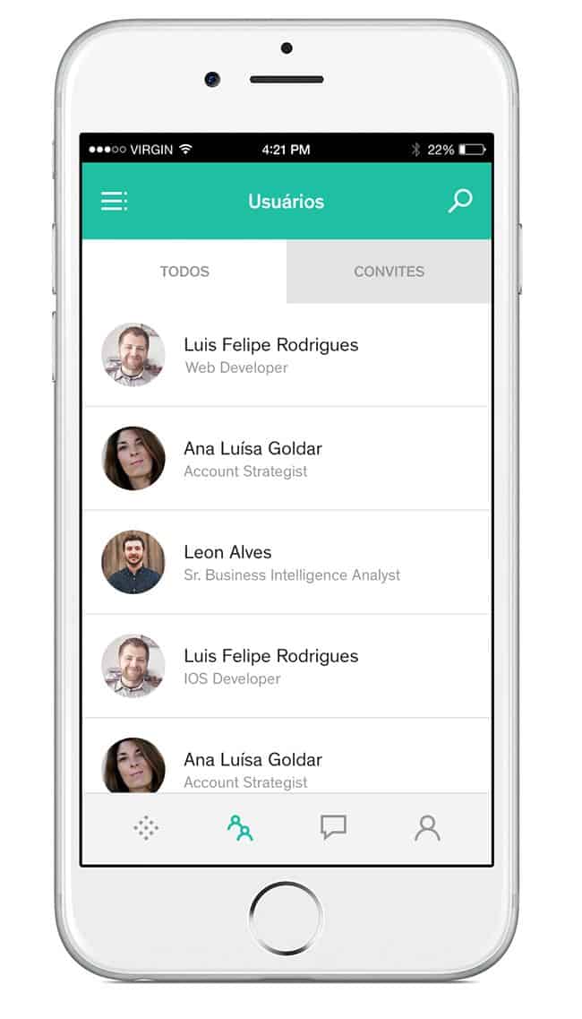
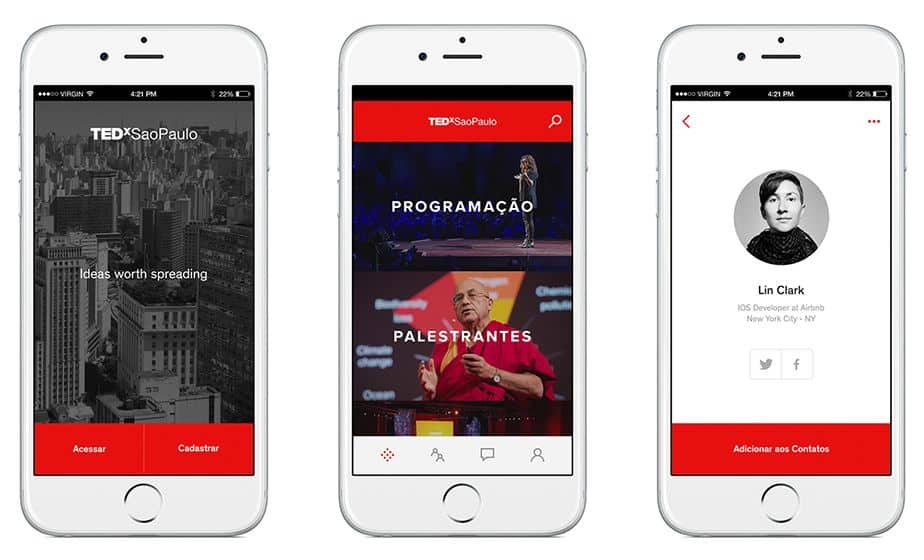
Brands often seek to improve customer engagement whether offline or online, whereas customers enjoy greater interaction with their favourite brands. Sinappse is a mobile app concept that aims to promote interaction between brands and customers, as well as between all sorts of event participants. The latter is indeed very attractive for festival goers and conference attendees hoping to expand their professional or social networks.
What’s interesting about the app UI design is that it is adaptable. The different brands on the platform can maintain their unique brand image with the use of colors, images and logos that users are already familiar with. The examples below of SXSW and TEDxSaoPaulo on Sinappse app show how a mobile app UI design can be both flexible and consistent at the same time.
10. Hello Heart by Hello Heart
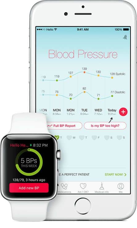
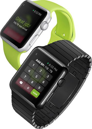
Medical technology is a booming industry. With the rising popularity of health and fitness tracking apps, it’s clear that the general public is concerned with taking health matters into their own hands. Hello Heart is one such health app that helps individuals manage high blood pressure and related heart risks. It also organises all your essential medical information and offers explanations about your medical data.
Hello Heart sports an excellent app UI design. For any app that deals with loads of important data, the key to a successful UI design is the ability to filter signal from noise and to effectively visualise data in a simple, understandable way. In Hello Heart, data is presented in a clear layout well-suited for the mobile experience. The choice of colors for different data points and the ample use of white space also adds to the brilliance of the UI design.
Would you like to recommend a stunning mobile app UI design for next month’s edition? Feel free to tweet us @protoio!
