Every month, we showcase ten of the best in mobile app UI design in our monthly series. We tend to look out for great mobile app visual design, stunning UI elements, mobile app UI that is magical or outstanding, and good app layouts that pay careful attention to usability.
In this month’s edition, we see a greater number of fantastic mobile app UI designs from Android-only apps. This is exciting for the design world as it goes to show that designers should no longer ignore Android UI design. In no particular order, here are the top 10 mobile app UI designs of November 2015.
1. Daresay by Daresay Ltd
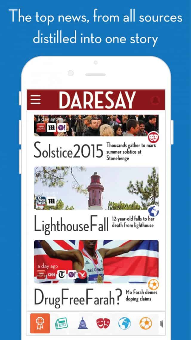
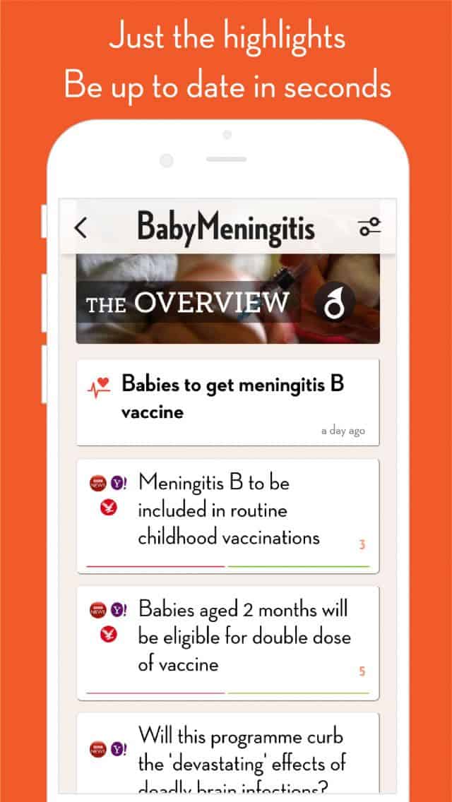
Some days, we simply can’t afford the time to read through entire news articles. But yet, skimming through headlines doesn’t quite allow us to stay adequately informed. Daresay is a fine-looking mobile app that brings us an unconventional way of consuming the news. Regular, lengthy news articles are condensed into bite-sized bits of important information. The app also focuses on customisation so that you read what matters to you.
It’s a refreshing change to have a news app that puts the reader above all. What Daresay also offers is a stunningly bold and unique mobile app UI design. The sleek card-style layout and the impressive typeface make the bite-sized information very readable and pleasant to browse through. No doubt, Daresay’s mobile app UI is loud but I find that the overall design works effectively by calling attention precisely to what’s important.
Source: PreApps
2. Called It! by Uncharted
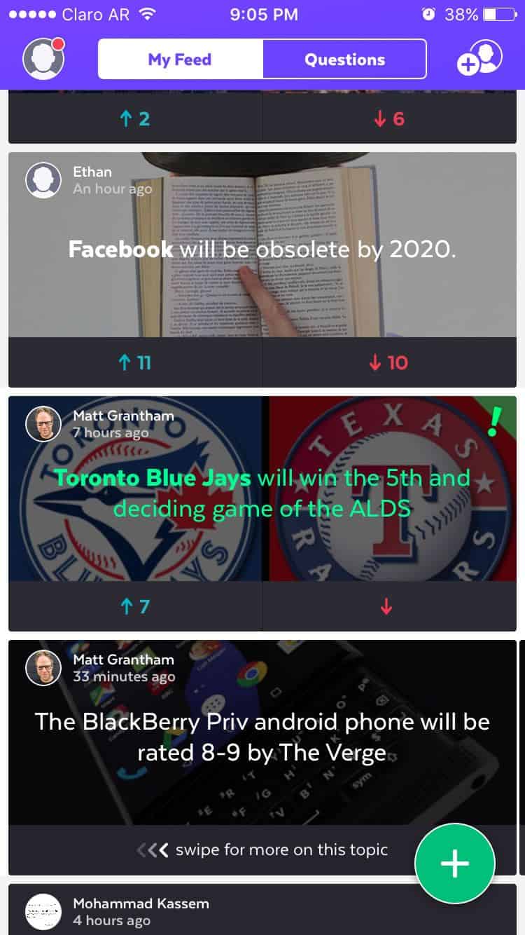
Who will be the next President of the United States? Will National Cat Day ever be declared a public holiday? If you’re the kind who enjoys predicting the future and sharing your predictions with others, Called It! is the right app for you. The app allows those with a keen eye on the future to easily make a call and browse through and comment on predictions made by other visionaries. It then tracks your predictions and lets you know when you’ve got it right, earning you street cred and points to level up.
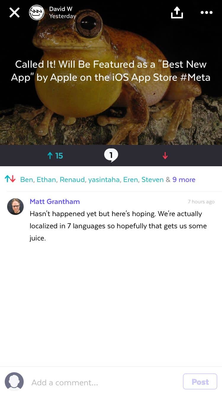
Called It! is a wicked fun way to pass the time, no doubt. And while you’re busy becoming the next Nostradamus, check out the mobile app UI that is also quite worthy of mention. Each list item features a nice image background and simple actions familiar to many forum users: up vote, down vote, and comment. The layout of the app makes it easy to browse and each prediction is short and clearly displayed.
3. Morse Me by Veddpa Application
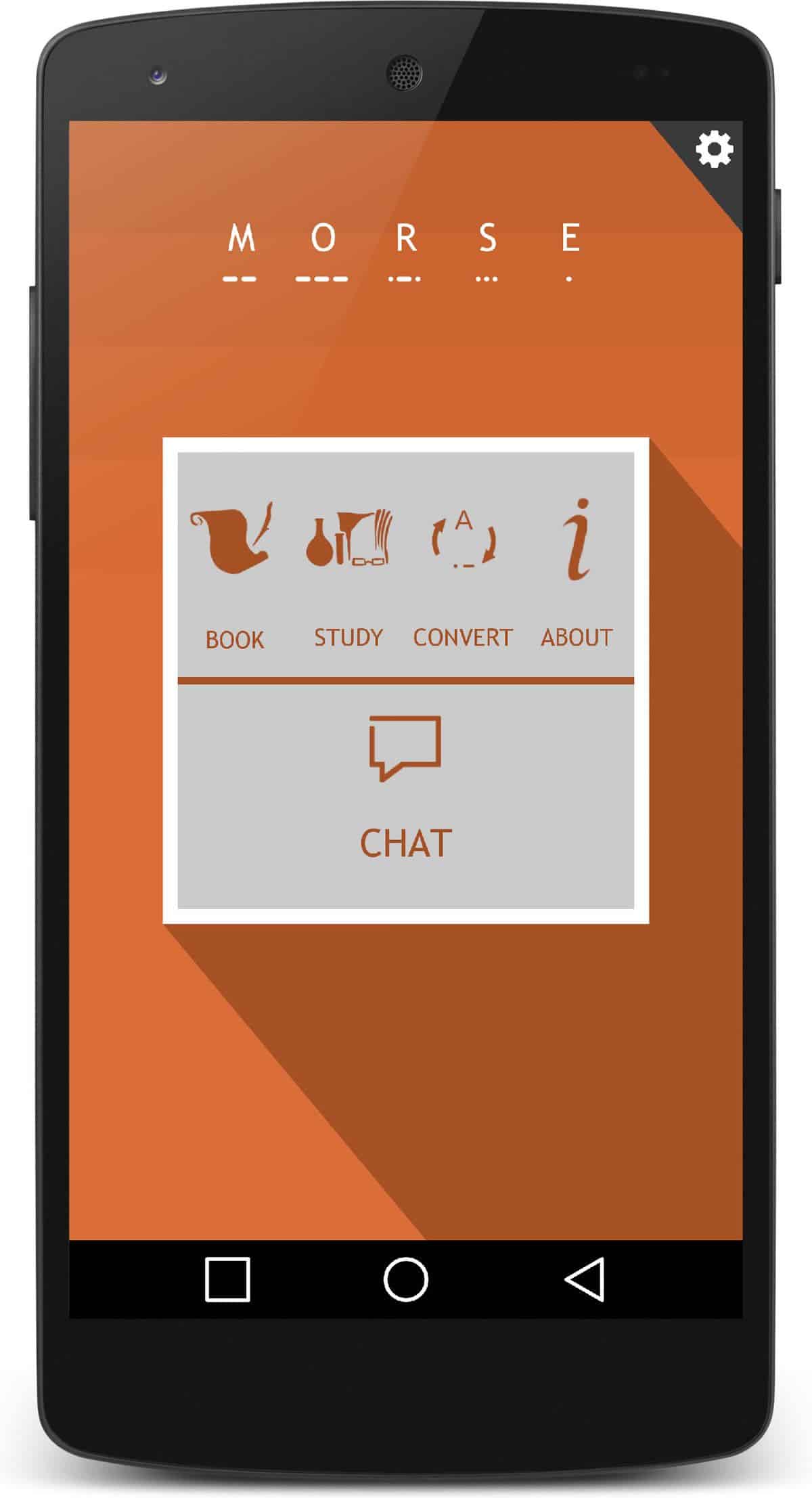
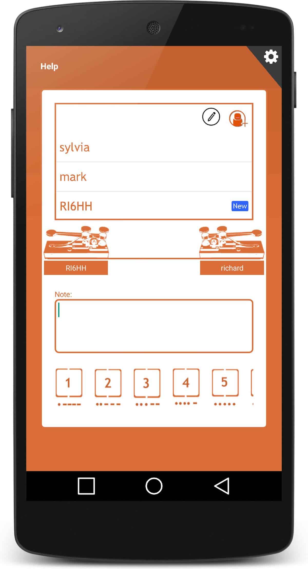
Ever felt a great desire to learn Morse Code? Although it was developed over a century ago, Morse Code has not lost its cool factor, partly thanks to James Bond and other action-based spy movies. The method of transmitting text information via dots and dashes is definitely geeky but nonetheless useful to know. Now you can learn it in an interactive way with this beautiful app.
Morse Me’s mobile app UI is a classy blend of vintage and flat design. The custom icons are very befitting and the simple color palette further enhances the alluring vintage-flat design style. Morse Code learners can send their contacts signals using a digital telegraph. The app truly captures the value of learning by doing.
4. Parchi by Microsoft Corp
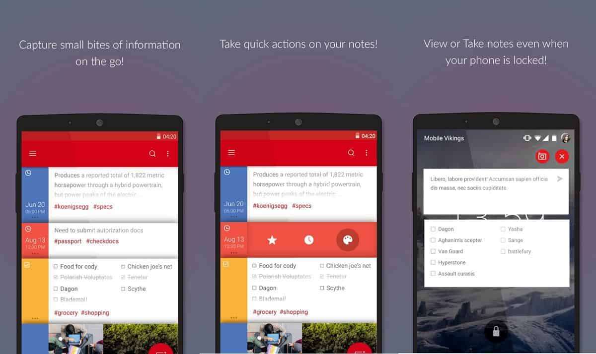
Note-taking apps are in abundance and most of them serve their functions well enough. Google Keep is a particular favourite of mine and many users tend to agree. So it was interesting that Microsoft Garage released an Android-only note-taking app. Reviewing Parchi’s beautiful mobile app UI and sleek functionality, it would seem that the bar for note-taking apps has just gone up a notch or two.
Feature-wise, Parchi allows users to take notes from the lock screen and is tag-based. Talk about great #usability. The app UI design of Parchi though is a real gem. Heavily influenced by Material Design but not a direct rip-off of Google’s apps, Parchi sports some bold and bright colors and clean card-style layout. The mobile app UI clearly reflects inspiration from Post-It notes and in a way, the app works like those coloured bits of paper that we would once stick all over our work desks.
Source: Microsoft News
5. Run Mo Run! by Movember Foundation
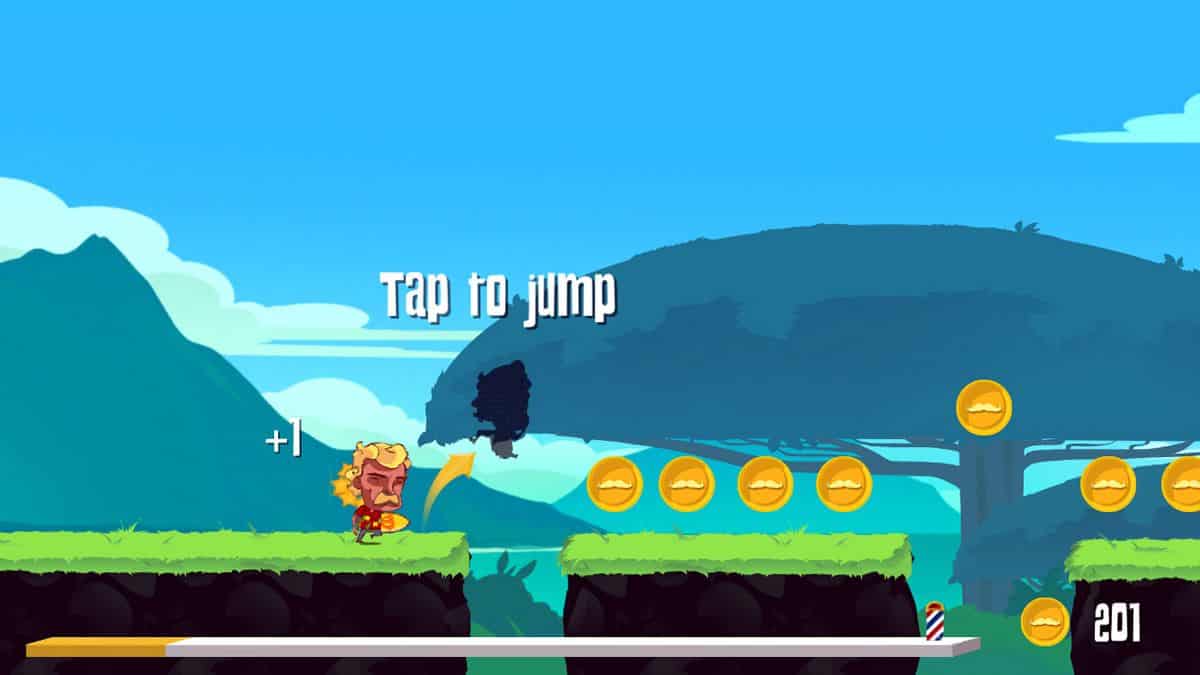
November is a pretty magical month. It’s a month dedicated to growing moustaches, at least for those who are biologically able to. Yes, November is Movember, the month in which lip foliage on men gets to grow free. Born in 2003, Movember has been part of a global movement to improve men’s health. This year, a mobile app has been released as part of the movement’s efforts to raise funds towards its cause.
Besides the fact that a game featuring whacky characters sporting many different types of moustaches is pretty fun, the mobile app UI is also a great piece of work. The scenery and characters are beautifully illustrated. The game play is simple – a one-tap control that makes your Mo character jump and leap through obstacles. Ultimately, if you won’t or simply can’t “grow a mo and help a bro”, Run Mo Run is a good alternative to have some fun and help out a good cause.
6. Plume Air Report by Plume Labs
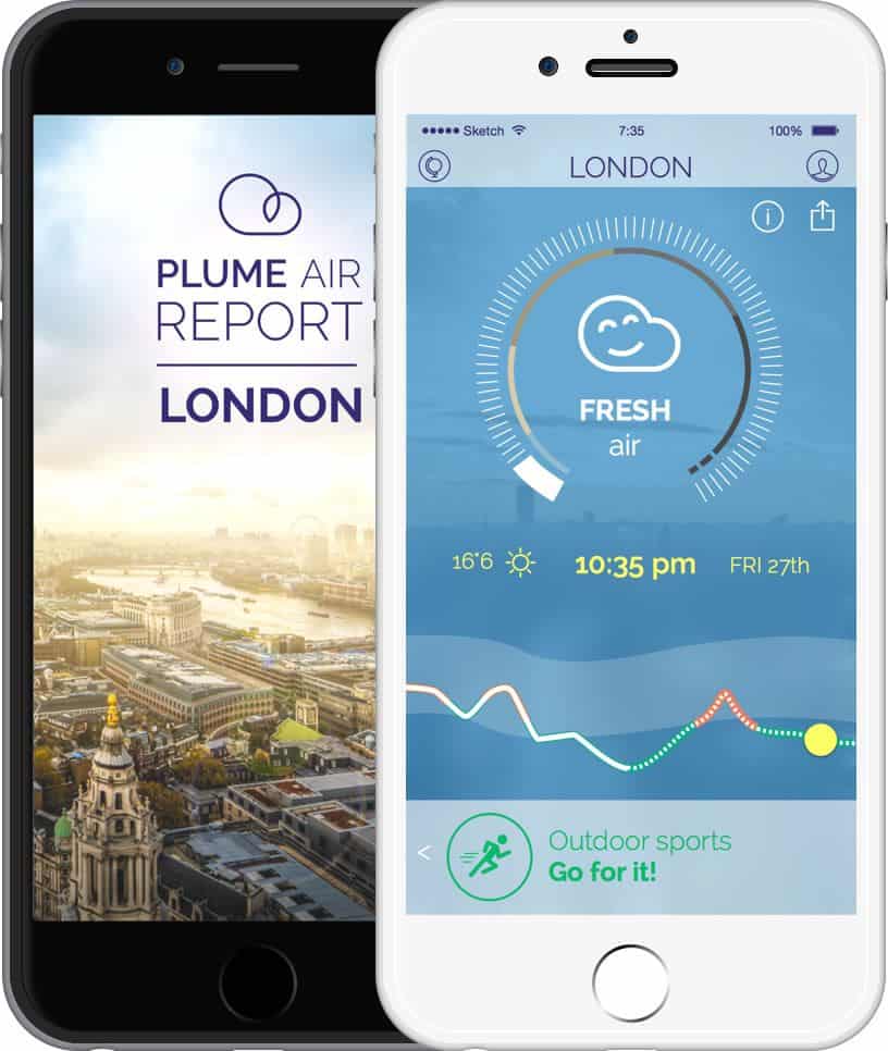
Air pollution is not a new phenomenon. Neither is it one to be taken lightly. Breathing in excessive smog will have dire consequences on our health. Plume Labs wants to raise greater awareness on this grave issue and to provide us with a means to monitor air pollution in the cities we live in. The Plume Air Report app has so much potential to bring positive changes to our modern urban lives.
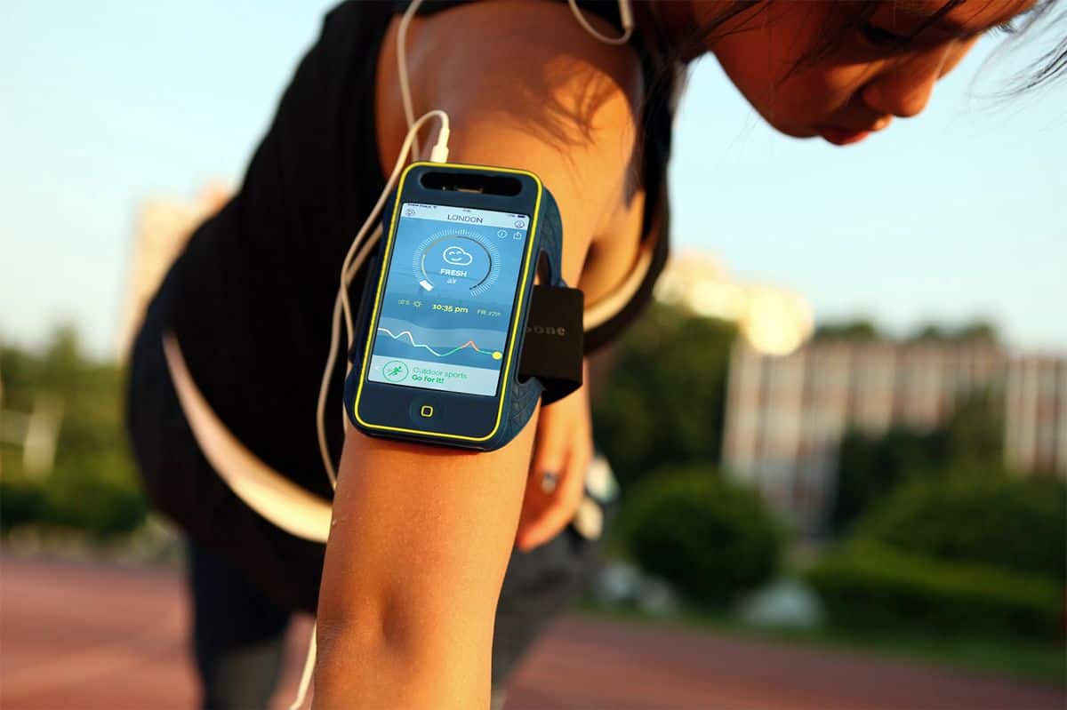
The mobile app UI is also a prime example of delightful design. To put it simply, the Plume app is gorgeous. With its sleek and fresh design, the app informs you of the quality of air in your area and advises you on the type of activities you could do. I find the aerial shots of the different cities for which Plume is available absolutely stunning. The graph representing the level of air pollution is also well-designed and clear to the user.
Get Plume Air Report on iOS and Android.
7. Stash by Collective Returns, Inc
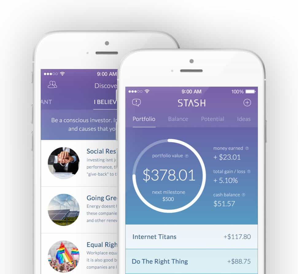
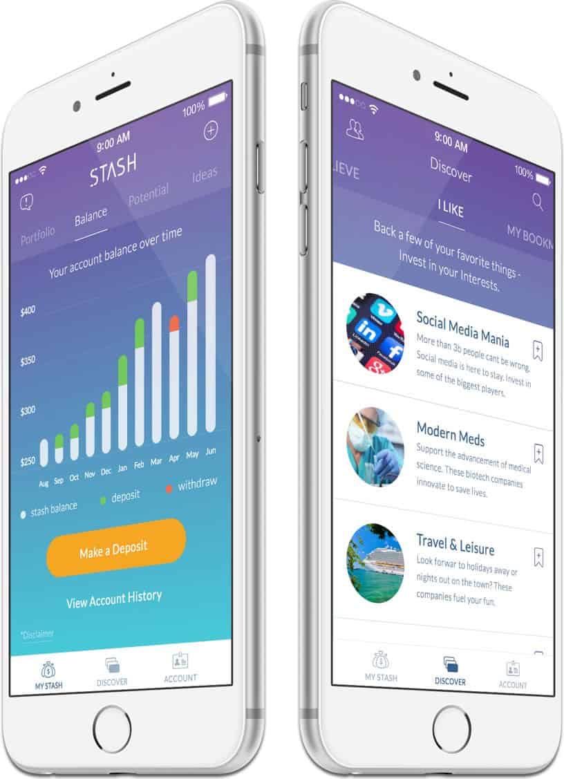
Have you ever wondered what to do with your money besides spending it or keeping it in the bank? If you’re one of the more financially responsible individuals among us who sticks to a savings plan, Stash might be of interest to you. Stash curates investments from professional fund managers and investors. With the app and some 5 dollars to start, you can then invest in the funds that reflect your beliefs, interests and goals.
Stash also shows that finance apps do not have to sport a boring and dull mobile app UI. The radiant color gradient background of the Stash app, combined with the sleek graphical representation of otherwise boring numbers, make for a stylish overall look. I especially like the way financial data is presented so clearly without an excessive use of white space.
Get Stash on iOS.
8. Cloud Chasers by Blindflug Studios
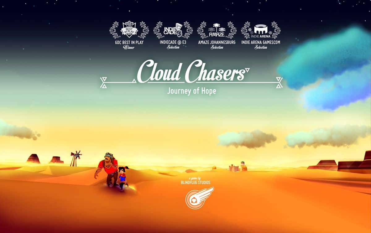
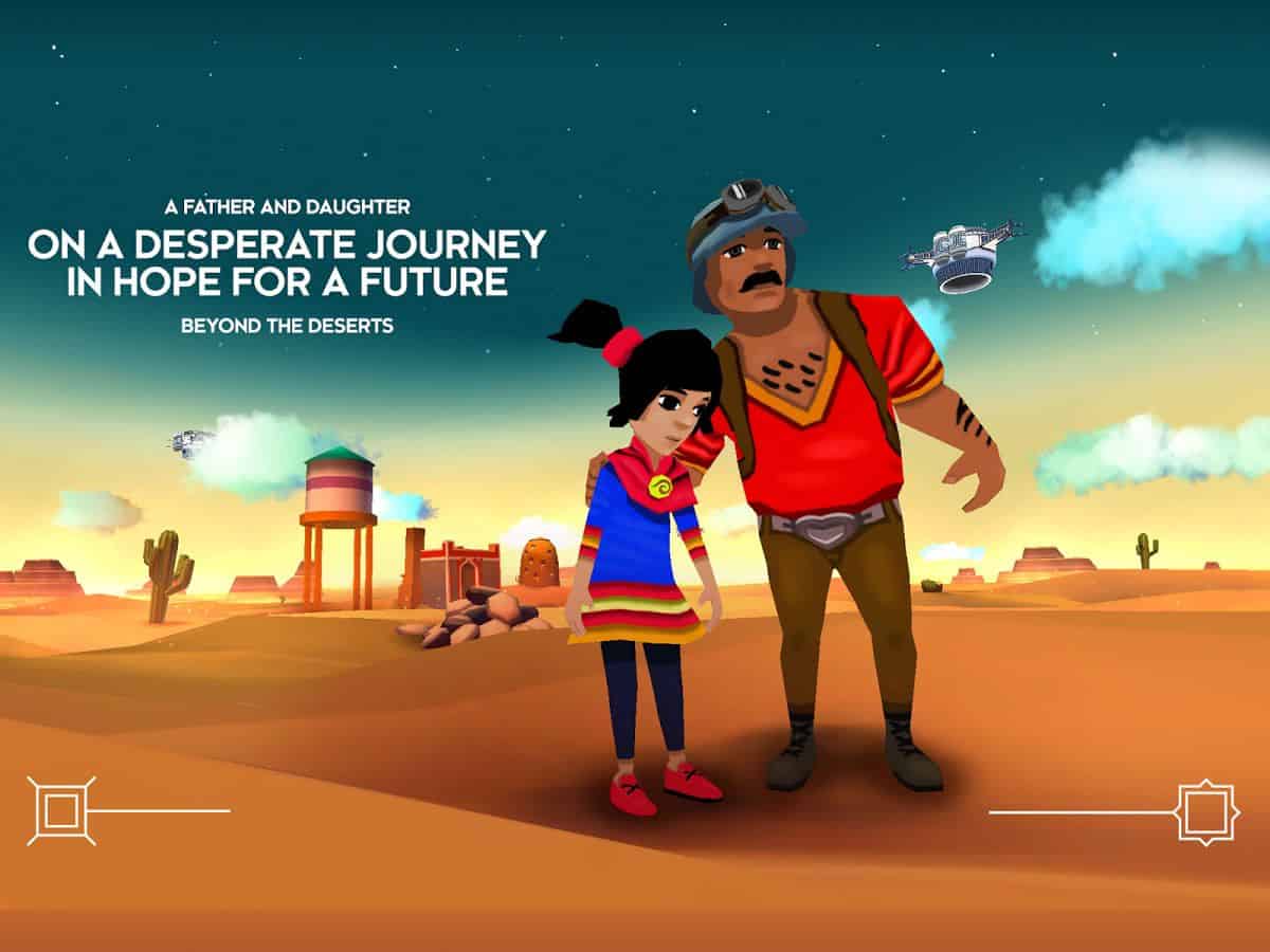
Indie game studios are increasing in numbers and many of them have released mobile games that look and feel like the product of a 20 strong team rather than that of two creatives working out of a stylish loft. Blindflug Studios probably doesn’t work out of a loft but their latest game, Cloud Chasers, is a true gem cut and polished by the minds of creative designers and developers.
The game takes you to a steampunk-styled world in which a father-daughter team has to navigate so as to reach a better world located above the clouds. Cloud Chasers carries a subtle social message; the game’s context alludes to the harsh realities of that modern-day immigrants have to face on a daily basis. Design-wise, the visuals are nothing short of impressive and beautiful. The visual is also well complemented by the auditory experience of the game.
Get Cloud Chasers on iOS and Android.
9. Accomplish by Accomplish Software
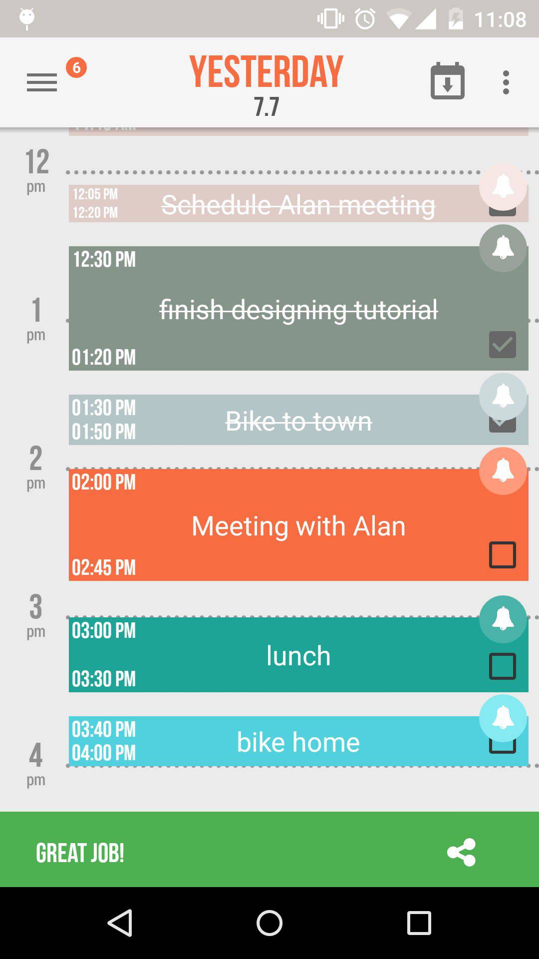
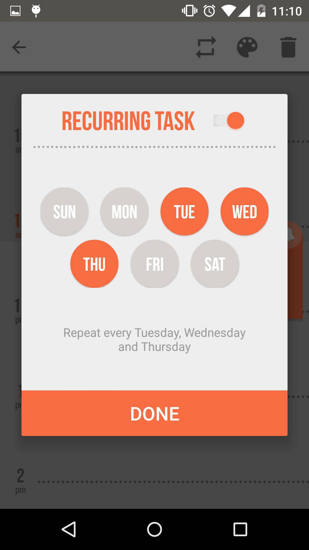
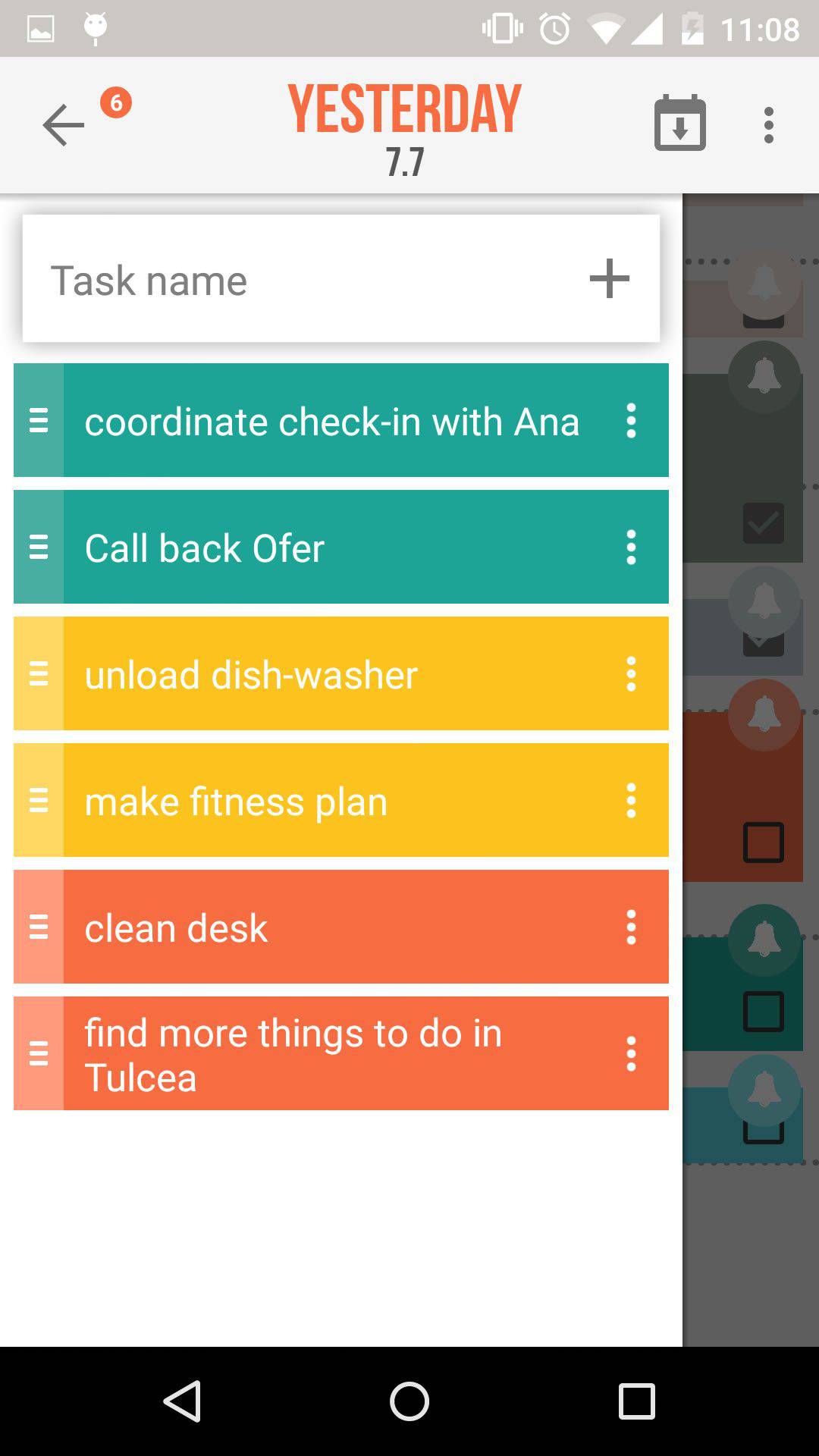
Most of you probably have a todo app that you’re already settled on. Mine’s Todoist, I love it for its lovely interface and great functions. But if you’re in the mood to try something new, Accomplish is a fantastic choice to opt for. This beautiful app combines the classic to-do list with a calendar view, helping you to remember what you need to do and to plan your time.
Accomplish’s mobile app UI is splendid and well-designed. And to think that it’s the work of a teenager from Israel makes me question the priorities I once had as an adolescent. The vibrant colors of both the list and calendar views give a perky, uplifting feel to the app. What’s even more appealing is the careful attention paid to the user experience. Todo apps are meant to make us more productive so the app itself should be fast and easy to use. Indeed, the gesture-based controls of Accomplish, such as changing the time of an event simply by dragging it around, is spot-on user-friendly.
10. Rudimental by Disciple Media
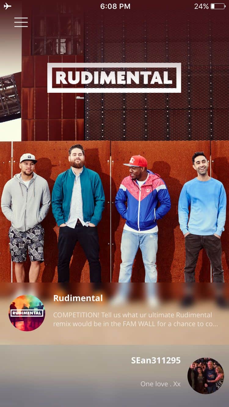
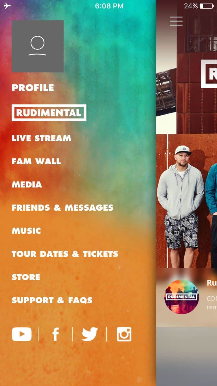
Granted, there’s not too much you could do with an app that’s been made specifically for fans of a music band. But if the app’s UI design is simply dazzling, it could very well serve as a mobile app UI design inspiration for anyone. For that, I included Rudimental’s app for fans who want to stream live performances and be informed about the band’s latest tour dates. The app is a delightful splash of colors, almost like an impressive piece of digital artwork. Notably, the mobile app UI keeps faithful to the band’s image and website design.
Love to inspire? Recommend us a stunning and recent mobile app UI design for feature in our monthly series. Tweet @protoio or @wildningja
