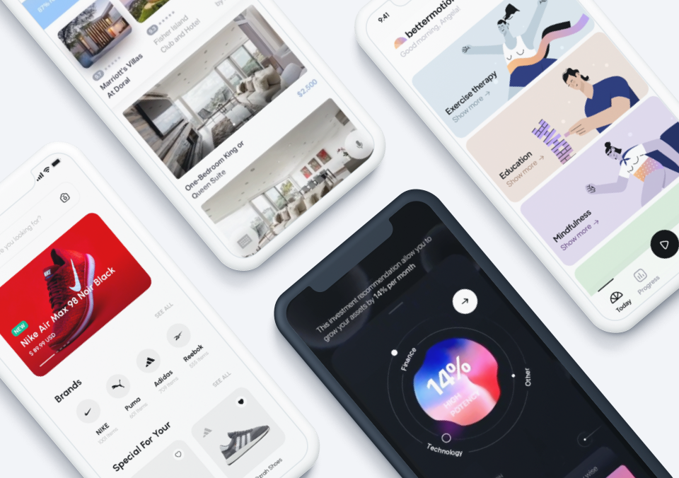
In the third edition of our Top 10 Mobile App UI series, we’re excited to present some of our favorite mobile app designs that we’ve come across recently. From music player apps to utility apps, these mobile apps made it to the list for their amazing and well-designed user interface.
The mobile app experience is not only a result of how well the app works but also how well it’s been designed for visual and emotional pleasure. We love to celebrate great app UI that serve user needs as well as contribute to the growing field of mobile app design. Here are the top 10 mobile app UI for August, listed in no particular order.
1. Phonograph App by Karim Abou Zeid
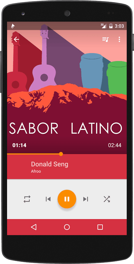
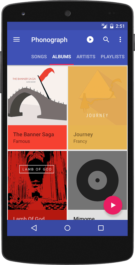
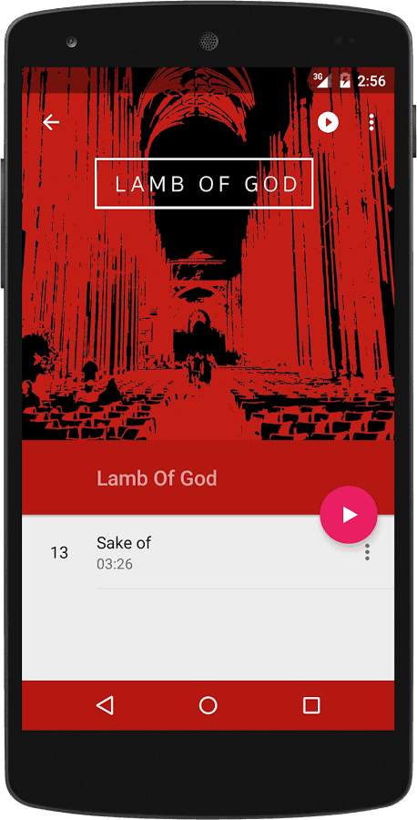
It’s not common to find beautiful Android-only apps, given that many designers often prioritise iOS for designing mobile app. That’s why Phonograph app for Android got me pretty excited and given that I’m also a big fan of Google’s Material Design, this app’s gorgeous UI contributes positively to the argument that Material Design has a future in the design space of the future.
With a simple layout, bold colors, and subtle, clean animations, the Phonograph music player app is a real pleasure to look at and also to use. Although not as popular as their major competitors in the music reproduction industry, Phonograph shows through their well-designed app UI that a good music player app works wonderfully with controls that are easily understood and amazing color combinations.
Download Phonograph for Android.
2. Tossup by Microsoft Corporation
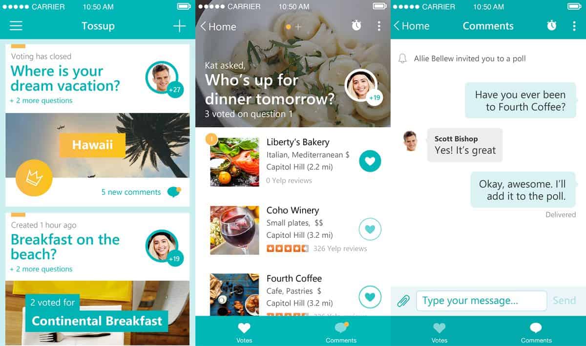
A certain joke has been circulating on the Web that the point of friendship among adults is to make plans and then cancel them at the last minute. Funny or not, it’s unfortunately true that making social plans and keeping them is a real challenge for many adults. Not only do our busy lives hinder us from sticking to our plans but we’re not always blessed with having that extremely organized, go-to organising person as one of our friends.
This latest app release by Microsoft Garage wants to solve that. Tossup is the latest from the Microsoft Corporation’s after-hours innovation space that wants to help friends get together without the usual headaches caused by planning. The app UI is easy to navigate and it is generally a pleasant experience to use it. I particular like the color palette, it’s a great choice for conveying both positivity and relax.
3. Charlie by Charlie Contacts Corp
I recently overheard a phone conversation a good friend of mine had with a person who was offering him a potential business opportunity. As the conversation progressed, my friend became increasingly irritated and started rolling his eyes repeatedly before he finally but firmly cut the call short. Why? The other person obviously had no idea who my friend is or what he even does.
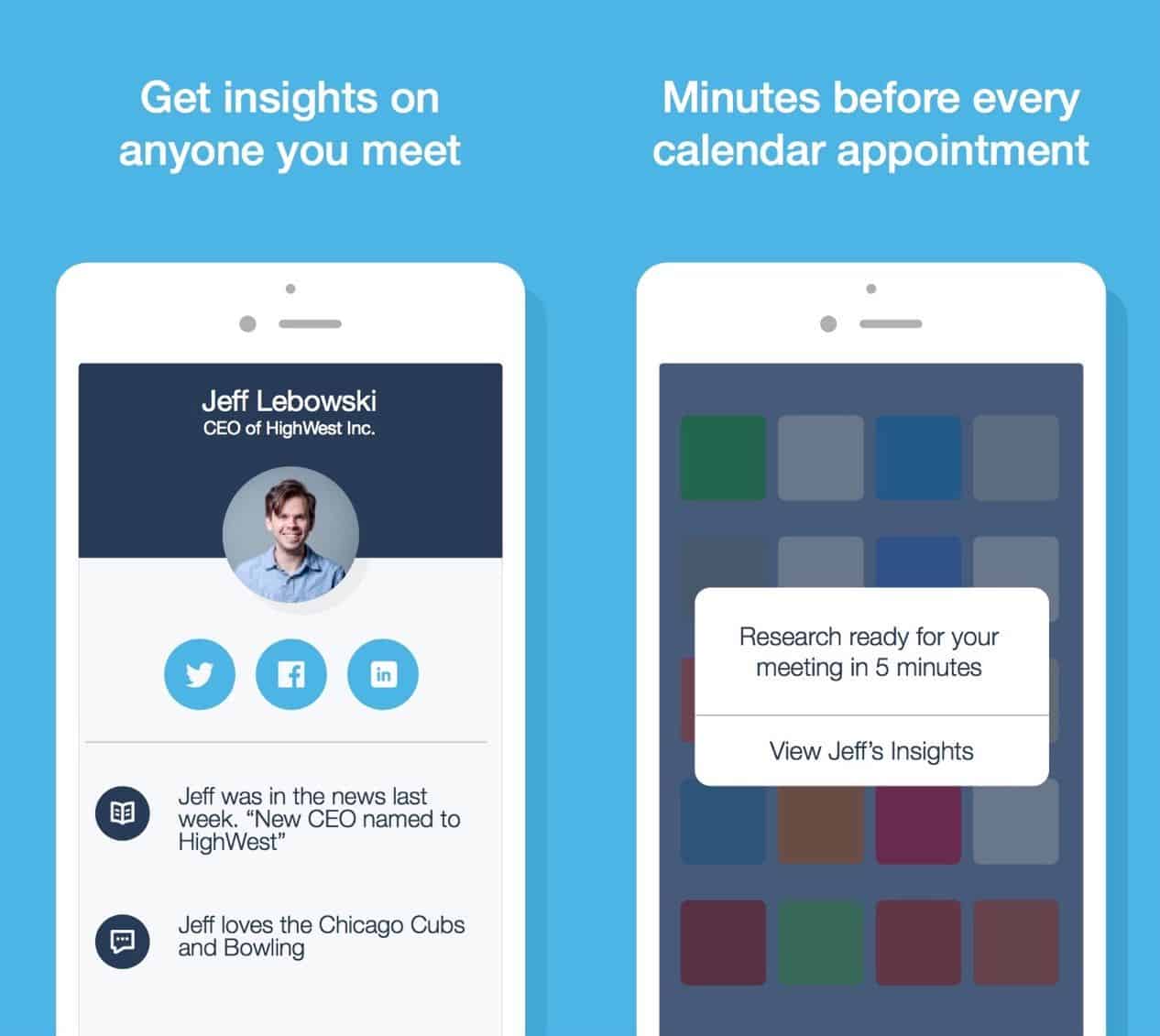
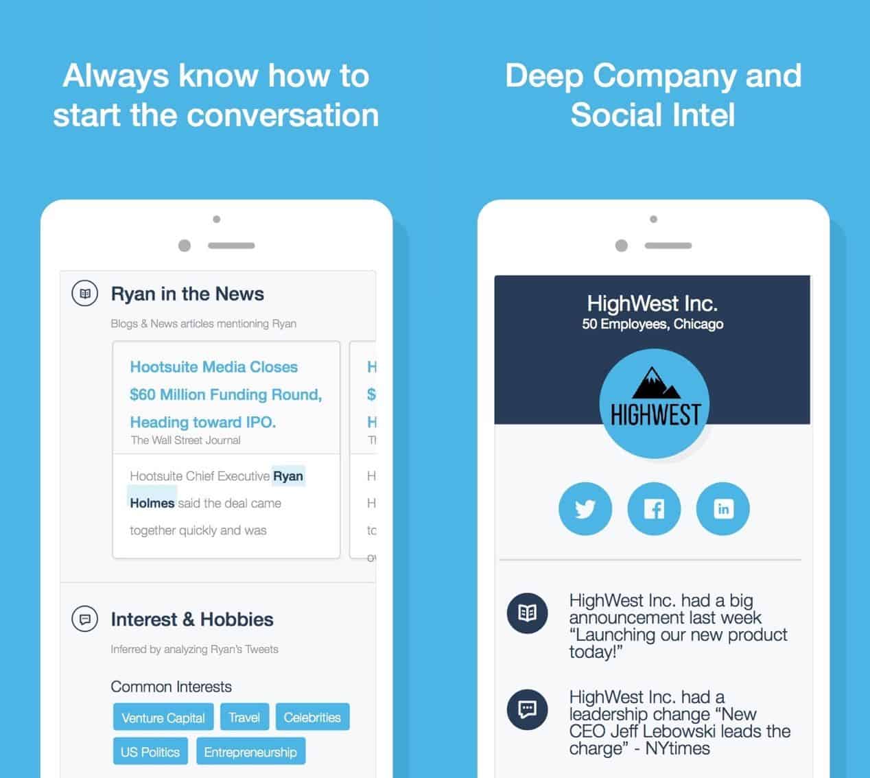
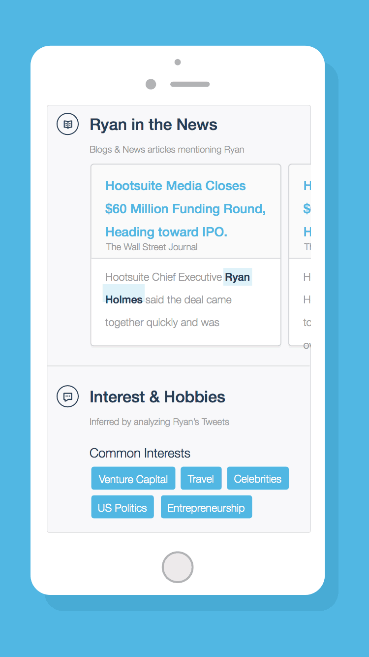
That person probably wished he had Charlie, a handy app that briefs you on the people you’ll be meeting with before you meet them. Charlie sports an app UI that is simple and clear, it speaks to you like a true blue personal assistant. The briefs Charlie delivers are presented in the form of bite-size, card-style information that succinctly displays the lowdown on the person you’re about to meet.
4. Great Little Place
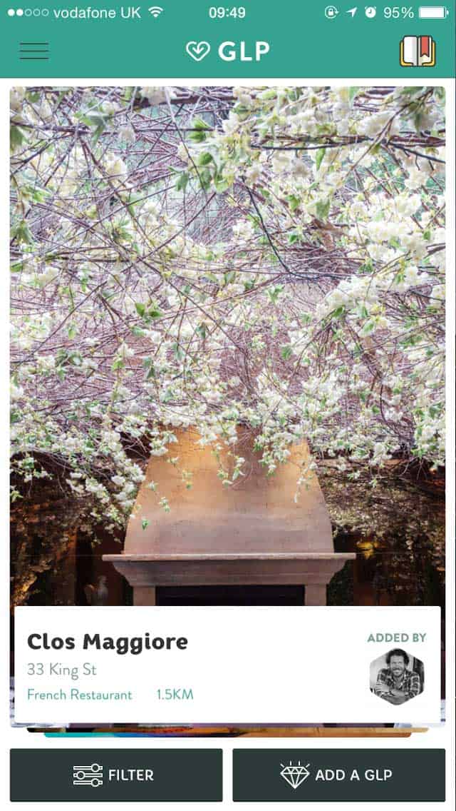
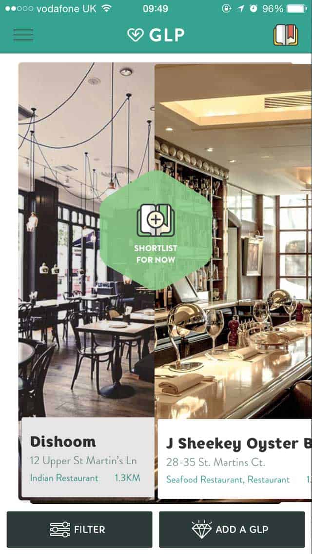
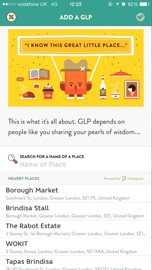
Whether you’re travelling or eating out for the night in your own city, you’d never say no to a “great little place” that only the locals who know the area all too well would know about. Great Little Place is an app just for that.
It’s the Tinder for restaurants and eateries, given that these days, being the Tinder or Uber of anything is the highest form of compliment you could offer a mobile app. Currently available in 6 countries, GLP works in the swipe left or right manner, with each local gem of a food place beautifully presented in card format.
5. SubscriptMe by SubscriptMe
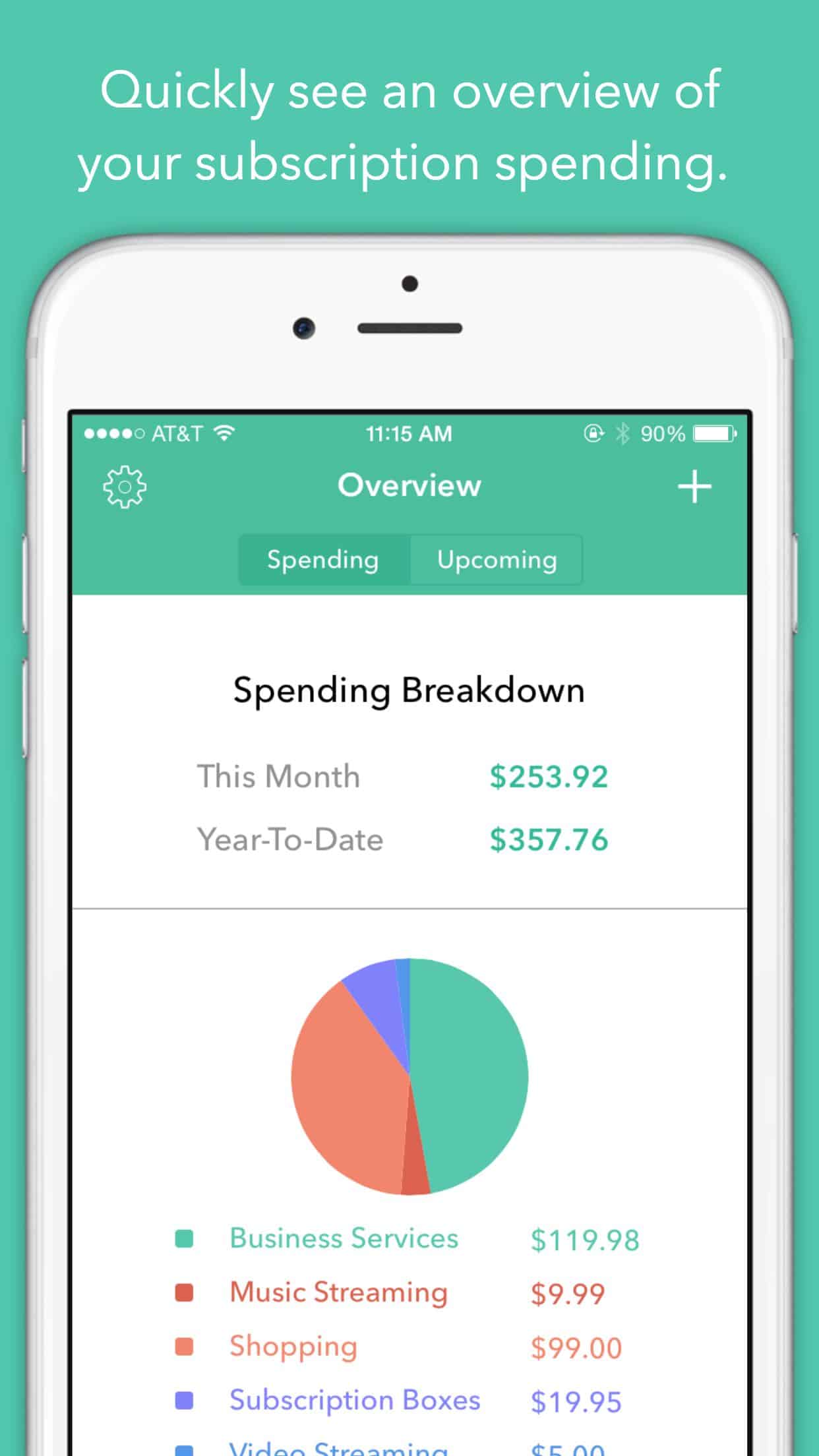
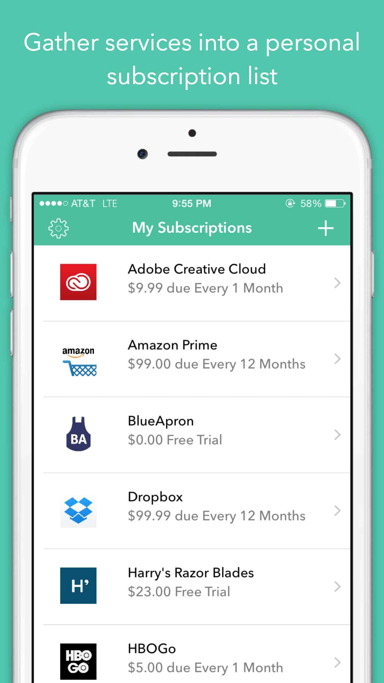
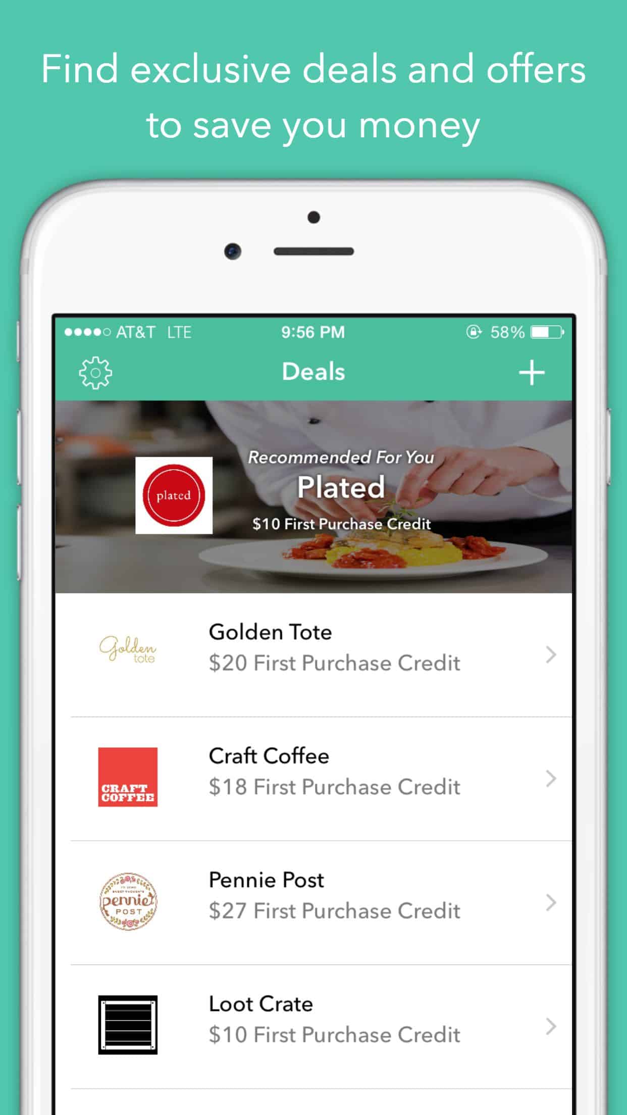
Just thinking about all the online subscriptions that I have puts me in a daze, it’s almost impossible to keep track of them. SubscriptMe is an app that does this for you, by automatically detecting your subscriptions, keeping record of them, and finding your best deals and offers. The app UI is minimalistic, clean, and striking, it presents your different subscription categories and spending information in a very pleasant layout.
6. Moleskine Timepage by Moleskine Srl
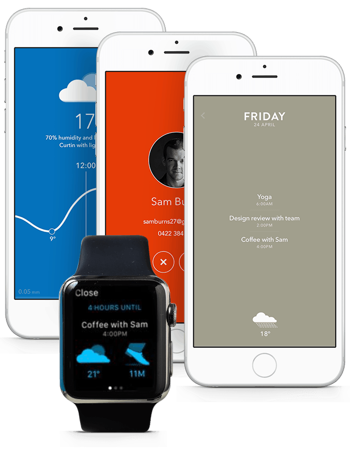
When I was a awkward teenager, all the cool middle-class kids in school had Moleskine notebooks for their note-taking, or whatever it was that teenagers used notebooks for in that mobile-less era. I never imagined back then that Moleskine would be making mobile apps in 2015 but here we are, and just like a classic notebook, the Timepage app is exquisite and beautiful.
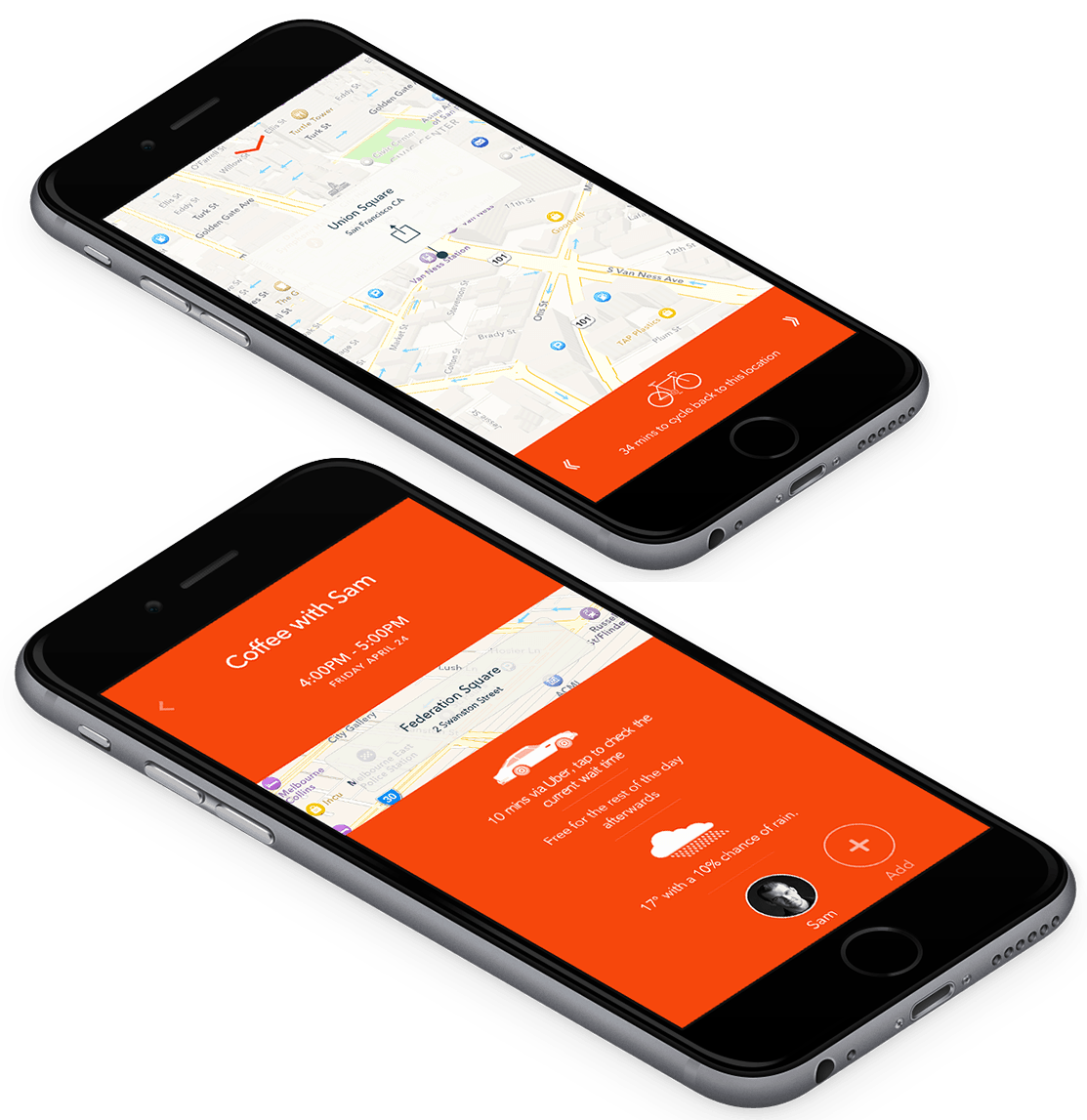
Timepage presents your calendar in a timeline format, making use of rich colors and elegant typography to display your upcoming day with style. The app UI is truly refreshing and easy to use. I also give it points for including the weather forecast, integrating location maps and Uber. It works in every way that a calendar should, but only with a lot of elegance and style.
Download Timepage for iOS and Apple Watch.
7. Hopper by Hopper
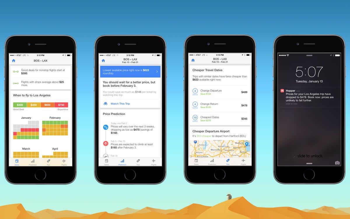
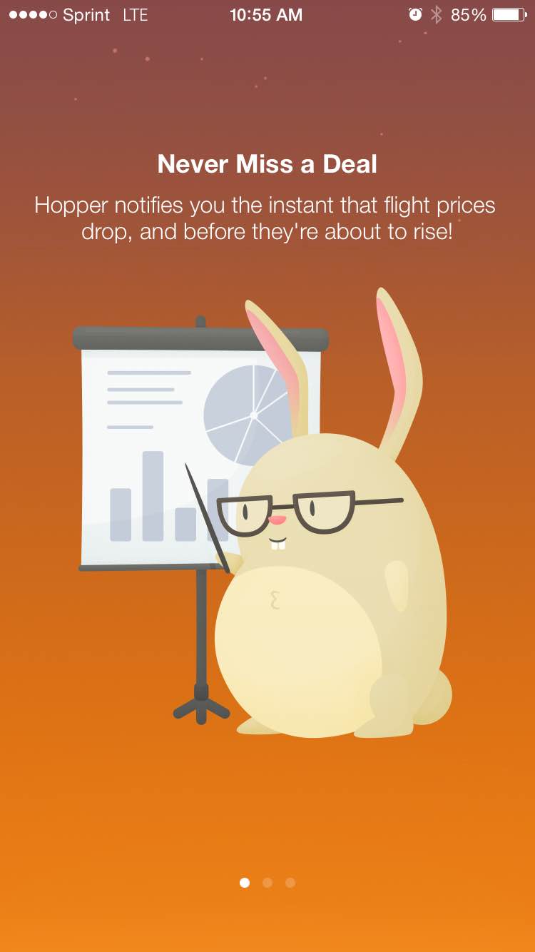
Who doesn’t like to score a good deal on flights? Hopper is an amazing app for globetrotters and regular vacationeers alike. It analyzes the market trends of flight prices and watches the data for you, then sends you a notification when it’s prime time for snagging a good deal.
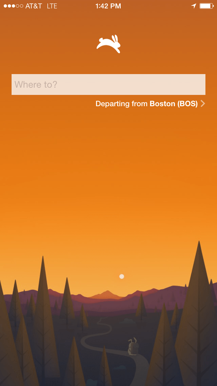
When it comes to flight searching apps, whether for mobile or web, design isn’t usually the most noticeable element of them all. But Hopper does a magnificent job in their design department, with their splendid choice of colors and clean app UI. The chubby bunny that onboards new users is adorable and I love the quirky animation of a bunny hopping in the middle of the screen while the app is searching for flight deals.
Download Hopper for iOS.
8. Radical by BeaverTap Games
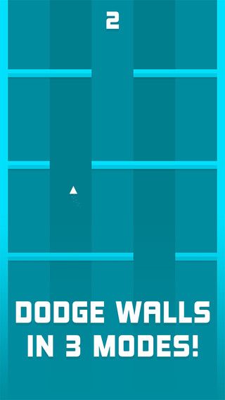
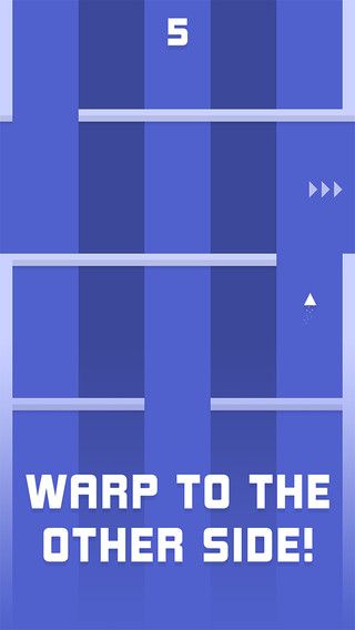
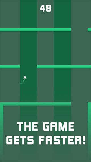
By indie game developers at BeaverTap Games, the app Radical is pretty radical indeed. As the screen moves faster, you control a little flying triangle by holding it to the left or the right so as to control it. The striped backdrop is composed of contrasting colors and somewhat resembles a swimming pool with lanes, but with awesome funky colors. The gameplay may sound simple but it isn’t easy. Or maybe I’m just really bad at controlling the flying triangle. The fine-looking app UI is pure delight but it certainly doesn’t help improve my scores.
9. Help by Moe Slah
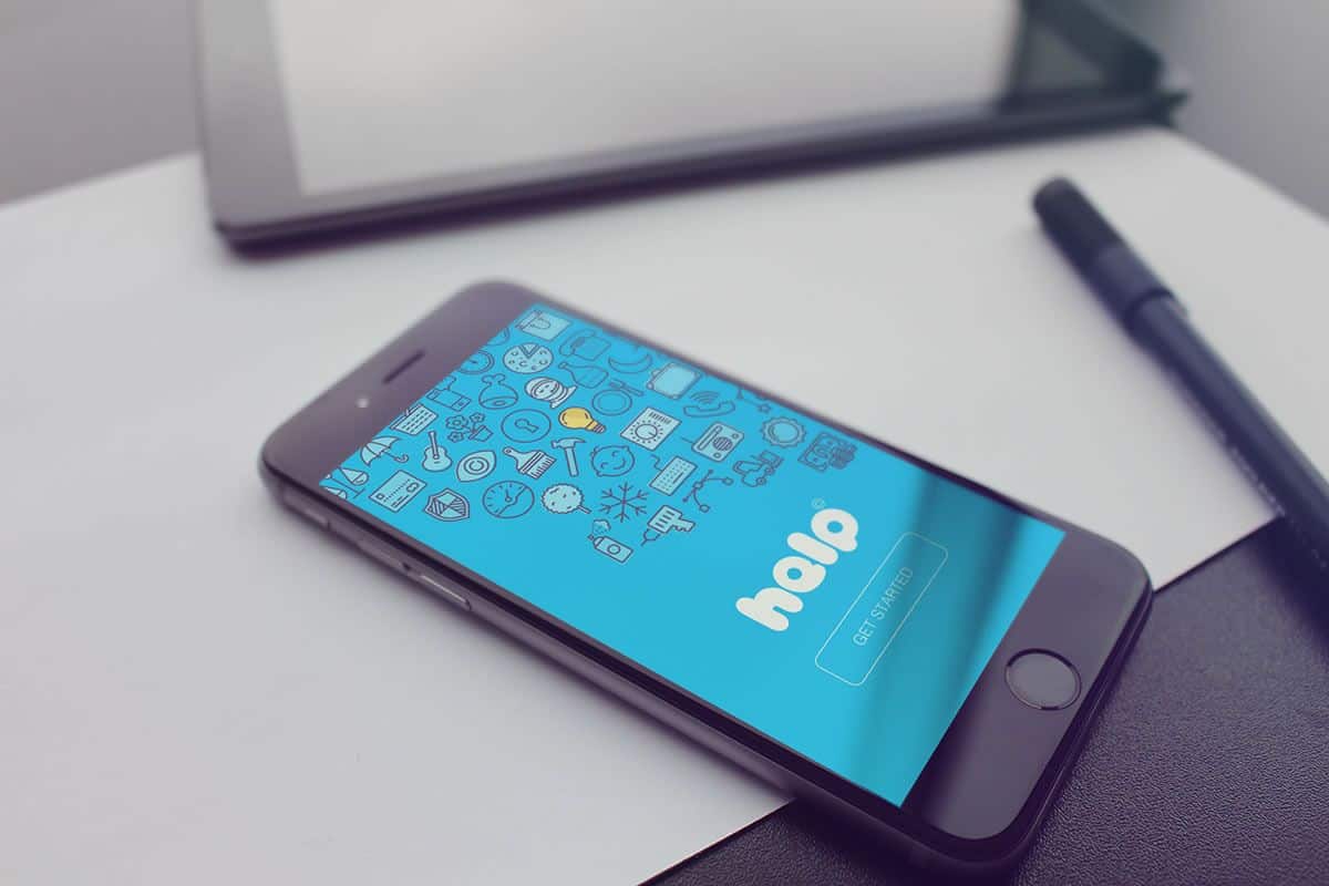
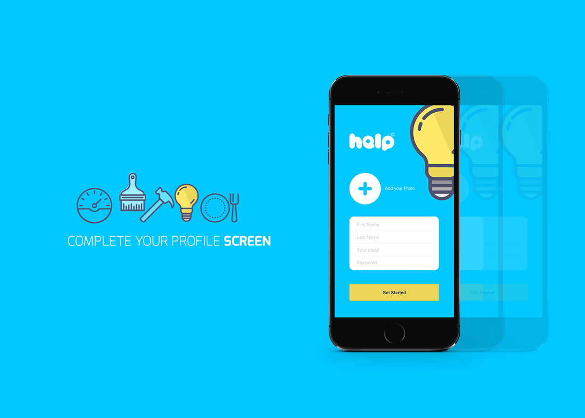
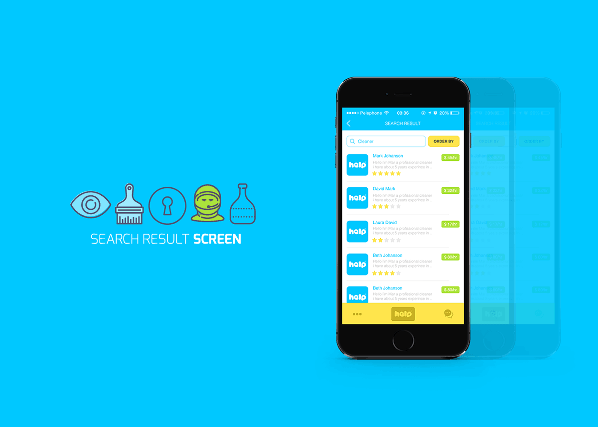
Help is a mobile app design concept that is so stunning that I hope it’s already on its way to being developed into an actual product. The app is meant for searching for and contacting professionals for different types of work that you might need help for, such as plumbing, electricity, carpentry and so forth.
The choice of colors provokes a feeling of friendliness and cheerfulness, the app UI presentation is clear and clean, and the custom icons are well-detailed and lovely. The font choice for the logo is brilliant, it makes a rather normal sounding name stand out, swell up, and appear very wholesome. Having such an app would indeed be of great help and I would like nothing more than to see this excellent design in action.
10. Powder – Alpine Simulator by Buck Lumber Games
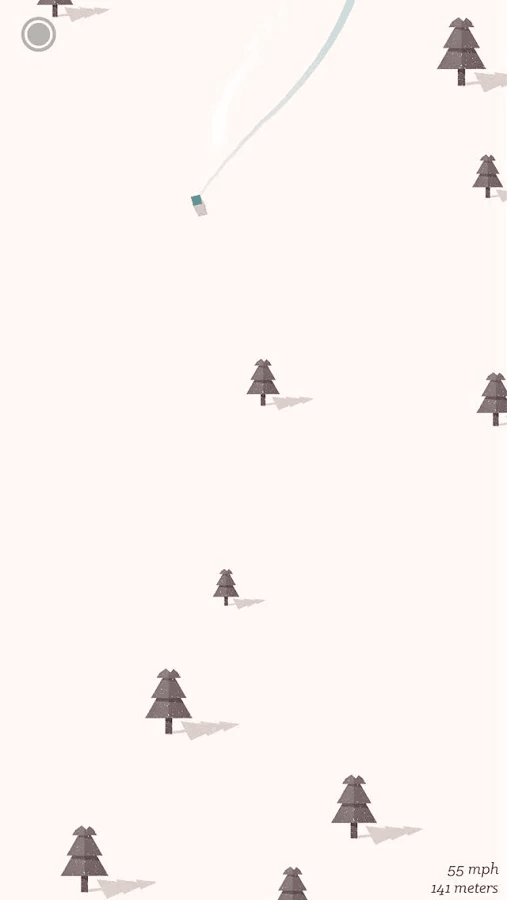
The most calming stressful game ever, if such an oxymoron could ever exist. Although I’m not a fan of winter sports, I’m becoming a real fan of Powder – it’s like skiing with all the thrills and adrenaline but at least I’m warm indoors. On the other hand, the beautiful and unique app UI design with its snow-filled background, tiny pine trees, and dangerous little boulders produce such a soothing and calming effect on the player. It’s almost like watching absolutely nothing happen through the window of a log cabin hidden in the snowy mountains on an early winter morning. Yes, that peaceful feeling. But oh wait, you’d better stop daydreaming now or you’ll crash and lose the game!
Do you have an amazing app design that you’d like to see featured in our monthly Top 10 Mobile App UI series? Or perhaps you’ve just made an awesome mobile interaction design that deserves a spot in the Top 5 Mobile IxD? Let us know! Tweet @protoio or @wildningja
