We all love the apps on our smartphones. They help us get places, pay for things, and some make it possible to catch elusive Pokémon. The thing that makes a good app great, beyond working really well, is the user interface design. Beautiful UI is something that makes apps stand out. Whether that’s a really simple layout or a color palette like we’ve never seen before, wonderfully designed apps show that designers had their users in mind.
Here is a roundup of the top 10 mobile app UIs of this month that really stood out.
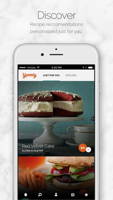
1. Yummly by Yummly
Yummly is an app made for foodies. It helps in the kitchen with next level recipes. Whether you’re looking for recipes for a certain holiday, diet, cuisine, allergy, or a time constraint, Yummly will recommend the right one based on user specifications. You can save and share the recipes you find, as well as the ones that are suggested based on the taste preferences you give. Naturally, an app that is centered around food has to be very (delicious) image heavy. The layout of Yummly is simple with recipes for you specifically and generally suggested recipes on the explore page. They prove that they know their stuff with comprehensive nutrition info, ideas of the cooking equipment you’ll need with the option to buy it, as well as step by step recipes and videos.
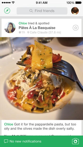
2. Foodspotting by Foodspotting
This social food app helps you find your next tasty meal. It’s a visual guide that strays from the Yelp way of leaving restaurant reviews. Instead, you can see what fellow foodspotters (whether they’re friends or well known foodies) have eaten and what specific dish they suggest. Using Foodspotting you’ll have fellow foodies that have tried things at a certain restaurant make recommendations based on their experience. My favorite features of this app are first the geolocation, so you can figure out where to get the best burrito (or whatever you’re craving) where you are. Second, the image based suggestions add a layer of authenticity. Third, you can use their camera button to add your own review. Foodspotting is simple and shows that it understands its hungry users.
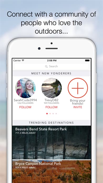
3. Yonder by Active Interest Media
On the note of getting suggestions from others, Yonder does just that for the outdoors. Yonder brought together a community of adventurers that post pictures about their latest outings in categories from fishing to hiking and beyond. It doesn’t stop there, it also helps get people together who enjoy the same outdoor activities in meetups, sharing their different knowledge and experiences. App users gain inspiration to get outdoors more and explore places suggested by others. It focuses on beautiful images of the places its users visit, complete with tips and details on the experiences they had there. The social aspect makes sense so users can find fellow explorers nearby to connect with, as well as “following” one another, and setting up official meetups. Yonder’s layout is logical because it puts images first, is inherently social, and is incredibly location-focused to give spot-on advice.
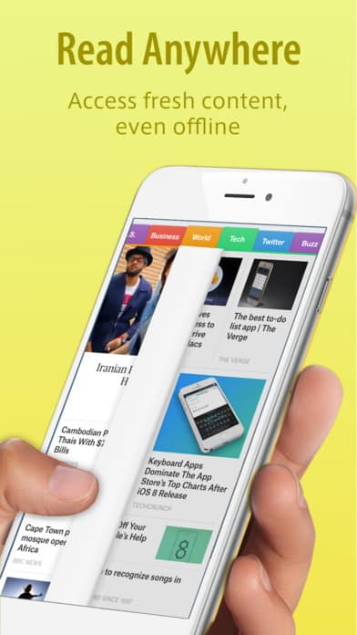
4. SmartNews by SmartNews
How do you get up to date on the news? The idea behind SmartNews is curating the news you need to know about all in one place, so you can get current faster than ever. A few features that make it a top news app are super fast loading time, so you can spend more time reading. News stories are also available when you don’t have service, making it perfect for morning public transportation commutes. It takes into consideration the categories you care about, so you get exactly the stories you want to read about, as well as any publications that you like to follow. The interface is clear and it allows users to flip and scroll through sections with just one finger.
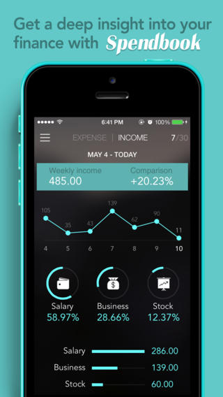
5. Spendbook by Lab304
Spendbook is a sleek personal finance app that helps users track their spending and income in one place. They aim to make personal finance delightful and with their straightforward icons, graphs, and color coding, they accomplish this. It allows users to add transactions on the go with photos and notes and condenses all the information for that day and month into easy to understand graphs. The information is further broken down by categories and subcategories to get as granular as a user needs.
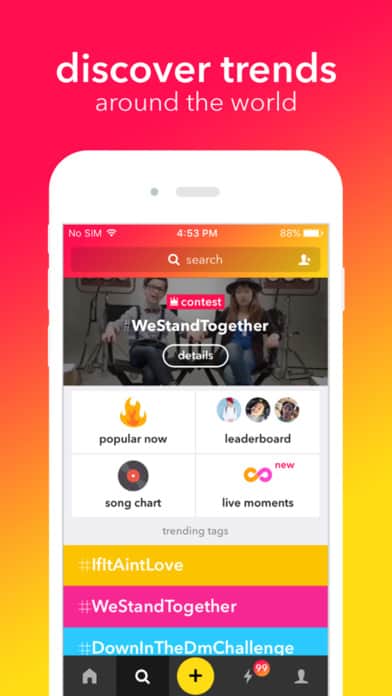
6. musical.ly by musical.ly
musical.ly is an app that allows users to easily make music videos. It takes music from your mobile device (there are also music selections within the app), records you lip synching, and then gives lots of options of filters and effects to further customize. The videos are easily shareable on top social media sites and savable as well. Beyond social shares, musical.ly users can also share with each other in-app and try to rank on the leaderboard. I appreciate the fun colors used in musical.ly because they embody the fun and young users they have.
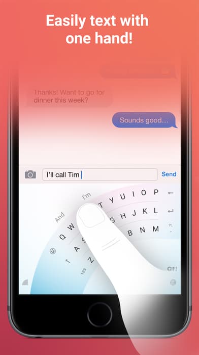
7. Word Flow by Microsoft
Word Flow solves some of the problems most of us experience while using our smartphones each day. It allows users to text with one hand by swiping on a semi-circle keyboard, instead of tapping each letter. It also gives the option to customize that new keyboard with the image of your choice. Even if users opt for the standard keyboard, Word Flow makes it faster than ever to tap out a message. As many apps do these days, it also makes it easy to put gifs into text messages. Where it stands out is its easy way of putting search results, such as contact information, into a text, instead of having to copy/paste. Word Flow’s minimal mobile app UI makes it an effective texting add-on.
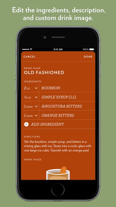
8. Highball by Studio Neat
This one is for all the cocktail enthusiasts out there. If you love making and trying new drinks, Highball has what you need. When users come up with their own recipes or take on originals, they can input the ingredients and the app generates a “drink recipe card” and a lovely animated image of your concoction. You can save your drinks in the app and also share them on your favorite social media sites. Highball is a simple concept that modernizes recipe cards with a classy color scheme and even the ability to import existing recipes.
Get Highball on iOS.
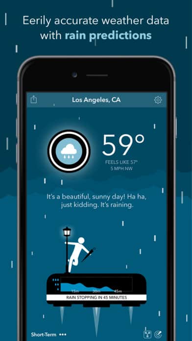
9. CARROT Weather by Grailr
This weather app has been winning awards left and right for its accurate and funny predictions. No wonder their tagline is “the weather robot with a personality.” It’s customizable to show weather down to the minute, daily, and weekly forecasts, all infused with a sarcastic robot that I wish were real. Checking the weather can be a mundane task, but with the exciting animations and messaging for each weather change, you’ll look forward to notifications from CARROT.
Get CARROT Weather on iOS.
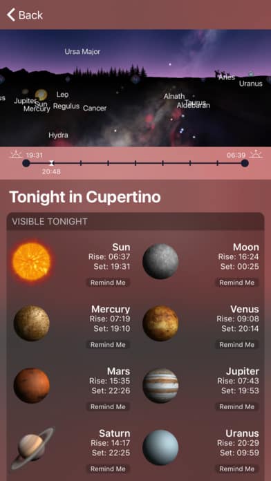
10. Night Sky 4 by iCandy Apps
On the topic of the sky, with the help of Night Sky 4 you’ll be able to look up and know exactly what you’re looking at. Many of us know major constellations, but the little ones slip our minds. Night Sky 4 makes it possible to point your iOS device at the sky and the constellations and planets in the sky above will show up on your screen. It takes it further and shows planet rising and setting times with the option to remind you, if you don’t want to miss them. The interface of Night Sky 4 is full of celestial colors and easy to use, so you can spend more time learning about the universe and even exploring the moon!
Get Night Sky on iOS.
If you enjoyed this curated list of great mobile app designs, share it with your social network! Do you have a suggestion for the next edition of our Top 10 Mobile App UI series? Reach out to us via Twitter @Protoio or Facebook.


