Spring is finally here and even if the weather isn’t warming up just yet, designers from around the world have been keeping busy. The mobile app UI designs these creators have come up with have been smash hits in their market and paved the way for up and coming designers. Let’s get into the top mobile app UI designs that have caused a stir this month.
1. Peak by brainbow
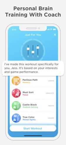
We work out our bodies to stay healthy and strong, but what about our brains? Peak takes on this important facet of health by offering users fun games that improve mental functions, memory, and more. These mental exercises train users to focus their attention and improve their lives, starting with their brains. As a mobile game, Peak is full of bright colors and animated icons to bring the experience of brain training to life. The metrics section is one of the best parts of the mobile app UI design, as it brings together helpful graphs to visualize progress in a candy-coated color scheme. With smooth, rounded buttons and a layout that streamlines the process of choosing the next brain game, what’s not to love?
2. Grabr by Grabr Inc.
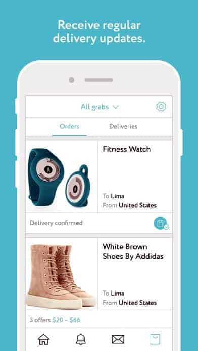
International shipping is a real pain; not only does it cost an arm and a leg, but it also comes with a hefty price tag. Grabr is an app made up of travelers that are already heading your way that can bring you the item you’re searching for from the original country. This peer to peer marketplace asks shoppers to input the link of the item they want, then verified travelers submit bids to deliver that item when they’ll be in the shopper’s area. To make things even better, this incredibly useful app comes packaged in a sleek and modern mobile app UI. It has smooth buttons, muted blues and grays, simple icons, and crisp product images.
3. OfferUp by OfferUp, Inc.
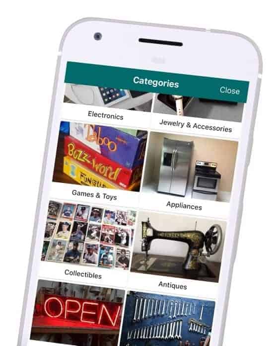
While Craigslist is incredibly useful, no one can argue that it meets the criteria for having bad design. Offerup is a platform where buyers and sellers can connect. As a seller, you simply snap a photo of the item you want to sell and add in a description and price. Then buyers can scroll through the offerings in their area to make offers on items they’d like to buy. From a design perspective, the buying and selling process is infused with cheerful icons and well-organized product layouts to make it easier than ever to pick from multiple offerings without getting overwhelmed. OfferUp has an eCommerce vibe, in which each seller has a profile that shows the items they have for sale, in addition to their rating with other users. Buying new and used goods online just got a lot less sketchy.
4. Lively by Zoosk, Inc.
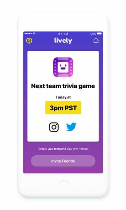
Zoosk launched a dating app around trivia, playing off HQ Trivia’s success. While it seems more suited to finding a friend, this app launches players into a team of four to play a trivia game together with others in their geographical location. They can video chat during the game and can add each other as friends to chat outside of the trivia games that take place at 3 and 7 pm daily. This trivia app is designed in a familiar way, with rounded and bright buttons. Just like HQ, the timer is ever-present at the top of the screen, counting down to when time is up for that specific question. The design feature that is most novel is the group video chats at the bottom on the screen. The four boxes show all of the team members and make it easy to chat about which answer seems right, without stealing much space from the question itself.
Get Lively on iOS.
5. Babbel by Lesson Nine
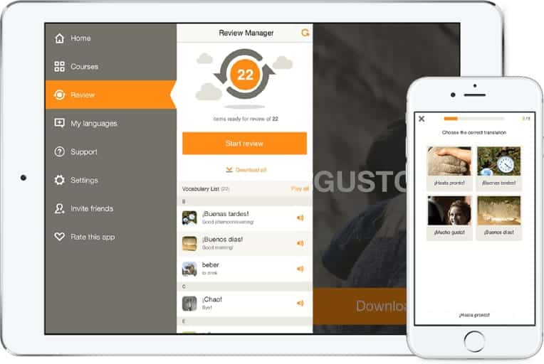
Babbel is an app that helps users learn languages right on their smartphones. It diverges from Duolingo with real life images instead of animations and icons for the words you’re learning. The app offers quick and practical lessons you can complete anywhere to learn translations, have conversations, and improve pronunciation. The mobile app UI takes it back to basics with a straightforward white background, with red and orange accents. The design incorporates plenty of white space to display only the necessities and keeps the focus on the lesson at hand.
6. JUMP Bikes by Social Bicycles Inc.
Biking around a city is not only good for you, it is also good for the environment and an effective means of transportation. There have been many bike share companies that have come and gone. If you’ve walked around San Francisco or Washington, DC recently, you’ve noticed red, bulky, dockless bikes across the city.
JUMP Bikes are electric bikes that you can rent in the Uber or JUMP apps. In terms of their proprietary app, it has all the features we’re used to when using a sharing economy product: a clear map showing where bikes are that you can reserve and data on your usage. The colors within the app are kept to a simple black, white, and their signature red. While the app is quite simple, I appreciate that they fit in key features like battery life left in the bike of your choice to make sure you don’t run out of juice halfway up a steep San Francisco hill.
Get JUMP Bikes on iOS.

7. Cool Cousin by Cool Cousin
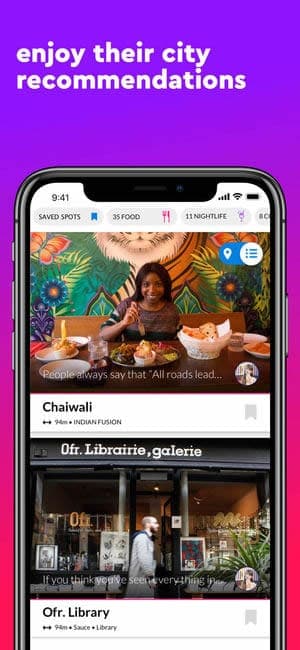
If you travel often, you know the value of good recommendations. Cool Cousin may have a silly (yet oddly spot-on) name, but beyond the function it serves for travelers, it also comes in a beautifully designed package. From bright icons on city maps to recommendations by category (restaurant, cafe, etc.), to high quality, inviting photos of attractions, this app will delight the eyes. It even adds a human connection to travel recommendations, with the ability to connect with the creator of the recommendations to ask follow up questions.
8. 7 Minute Workout Challenge by Fitness Guide Inc
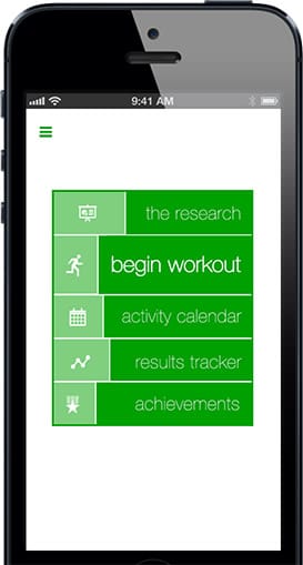
In such a demanding world, efficiency is key. Staying active is central to our health, even when deadlines are looming and it feels like we have no downtime in our schedules. That’s where the 7 Minute Workout Challenge comes in. It’s all about condensing a workout to the essentials and still enjoying the benefits. These are exercises that you can do anywhere—even your office! The app is designed to get users to quickly understand exercises with videos and get in reps quickly, in order to move on to the next ones. The app is a crisp white with green accents to denote time on the stopwatch and more. The design feature I like best is the the activity tracker calendar with a simple way to visualize your progress with green circles on days when you fully completed your workout.
Get 7 Minute Workout Challenge on iOS.
9. Asos by Asos
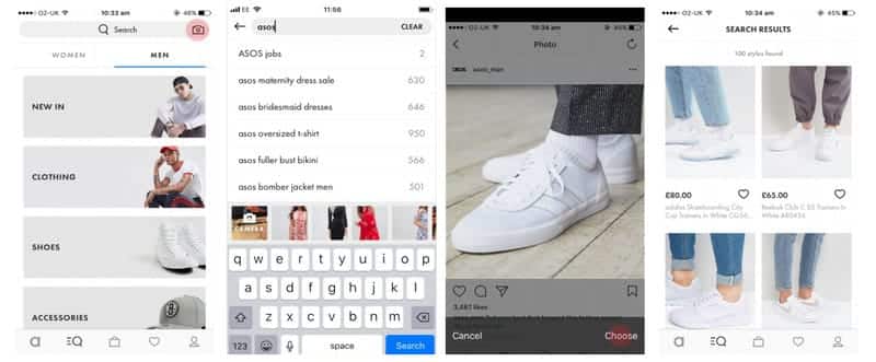
How many times have you been out and about or scrolling through the internet and seen a pair of shoes that you loved, but had no idea where you could buy them? Asos aims to simplify this with their Style Match feature within their app. Users can upload an image they took in the wild or on social media and Asos will search its database in order to find something similar you can buy on their site. This new feature works seamlessly, simply upload an image of a product you’d like to buy and let the app work its magic. Asos has a dreamy layout, with stylish product images, an easy to navigate layout, and quick check out.
That wraps up the apps for March, but if you’d like to explore some of our other favorite mobile app UI designs, check out our February installment.
Feeling inspired? Sign up for free with Proto.io and prototype your own app in minutes.
If you enjoyed this curated list of great mobile app designs, share it with your social network! Do you have a suggestion for the next edition of our Top 10 Mobile App UI series? Reach out to us via Twitter @Protoio or on Facebook.
 Source:
  Source: