As the summer days come to a close, we want to wrap up with some of our favorite mobile app UI designs that have sparked our interest since last month. These apps range from fitness to travel to personal finance, and they’re all a delight to use.
Let’s jump right into the top mobile app UI designs of the month and why we chose them.
1. Wakeout by Andres Canella
Waking up is tough, especially on cold winter mornings as the days get shorter and shorter. Wakeout has a way to combat this by combining an alarm with a required morning workout. You can do all the exercises in or next to your bed, so don’t worry, it won’t make you jog around the block in your pajamas. From crunches to pillow punching, it’ll wake you up with your heart pumping to get your day started on the right foot. When you’re just waking up, the last thing you need is a complicated mobile app UI that you have to decipher. Wakeout is perfect because of its simplicity. It shows the exercise you’re supposed to do with a timer counting down, in addition to how many reps you should aim to do and what exercise you’re on. It’s insanely easy to use, which is perfect for an app that wakes you up with 80s music every morning.
Get Wakeout on iOS.

2. Packr by Jeremie Leroy
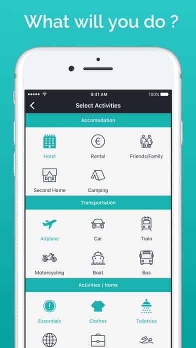
As an avid traveler, I have improved the way I pack for each trip. Packr makes packing even easier with 24 different packing lists depending on where you’re going, for how long, and what the weather will be like. It learns from each of your packing lists to give better suggestions the next time. You can either choose to follow the packing lists the app generates for you or make and save your own. I love that Packr incorporates beautiful imagery of top trip destinations. On top of that, when building out your list, it has great icons to make the process of picking how you’re traveling, where you’ll be staying, and what you’ll be doing a bit more fun. After all, you’ll need different things if you’re traveling by train to go camping, compared to taking a plane and staying in a hotel.
Get Packr on iOS.
3. Trips by Lonely Planet
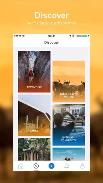
Having more inspiration for future trips is never a bad idea. It can help you stick to your savings plan and get friends onboard as well. Lonely Planet just came out with a new app that allows you to follow the adventures that fellow travel lovers post, as well as chronicling your own. Just like traveling, it’s full of bursts of color and something new and exciting everyday. The mobile app UI is based on the fantastic images travelers want to share with the world. It keeps the formatting and options to a minimum so that travelers can focus on the pictures and stories abroad that captivated them the most. The bold color palette they infused into the app is certainly a plus, as it’s infused into the card based timeline you can scroll down until you find something that piques your interest.
4. WaterMinder by Funn Media
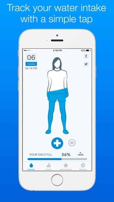
When you have a seemingly endless to-do list and meetings every hour, it can be hard to remember to drink enough water. WaterMinder puts an end to that with a simple way to track how much you’ve had and how much more you need to drink to be fully hydrated for the day. With a tap of your finger, you can update how much water you’ve had and track your water intake day over day, as it relates to your goals. As you can expect, this water app uses a cool blue palette. The mobile app UI design is simple, with minimal text beyond user preferences and achievements.
5. Musixmatch by musiXmatch srl
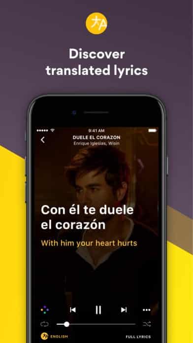
Love that new song, but wonder what in the world the singer is saying? Musixmatch has you covered with lyrics that can pop up when you’re listening to music on your favorite streaming app or even identify a song and its lyrics when you hear it.. This app utilizes gamification by giving users points as they contribute to the app’s bank of song lyrics. The design allows the lyrics to be front and center, with an image of the musician obscured in the background and the lyrics brightly presented in a large font.
6. Hitlist by TripCommon Inc.
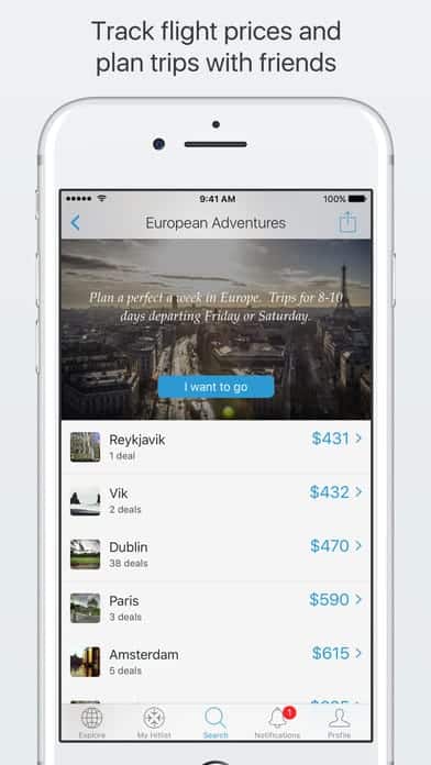
The price tag of traveling is the least enjoyable part, but Hitlist is putting an end to that by helping travelers spend less to see more of the world. If your wanderlust says “yes,” but your wallet says “no,” Hitlist helps by alerting you to flight deals for all the places you want to go. The app is fully customizable, as it asks where you want to travel and even allows you to get inspiration for your next trip by browsing locations by price, activity, or region. Then you can stay up to date on the best deals and plan trips with friends. The mobile app UI is clean, with many attractive images of possible destinations and prices clearly marked in bright blue. This app is perfect for those who want to travel at a lower cost and with a sleek interface to keep track of it all.
Get Hitlist on iOS.
7. White Noise by TMSOFT
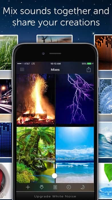
With the rise of open offices and coworking spaces, being able to find peace wherever you are is key. Whether you’re trying to focus or fall asleep faster, White Noise can help you relax and do what you need to do. It has a number of different options, from waves to fire crackling that you can add together if you like. You can even record your own sounds if you want to remember how relaxed you felt when you were sitting on the beach in Hawaii. This app prominently features images that go along with the sounds you pick to avoid being a visual distraction. White Noise has an easy to use mobile app UI that helps users focus on what’s important to them, while hopefully even relaxing them a bit.
8. Penny by Friendly Finances, Inc.
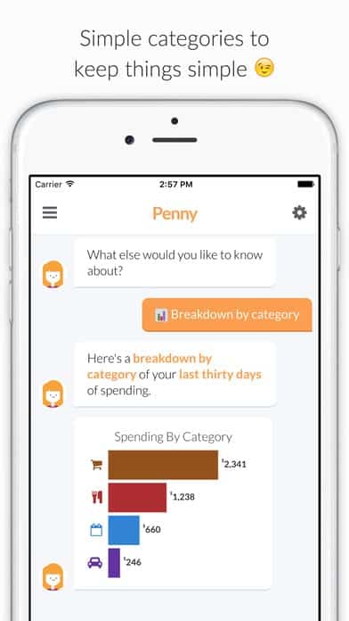
Penny is a fun personal finance app that can help get or keep your finances in order. It’s centered around a chatbot who reminds you when bills are due, when your bank charges a fee or suggests ways to improve the way you manage your finances. Users can ask Penny questions and get answers and graphs with the information they requested. One feature that Penny has that I love is the automatic categorization of purchases so you can know exactly how much you spent at restaurants last month, for example. The mobile app UI is so straightforward because the point of the app is being able to text Penny and get the information you need in real-time without having to log into your credit card’s app and digging through last month’s statement. Penny keeps it simple with a white and orange layout, and additional bright colors to help make graphs and category icons stand out.
9. Funnel by By Mathias Nilles
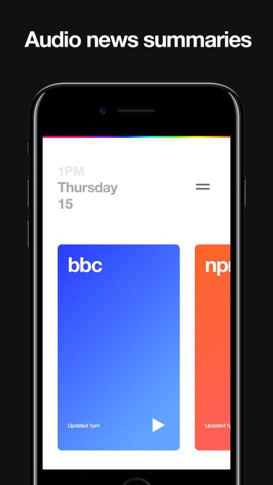
This news aggregator app is so satisfyingly minimal I had to include it in the top mobile app UI designs this month. Funnel brings together the top news outlets that you care about to quickly catch up on the news from around the world. It follows a very simple bright card design that you can swipe through to change the station you’re listening to. With so many cluttered apps out there, it’s a breath of fresh air to see a news app that takes us back to basics.
10. Tasty by Buzzfeed
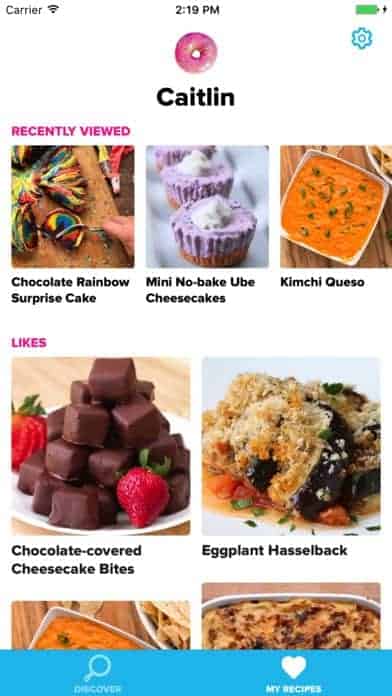
Food apps and social media go together like peanut butter and jelly. If you scroll through your Facebook timeline right now, chances are there will be at least a few recipe videos. And if you have never seen Tiny Kitchen on Snapchat, have you really lived? In all seriousness, Tasty is a great app if you want to discover new recipes and get step-by-step instructions using video. It even gives recommendations based on what time it is, the day, and holidays coming up. On top of how useful it is, it’s got the cutest design, as if you’ve just stepped into a quaint cupcake shop. Tasty has a candy coated color palette, with bright turquoise and pink. It’s also customizable, with recipes saved for you to come back to another time.
Get Tasty on iOS.
That wraps up the apps for August, but if you’d like to explore some of our other favorite mobile app UI designs, check out our July installment.
Feeling inspired? Sign up for free with Proto.io and prototype your own app in minutes.
If you enjoyed this curated list of great mobile app designs, share it with your social network! Do you have a suggestion for the next edition of our Top 10 Mobile App UI series? Reach out to us via Twitter @Protoio or on Facebook.
