With spring setting in and cold weather finally going away, there are a ton of new and established apps that have been taking the design world by storm. Some have been rising in ranks on the App Store and others were just introduced. No matter their position on the charts, what these apps have in common are fantastic mobile app UI designs that put them at the top of my list.
Here are the best mobile app UI designs of the month:
1. News Break by Particle Media Inc.
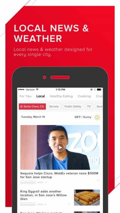
There’s so much going on in the world and with the help of social media sites and news apps, we’re able to find out what’s going on near and far, even when we’re on-the-go. If you want to be in the know 24/7, then News Break is for you. It allows you to follow news topics you’re interested in and gives you access to a personalized newsfeed that is aggregated using an artificial intelligence algorithm. All the news you’ll get will be tailored to you and from reputable sources (none of that fake news!). The design is sleek and straightforward, something we’ve grown used to on websites like The New York Times. It’s black and white with pops of red in the palette, which is appealing and makes call to actions very clear.
2. Monkey by Monkey
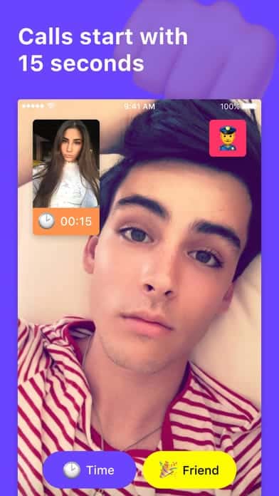
Teens aren’t all that interested in Facebook these days, Snapchat was a favorite and now it’s Monkey’s time to shine. This app with a silly name is a way for people to connect with real life buddies and make “Internet friends” as well. The way it works seems a bit like Chatroulette in that you can be matched with random people in your age group to video chat or play games with for set periods of time. It also has a Snapchat integration if people want to keep in touch after their brief conversation. This app was built by and for teens and the fun design shows. The mobile app UI is colorful, with bright purple, yellow, and pink buttons, complete with emojis. It effectively achieves its goal of connecting people all over the world and helps them potentially make new friends from those interactions.
Get Monkey on Android.
3. Heal by Heal
Going to the doctor when you’re sick can be a drag. You already don’t feel well, but you have to muster up the energy to make it to your doctor’s office. Heal is taking us back to the days of house calls, with the help of technology. Whether you’re feeling sick or just need a checkup, you can schedule a doctor to come to you. The cost depends on what kind of insurance you have but maxes out at $99 per visit. The in-app experience is soothing, after all, you might be pulling up the app when you’re having a medical problem, so its design needs to put you at ease as well. It has a muted color palette of light blues and pink. It makes the entire process clear with icons for types of visits, a place to explain your symptoms, and payment right on the same screen. Heal is making doctor visits more comfortable and providing a medical mobile app UI that is enjoyable for once.
Get Heal on iOS.

4. Bitmoji by Bitstrips
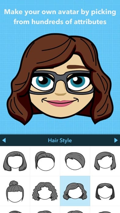
Snapchat acquired a little company called Bitmoji last year and together they’ve seen explosive success. With Bitmoji, users are able to make emojis of themselves and it’s a ton of fun. Whether they choose to stick their bitmojis onto their snaps or use them in text messages, there are a ton of places people use them. Bitmoji has slowly been creeping up the App Store charts and they’re not slowing down anytime soon. The mobile app UI of Bitmoji is understandably minimal. After all, you want to set up all the features of your avatar quickly and let the fun begin. Dropping them into your conversations with friends will describe how you’re feeling better than words ever could.
5. Sway by PauseAble
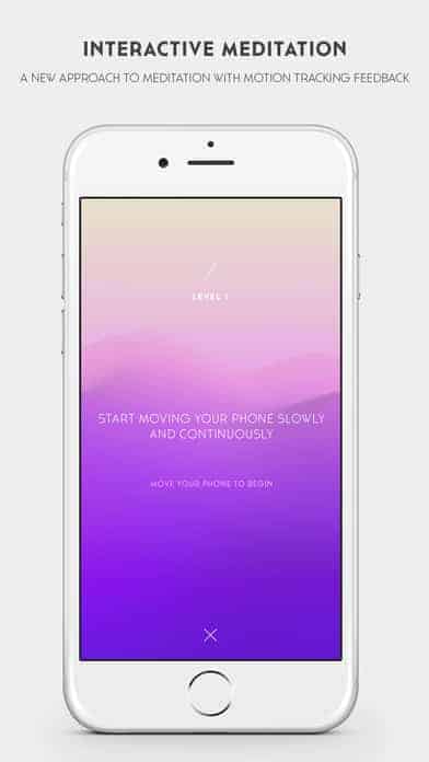
It seems like a new mindfulness or meditation app is popping up every day, but Sway takes a totally new approach. It helps you meditate and move mindfully so that you can get rid of distracting thoughts. Even if you’re sitting at work or walking down the street, Sway can help you find calmness and bring mindfulness to average movements. It’s an interactive app that isn’t about what you see on the screen, but instead the motions it tells you to make and the speed. The app tells you when you’re moving too quickly or slowly so that you can go through your mindfulness practice in the optimal movement range to fully reap the benefits. Sway comes from the makers of Pause, which we love here at Proto.io and talked about back in December. Sway’s interface includes fuzzy pictures with calming colors and they give straightforward instructions. For an app that’s all about the sound and feeling, they still accomplish a lot with their mobile app UI design as well.
Get Sway on iOS.
6. shopkick by shopkick
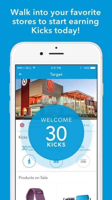
What if I told you that you could get paid for the shopping you’re already doing? Sounds too good to be true, but shopkick made it happen. The shopkick app gives you a heads up on what deals are available before you go out shopping, then you earn reward points (or “kicks” as they call them) for going to certain stores, snapping pictures of barcodes and for buying certain items. Then all those kicks translate into gift cards for your next shopping trip. Not bad at all for shopping you would have done anyway! On top of how useful it is, it’s also designed well. It certainly isn’t like the rewards apps that remind you of your grandma’s coupon clippings. Instead, it’s laid out logically, telling you what’s on sale at each store, alerts you when you get kicks, and reminds you of new ways to earn kicks (like trying out a new recipe).
7. Clips by Apple
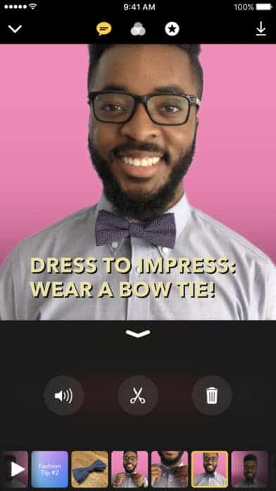
There’s so much copying going on in the social media app world, but Apple jumped into the scene with something original. Their new Clips app (with over 1 million downloads in its first 4 days!) focuses on making videos. They aren’t as pithy as snaps or Instagram videos, they require a bit of thought and time. But the result is a rather polished video that you can feel proud of sharing. It’s like iMovie meets Snapchat with an artsy on-the-go twist. The videos you make are shareable on other platforms in 1080p HD, so they are much higher quality that your average social media video. Clips is brand new, so Apple still has some quirks to work out. But overall, it’s poised to be a cut above the social media apps we’re used tor. While Clips makes longer and higher quality videos, it still uses easy to understand icons and Apple’s classic minimal design to help users accomplish this.
Get Clips on iOS.
8. Vivino by Vivino ApS
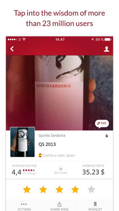
Picking wine can be tricky. Especially if you’re in the grocery store surrounded by hundreds of bottles and no expert in sight. Vivino is a wine scanner that has your back. You can take a picture of the label to learn more about the wine and even see reviews and comparisons from the millions of Vivino users around the world. It gives you access to ideas of what to pair your wine with and even the ability to buy wine directly from the app, with access to a giant selection of wines. The color scheme is a bit all over the place, in my opinion, but the layout more than makes up for it. You can sort by price range if you’re buying a bottle. If you’re researching wines, you can see additional product information, average prices, and reviews from fellow wine lovers. It’s a comprehensive app that makes it easy to learn about and buy more wine.
9. Sprinkles by Microsoft
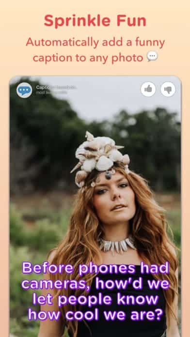
2017 might just be the peak of photo editing apps. Microsoft recently entered the game with their own twist. Sprinkles is just what it sounds like—a little extra sugar on top. It allows users to upload photos and add stickers, find a doppelganger, and detect the age of the person in the photo. The latter two are signature Microsoft technologies and whether people will be into it will take time to determine. But overall, it’s a fun way to add a little something to images and easily share your creations with friends. The feature that I find most fun is the random caption generator depending on the picture. Sprinkle’s mobile app UI design is clean with minimal buttons so that users can focus on their image creations.
That’s all we’ve got for the April roundup, but if you’d like to check out some of our other favorite mobile app UI designs, click over to our March installment.
Feeling inspired? Sign up for free with Proto.io and prototype your own app in minutes.
If you enjoyed this curated list of great mobile app designs, share it with your social network! Do you have a suggestion for the next edition of our Top 10 Mobile App UI series? Reach out to us via Twitter @Protoio or on Facebook.
