User Experience 101: What is UX Design?
Put simply, user experience design (or UX design) is the process of designing the verbs of an interactive product, like a mobile app:
- How users interact with the app
- What the app does in response to the user’s input
- How the app feels to the user
- How the app shows and explains what it (and the user) can do
- Whether all users can access your app’s features
The term “user experience” can feel intimidating for new mobile app designers — it involves everything from graphic design to psychology to accessibility testing. Not only that, but the field of mobile app design is full of technical jargon, acronyms, and far, far too many buzzwords. Just the similarity between the terms “UX design” and “UI design” (user interface design) can be a bit confusing, especially given how much they have in common.
So let’s start by clearing that up!
What’s the Difference Between UX Design and UI Design?
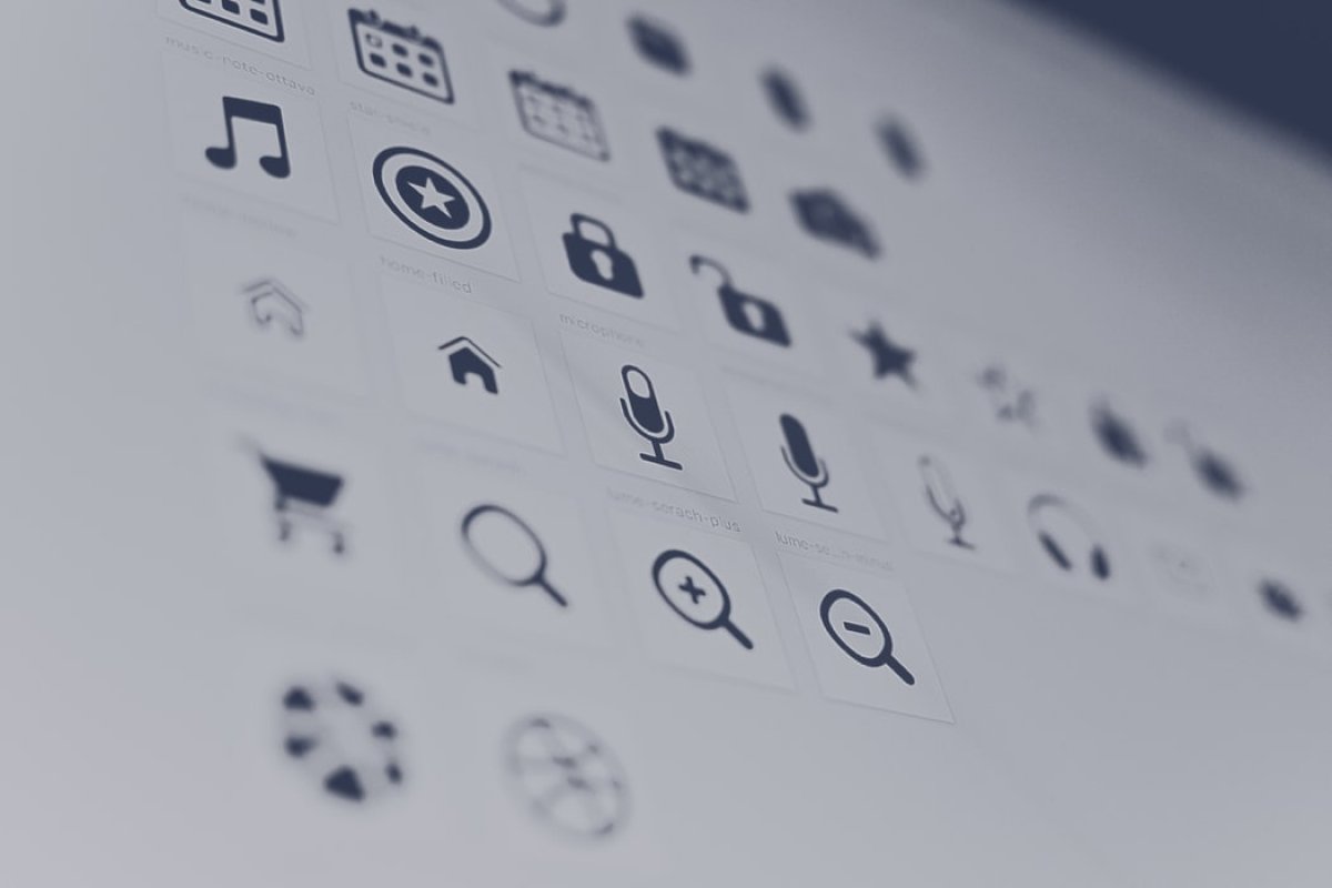
You download an app and open it up for the first time. You may see a splash screen that teaches you how to use the app as you swipe through it, or the developers may drop you directly into the experience. The visuals you see — from the navigation dots or animated fingers coaxing you to swipe, to the buttons, menus, basic layout, as well as any audio cues you may hear are all part of UI design.
They’re also all part of UX design.
What’s going on here?
If user experience design involves the verbs of a digital product or service, then user interface design involves the nouns — your cards, accordions, hamburgers, breadcrumbs, meatballs, etc. (we swear, whoever named half these UI design elements was hungry). The way the user engages with these elements (and the ways the elements react) is the result of UX design.
UI design is just one part of UX design, but it’s a very important part. For a deeper dive into what makes a user interface great, check out our 10 Commandments of Mobile App Design.
5 UX Design Best Practices Every Mobile App Creator Should Know
1. Everything Begins With User Research
Before you design product experiences, you may be tempted to start with the question: “what will it do?” However, you’re already getting ahead of yourself. In the history of UX, no question has ever mattered as much as, “Who is it for?”
That’s where you begin your user experience design. Long before you sit down to sketch things out, you need to know who you intend to use your app (and anyone else who may be in your audience). What do they want? What do they need? What can your mobile app give them that they aren’t getting elsewhere? If they are getting it elsewhere, what can you do better than the competition?
(Hint: if you offer a better user experience, that’s a serious competitive advantage.)
This doesn’t mean you have to waste thousands of dollars on market research. First, figure out who your target audience is. If you’re designing a mobile experience to accompany an existing one — for example, a desktop application or brick and mortar retail experience — then this part is easy for you, because you already know who your (current) users are, and can survey them.
If, like many of our users, you’re designing a freestanding mobile app, figure out your target audience persona, asking questions like:
- What demographic features are you targeting? Women 18-25, men and women 55+, professionals, students, parents, etc.?
- What interests are you targeting? Gamers, musicians, fashionistas, volunteers, foodies, travelers?
- What apps, products, or services are they already using? What feedback are they giving those products and services on app stores and social media? How are those creators responding, and what can you do better?

All of this information should inform your UX design process. Use polls, surveys, statistics, and even good ol’ fashioned Google to learn as much about your target users and what they need as possible. Remember: designing experiences people want is a lot easier than making people want experiences you’ve designed.
2. Good UX Design is Accessible UX Design
Remember: no matter who your target audience is, your users will have varying levels of ability and accommodation needs, so accessibility needs to be one of your top priorities. We love this tweet from Billy Gregory, Director of Training and a user experience expert at The Paciello Group, an accessibility consultancy: “When UX doesn’t consider ALL users, shouldn’t it be known as ‘SOME User Experience’ or… SUX?”
What makes UX design accessible for users with disabilities? Clear, high-contrast visuals, easy-to-read text (never flatten text in an image, where it’s impossible for screen readers to access); color schemes that work well for people with color blindness (or options to customize the scheme for that purpose); and touch elements that don’t require fine motor movements can all help you improve access to your creation.
To learn more about accessibility in mobile app design, check out our full-length beginner’s guide. Android and Apple both offer accessibility guidelines for designers and developers creating experiences on their platforms (bookmark them!).
Here’s a bonus: accessible user experience design principles are beneficial for all users — for example, consider the following best practice…
3. Make Your User Experience As Simple and Intuitive As Possible
Keep in mind that people download apps to help them accomplish a goal, not to create more work for themselves. It’s easy to forget that dating apps existed before Tinder became synonymous with mobile dating by replacing introductory messages with simple swiping motions. (This has been lampooned beautifully by ClickSwipe, “a desktop app that swipes on Tinder everytime you click your mouse.”)
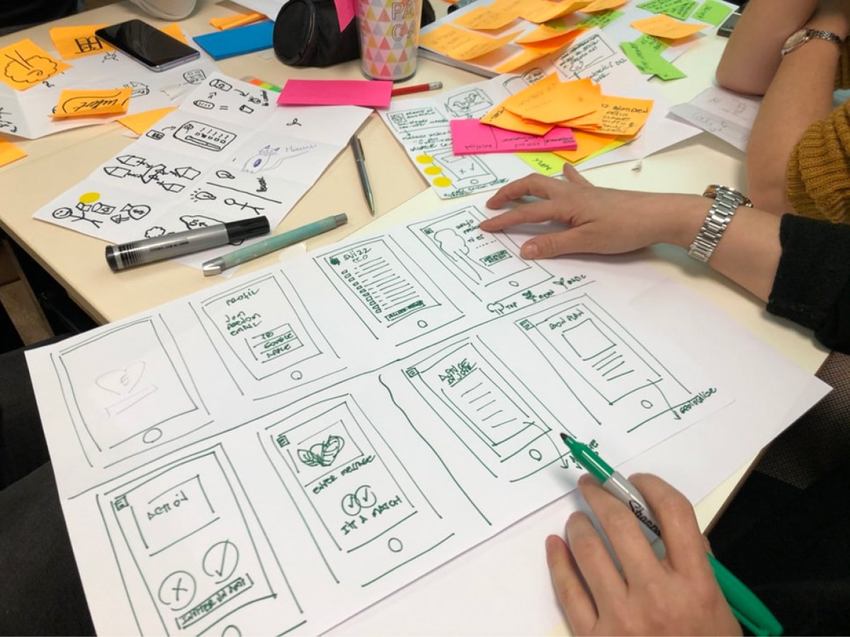
How many actions does it take users to accomplish a goal? Reduce that number as much as possible. Then, reduce it again. Remove as much friction as possible between the users and the actions they want to take. Nobody wants to take a night class just to learn how to use a mobile app!
4. Optimize Your User Onboarding Experience
What is user onboarding? It’s that tutorial experience we mentioned earlier. Sometimes, the best way to improve the usability of your app is to, well, show people how to use it!
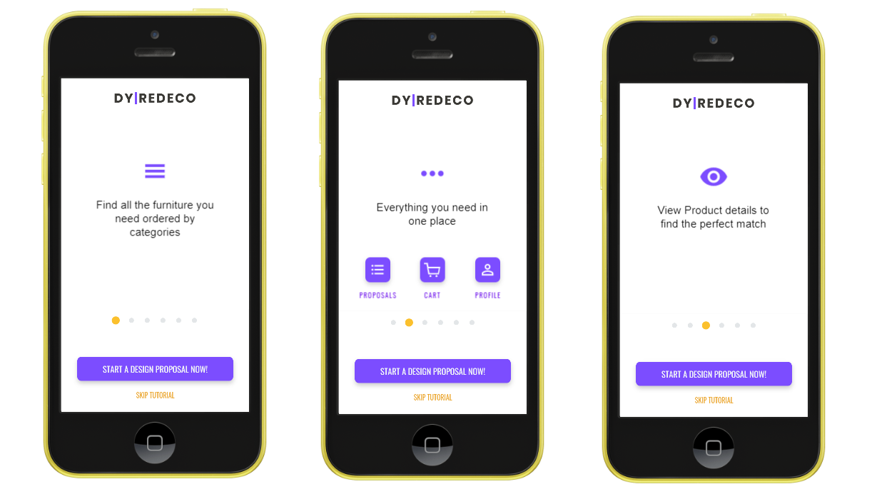
For example, this interior design mobile app prototype by Proto.io user Merry Mustard guides new users through a simple (and skippable) onboarding experience explaining what each of the app’s main UI elements mean and how users can interact with them to achieve their goals.
One of the best ways to learn how to create a great onboarding experience is to look at examples of mobile apps that do it remarkably well. Successful mobile games are often some of the best apps to look to, because gameplay mechanics necessarily take extra steps to explain, and the games industry has been optimizing in-game tutorials for much longer than mobile app ecosystems have existed.
To see some user onboarding experiences that inspire us, check out 7 Apps That Excel At User Onboarding Experiences — And What They Do Right.
5. User Experience and Usability Testing are Where the Rubber Meets the Road.
There’s only one way to learn whether you’re delivering a good user experience, and that’s testing your app — first, yourself, then your team or stakeholders, and most importantly, on test users. Test, test, test! When you’re finished, test some more. (If you can’t tell, we’re a bit passionate about testing and QA.) This is when user feedback guides you to put the finishing touches on your mobile UX design.
Technically, usability testing never ends (or, at least, it shouldn’t). User feedback will continue to roll in from your mobile app after you publish it, and competitors may try to replicate your success, so continuous improvement is the name of the game. Not only that, but the art and science of UX design are always evolving. As new real-world research and best practices emerge, you will want to incorporate them into your product design.
That may seem daunting, but we find it exciting. After all, nobody gets into mobile app design because it’s a boring, slow-moving field with little room for innovation.
How to Use Prototyping to Your Advantage in User Experience Design
User experience design is one of the best reasons to use a rapid prototyping tool that doesn’t require coding to mock up your mobile app. Why? Consider these two scenarios:
The Hard Way: The UX Designer Designs, the Developer Codes, the Whole Team Revises
This may seem like an extreme scenario, but it will feel unfortunately familiar to many agency veterans:
A mobile app designer mocks up a beautiful, but static series of user interfaces. Maybe he begins with wireframes, adding another step to the process. Once he’s satisfied with how the user interface and overall visual design look, he sends the images to the developer.
The developer then builds the app the designer envisioned. She may have to make inferences when it comes to motion curves, touch and haptic feedback, scrolling behavior and other elements of the user experience. After having built the first draft of the mobile app, she sends it back to the designer to look over, make adjustments, and improve.
The animations are all wrong — not what the designer wanted at all! So he fires up an animation program, adds some keyframes and sends the dynamic mockup to the developer. “Ah, that’s what he wanted!” the developer thinks, fantasizing about an optimized workflow that cuts down on all these iterations. She revises her initial mobile app build and sends it back to the designer. Miracle of miracles, it only takes one revision for both team members to feel ready to send it off for usability testing.
Bad news: despite the best-laid plans of mice and men, the accessibility tools and beta testers return pages upon pages of feedback. Not only does the developer need to improve her code, but she has to wait for the designer to make changes to the mockups. These situations are the reason we wrote a post on how designers and developers can be friends. Stress and frustration from an endless workflow not only kill any passion they had for the project, but also increase tensions between colleagues as the deadline quickly approaches.

The Smart Way: Nail Down UX Design With a Mobile App Prototyping Tool
There are some elements of usability and UX testing you need to save for a developed mobile app build — for example, accessibility testing looks not only at how UI design elements accommodate all users, but it also looks under the hood to ensure the code plays nice with screen readers.
For everything else, there’s prototyping software.
Imagine our designer and developer from the last scenario. Consider how much faster the designer’s workflow would be if he could use a prototyping tool to turn his ideas into fully interactive prototypes. Introduce user experience testing into the prototyping process, and you can quickly iterate on any user feedback. You can even see recorded playbacks of real beta tester interaction with your UX design or A/B test two different options and get to “perfect” (or as close as humanly possible) faster.
By the time the designer hands the prototype off to the developer, the look and feel of the user experience has already been optimized, and she can focus on creating clean, stable, accessible code. The result is a better final product, faster.
Perfect Your User Experience Design With Proto.io
We’re passionate about making it easier than ever to create user experiences that feel like magic. In addition to powerful user experience testing and collaboration tools, Proto.io also works with popular user testing services, allows you to record your beta testers’ experiences with the prototype and enables both text and video comments from users. Our huge (and growing) UI libraries provide assets already optimized for UX design best practices, so you don’t need to reinvent the wheel.
We’ve put a lot of work into our own UX design so that we can make these features as easy-to-use and frictionless for mobile designers. Try our prototyping tool risk-free for 15 days to put these UX design principles into practice faster than ever!
