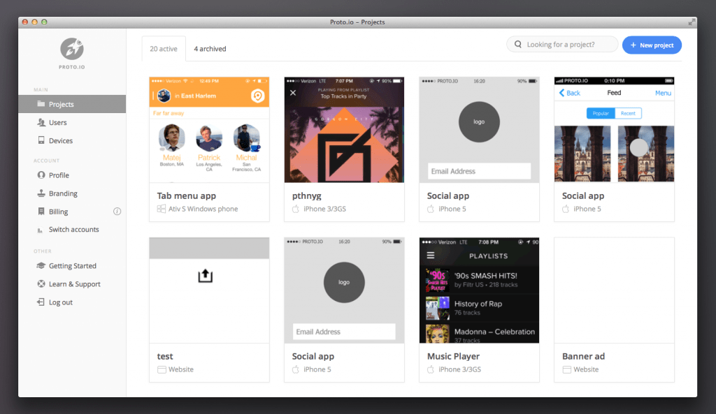
Today marks a new day for Proto.io. We just released a shiny, new design for our dashboard.
The new design should greatly improve your Proto.io experience and help you find things a lot faster. We primarily focused on four areas:
- Responsiveness
- Creating projects
- Finding stuff
- Icons
We also had to be very careful not to break existing functionality. Thorough testing of the new dashboard was necessary prior to the release.
Responsiveness
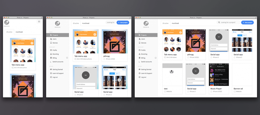
With an increasing number of mobile devices, we decided that the best approach would be to optimise the dashboard and adapt its layout, not just fit it, to the device. This way, the dashboard and all your projects look good no matter the device you’re browsing on.
Creating projects
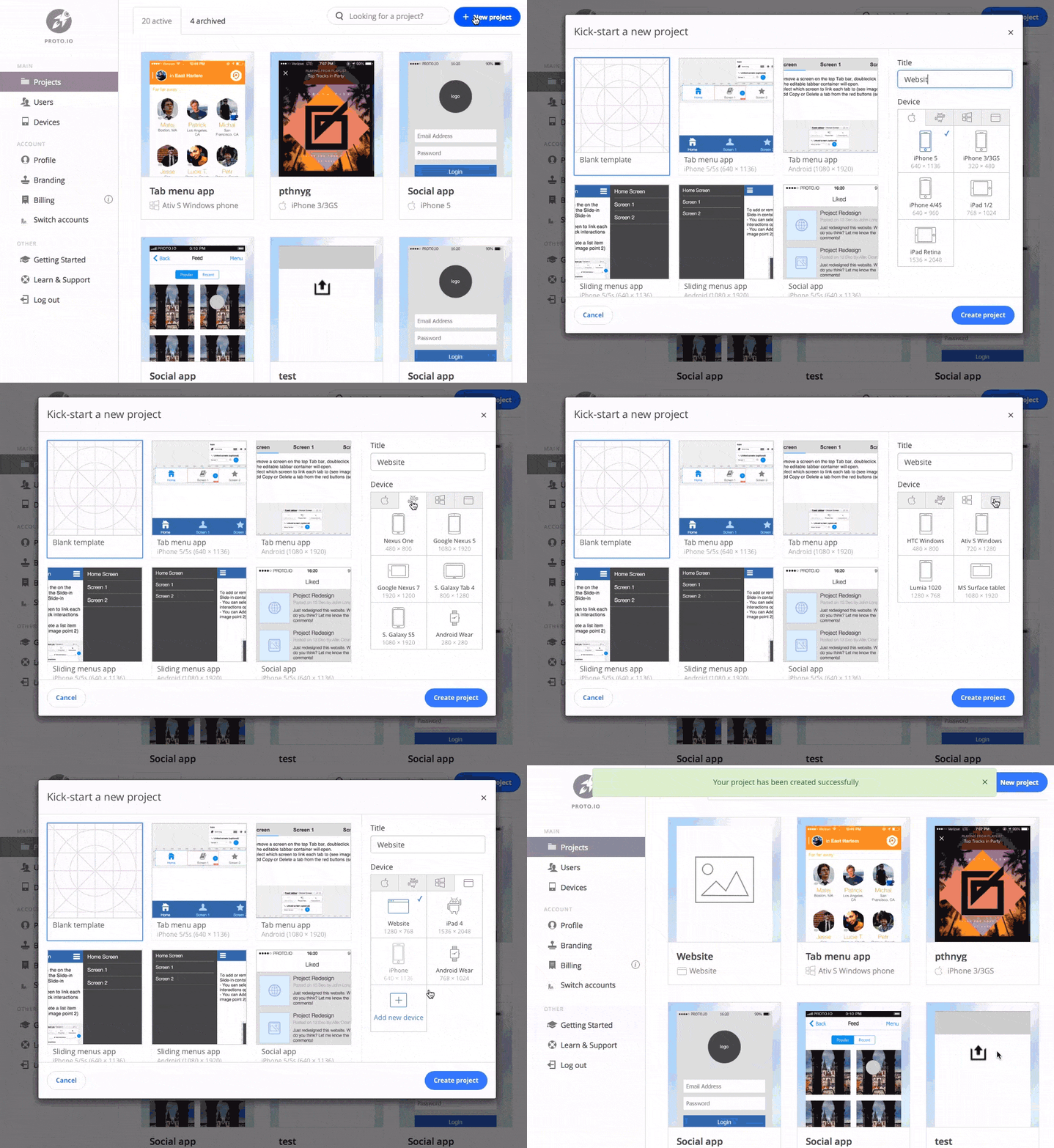
Creating a project is one of the most important aspects of the dashboard. We aimed to make the process of adding a new project simple and intuitive. We also created a number of templates and popular devices to get you started prototyping faster.
Finding stuff
There are a number of ways you can quickly find projects, users, and devices. Either filter by type from the top tabs or search for it directly (our preferred method).
Icons
Icons, technically pictograms, play an important role in this redesign: they provide clarity and describe an action. The icons needed to be instantly recognisable, and some not-so-known icons proved challenging to depict (like the icon for Branding or Billing).
Aside from that, different versions of icons needed to be created, not just scaled down, so that they look good at any size (pixel perfect).
This redesign brings Proto.io in tune with the many changes coming in the following months. Sit tight, and in the meantime, enjoy our redesigned dashboard!
P.S. Designers, you can now find us on Dribbble. We post cool stuff!
