Designers worldwide are turning to their craft to make use of extra time during the lockdown and create fresh, innovative mobile interaction designs to give them hope for post-COVID life. This month we’ve gathered up five interesting designs to get your creative juices flowing. Let’s dive in!
1. Car Rental Mobile App by Alex.S for Etheric ⚡️
Renting a car is usually a straightforward process, one that has never incorporated any design-forward elements. Alex takes the experience to another level with liquid motions and rotating images. The welcome screen offers minimal information to easily see a card that shows them the car, how long the rental is, and the cost. Below there is a map that possibly tells where to pick it up. Dragging down from the top of the screen spins the image of the car and creates a top toggle to switch between the car specifics and the user profile. For us, the liquid motions in the user experience make this a very fresh take on car rental apps.
Source: Dribbble
2. Adopt Mobile App by Rohmad Khoirudin for Odama
With all the extra time spent at home over the last year, many people have decided to get pets. This app concept makes the process of adopting a cat even easier. First, the user enters their location. Then they are presented with cards featuring cats nearby. They can choose to either swipe through the cats in their area, tap to read more about one in particular or continue to scroll down to pick out accessories for their future cat. Tapping on a cat brings up an entire screen full of information, complete with pictures, age, weight, breed, and the ability to chat with the owner. Even if you’re not ready to get a cat just yet, this mobile interaction design could be a fun way to see cats you might be able to get in the future.
Source: Dribbble
3. Cards 3D Transition by Den Klenkov for Fireart Studio
Tracking your workouts is a great way to stay consistent with your fitness regimen. This app concept gets quite granular on your weight goals, workouts you have to complete, and how much and how long you’ve worked out. This mobile interaction design is effective in putting all of the essential health information in one place. When it comes to the design craftsmanship, we most appreciate the pop-out sections. For example, tapping on the fire icon in the top right corner superimposes a recent workout menu to scroll through. The layers are a fresh way of approaching multiple sections of content, options, and metrics in this fitness app.
Source: Dribbble
4. E-Book App Motion Design by Arindam
Reading is one of our favorite pastimes, and e-readers make it much easier to access tons of books from a single device. This mobile interaction design caught our eye because it really brings the book to life. The designer took time to make the mobile experience as close to reading a physical book as possible. You can see this in the way that you turn pages. While the designer could have simply created the next button or allowed for a content refresh when the user swipes to the next page, instead, there is a delightful animation that shows the page-turning to the next. Incorporating little moments of delight that pay homage to the original and physical way of doing things is a nice way to make the digital experience nostalgic and enjoyable.
Source: Dribbble
5. Daily UI – Dropdown by Cleiton Gonçalves
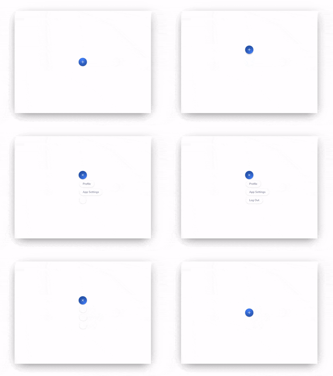
Lastly, we have an interesting take on the humble menu. Oftentimes, an app has much more information to convey than can fit on one smartphone screen. To make the best use of space, adding a plus sign helps pull up that additional information only when it’s needed. In this mobile interaction design, tapping on the blue plus sign moves the button up the screen and rotates it to become an “x.” Then down below it, three additional menu options appear, one after the other. And a quick tap of the blue “x” minimizes it back to a plus sign again. It is an elegant way to bring up options for the user to save screen space.
Source: Dribbble
That’s all for April, but be sure to check out last month’s edition, featuring the best mobile interaction designs of March 2021.
Feeling inspired? Proto.io helps you bring your idea to life in no time, with no coding skills required. It’s ideal for UX designers, entrepreneurs, product managers, marketers, students, and anyone with a great idea. Sign up for a free 15-day trial to start building your first prototype today!


