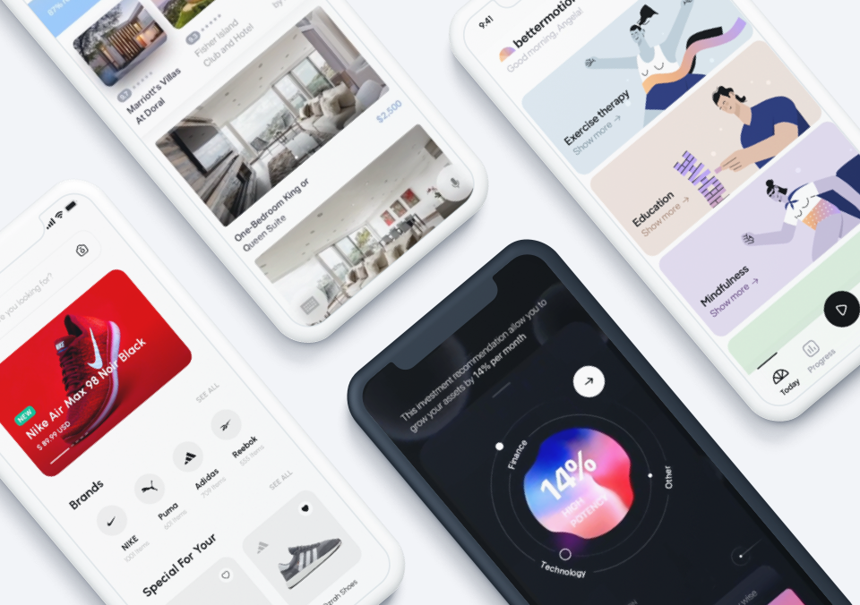
With several months of the pandemic under our belts now, it’s time to reflect on some designs creators all over the world have produced to help improve our health and mobile experiences. This month we bring you five mobile interaction designs that cover meditation, health, icon design, and more. Dig in to learn more.
1. Pull-to-Refresh by Guido Rosso for Rive
Many apps need to refresh in order to generate new content, but it’s generally a standard design that includes a spinning wheel or something similar. This mobile interaction design brings some personality to the refresh process. It offers three options when a user pulls down to refresh. One features a cassette tape spinning. The second launches a satellite into space. And the third travels through space to watch the earth and moon rotate. This provides a new take on what refreshing means and how it might tie in with the purpose of an app. We can imagine a world in which an astrology app is refreshed by a user dragging and releasing at the top of the screen and encountering a short trip through space—adding a joyful interaction to the user flow when they least expect to be delighted.
Source: Dribbble
2. Health Tracking App by Ariuka for Awsmd
As we get more and more used to tracking our lives with technology, health has been one of the most useful areas. In particular, tracking steps helps us monitor how active we are. This mobile app concept helps users track how many steps they’ve taken in a particular week. Tapping on the heart rate card brings up a graph with red data points extending up and down to show the range of rates for that day. Lastly, the “exercise” button shows progress in real time with information such as how long you’ve been walking, current heart rate, and a map of where you’ve traveled that updates in real time.
Source: Dribbble
3. Calm App UI Animation by Dmitry Lauretsky for Ronas IT | UI/UX Team
Meditation apps have been increasingly important during quarantine, as many of us need to be extra mindful in order to get through the additional stress we’re all dealing with. Apps like Calm and Headspace facilitate moments of zen with guided meditations. In this example, the home screen of the app asks the user how they are doing and offers recently played and favorite meditation sessions. Tapping on a recently played session expands the card image and promotes it to the top of the screen, while the play button and description slide in from the left side of the screen, and additional options travel up the screen to settle in below. Tapping on the back arrow reverses this process, bringing the previous information back to the screen in almost identical reversed motions.
Source: Dribbble
4. Mobile Application – Help by Outcrowd
On the note of using apps to track important information, this mobile interaction design is used to manage health metrics, medical details, and current medications for elderly people. By tapping the settings icon in the tab bar, users can easily monitor vitals. Tapping on the menu in the top right corner and then the “Your Doctor” option offers a bright green button to easily allow users to track how they feel by tapping on an emoji showing different emotions. Below that, users can remind themselves of the medications they need to take that day. In all, this is a great idea to help older folks keep track of their health and easily get help when they need it.
Source: Dribbble
5. ⭐️Star 📌Pin 🚩Flag by Aaron Iker
Last, but not least, we have the most micro of microinteractions to round out our favorite mobile interaction designs of October 2020. We love it when designers rethink simple interactions that all mobile users are used to and completely reimagine them. For example, icons that we use for starring, pinning, and flagging content are commonplace, but the way these icons react has often been static and/or boring. Aaron Iker approaches these icons from a literal standpoint, helping the star shine, the thumbtack poke, and the flag wave in the wind. And all of this is accomplished with just a click of the mouse or a tap of the finger. To make the motion interaction designs cohesive, Iker also adds a little wiggle to each icon after it is done with its signature move.
Source: Dribbble
That’s all for October but be sure to check out last month’s edition, featuring the best mobile interaction designs of September 2020.
Feeling inspired? Proto.io lets anyone build mobile app prototypes that feel real. No coding or design skills required. Bring your ideas to life quickly! Sign up for a free 15-day trial of Proto.io today and get started on your next mobile app design.


