Whether it’s a building, logo, website, or software, good design is easy to recognize. Most people may not realize that good design has just as much to do with how something works as it does with how something looks.
Let’s face it: if you buy something to perform a function, you want it to perform well. If it doesn’t, you’re probably going to stop using it or ask for your money back, no matter how good it looks. However, if you hate the way a product looks, you’re less likely to buy it in the first place.
When it comes to software design, these principles are no different. Thankfully, basic design principles can be translated regardless of the field. One basic principle of good design is form follows function. It’s interesting how this modernist design principle can work for software development.

How Design Differs from Art
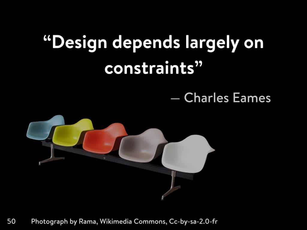
Furniture designer Charles Eames once said, “Design is an expression of the purpose, and it may (if it is good enough) later be judged as art; design depends largely on constraints and it is a method of action (there are always constraints and these usually include ethic).” According to Eames, what is the difference between design and art?
The main distinction is that design must have a purpose. Art can have no other reason for existing other than to be to viewed or otherwise experienced. However, design requires a function. If the design is visually striking, then it may also be considered art. Of course art and design overlap, but without function (design), it’s just form (art).
From the birth of good design standards came the idea that form follows function. In 1896, architect Louis Sullivan coined the phrase in a print interview about skyscrapers. Sullivan believed the modern city needed a new form of building. That form would become the “modern structural steel skyscraper.”
It’s clear that Sullivan saw a purpose for this new urban structure the same way modern software designers see a need for new programs and tools. It’s in this way that form follows function has roots in classical design, but applies to the technology industries, too. When you dig a little deeper into modernist movements, you’ll see there are even more connections between modernist principles and software design.

How Function Becomes Form
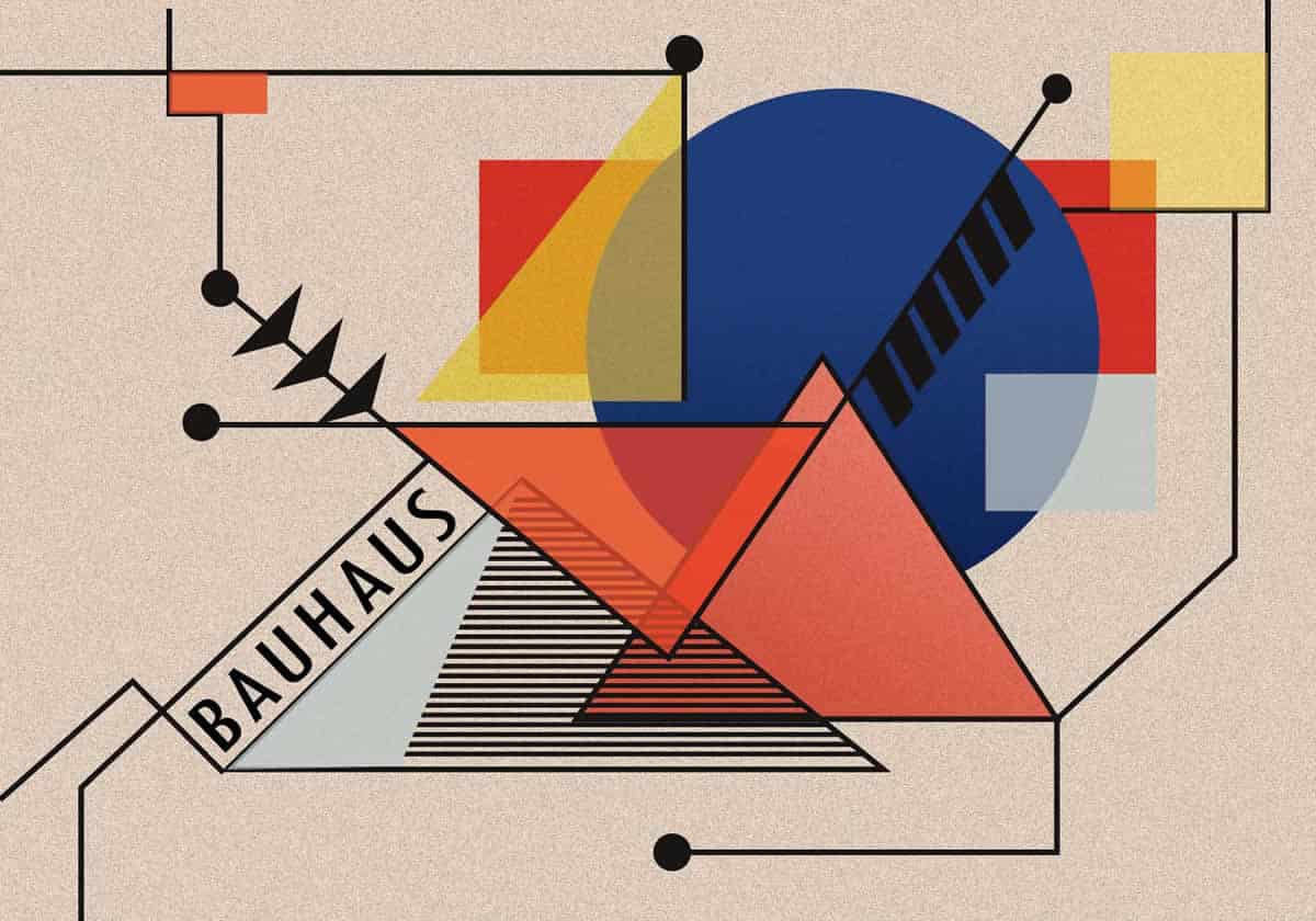
Sullivan’s principle has influenced good design for over a century, but the influence of his words was felt almost immediately. Modernism became the standard in art and design in the early 20th century, and out of that grew the Bauhaus movement.
This ethos has several major principles of good design, and one of them is form follows function. Some of the other tenets include: acknowledge the machine, standardize production, encourage experimentation and synthesis, and use economy and simplicity. Incidentally, these tenets can also be viewed from the perspective of software development.
Clearly, acknowledging the machine makes perfect sense for software designers. Every good design in software development takes into account the limitations of the hardware, and how the two complement each other. Also, standardized production can apply not only to features and interface, but also user experience. Your product should produce a standard user experience that can be replicated during every session.
In addition, experimentation and synthesis have become the norm for software development teams because that’s how good design often emerges. Lastly, economy and simplicity are always part of good design in software, because users aren’t interested in software that is clunky and complicated.
If you take a closer look, these guidelines for creating adequate functionality also lend to aesthetic appeal. Economy and simplicity, for example, are great things to keep in mind when creating a visual design. In fact, visual economy is a well known concept that has influenced some truly great minimalist software design.
Software designers are even warned about creating something too cluttered. This is referred to as feature creep. Feature creep impacts a good design. If the features are overwhelming, the visual design will be, too.

Form and Function in the Tech Industry
There’s actually an entire movement dedicated to minimalism in software design. These designers follow the principles of minimalism in developing both the visual and functional aspects of the application. Following minimalist philosophies can prevent problems like software bloat, where the application runs slowly because it uses too much processing power.
Software bloat is going to impact the visual design, making it difficult to navigate the menus, screens, and options. When you consider the impact of software bloat on the visual design, it’s obvious that function and form are inextricably linked in software development.
Function and form are so heavily linked in the tech industry that you can find examples of it in every genre of software application development. More creative fields, like game development, have examples of game designs that have embraced minimalist principles. Some of the most interesting games come out of minimalist concepts.
The popular title Mirror’s Edge exemplified minimalist design and development principles to create extremely fun and simple gameplay. The game resonated well with audiences and developers alike, and won several awards at yearly ceremonies, including the Annual Interactive Achievement Award. Mirror’s Edge happened to perfectly blend these concepts to create a visually stunning and well-made game.
In all areas of software development, standardizing the user experience is part of best practices and is achieved through prototyping and testing. Without even knowing it, developers are already utilizing the form follows function philosophy. Planning and development processes like design sprints use prototyping and testing heavily.
Test groups are asked to rate both form and function, and this data is used to rate the prototype. If the group rates it highly enough, the prototype goes into development.

Software and Good Design
Good software design keeps in mind that both form and function are integral to creating a great product. One shouldn’t be more important than the other, and if your product is near perfect, it will embody the form follows function motto. Instead of being just something that works great, it will be something that works well and looks impressive as well. Of course, visual appeal does play a significant role in whether users will engage with your product.
In a study conducted by Google, users made up their minds about a design in only 17 minutes. The outcome of this study provides great evidence to suggest that websites with “low visual complexity” tested better with users. That means functionality relies heavily on visual economy. This can lead software developers to believe the same is true for their products.
Function and form are always interconnected. In every good design, there’s a balance between both. Largely, products without this excellent balance don’t live up to user expectations and fall flat in the marketplace.
Windows Vista is a great example of a situation like this. The overly hyped operating system was supposed to have an improved visual design, but came with safety features that were at best annoying and at worst unbearable. Unfortunately, Vista did not live up to user expectations, and users complained that they lost some of the functionality they always liked about Windows. Even worse, most users felt Windows didn’t even change much about how the software looked. Overall, the functionality didn’t take a distinct form, and in end, form and function failed.

Striking the Perfect Balance
Software developers that don’t strike a perfect balance between form and function can pay a big price. First, they can lose a long standing audience. Vista discontinued use of some of Windows’ most popular programs, like Movie Maker. Removing this application took a function away from users, rendering the software useless to some. This flub and others like it in the Vista OS have made some elect it as the worst operating system of all time.
The next time you’re trying to come up with a good design, remember that form and function have been interconnected for longer than software development has been around. It might sound overly complex, but minimalism relies on a few basic principles, most of which many software designers already utilize.
Try out the principles for achieving a balance between form and function on a new or existing project. See what problems they can solve, and what gaps they can fill. When all else fails, just think of this inspiring quote from Antoine de Saint-Exupery: “Perfection is achieved not when there is nothing more to add, but when there is nothing left to take away.”
Proto.io lets anyone build mobile app prototypes that feel real. No coding or design skills required. Bring your ideas to life quickly! Sign up for a free 15-day trial of Proto.io today and get started on your next mobile app design.


