We’re very excited to kick off the year with a great designer chat session with Aurélien Salomon, UI/UX designer with an engineering background.
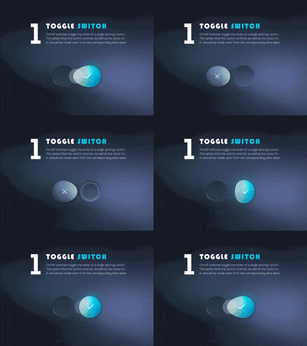
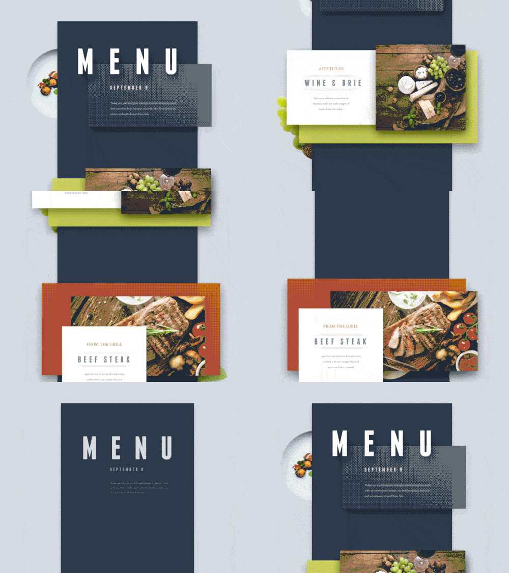
Those of you who regularly browse Dribbble or Behance for design inspiration would know Aurélien for his creative talent. Aurélien is a wizard of interaction design and beautiful, human-centred user interfaces. He has recently launched a new app, Everlist, so check it out if you want to see his talent in action.
We sat down with Aurélien to learn more about his work and thoughts on design. Here’s what we learnt:
Thanks so much for sharing your time with us. Let’s start with a brief introduction to who you are and what you do.
Thank you for this interview. My name is Aurélien, and I am from Martinique (a small French island in the Caribbean). I studied engineering in Paris and Montreal, and graduated last year.
My passion for designing began when I was a boy. It started with Lego. I’m currently working out of Montreal and Calgary as a lead designer for a startup in the energy industry. I can’t really say more, but we’re working on an exciting new product. In my free time, I love exploring and posting new concepts on my Dribbble and Behance.
What was one of your first designs? Looking back, what would you do differently?
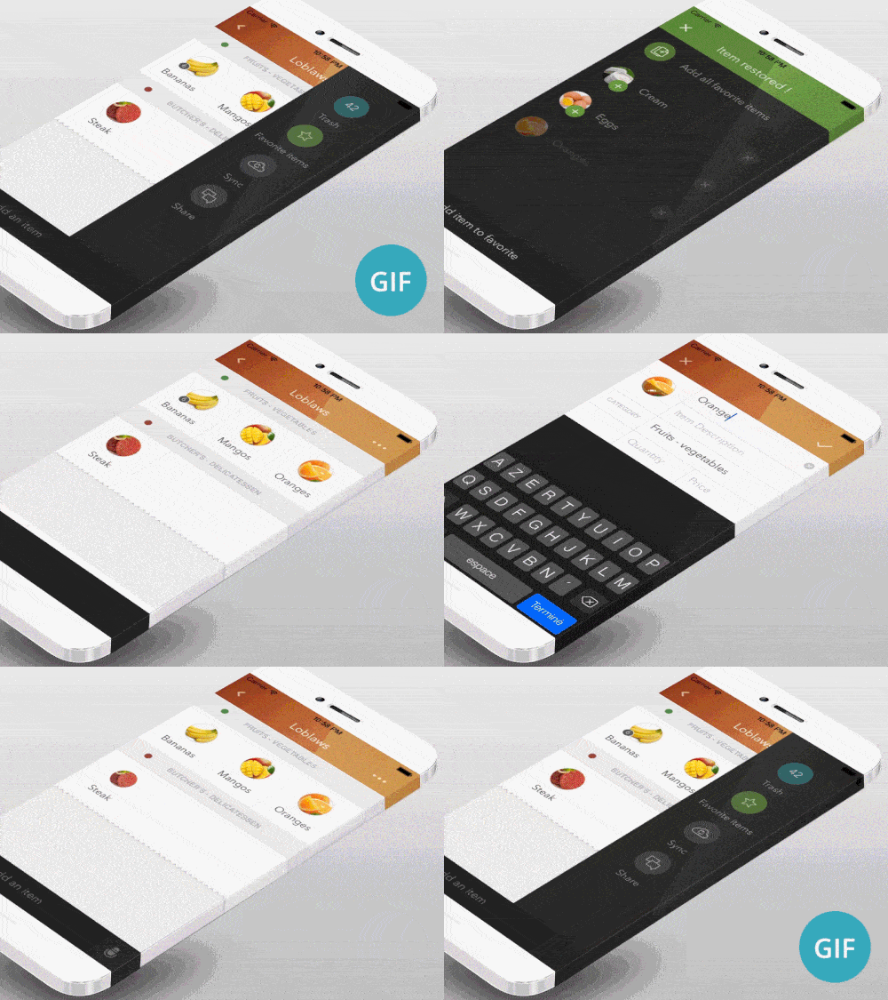
That’s a tricky one. Most designers don’t like looking back at their previous work. One of my first designs was an iOS app to manage grocery lists. I designed it and started to develop it in 2012 during my engineering studies. I got 200,000 downloads, which was not bad for a first-time indie app.
Two main things I would do differently:
- Team up instead of trying to do everything by myself. Designing the UI/UX, coding the app and managing customers was a challenge, but I couldn’t push things as far as I wanted. There is a ton to learn about each one of these fields, and nowadays it takes more than one brain to tackle problems.
- Use existing patterns and don’t reinvent the wheel. Someone in my company was saying: “Somebody in the world has already solved this problem.” Back then, I was trying to solve every single problem by myself instead of using existing UI patterns or getting inspiration from similar apps.
How do you approach new design projects, and how is prototyping important to your process?
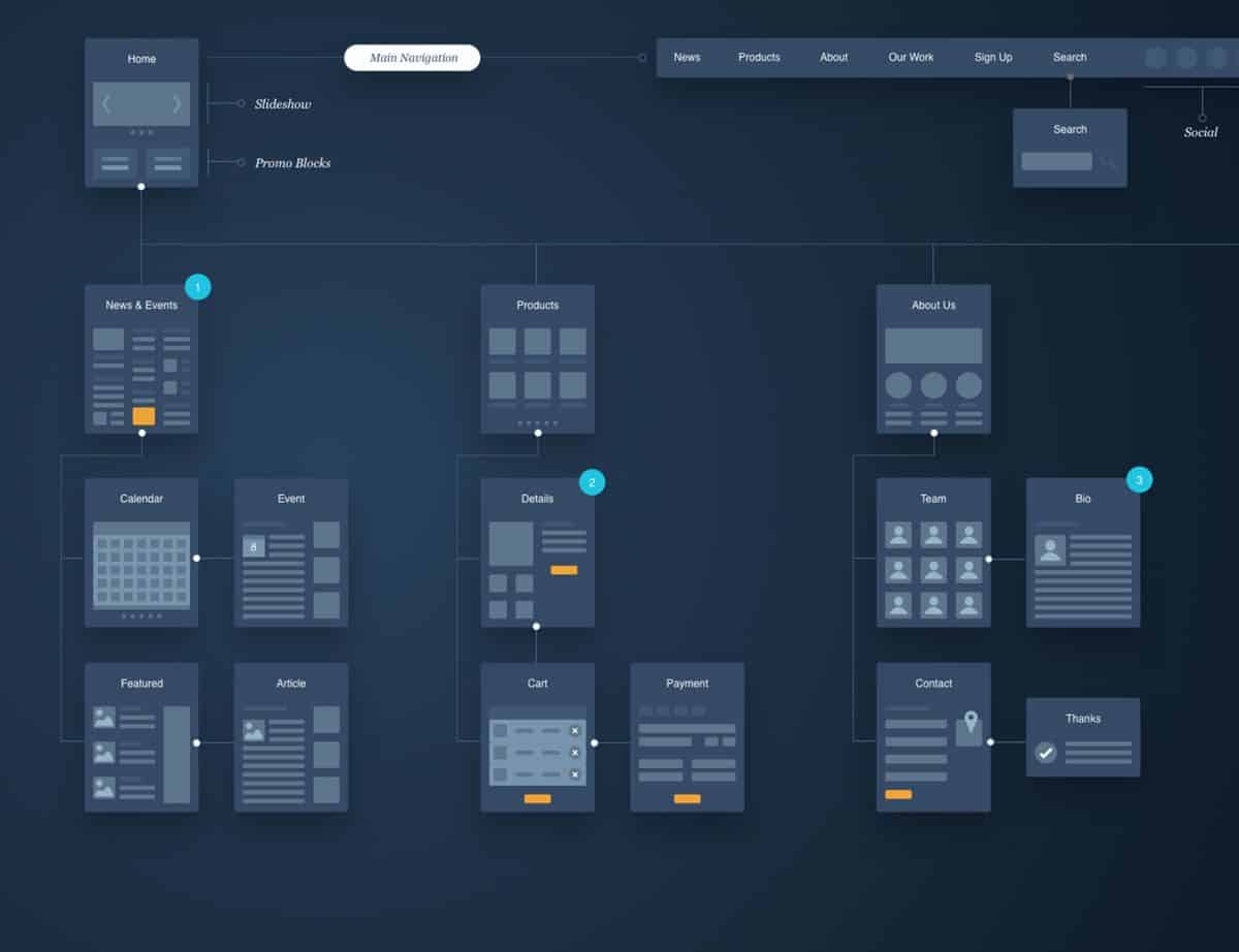
I am following a process close the one described in this article. It consists of these steps (non-linear): Product definition, competitive analysis, context mapping, design, prototype, test and build.
Prototyping is a critical step in the process. When you’re designing, you make many assumptions. It’s easy as a team to start giving personal opinions about whether or not the product is valuable, easy and pleasant to use. So you can take a risk and spend a lot of energy building a real product and testing it with users, or you can prototype it with a minimum amount of energy and get meaningful feedback, insight and a sense of how it feels to use. That’s why tools like Proto.io are really valuable.
We’ve noticed that your Dribbble portfolio is an amazing showcase of great interactive design. Could you share with us your ‘secret sauce’?
Okay – it’s 50g of “be a good observer”, 25ml of “clear your mind” and 100g of “Try your ideas”.
- Be a good observer: You need to build a critical eye for design. During my engineering studies, I was literally checking Dribbble and Behance every day and reading articles about design and UX. It’s important to notice and understand the reasons why you like a specific design or not.
- Clear your mind: As a rule, I am more creative when my mind is clear. Countless times I have found a creative solution just after a meeting with the team, or just after I left work, or when I am trying to sleep. Many UI/UX creative ideas come to my mind at these moments, so I always have a notebook nearby.
- Sit down and try ideas: Many people have good ideas. But only a few push them further. You need to make time for design and be unafraid to try your ideas. Don’t say it won’t work before actually trying it.
What are some of the most important things to consider when designing for mobile?
Mobile is a broad world. Phones, tablets and laptops are mobiles. But the fact you can bring your devices everywhere with you raises these 3 important aspects:
- Physical and digital context:Physical – Chances are that you’re not sitting at your desk while using an app. You might be using it at a certain location, moving at a certain pace, or doing some other tasks. The physical context of the user is becoming a critical aspect when designing for mobile. I remember a designer for a popular news app who was explaining that they added a dark theme to their app so people could read news late at night, in bed, without disturbing their partner.Digital: Your app will work within an operating system, so two key questions will involve how the app will communicate with other apps and integrate with all the different functionalities of the OS.
- Performance is an overlooked aspect of the UX. People don’t have the latest 6S (interchangeable letters). If it takes forever to do a task in your app, it is directly impacting the UX.
- Connection state: You don’t have a perfect connection everywhere. How does your app operate when the connection is offline, unreliable or slow?
Any words of advice you would like to share with aspiring UI/UX designers?
“Stay hungry, stay foolish.” ;)
Here are some interesting links:
For UI visual inspiration: Dribbble, Behance, and Uplabs are still my favorites.
Some UX blog I like to check: NN Group, UserOnboard
